Data Visualization on Ramen Ratings
When browsing Kaggle datasets, I came across this interesting dataset (here is the link) about ramen ratings, which includes some brands we encounter at each grocery store. Using this dataset, I would like to show which ramen has received the decent ratings through visualization and it might shed some light on which ramen brands/varieties we should purchase.
Data Introduction
Load tidyverse package and the dataset, then check its basic structure.
library(tidyverse)
rr <- read_csv("ramen-ratings.csv")
dim(rr)
## [1] 2580 7head(rr)## # A tibble: 6 x 7
## `Review #` Brand Variety Style Country Stars `Top Ten`
## <dbl> <chr> <chr> <chr> <chr> <chr> <chr>
## 1 2580 New Touch T's Restaurant Tantanmen Cup Japan 3.75 NA
## 2 2579 Just Way Noodles Spicy Hot Sesame ~ Pack Taiwan 1 NA
## 3 2578 Nissin Cup Noodles Chicken Veget~ Cup USA 2.25 NA
## 4 2577 Wei Lih GGE Ramen Snack Tomato Fl~ Pack Taiwan 2.75 NA
## 5 2576 Ching's ~ Singapore Curry Pack India 3.75 NA
## 6 2575 Samyang ~ Kimchi song Song Ramen Pack South K~ 4.75 NAOne thing we noticed is Stars column should be numeric rather than character. Let’s change it and then use skim() to output an overview of the dataset.
rr$Stars <- as.numeric(rr$Stars)
skimr::skim(rr)| Name | rr |
| Number of rows | 2580 |
| Number of columns | 7 |
| _______________________ | |
| Column type frequency: | |
| character | 5 |
| numeric | 2 |
| ________________________ | |
| Group variables | None |
Variable type: character
| skim_variable | n_missing | complete_rate | min | max | empty | n_unique | whitespace |
|---|---|---|---|---|---|---|---|
| Brand | 0 | 1.00 | 1 | 31 | 0 | 355 | 0 |
| Variety | 0 | 1.00 | 3 | 96 | 0 | 2412 | 0 |
| Style | 2 | 1.00 | 3 | 4 | 0 | 7 | 0 |
| Country | 0 | 1.00 | 2 | 13 | 0 | 38 | 0 |
| Top Ten | 2539 | 0.02 | 1 | 8 | 0 | 38 | 4 |
Variable type: numeric
| skim_variable | n_missing | complete_rate | mean | sd | p0 | p25 | p50 | p75 | p100 | hist |
|---|---|---|---|---|---|---|---|---|---|---|
| Review # | 0 | 1 | 1290.50 | 744.93 | 1 | 645.75 | 1290.50 | 1935.25 | 2580 | ▇▇▇▇▇ |
| Stars | 3 | 1 | 3.65 | 1.02 | 0 | 3.25 | 3.75 | 4.25 | 5 | ▁▁▂▇▅ |
Besides the column of Top Ten being fraught with missing values, other columns are rather neat.
Data Visualization
There are more than 355 ramen brands presented in the dataset. First off, we would like to learn which brands are popular. Using a barplot to show the popularity is appropriate, but one problem is if all brands are shown, it will be cluttered and hard to visualize anything. Here is where the function fct_lump() kicks in and makes things handy. This function is specifically designed to deal with this situation in a way that the barplot shows the top n most popular ramen noodles and the rest of brands are put in the category of Other. Here in the plot below, we choose n to be 30.
rr %>%
  count(Brand, sort = TRUE) %>%
  mutate(Brand = fct_lump(Brand, n = 30, w = n),
         Brand = fct_reorder(Brand, n, .desc = TRUE)) %>%
  ggplot(aes(Brand, n, fill = n)) +
  scale_fill_gradient(name = "Brand Counts", low = "grey60", high = "grey20") +
  geom_col() +
  coord_flip() +
  labs(y = "Brand Count") +
  theme_bw() +
  theme(
    legend.position = "none"
  ) +
  ggtitle("Brands and Their Count")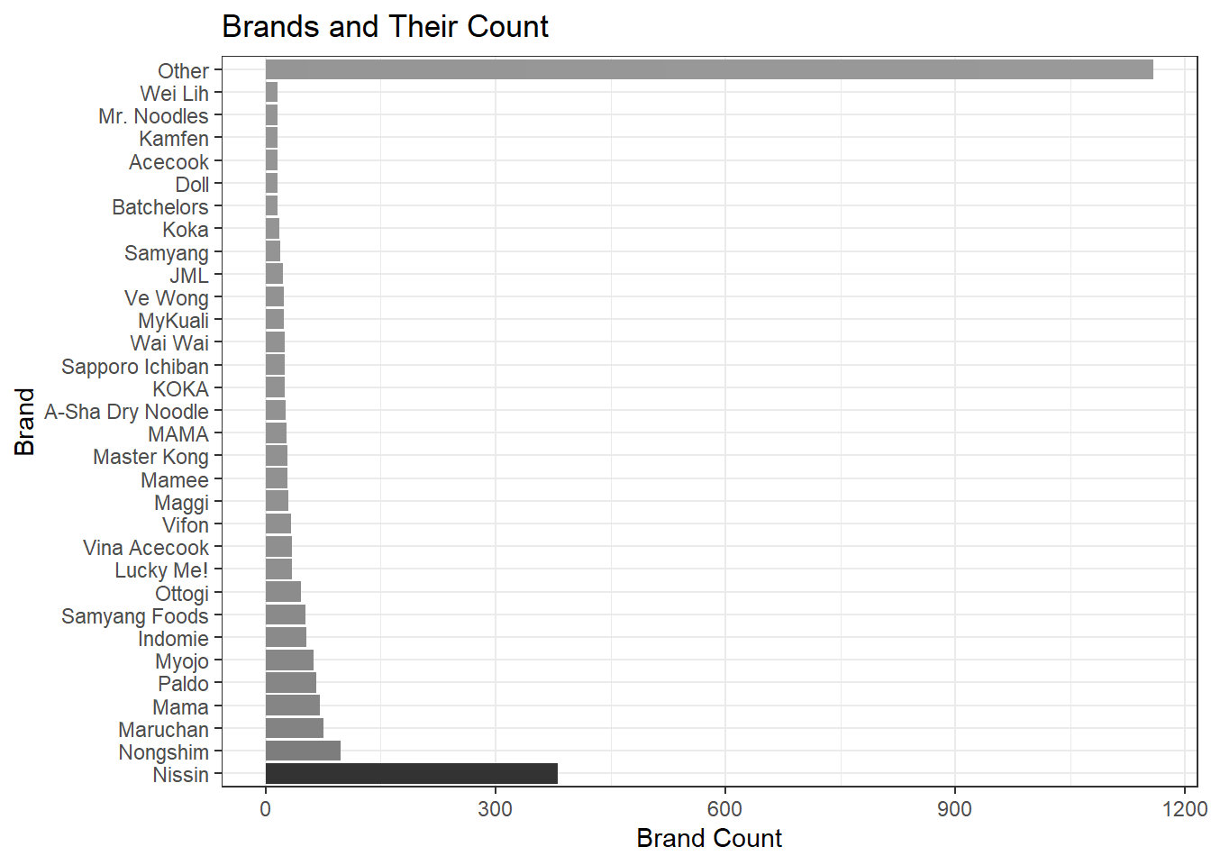
As the barplot shown, the most popular brand is Nissin, which is ubiquitous in every major grocery store chain here in the U.S. Where are these Nissin raman noodles from? We can obtain the information pretty quickly.
rr %>%
  filter(Brand == "Nissin") %>%
  count(Country, sort = TRUE) %>%
  mutate(Country = fct_reorder(Country, n)) %>%
  ggplot(aes(Country, n, fill = Country)) +
  geom_col() +
  coord_flip() +
  theme_bw() +
  theme(
    legend.position = "none"
  ) +
  labs(y = "Count", title = "Nissin Ramen Country Count")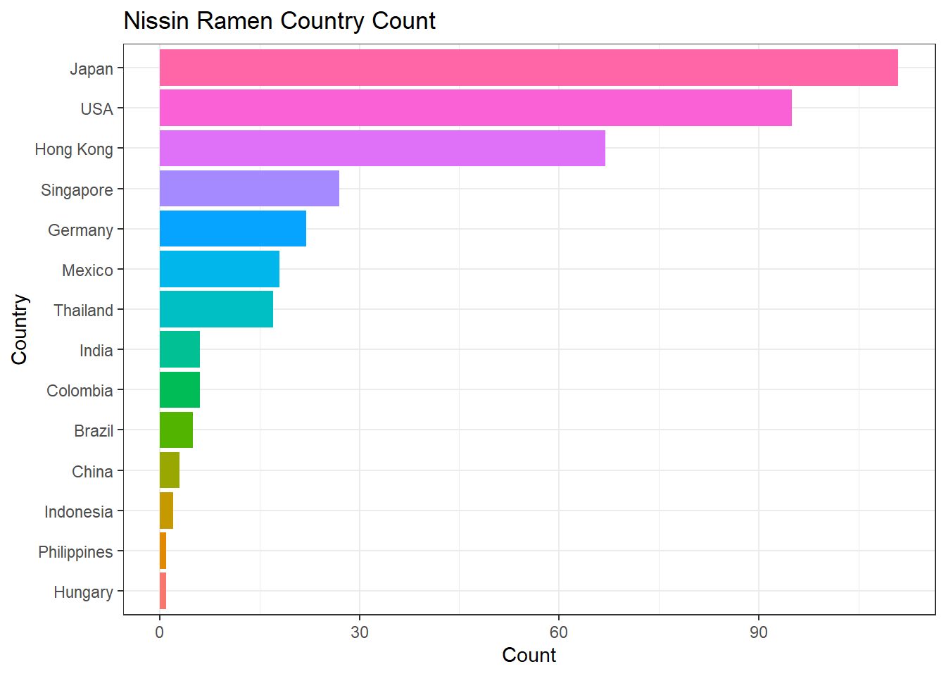
Most of the Nissin ramen is from Japan and then the U.S. What is a bit counterintuitive for me is that all my Nissin ramen I had either came from Korea or China. Now it is interesting to check which countries produce better Nissin ramen based on the stars presented in this dataset.
rr %>%
  filter(Brand == "Nissin") %>%
  group_by(Country) %>%
  summarize(Stars = Stars) %>%
  ggplot(aes(Stars, fill = Country)) +
  geom_bar() +
  facet_wrap(~Country) +
  theme_bw() +
  theme(
    strip.text = element_text(size = 13, face = "bold"),
    axis.title = element_text(size = 15),
    axis.text = element_text(size = 13),
    plot.title = element_text(size = 16),
    legend.position = "none"
  )+
  ggtitle("Nissin Ramen Star Distribution In Each Country")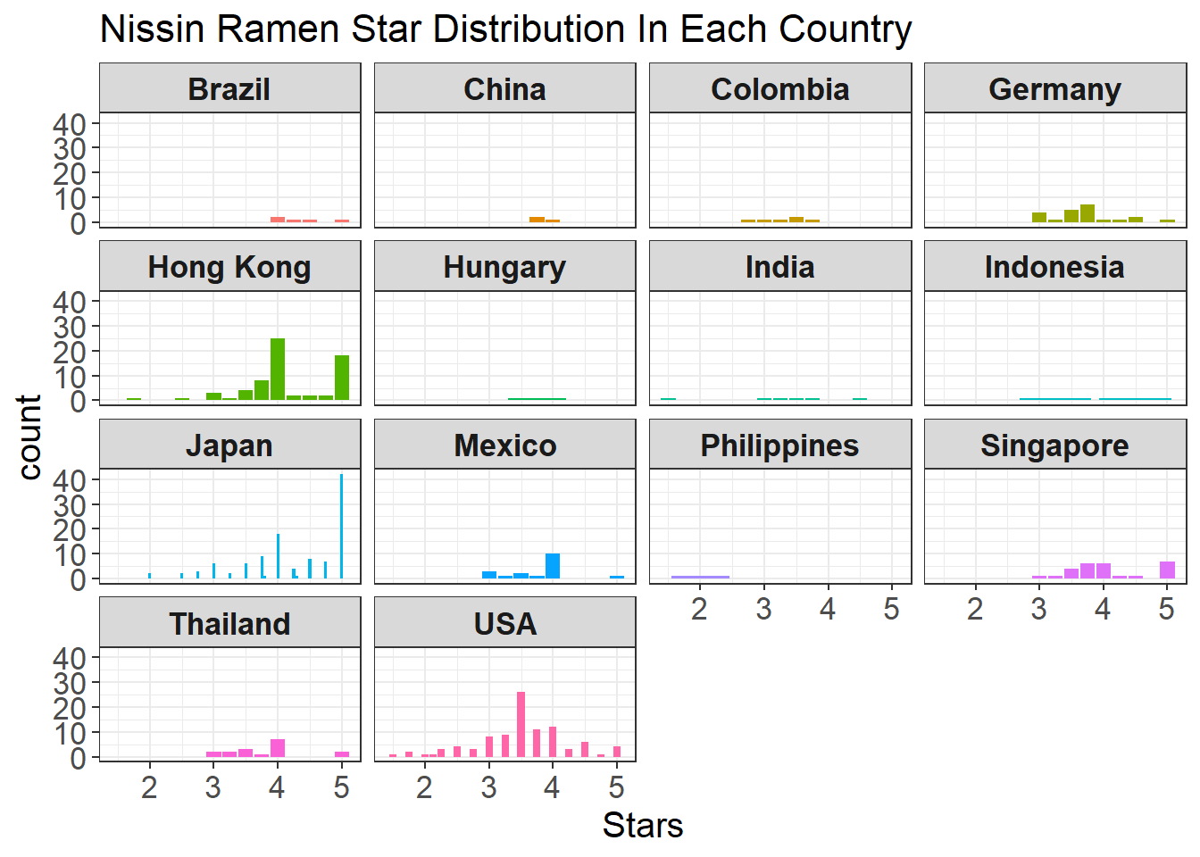
It looks like ratings from Nissin noodles manufactured in the U.S are mixed-up ranging from 1 to 5, yet most of their Japanese counterparts have much more 5 stars.
Now we would like to visualize the relations between Style and Country. First, let’s dive into which country contributes the most to each style from the dataset.
rr %>%
  group_by(Country, Style) %>%
  count(sort = TRUE) %>%
  ggplot(aes(Style, Country, fill = n)) +
  geom_tile() +
  scale_fill_gradient(low = "grey80", high = "black") +
  theme_bw() +
  labs(fill = "Count", title = "The Relations Between Country and Style on Count")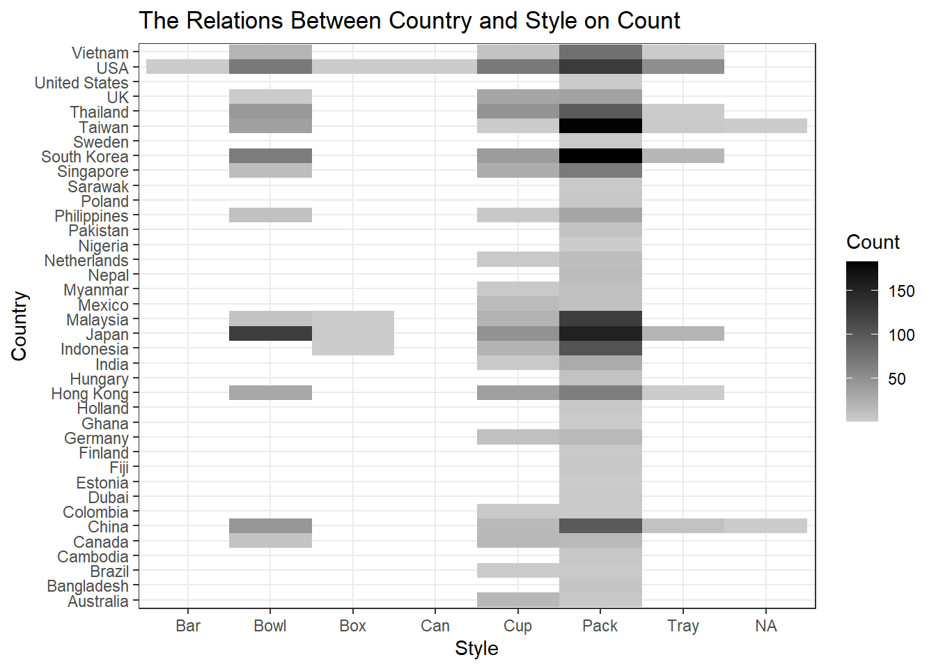
Based on the heatmap above, it looks like that Pack is the most popular ramen packaging, and Taiwan and South Korea contributed the most to it, followed by Japan, Malaysia, and USA. It is interesting to note that many bowl-style ramen were produced by Japan.
rr %>%
  group_by(Style, Country) %>%
  summarize(avg_star = mean(Stars, na.rm = TRUE)) %>%
  ggplot(aes(Style, Country, fill = avg_star)) +
  geom_tile() +
  scale_fill_gradient(low = "grey90", high = "black") +
  theme_bw() +
  labs(fill = "Mean Stars", title = "Mean Stars between Country and Style")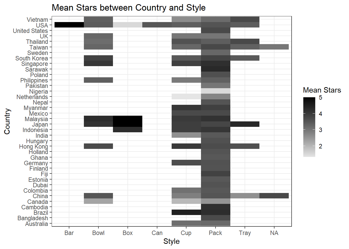
Min-Max transformation on Style.
rr %>%
  group_by(Style) %>%
  mutate(minmax_star = (Stars - min(Stars, na.rm = TRUE))/(max(Stars, na.rm = TRUE) - min(Stars, na.rm = TRUE))) %>%
  ggplot(aes(Style, Country, fill = minmax_star)) +
  geom_tile() +
  scale_fill_gradient(low = "grey90", high = "black") +
  theme_bw()+
  labs(fill = "Min-Max Star", title = "Style-wise Min-Max Star In Each Country")
It is a little surprising to me that Cambodia has the highest normalized star for Pack style. Although Japan made more bowl-style ramen, China had better stars in such category.
Min-Max transformation on Country.
rr %>%
  group_by(Country) %>%
  mutate(minmax_star = (Stars - min(Stars, na.rm = TRUE))/(max(Stars, na.rm = TRUE) - min(Stars, na.rm = TRUE))) %>%
  ggplot(aes(Style, Country, fill = minmax_star)) +
  geom_tile() +
  scale_fill_gradient(low = "grey90", high = "black") +
  theme_bw()+
  labs(fill = "Min-Max Star", title = "Country-wise Min-Max Star In Each Style")
For most of grocery stores in the U.S., Bowl and Pack style are rather popular. If the bowl ramen are from China, they should be the best from all made-in-China ramen based on the above heatmap in terms of normalized star received. USA, however, enjoyed the highest rating from its Bar style ramen.
Conclusion
In this data visualization project, we used barplot along with its variation and heatmap to visualize the ramen dataset. Through viewing the plots generated from this project, it gives viewers a decent sense of what information this very dataset conveys and might shed some light on how we choose ramen in our future grocery shopping.