Stack Overflow Survey Data Processing And Visualization
When we encounter any technical issues in our everyday work, one of the ways to get the issue addressed is Stack Overflow, where some users might have posted similar questions and useful solutions we can borrow for solving the problems we have at the moment. Besides it, Stack Overflow conducts annual survey and publishes the survey results on this website. In this project, we use the 2020 survey result, which can be downloaded here, to analyze what the survey tries to inform us. But before we get the right information, a slew of data cleaning and processing is required, as the dataset is not suitable for a wide range of visualizations by using raw data.
Introduction
First off, let’s load libraries and the dataset.
library(tidyverse)
library(scales)
ss <- read_csv("survey_results_public.csv")
head(ss)
## # A tibble: 6 x 61
## Respondent MainBranch Hobbyist Age Age1stCode CompFreq CompTotal
## <dbl> <chr> <chr> <dbl> <chr> <chr> <dbl>
## 1 1 I am a developer by p~ Yes NA 13 Monthly NA
## 2 2 I am a developer by p~ No NA 19 NA NA
## 3 3 I code primarily as a~ Yes NA 15 NA NA
## 4 4 I am a developer by p~ Yes 25 18 NA NA
## 5 5 I used to be a develo~ Yes 31 16 NA NA
## 6 6 I am a developer by p~ No NA 14 NA NA
## # ... with 54 more variables: ConvertedComp <dbl>, Country <chr>,
## # CurrencyDesc <chr>, CurrencySymbol <chr>, DatabaseDesireNextYear <chr>,
## # DatabaseWorkedWith <chr>, DevType <chr>, EdLevel <chr>, Employment <chr>,
## # Ethnicity <chr>, Gender <chr>, JobFactors <chr>, JobSat <chr>,
## # JobSeek <chr>, LanguageDesireNextYear <chr>, LanguageWorkedWith <chr>,
## # MiscTechDesireNextYear <chr>, MiscTechWorkedWith <chr>,
## # NEWCollabToolsDesireNextYear <chr>, NEWCollabToolsWorkedWith <chr>,
## # NEWDevOps <chr>, NEWDevOpsImpt <chr>, NEWEdImpt <chr>, NEWJobHunt <chr>,
## # NEWJobHuntResearch <chr>, NEWLearn <chr>, NEWOffTopic <chr>,
## # NEWOnboardGood <chr>, NEWOtherComms <chr>, NEWOvertime <chr>,
## # NEWPurchaseResearch <chr>, NEWPurpleLink <chr>, NEWSOSites <chr>,
## # NEWStuck <chr>, OpSys <chr>, OrgSize <chr>, PlatformDesireNextYear <chr>,
## # PlatformWorkedWith <chr>, PurchaseWhat <chr>, Sexuality <chr>,
## # SOAccount <chr>, SOComm <chr>, SOPartFreq <chr>, SOVisitFreq <chr>,
## # SurveyEase <chr>, SurveyLength <chr>, Trans <chr>, UndergradMajor <chr>,
## # WebframeDesireNextYear <chr>, WebframeWorkedWith <chr>,
## # WelcomeChange <chr>, WorkWeekHrs <dbl>, YearsCode <chr>, YearsCodePro <chr>When glancing the column names, one way to change it is to use clean_names() from janitor package. Not only can the function lowercase all column names, it will also replace the space within each column by _. This is one of the tricks when dealing with datasets in the very first place.
ss <- janitor::clean_names(ss)
head(ss)
## # A tibble: 6 x 61
## respondent main_branch hobbyist age age1st_code comp_freq comp_total
## <dbl> <chr> <chr> <dbl> <chr> <chr> <dbl>
## 1 1 I am a developer b~ Yes NA 13 Monthly NA
## 2 2 I am a developer b~ No NA 19 NA NA
## 3 3 I code primarily a~ Yes NA 15 NA NA
## 4 4 I am a developer b~ Yes 25 18 NA NA
## 5 5 I used to be a dev~ Yes 31 16 NA NA
## 6 6 I am a developer b~ No NA 14 NA NA
## # ... with 54 more variables: converted_comp <dbl>, country <chr>,
## # currency_desc <chr>, currency_symbol <chr>,
## # database_desire_next_year <chr>, database_worked_with <chr>,
## # dev_type <chr>, ed_level <chr>, employment <chr>, ethnicity <chr>,
## # gender <chr>, job_factors <chr>, job_sat <chr>, job_seek <chr>,
## # language_desire_next_year <chr>, language_worked_with <chr>,
## # misc_tech_desire_next_year <chr>, misc_tech_worked_with <chr>,
## # new_collab_tools_desire_next_year <chr>,
## # new_collab_tools_worked_with <chr>, new_dev_ops <chr>,
## # new_dev_ops_impt <chr>, new_ed_impt <chr>, new_job_hunt <chr>,
## # new_job_hunt_research <chr>, new_learn <chr>, new_off_topic <chr>,
## # new_onboard_good <chr>, new_other_comms <chr>, new_overtime <chr>,
## # new_purchase_research <chr>, new_purple_link <chr>, newso_sites <chr>,
## # new_stuck <chr>, op_sys <chr>, org_size <chr>,
## # platform_desire_next_year <chr>, platform_worked_with <chr>,
## # purchase_what <chr>, sexuality <chr>, so_account <chr>, so_comm <chr>,
## # so_part_freq <chr>, so_visit_freq <chr>, survey_ease <chr>,
## # survey_length <chr>, trans <chr>, undergrad_major <chr>,
## # webframe_desire_next_year <chr>, webframe_worked_with <chr>,
## # welcome_change <chr>, work_week_hrs <dbl>, years_code <chr>,
## # years_code_pro <chr>dim(ss)## [1] 64461 61Now, the column names are cleaned by clean_names(), which would save us some typing afterwards. Also, there are almost 65,000 questionnaire takers and 61 different questions within each survey questionnaire. Based on the dimensions of the dataset, we can sense it is highly detailed and there are valuable nuggets we can dig out from it.
Data Processing
Let’s check the missing value percentage within each column through a bar plot.
ss %>%
  summarize_all(~sum(is.na(.))) %>%
  pivot_longer(!respondent, names_to = "column", values_to = "missing_value") %>%
  select(-respondent) %>%
  mutate(total_rows = dim(ss)[1],
         missing_percent = missing_value/total_rows) %>%
  mutate(column = fct_reorder(column, missing_percent, .desc = TRUE)) %>%
  ggplot(aes(column, missing_percent, fill = missing_percent)) +
  geom_col() +
  coord_flip() +
  scale_y_continuous(labels = percent_format()) +
  theme_bw() +
  theme(
    legend.position = "none",
    axis.title = element_text(size = 17),
    axis.text = element_text(size = 15),
    plot.title = element_text(size = 20)
  ) +
  labs(y = "missing percent", title = "Column Wise Missing Value Percentage")
Some columns are missing for almost half, which might have made them difficult to work with. Just bear this mind.
employment and ed_level are something we can use as analyze to see if a higher degree would help a person on employment search. Here we can see the unique values presented in both columns.
unique(ss$employment)## [1] "Independent contractor, freelancer, or self-employed"
## [2] "Employed full-time"
## [3] NA
## [4] "Student"
## [5] "Not employed, but looking for work"
## [6] "Employed part-time"
## [7] "Retired"
## [8] "Not employed, and not looking for work"unique(ss$ed_level)## [1] "Master’s degree (M.A., M.S., M.Eng., MBA, etc.)"
## [2] "Bachelor’s degree (B.A., B.S., B.Eng., etc.)"
## [3] NA
## [4] "Secondary school (e.g. American high school, German Realschule or Gymnasium, etc.)"
## [5] "Professional degree (JD, MD, etc.)"
## [6] "Some college/university study without earning a degree"
## [7] "Associate degree (A.A., A.S., etc.)"
## [8] "Other doctoral degree (Ph.D., Ed.D., etc.)"
## [9] "Primary/elementary school"
## [10] "I never completed any formal education"One thing worth noting is that the values presented in both columns are verbose. One of the ways to deal with it is separate(), but considering there aren’t too many unique values, I think case_when would be better in this particular scenario.
ss <- ss %>%
  mutate(
    employment = case_when(
              employment == "Employed full-time" ~"Fully Employed",
              employment == "Student" ~"Student",
              employment == "Independent contractor, freelancer, or self-employed" ~ "Independent",
              employment == "Not employed, but looking for work" ~ "Unemployed",
              employment == "Not employed, and not looking for work" ~ "Unemployed",
              employment == "Employed part-time" ~ "Partly Employed",
              employment == "Retired" ~ "Retired"
            ),
    ed_level = case_when(
              ed_level == "Master’s degree (M.A., M.S., M.Eng., MBA, etc.)" ~ "Master's",
              ed_level == "Bachelor’s degree (B.A., B.S., B.Eng., etc.)" ~ "Bachelor's",
              ed_level == "Secondary school (e.g. American high school, German Realschule or Gymnasium, etc.)" ~ "High School",
              ed_level == "Professional degree (JD, MD, etc.)" ~ "JD/MD",
              ed_level == "Some college/university study without earning a degree" ~ "Some College",
              ed_level == "Associate degree (A.A., A.S., etc.)" ~ "Associate",
              ed_level == "Other doctoral degree (Ph.D., Ed.D., etc.)" ~ "Ph.D./Ed.D.",
              TRUE                      ~ "Other"
    )
        )
Repeating what we had earlier, the unique values are much cleaner without too many words cluttered together.
unique(ss$employment)## [1] "Independent" "Fully Employed" NA "Student"
## [5] "Unemployed" "Partly Employed" "Retired"unique(ss$ed_level)## [1] "Master's" "Bachelor's" "Other" "High School" "JD/MD"
## [6] "Some College" "Associate" "Ph.D./Ed.D."Age VS Employment Status VS Degree Type
Making the following two bar plots, both of which are faceted by degree types.
ss %>%
  group_by(ed_level,employment) %>%
  summarize(avg_age = mean(age, na.rm = TRUE)) %>%
  ggplot(aes(employment, avg_age, fill = employment)) +
  geom_col() +
  facet_wrap(~ed_level) +
  coord_flip() +
  theme_bw() +
  theme(
    legend.position = "none",
    strip.text = element_text(size = 13, face = 'bold')
  ) +
  labs(y = "Age Mean", x = "", title = "Age Mean and Employment Status")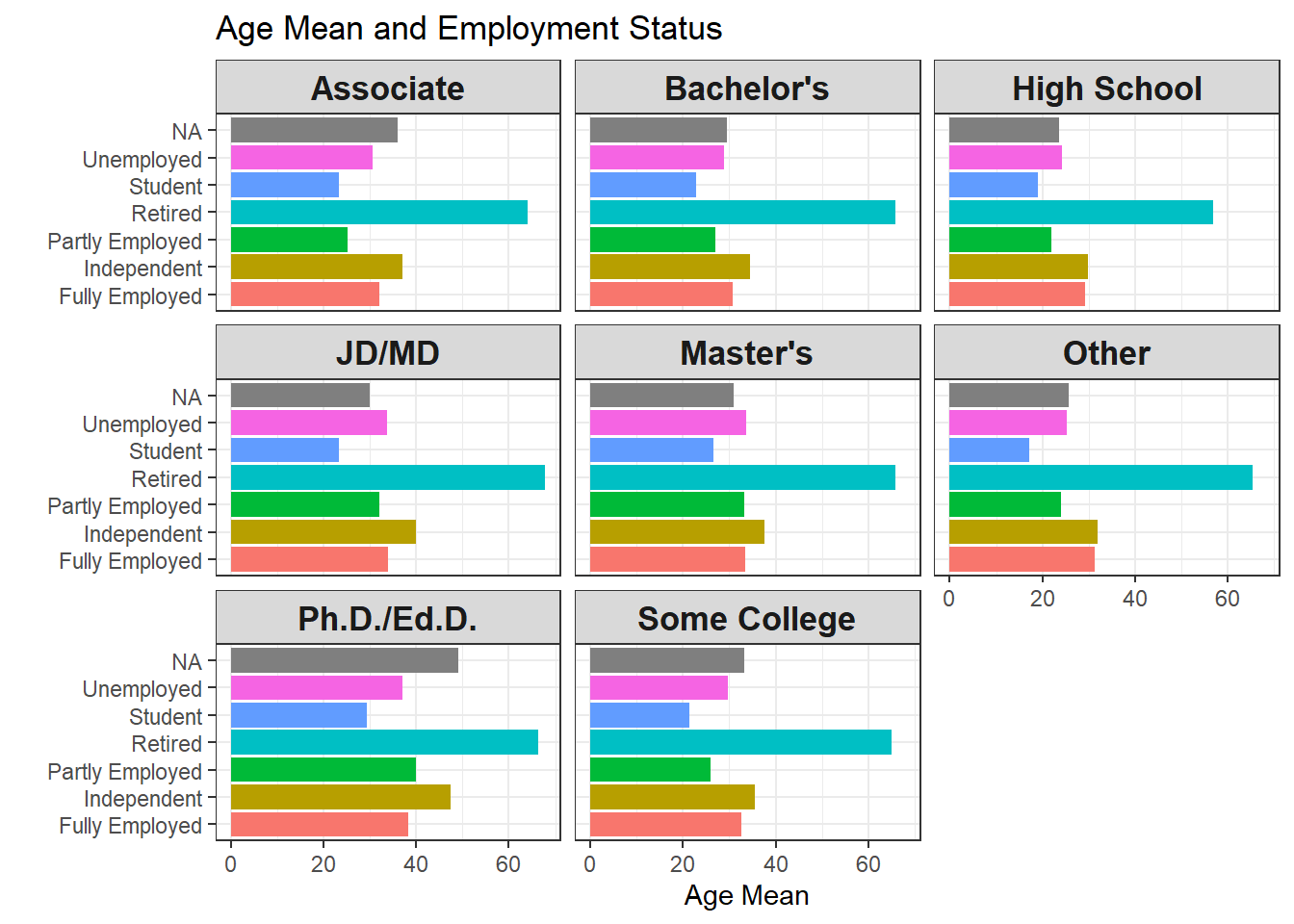
ss %>%
  group_by(ed_level,employment) %>%
  summarize(avg_age = median(age, na.rm = TRUE)) %>%
  ggplot(aes(employment, avg_age, fill = employment)) +
  geom_col() +
  facet_wrap(~ed_level) +
  coord_flip() +
  theme_bw() +
  theme(
    legend.position = "none",
    strip.text = element_text(size = 13, face = 'bold')
  ) +
  labs(y = "Age Median", x = "", title = "Age Median and Employment Status")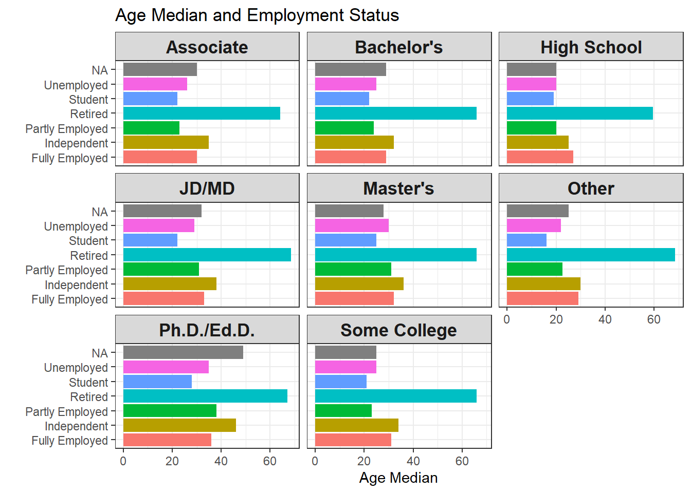
One interesting thing found from both plots above is that people fall in independent employment status is older than fully employed based on both mean and median across almost all degree types. This makes sense in a way that people who have gained much experience when full-time employed can be freelancers by providing independent counsels to various companies and organizations.
Popularity of Languages VS Employment Status
To a data scientist, Python, R, and SQL might be the three most critical and fundamental languages.
ss %>%
  filter(str_detect(language_worked_with, "R(?=;)|R$")) %>%
  ggplot(aes(employment)) +
  geom_bar() +
  ggtitle("R")
ss %>%
  filter(str_detect(language_worked_with, "SQL")) %>%
  ggplot(aes(employment)) +
  geom_bar() +
  ggtitle("SQL")
ss %>%
  filter(str_detect(language_worked_with, "Python")) %>%
  ggplot(aes(employment)) +
  geom_bar() +
  ggtitle("Python")
It looks like Python and SQL are the most popular language from the survey takers, especially SQL, which is the backbone of querying data. R, however, is much less popular compared to the other two. Maybe R is deeply rooted in Statistics and less appreciated among software engineers. But I need to say that R is such an amazing ecosystem that a slew of wonderful data science libraries and tools are used by me on a daily basis.
Gender and Sexuality Distribution
ss %>%
  group_by(gender) %>%
  count(sort = TRUE) %>%
  ungroup() %>%
  mutate(gender = fct_lump(gender, n = 2, w = n),
         gender = fct_reorder(gender, n)) %>%
  rename(count = n) %>%
  ggplot(aes(gender, count, fill = count)) +
  geom_col() +
  theme_bw() +
  theme(
    legend.position = "none"
  ) +
  labs(x = "", title = "Survey Participants' Gender")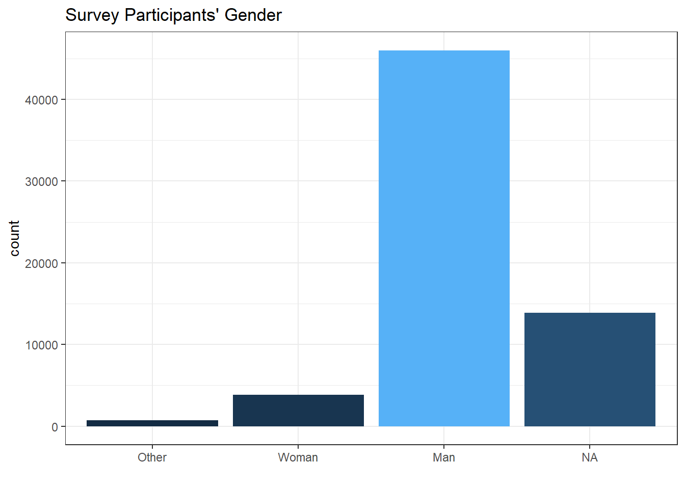
ss %>%
  group_by(sexuality) %>%
  count(sort = TRUE) %>%
  ungroup() %>%
  mutate(sexuality = fct_lump(sexuality, n = 5, w = n),
         sexuality = fct_reorder(sexuality, n)) %>%
  rename(count = n) %>%
  ggplot(aes(sexuality, count, fill = count)) +
  geom_col() +
  labs(x = "", title = "Survey Participants' Sexuality") +
  coord_flip() +
  theme_bw() +
  theme(
    legend.position = "none"
  )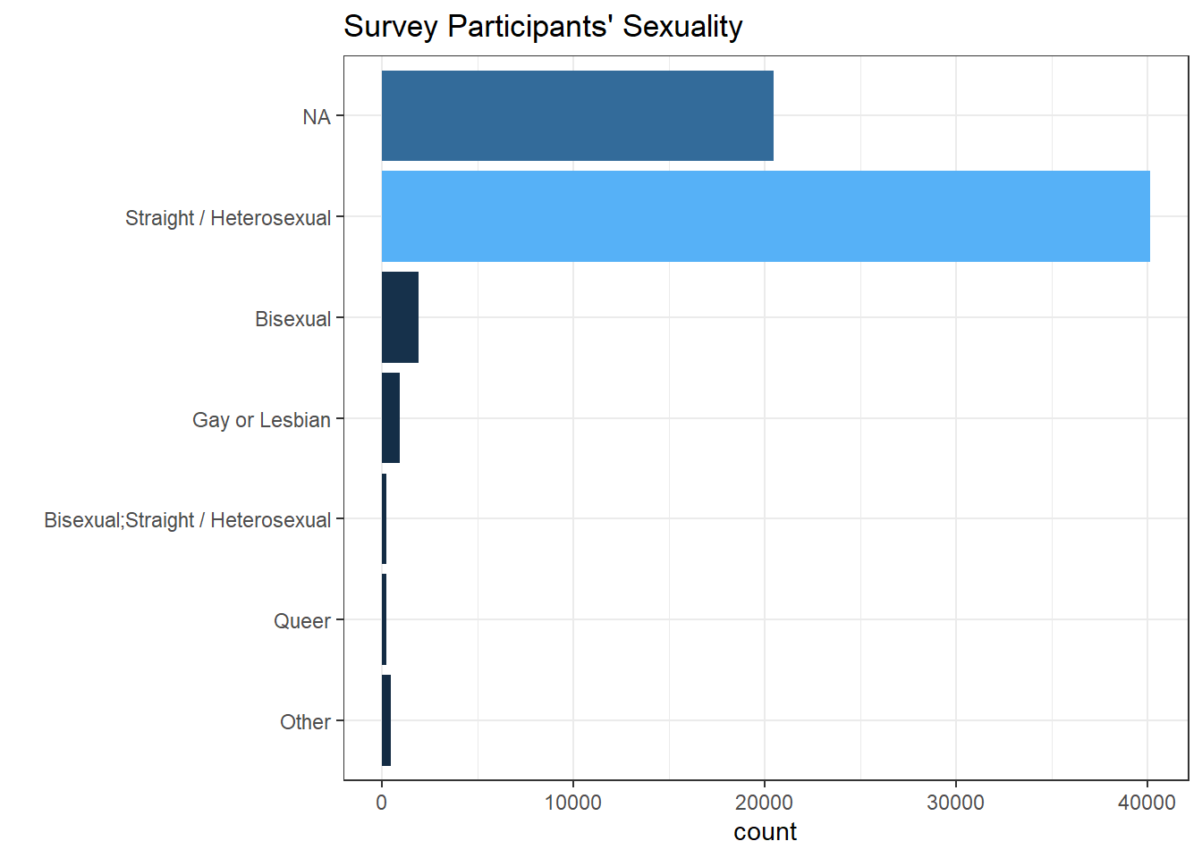
Not surprisingly, men dominates the tech field based on the survey. And most of survey takers are straight.
Country VS Degree Type
ss %>%
  group_by(ed_level, country) %>%
  count(sort = TRUE) %>%
  as_tibble() %>%
  #filter(ed_level == "Ph.D./Ed.D.") %>%
  mutate(country = fct_lump(country, n = 20, w = n),
         ed_level = fct_reorder(ed_level, n)) %>%
  ggplot(aes(ed_level, country, fill = n)) +
  geom_tile() +
  theme_bw() +
  theme(
    axis.text.x = element_text(size = 10, angle = 20),
    axis.title = element_blank(),
    axis.text.y = element_text(size = 13)
  ) +
  labs(fill = "count", title = "Top 20 Survey Takers's Nationality V.S. Degrees Received")
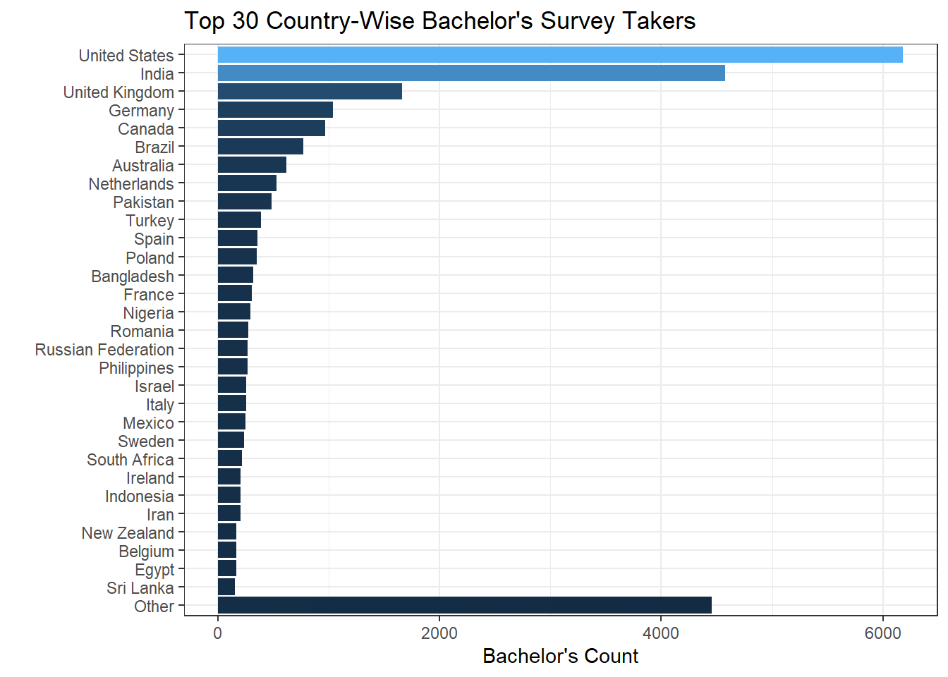
Based on the heat map shown above, it looks like people who hold a bachelor’s degree from the U.S. stand out as the most popular group, followed by their Indian counterparts.
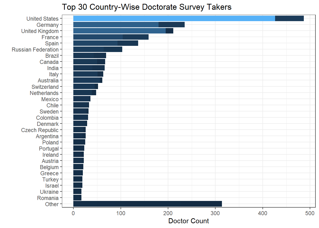
Since Doctorate degree holders (Ph.D./Ed.D./JD/MD) are the minority from the heat map, it would be interesting to single the group out and see where they come from. But keep in mind that besides Ph.D., Ed.D./JD/MD might not have no need to use Stack Overflow because of their highly specific fields.
ss %>%
  group_by(ed_level, country) %>%
  count(sort = TRUE) %>%
  as_tibble() %>%
  filter(ed_level == "Bachelor's") %>%
  mutate(country = fct_lump(country, n = 30, w = n),
         country = fct_reorder(country, n)) %>%
  ggplot(aes(country, n, fill = n)) +
  geom_col() +
  coord_flip() +
  labs(y = "Bachelor's Count", x = " ", title = "Top 30 Country-Wise Bachelor's Survey Takers") +
  theme_bw() +
  theme(
    legend.position = "none"
  )
ss %>%
  group_by(ed_level, country) %>%
  count(sort = TRUE) %>%
  as_tibble() %>%
  filter(ed_level %in% c("Ph.D./Ed.D.", "JD/MD")) %>%
  mutate(country = fct_lump(country, n = 30, w = n),
         country = fct_reorder(country, n)) %>%
  ggplot(aes(country, n, fill = n)) +
  geom_col() +
  coord_flip() +
  labs(y = "Doctor Count", x = " ", title = "Top 30 Country-Wise Doctorate Survey Takers") +
  theme_bw() +
  theme(
    legend.position = "none"
  )
Race VS Job Satisfaction
When looking at first 10 unique ethnicity inputs, many of them are verbose and repetitious. Therefore, some processing should be carried out by using separate() function.
head(unique(ss$ethnicity),10)## [1] "White or of European descent"
## [2] NA
## [3] "Hispanic or Latino/a/x"
## [4] "East Asian"
## [5] "Black or of African descent"
## [6] "Middle Eastern"
## [7] "White or of European descent;Indigenous (such as Native American, Pacific Islander, or Indigenous Australian)"
## [8] "South Asian"
## [9] "Indigenous (such as Native American, Pacific Islander, or Indigenous Australian)"
## [10] "Hispanic or Latino/a/x;White or of European descent"ss_asian <- ss %>%
separate(ethnicity, c("race"), sep = ";", extra = "drop") %>%
filter(str_detect(race, "Asian")) %>%
mutate(race = "Asian")
ss_new <- bind_rows(
ss %>%
separate(ethnicity, c("race"), sep = ";", extra = "drop") %>%
filter(!str_detect(race, "Asian")) %>%
separate(race, c("race"), sep = " ", extra = "drop"),
ss_asian)After using the above code, the race column is cleaned well (shown below).
unique(ss_new$race)## [1] "White" "Hispanic" "Black" "Middle" "Indigenous"
## [6] "Multiracial" "Biracial" "Asian"Now let’s see the relationship between job_sat and race based on raw count.
ss_new %>%
  count(job_sat, race, sort = TRUE) %>%
  ggplot(aes(race, job_sat)) +
  geom_point(aes(size = n, color = n)) +
  theme_bw() +
  theme(
    axis.text.x = element_text(angle = 10)
  ) +
  labs(x = "", y = "Job Satisfaction", color = "count", size = "count", title = "Raw Count of Race and Job Satisfaction Level")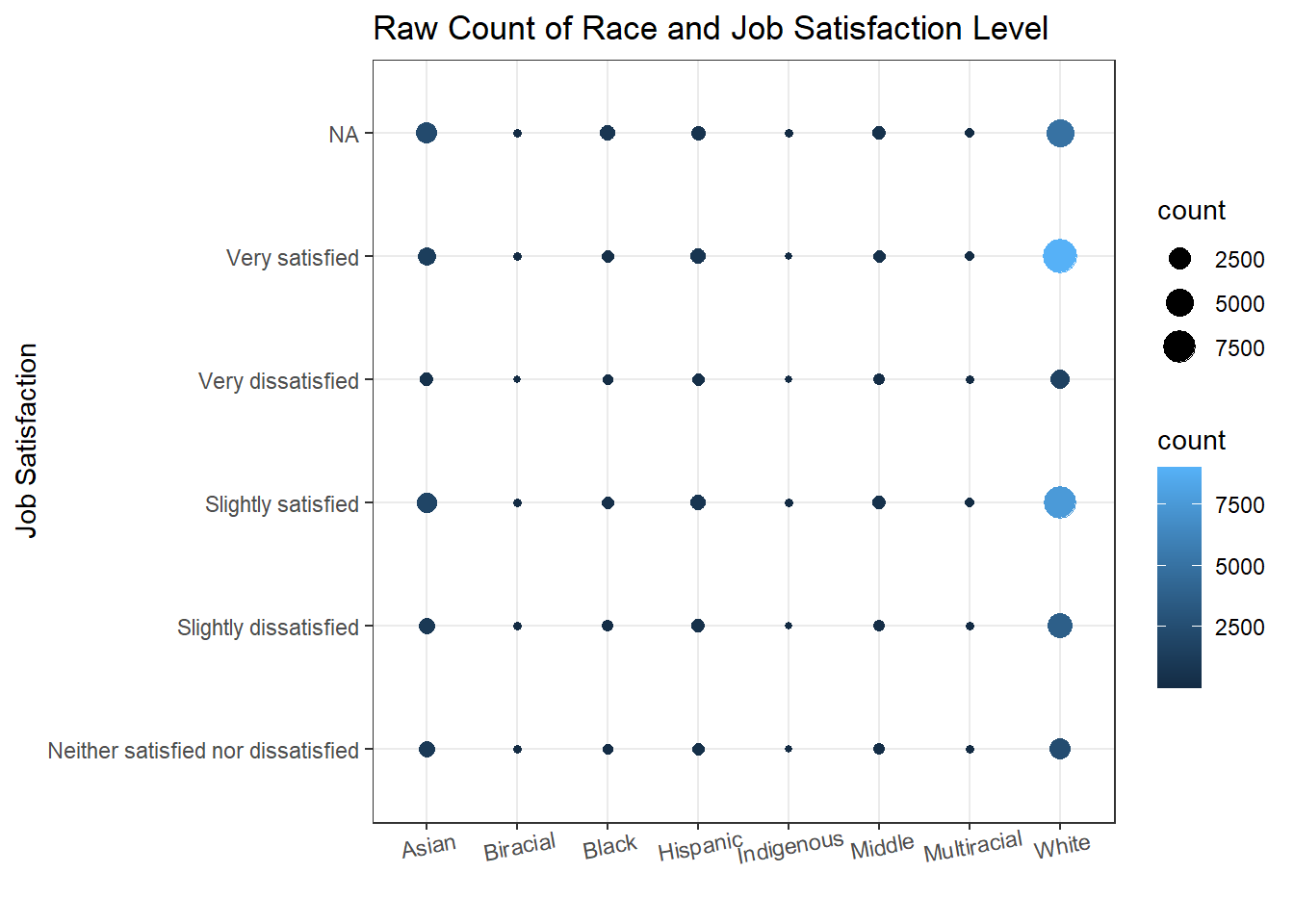
Since different races have different number of questionnaire takers, it would be more accurate to use the ratio rather than the raw counts.
ss_new %>%
  count(job_sat, race, sort = TRUE) %>%
  left_join(ss_new %>%
            group_by(race) %>%
            summarize(total_num = n()),
            by = "race") %>%
  mutate(ratio = n/total_num) %>%
  ggplot(aes(race, job_sat)) +
  geom_point(aes(size = ratio, color = ratio)) +
  theme_bw() +
  theme(
    axis.text.x = element_text(angle = 10)
  ) +
  labs(x = "", y = "Job Satisfaction", color = "ratio", size = "ratio", title = "Percentage of Race and Job Satisfaction Level")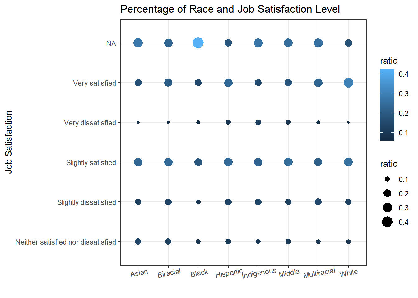
Learning Period VS OS VS Degree Type
Given the nature of tech field changing rapidly, consistently learning new knowledge and updating ourselves is something we should do. The following bar plot faceted by degree type gives us the information about the ratio of learning frequency among each type of OS users.
ss_new %>%
  count(ed_level, new_learn,op_sys, sort = TRUE) %>%
  ggplot(aes(op_sys, n, fill = new_learn)) +
  geom_bar(stat = "identity", position = "fill") +
  labs(x = "", y = "Ratio", fill = "Frequency of Learning New", title = "The Relations Between OS, Degree And Learning New Frequency") +
  facet_wrap(~ed_level) +
  coord_flip() +
  theme_bw() +
  theme(
    strip.text = element_text(size = 15),
    axis.text = element_text(size = 13),
    axis.title = element_text(size = 15),
    legend.position = "bottom",
    plot.title = element_text(size = 18)
  )
Conclusion
In this project, we used a number of handy techniques to clean up the dataset (fct_lump(), separate() etc.) for visualization purposes. This project provides a wonderful opportunity for us to come up with ways to process data and to visualize it based on our design. A battery of plots are presented throughout the project and more visual designs could come, but I just picked a number of interesting columns and tried to triangulate them together in a visually appealing manner, and hopefully, it can shed some light on processing and visualizing data in some useful way.