Maryland Car Accident Data Analysis And Visualization
Keeping car accidents at bay is every driver’s hope, and all of us want to have a safe road trip. Accidents, however, do happen. Few days ago, I came across a dataset from data.gov about the state of Maryland car crash reports from year of 2015 to the first two quarters of 2021 (as the year has not finished) and the download link is here. In this project, we would like to use this particular dateset to shed some light on dissecting car accidents through visualization.
Data Introduction and Processing
First, let’s load the libraries we need.
library(tidyverse)
library(lubridate)
library(scales)
library(tidytext)
library(patchwork)
library(ggthemes)
Here we load the dataset and use clean_names() from janitor package to lowercase column names so that the data frame is easier work with.
vc <- read_csv("Maryland_Statewide_Vehicle_Crashes.csv")
vc <- janitor::clean_names(vc)
head(vc)
## # A tibble: 6 x 56
## year quarter light_desc light_code county_desc county_no muni_desc muni_code
## <dbl> <chr> <chr> <dbl> <chr> <dbl> <lgl> <dbl>
## 1 2020 Q2 Daylight 1 Baltimore 3 NA NA
## 2 2020 Q2 NA 6.02 Baltimore C~ 24 NA NA
## 3 2020 Q2 Daylight 1 Montgomery 15 NA NA
## 4 2017 Q2 Daylight 1 Baltimore C~ 24 NA NA
## 5 2020 Q2 Daylight 1 Cecil 7 NA NA
## 6 2020 Q2 Daylight 1 Anne Arundel 2 NA NA
## # ... with 48 more variables: junction_desc <chr>, junction_code <dbl>,
## # collision_type_desc <chr>, collision_type_code <dbl>, surf_cond_desc <chr>,
## # surf_cond_code <dbl>, lane_desc <chr>, lane_code <dbl>, rd_cond_desc <chr>,
## # rd_cond_code <dbl>, rd_div_desc <chr>, rd_div_code <dbl>,
## # fix_obj_desc <chr>, fix_obj_code <dbl>, report_no <chr>, report_type <chr>,
## # weather_desc <chr>, weather_code <dbl>, acc_date <dbl>, acc_time <time>,
## # loc_code <chr>, signal_flag_desc <chr>, signal_flag <chr>,
## # c_m_zone_flag <chr>, agency_code <chr>, area_code <chr>,
## # harm_event_desc1 <chr>, harm_event_code1 <dbl>, harm_event_desc2 <chr>,
## # harm_event_code2 <dbl>, rte_no <dbl>, route_type_code <chr>,
## # rte_suffix <chr>, log_mile <dbl>, logmile_dir_flag_desc <chr>,
## # logmile_dir_flag <chr>, mainroad_name <chr>, distance <dbl>,
## # feet_miles_flag_desc <chr>, feet_miles_flag <chr>, distance_dir_flag <chr>,
## # reference_no <dbl>, reference_type_code <chr>, reference_suffix <chr>,
## # reference_road_name <chr>, latitude <dbl>, longitude <dbl>, location <chr>dim(vc)## [1] 715561 56Since the dataset contains a column acc_time, we define the accidents happened between 6AM and 6PM as Bright conditions and Dark conditions otherwise. Although this might vary in different seasons, Summer, for example, might provide ideally bright conditions even at 9PM, it is a rule-of-thumb way to divide acc_time. Also, day_of_week column should be factor and ranged from Monday to Sunday.
vc <- vc %>%
  mutate(
    bright_or_dark = if_else(hour(acc_time) >= 6 & hour(acc_time) <= 18, "Bright (6AM-6PM)", "Dark (Otherwise)"),
    day_of_week = wday(ymd(acc_date), label = TRUE, abbr = FALSE))

vc$day_of_week <- factor(vc$day_of_week, levels = c("Monday", "Tuesday", "Wednesday", "Thursday",
"Friday", "Saturday", "Sunday"))
Data Visualization
Driving at night adds more risks as eyes have a harder time detecting surroundings. In the following bar chart faceted by bright_or_dark, yearly accidents are shown in every quarter. Please note Q3 and Q4 of this year (2021) have not happened yet, which is why there are four empty spots on the chart.
vc %>%
  count(year, quarter, bright_or_dark, sort = TRUE) %>%
  ggplot(aes(year, n, fill = n)) +
  geom_col() +
  facet_grid(quarter~bright_or_dark) +
  scale_x_continuous(breaks = seq(2015, 2021)) +
  theme_bw() +
  theme(
    strip.text = element_text(size = 12, face = "bold"),
    legend.position = "none"
  ) +
  labs(x = "Year", y = "Accident Count", title = "Quarterly Car Crash Between Bright And Dark Hours")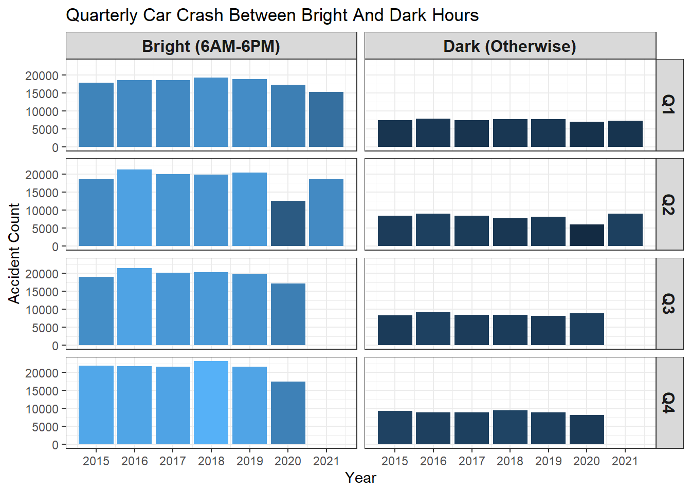
It looks like the fourth quarter had the highest accident numbers every year potentially due to the holiday seasons. One outlier from the bar chart is the second quarter of 2020, when the COVID lockdown was in place and consequently traffic on the road reduced significantly. Because of the much lighter traffic, the accidents were fewer than other years in the same quarter. The same reason can be applied to dark conditions: there was less traffic during night hours, there would be fewer accidents, but this does not mean driving at night is safer than driving during the daytime.
The following line and violin plots convey the same information but in different fashions.
vc %>%
  count(bright_or_dark, year) %>%
  ggplot(aes(year, n, color = bright_or_dark)) +
  geom_line(key_glyph = "timeseries") +
  geom_point()+
  theme_bw() +
  scale_x_continuous(breaks = seq(2015, 2021)) +
  labs(y = "Accident Count", title = "Yearly Accident Counts", color = "")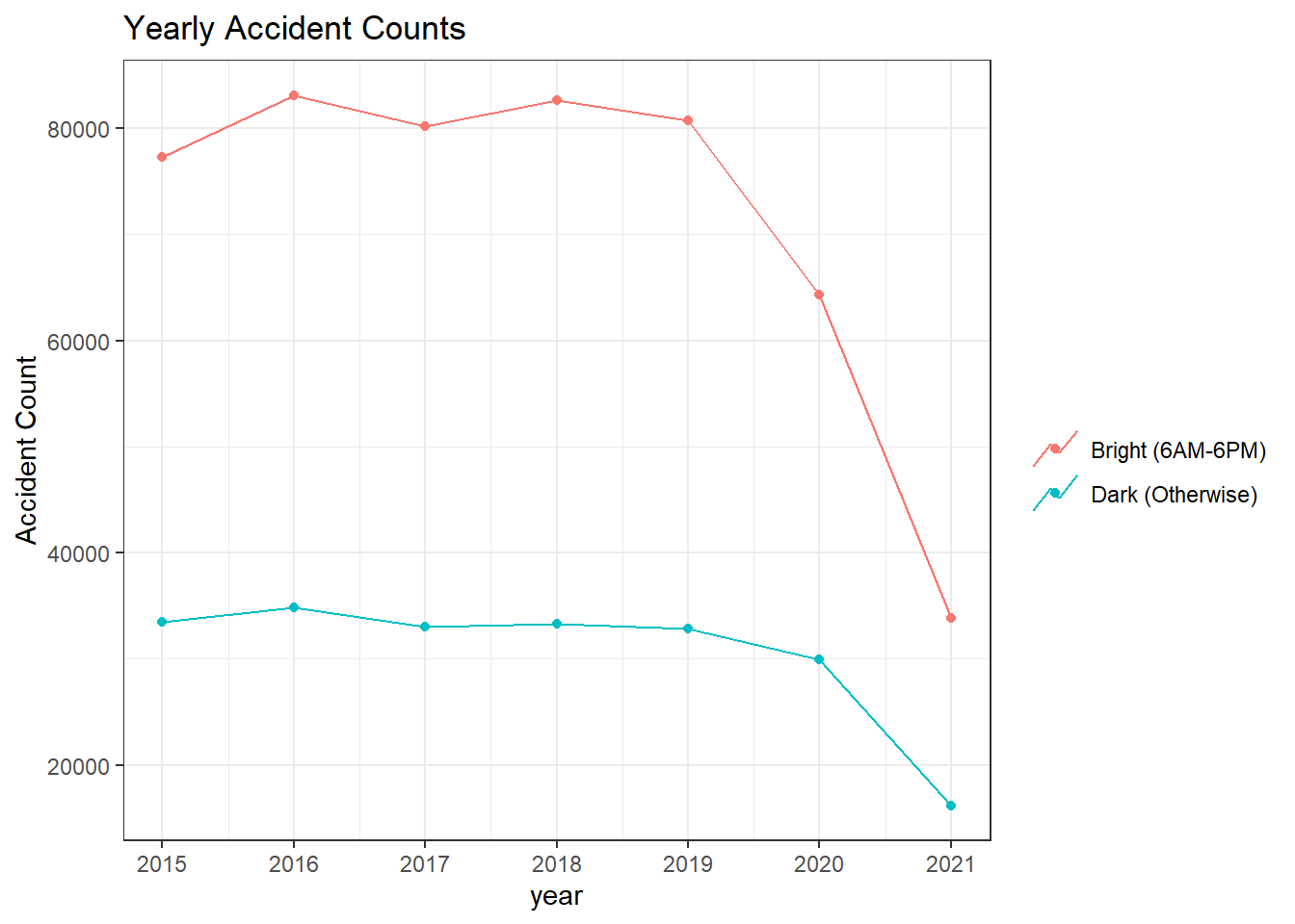
vc %>%
  count(quarter, year) %>%
  ggplot(aes(quarter, year, fill = quarter)) +
  geom_violin() +
  theme_bw() +
  theme(
    legend.position = "none"
  ) +
  scale_y_continuous(breaks = seq(2015, 2021)) +
  labs(x = "Quarter", title = "Yearly Accident Counts")
Which day of the week is dangerous to drive? Based on this particular dataset, Monday through Friday during the daytime accounted for most of the accidents in Maryland, with Friday the highest and Monday the lowest. It is interesting to note that weekends had much fewer accidents during the bright conditions and more accidents during the dark than other nights of the week.
vc %>%
  count(day_of_week,bright_or_dark, sort = TRUE) %>%
  ggplot(aes(day_of_week, n, fill = n)) +
  geom_col() +
  facet_wrap(~bright_or_dark) +
  coord_flip() +
  theme_bw() +
  theme(
    axis.title.y = element_blank(),
    axis.text = element_text(size = 13),
    legend.position = "none",
    strip.text = element_text(size = 12, face = "bold")
  ) +
  labs(y = "Accident Count", title = "Total Accident Distribution On Each Day Of Week")
vc %>%
  count(weather_desc, bright_or_dark, report_type, sort = TRUE) %>%
  ggplot(aes(bright_or_dark, report_type, size = sqrt(n), color = bright_or_dark, shape = bright_or_dark)) +
  geom_point() +
  scale_size_area(breaks = c(10, 50, 100, 1000, 1000), labels = comma) +
  facet_wrap(~weather_desc) +
  theme_bw() +
  theme(
    axis.text.x = element_blank(),
    axis.text.y = element_text(size = 13),
    axis.ticks = element_blank(),
    strip.text = element_text(size = 12, face = "bold"),
    plot.title = element_text(size = 17)
  ) +
  labs(size = "Square Root Accident Count", color = "Bright/Dark Time", shape = "Bright/Dark Time", x = "Bright/Dark Time", y = "",
       title = "Square Root Accident Count of Car Crash Type In Various Weather Conditions Between Bright And Dark Hours")
vc %>%
  count(year, bright_or_dark, collision_type_desc, sort = TRUE) %>%
  mutate(collision_type_desc = fct_lump(collision_type_desc, n = 10, w =n),
         collision_type_desc = reorder_within(collision_type_desc, n, bright_or_dark)) %>%
  ggplot(aes(year, collision_type_desc, fill = n)) +
  geom_tile() +
  scale_y_reordered() +
  facet_wrap(~bright_or_dark, scales = "free_y") +
  scale_x_continuous(expand = c(0,0), breaks = seq(2015, 2021)) +
  scale_fill_gradientn(colours = terrain.colors(10)) +
  theme_bw() +
  theme(
    axis.title = element_blank(),
    strip.text = element_text(size = 13, face = "bold"),
    axis.text = element_text(size = 13),
    plot.title = element_text(size = 18)
  ) +
labs(fill = "Accident Count", title = "Yearly Top 10 Collision Types Faceted By Bright/Dark Conditions") 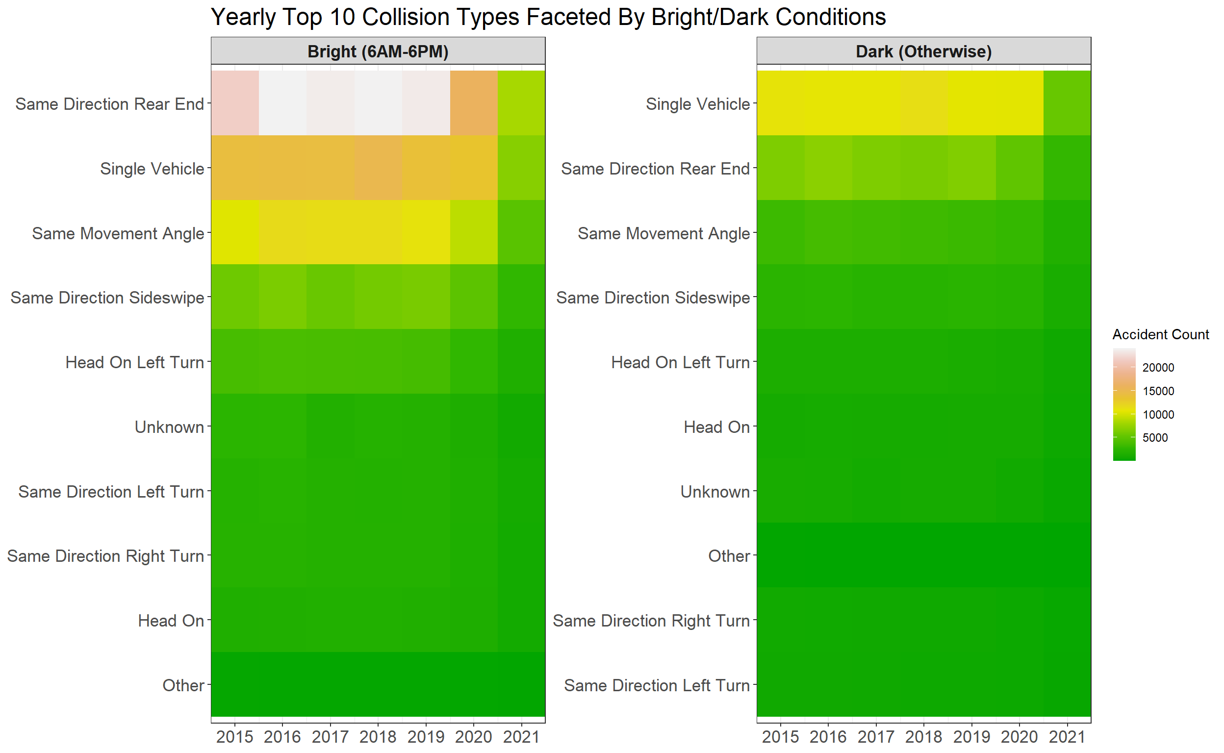
It seems like the type of rear-end accidents when driving the same direction was the most frequent one during daytime, and during the dark conditions, single-vehicle crashes happened the most. I assume when drivers can see the driving conditions clearly, their attention is easily directed to somewhere else rather than to focusing on the front of the vehicle; when driving at night, it is difficult to see the road, and single-vehicle crashes would happen much more than other accidents due to the nebulous driving conditions that hinder drivers making the safe decisions.
vc %>%
  count(bright_or_dark,harm_event_desc1, sort = TRUE) %>%
  mutate(harm_event_desc1 = fct_lump(harm_event_desc1, n = 5, w = n),
         harm_event_desc1 = fct_reorder(harm_event_desc1, n)) %>%
  ggplot(aes(harm_event_desc1, n, fill = n)) +
  geom_col() +
  facet_wrap(~bright_or_dark) +
  coord_flip() +
  scale_y_continuous(labels = comma) +
  scale_fill_continuous(labels = comma)+
  theme_bw() +
  theme(
    strip.text = element_text(size = 12, face = "bold"),
    axis.title.y = element_blank(),
    axis.text.y = element_text(size = 11),
    axis.text.x = element_text(angle = 10),
    legend.position = "none"
  ) +
  labs(y = "Accident Count", title = "Accident Count Relevant To Harm Event Description")
vc %>%
  count(bright_or_dark,harm_event_desc1, sort = TRUE) %>%
  mutate(harm_event_desc1 = fct_lump(harm_event_desc1, n = 5, w = n),
         harm_event_desc1 = fct_reorder(harm_event_desc1, n)) %>%
  ggplot(aes(harm_event_desc1, sqrt(n), fill = sqrt(n))) +
  geom_col() +
  facet_wrap(~bright_or_dark) +
  coord_flip() +
  scale_y_continuous(labels = comma) +
  scale_fill_continuous(labels = comma)+
  theme_bw() +
  theme(
    strip.text = element_text(size = 12, face = "bold"),
    axis.title = element_blank(),
    axis.text.y = element_text(size = 11),
    legend.position = "none"
  ) +
  labs(y = "Square Root Accident Count", title = "Square Root Accident Count Relevant To Harm Event Description")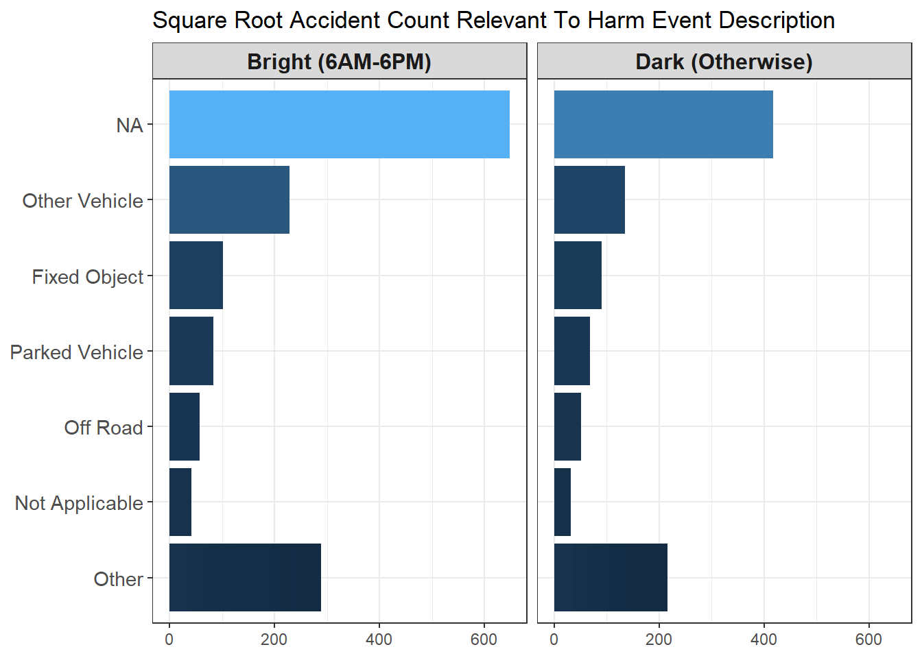
Because NA accounts for most car accidents among all harm event description, it is sensible to apply sqrt() to square root the count so that NA becomes less of an outlier. This is one of the common ways to deal with this situation. Similar methods such as log10() or log() would also suffice to get transformation done. The only issue related to it would be interpretation. How would a lay person interpret square root of car accident count?
The dataset also provides county where each accident took place. This is a perfect place to make a state map divided by each county and see the yearly car crash number shown on the map. With some data wrangling, we have the following map plot with Tufte style.
vc %>%
  count(year, county_desc, sort = TRUE) %>%
  filter(!is.na(county_desc)) %>%
  mutate(county_desc = str_to_lower(county_desc)) %>%
  mutate(
    county_desc = case_when(county_desc == "st. mary's" ~ 'st marys',
              county_desc == "queen anne's" ~ 'queen annes',
              county_desc == "prince george's" ~ 'prince georges',
              TRUE ~ as.character(county_desc))
  ) %>%
  right_join(map_data("county", "maryland"), by = c("county_desc" = "subregion"))%>%
  select(lon = long, lat, group, id = county_desc, n, year) %>%
  ggplot(aes(lon, lat, group = group, fill = n)) +
  geom_polygon() +
  #geom_sf() +
  coord_sf() +
  #coord_quickmap() +
  #theme_bw() +
  theme_tufte() +
  theme(
    strip.text = element_text(size = 13, face = "bold"),
    axis.title = element_text(size = 15),
    axis.text = element_text(size = 13)
  ) +
  facet_wrap(~year) +
  labs(fill = "Accident Count", title = "Yearly Maryland Accident Count on County-level")
If you are puzzled by which county had the highest accident count, the following bar chart provides supplementary information to the map plot above.
vc %>%
  count(year, county_desc, sort = TRUE) %>%
  filter(!is.na(county_desc)) %>%
  mutate(year = as.factor(year),
         county_desc = reorder_within(county_desc, n, year)) %>%
  ggplot(aes(n, county_desc, fill = n)) +
  geom_col() +
  scale_y_reordered() +
  facet_wrap(~ year, scales = "free_y") +
  #theme_bw() +
  theme_tufte() +
  theme(
    legend.position = "none",
    strip.text = element_text(size = 13, face = "bold"),
    axis.title = element_text(size = 15),
    axis.text = element_text(size = 11.5),
    plot.title = element_text(size = 18)
  ) +
  labs(x = "Accident Count", y = "", fill = "Accident Count", title = "Yearly Maryland Accident Count on County-level") +
scale_x_continuous(expand = c(0,0)) 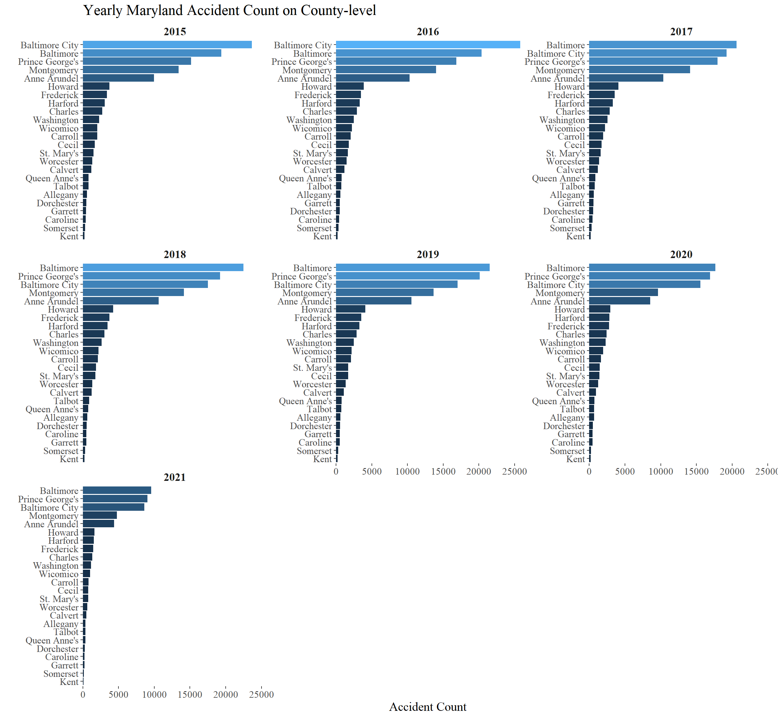
Baltimore, Baltimore City and Prince George’s Counties have been the top 3 car accident counties, but Kent, Somerset and Garrett have been the bottom 3.
Conclusion
In this project, we applied a real-world car crash dataset from Maryland to visualize accident report from different aspects. After processing data, some visualizations are carried out from the perspective of county, of time of the day, of weather conditions, and of day of the week, etc. Hopefully, not only can this project shed light on data processing and visualization techniques, but it can also help us drive more safely.