Global Vaccinations Analytic Visualization (with Global Maps included)
COVID vaccination has been a trending topic around the world in the last a few months. In this project, we use a vaccination dataset from Kaggle (here is the download link) about the vaccination status around the world. Since every country is presented in the dataset, it would be riveting to use a global map to visualize some metrics, and to see if we would encounter some technical issues along the way.
Dataset Introduction
First off, a number of useful libraries are loaded and then dataset is explored.
library(tidyverse)
library(lubridate)
library(scales)
vaccine <- read_csv("country vaccinations.csv")
head(vaccine)## # A tibble: 6 x 15
## country iso_code date total_vaccinati~ people_vaccinat~ people_fully_va~
## <chr> <chr> <date> <dbl> <dbl> <dbl>
## 1 Afghan~ AFG 2021-02-22 0 0 NA
## 2 Afghan~ AFG 2021-02-23 NA NA NA
## 3 Afghan~ AFG 2021-02-24 NA NA NA
## 4 Afghan~ AFG 2021-02-25 NA NA NA
## 5 Afghan~ AFG 2021-02-26 NA NA NA
## 6 Afghan~ AFG 2021-02-27 NA NA NA
## # ... with 9 more variables: daily_vaccinations_raw <dbl>,
## # daily_vaccinations <dbl>, total_vaccinations_per_hundred <dbl>,
## # people_vaccinated_per_hundred <dbl>,
## # people_fully_vaccinated_per_hundred <dbl>,
## # daily_vaccinations_per_million <dbl>, vaccines <chr>, source_name <chr>,
## # source_website <chr>dim(vaccine)## [1] 36063 15Since the dataset comprises date column, some time-series data visualizations can be made by manipulating the column based on month. But before going there, let’s visualize the top 15 countries on the maximum daily vaccination status.
Data Visualization
vaccine %>%
  group_by(country) %>%
  summarize(max_raw = max(daily_vaccinations_raw, na.rm = TRUE)) %>%
  arrange(max_raw) %>%
  filter(max_raw != -Inf) %>%
  ungroup() %>%
  mutate(country = fct_lump(country, n = 15, w = max_raw),
         country = fct_reorder(country, max_raw)) %>%
  ggplot(aes(country, max_raw, fill = max_raw)) +
  geom_col() +
  theme_bw() +
  theme(
    legend.position = "none",
    axis.text.y = element_text(size = 13)
  ) +
  coord_flip() +
  scale_y_continuous(labels = comma) +
  scale_fill_continuous(labels = comma) +
  labs(x = "", y = "Maximum Daily Vaccinations",title = "Top 15 Countries on Maximum Daily Vaccinations")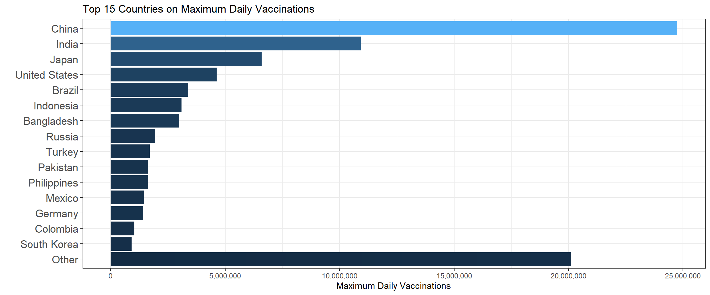
It turns out the top 3 countries are China, India and Japan on the maximum daily vaccinations. The following bar chart shows the top 15 mean daily vaccination countries.
vaccine %>%
  group_by(country) %>%
  summarize(mean_raw = mean(daily_vaccinations_raw, na.rm = TRUE)) %>%
  arrange(mean_raw) %>%
  filter(mean_raw != -Inf) %>%
  ungroup() %>%
  mutate(country = fct_lump(country, n = 15, w = mean_raw),
         country = fct_reorder(country, mean_raw)) %>%
  ggplot(aes(country, mean_raw, fill = mean_raw)) +
  geom_col() +
  theme_bw() +
  theme(
    legend.position = "none",
    axis.text.y = element_text(size = 13)
  ) +
  coord_flip() +
  scale_y_continuous(labels = comma) +
  scale_fill_continuous(labels = comma) +
  labs(x = "", y = "Mean Daily Vaccinations",title = "Top 15 Countries on Mean Daily Vaccinations")
Compared to the maximum plot, United States jumped from the 4th position to the 3rd on the mean plot. Besides the 15 countries shown on the bar chart, the rest of the world was below China on daily vaccination whether the metric is maximum or mean when combined.
Now let’s evaluate the U.S. only to see its monthly vaccination status.
vaccine %>%
  filter(country == "United States") %>%
  ggplot(aes(date, daily_vaccinations)) +
  geom_line() +
  geom_point() +
  scale_y_continuous(labels = comma) +
  scale_x_date(labels = date_format("%b"), date_breaks = "1 month") +
  theme_bw() +
  theme(
    axis.text = element_text(size = 13)
  ) +
  labs(x = "", y = "Daily Vaccinations", title = "Daily Vaccinations In the U.S.")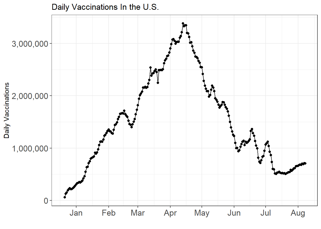
vaccine %>%
  filter(country == "United States") %>%
  ggplot(aes(date, total_vaccinations)) +
  geom_line() +
  geom_point() +
  scale_y_continuous(labels = comma) +
  scale_x_date(labels = date_format("%b"), date_breaks = "1 month") +
  theme_bw() +
  theme(
    axis.text = element_text(size = 13)
  ) +
  labs(x = "", y = "Total Vaccinations", title = "Total Vaccinations In the U.S.")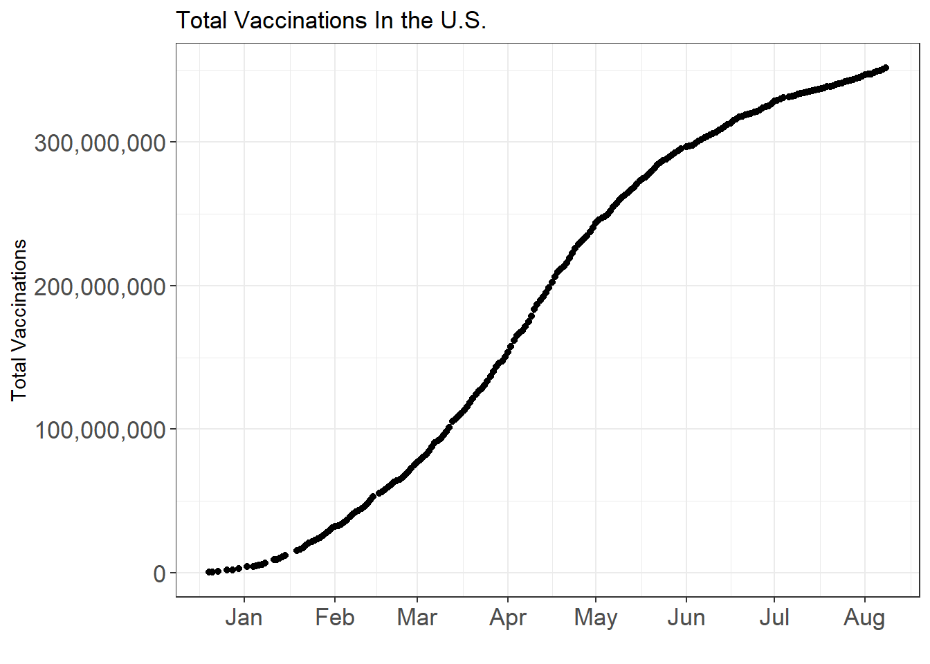
Up until August, more than 300 million shots have been administered and in some time between April and May, the daily vaccination reached to its peak.
Monthly Vaccination Velocity
Monthly vaccination velocity is defined as the maximum total number of vaccinations minus the minimum total number of vaccinations within each country and each month. Below we use the newly defined metric to evaluate the top 15 countries on their respective velocity from January 2021 to August 2021.
vaccination_velocity <- function(scales = "fixed", n = 15, labels = waiver()){
  vaccine %>%
  filter(year(date) == 2021) %>%
  mutate(month = month(date),
         year = year(date),
         day = day(date)) %>%
  group_by(country, month) %>%
  mutate(monthly_velocity = max(total_vaccinations, na.rm = TRUE) -  min(total_vaccinations, na.rm = TRUE)) %>%
  ungroup() %>%
  filter(!is.na(monthly_velocity) & monthly_velocity > 0) %>%
  mutate(country = fct_lump(country, n = n, w = monthly_velocity)) %>%
  ggplot(aes(month, monthly_velocity)) +
  geom_col(aes(fill = monthly_velocity)) +
  facet_wrap(~country, scales = scales)+
  theme_bw() +
  theme(
    legend.position = "none"
  ) +
  scale_x_continuous(breaks = seq(1,8)) +
  scale_y_continuous(labels = labels) +
  labs(x = "Month", y = "Monthly Vaccination Velocity", title = paste("Top", n, "Monthly Vaccination Velocity"))

}

vaccination_velocity(labels = scales::comma)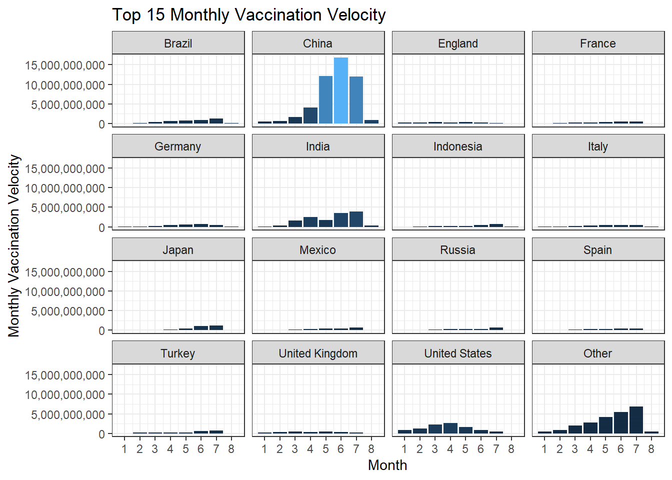
vaccination_velocity(scales = "free_y")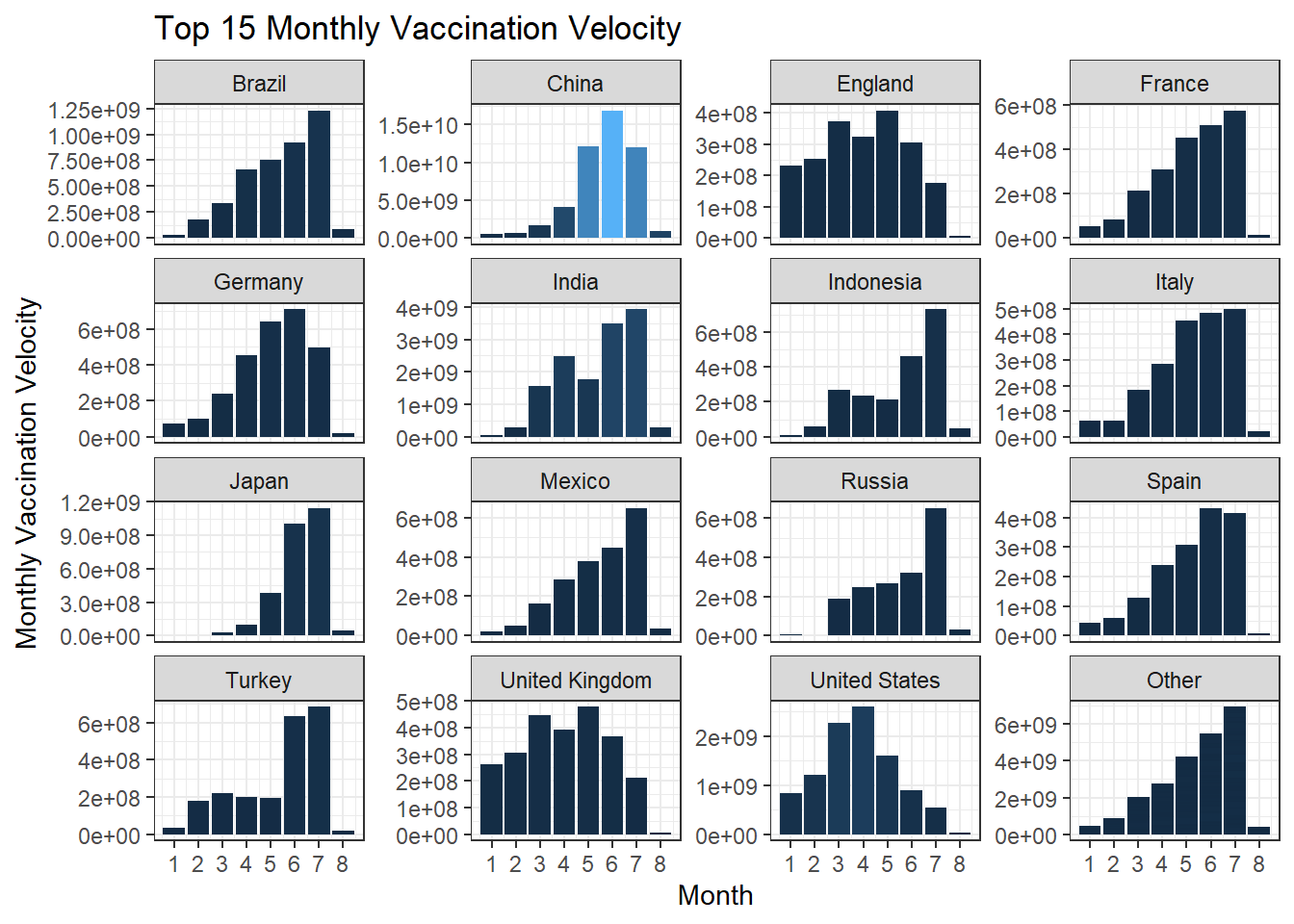
The reason why we generate the free-scaled bar chart is that the first bar chart does not give us too much information, since China is an outlier in terms of much larger velocity. Using free-scaled visualization gives us fine-tuned information on each country.
The World Maps
Since the COVID pandemic is a global one and the dataset has countries around the world. Using map_data("world") dataset, which contains long and lat of each country, to join the vaccination dataset outputs a global map with vaccination status shown within each country. Here we take a glance of map_data("world").
head(map_data("world"))## long lat group order region subregion
## 1 -69.89912 12.45200 1 1 Aruba <NA>
## 2 -69.89571 12.42300 1 2 Aruba <NA>
## 3 -69.94219 12.43853 1 3 Aruba <NA>
## 4 -70.00415 12.50049 1 4 Aruba <NA>
## 5 -70.06612 12.54697 1 5 Aruba <NA>
## 6 -70.05088 12.59707 1 6 Aruba <NA>Since our vaccination dataset does not contain long and lat information and the country names do not match perfectly, some country name changes are necessary for joining them together. United States, for example, is a country name in the vaccine dataset, but it is different from USA in map_data("world"). This is still an open question on how to efficiently find out the best way to remove discrepancies between country names. Here we only change two country names.
vaccine <- vaccine %>%
  mutate(
    country = case_when(country == "Congo" ~ "Democratic Republic of the Congo",
                        country == "United States" ~ "USA",
                        TRUE ~ as.character(country))
  )
map_data("world") is huge and it outputs an error when inner_join with vaccine dataframe.
vaccine %>%
  mutate(month = month(date)) %>%
  filter(!is.na(daily_vaccinations)) %>%
  group_by(country, month) %>%
  mutate(monthly_velocity = max(total_vaccinations, na.rm = TRUE) -   min(total_vaccinations, na.rm = TRUE)) %>%
  inner_join(map_data("world"), by = c("country" = "region")) %>%
  ggplot(aes(x = long, y = lat, group = group)) +
    geom_polygon(aes(fill = monthly_velocity)) +
    theme_bw() +
    theme(
      plot.title = element_text(size = 25)
    ) +
  facet_wrap(~month)
## Error: cannot allocate vector of size 267.0 MbYet, we are able to generate the following two world maps.
#memory.size(max = FALSE)

vaccine_world_map <- function(vac_sta, plot_title = "") {

  vac_sta <- enquo(vac_sta)
  vaccine %>%
  group_by(country) %>%
  summarize(max = max(!!vac_sta, na.rm = TRUE)) %>%
  right_join(map_data("world"), by = c("country" = "region")) %>%
  ggplot(aes(x = long, y = lat, group = group)) +
    geom_polygon(aes(fill = max)) +
    theme_bw() +
    theme(
      plot.title = element_text(size = 25)
    ) +
    labs(fill = "", title = plot_title)
}

vaccine_world_map(total_vaccinations_per_hundred, "Total Vaccinations Per Hundred People (2021-08-08)")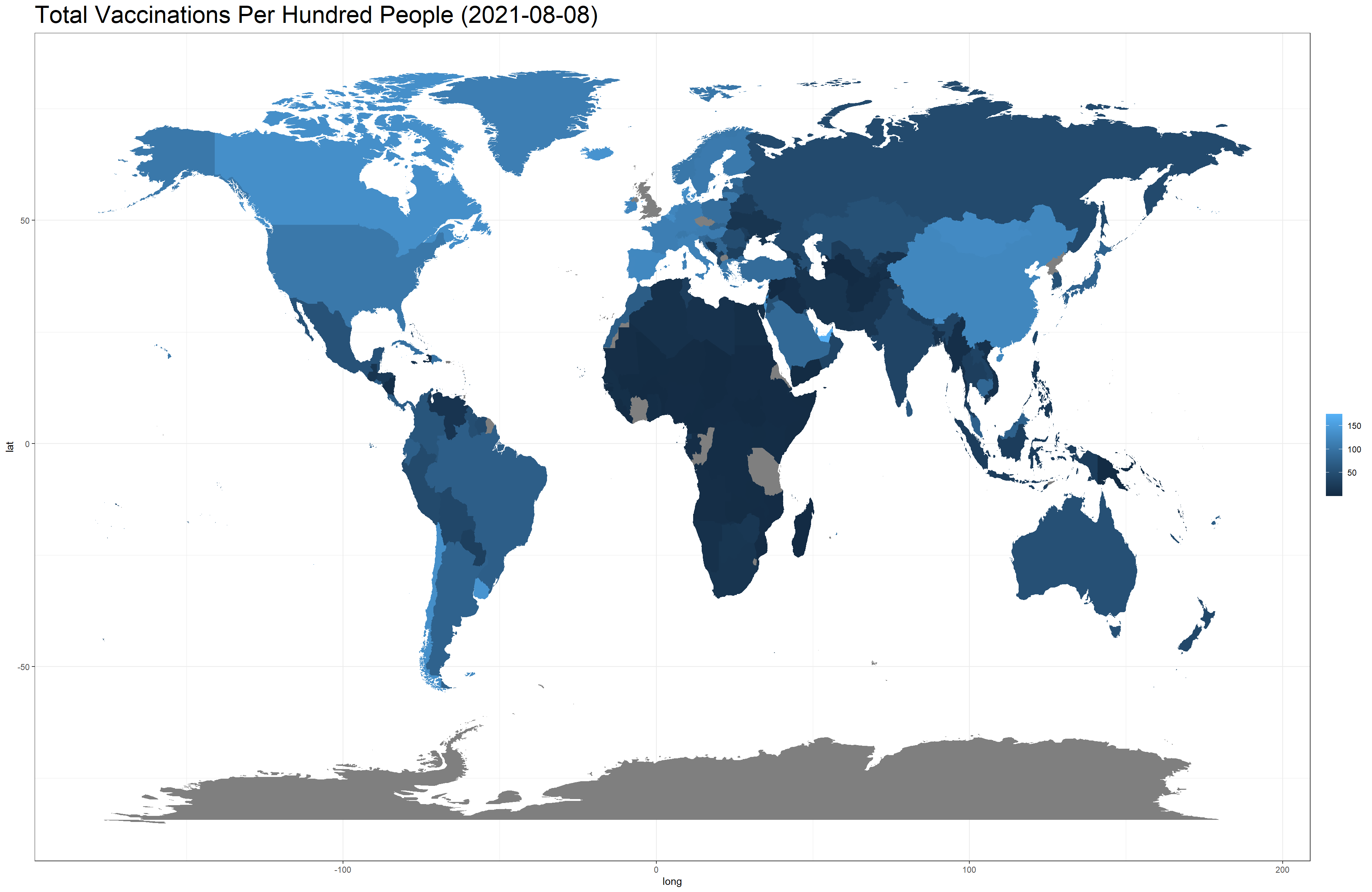
vaccine_world_map(people_fully_vaccinated, "Total Number of People Fully Vaccinated (2021-08-08)")
Conclusion
In this project, we analyzed the global COVID vaccination dataset from various perspectives. Metrics like daily vaccinations, total vaccinations as well as our self-defined monthly velocity are used for visualization purposes. Personally, this is my first time using ggplot2 to generate world maps, and it would be better if the dataset had information about long and lat. Because of this, this project has proposed an open question that how to find an efficient way to change the country names so that names on both datasets are consistent. United States, for example, has a number of ways to represent the country (The U.S., USA, etc.). Also, joining map_data("world") is computationally expensive, and it is difficult sometimes to obtain the results without having technological issues (as the error message shown above). Visualization on map is a practical, useful and attractive way to show geo-related data, and hopefully, this project has shed some light in this regard. In the future, I will make more map-related visualization reports.