Analyzing College Major & Income Data
In this project, we analyze the relations between college major and income after graduation. The dataset is from the link. To explore which majors are the most popular ones and which ones can help graduates land a high paying job is interesting.
Let’s load the libraries we need for this project.
library(tidyverse)
library(scales)
library(patchwork)
library(tidytext)
library(broom)
Data Introduction
recent_grads <- read_csv("https://raw.githubusercontent.com/fivethirtyeight/data/master/college-majors/recent-grads.csv")
recent_grads <- janitor::clean_names(recent_grads)
head(recent_grads)
## # A tibble: 6 x 21
## rank major_code major total men women major_category share_women
## <dbl> <dbl> <chr> <dbl> <dbl> <dbl> <chr> <dbl>
## 1 1 2419 PETROLEUM ENGIN~ 2339 2057 282 Engineering 0.121
## 2 2 2416 MINING AND MINE~ 756 679 77 Engineering 0.102
## 3 3 2415 METALLURGICAL E~ 856 725 131 Engineering 0.153
## 4 4 2417 NAVAL ARCHITECT~ 1258 1123 135 Engineering 0.107
## 5 5 2405 CHEMICAL ENGINE~ 32260 21239 11021 Engineering 0.342
## 6 6 2418 NUCLEAR ENGINEE~ 2573 2200 373 Engineering 0.145
## # ... with 13 more variables: sample_size <dbl>, employed <dbl>,
## # full_time <dbl>, part_time <dbl>, full_time_year_round <dbl>,
## # unemployed <dbl>, unemployment_rate <dbl>, median <dbl>, p25th <dbl>,
## # p75th <dbl>, college_jobs <dbl>, non_college_jobs <dbl>,
## # low_wage_jobs <dbl>skimr::skim(recent_grads)| Name | recent_grads |
| Number of rows | 173 |
| Number of columns | 21 |
| _______________________ | |
| Column type frequency: | |
| character | 2 |
| numeric | 19 |
| ________________________ | |
| Group variables | None |
Variable type: character
| skim_variable | n_missing | complete_rate | min | max | empty | n_unique | whitespace |
|---|---|---|---|---|---|---|---|
| major | 0 | 1 | 5 | 65 | 0 | 173 | 0 |
| major_category | 0 | 1 | 4 | 35 | 0 | 16 | 0 |
Variable type: numeric
| skim_variable | n_missing | complete_rate | mean | sd | p0 | p25 | p50 | p75 | p100 | hist |
|---|---|---|---|---|---|---|---|---|---|---|
| rank | 0 | 1.00 | 87.00 | 50.08 | 1 | 44.00 | 87.00 | 130.00 | 173.00 | ▇▇▇▇▇ |
| major_code | 0 | 1.00 | 3879.82 | 1687.75 | 1100 | 2403.00 | 3608.00 | 5503.00 | 6403.00 | ▃▇▅▃▇ |
| total | 1 | 0.99 | 39370.08 | 63483.49 | 124 | 4549.75 | 15104.00 | 38909.75 | 393735.00 | ▇▁▁▁▁ |
| men | 1 | 0.99 | 16723.41 | 28122.43 | 119 | 2177.50 | 5434.00 | 14631.00 | 173809.00 | ▇▁▁▁▁ |
| women | 1 | 0.99 | 22646.67 | 41057.33 | 0 | 1778.25 | 8386.50 | 22553.75 | 307087.00 | ▇▁▁▁▁ |
| share_women | 1 | 0.99 | 0.52 | 0.23 | 0 | 0.34 | 0.53 | 0.70 | 0.97 | ▂▆▆▇▃ |
| sample_size | 0 | 1.00 | 356.08 | 618.36 | 2 | 39.00 | 130.00 | 338.00 | 4212.00 | ▇▁▁▁▁ |
| employed | 0 | 1.00 | 31192.76 | 50675.00 | 0 | 3608.00 | 11797.00 | 31433.00 | 307933.00 | ▇▁▁▁▁ |
| full_time | 0 | 1.00 | 26029.31 | 42869.66 | 111 | 3154.00 | 10048.00 | 25147.00 | 251540.00 | ▇▁▁▁▁ |
| part_time | 0 | 1.00 | 8832.40 | 14648.18 | 0 | 1030.00 | 3299.00 | 9948.00 | 115172.00 | ▇▁▁▁▁ |
| full_time_year_round | 0 | 1.00 | 19694.43 | 33160.94 | 111 | 2453.00 | 7413.00 | 16891.00 | 199897.00 | ▇▁▁▁▁ |
| unemployed | 0 | 1.00 | 2416.33 | 4112.80 | 0 | 304.00 | 893.00 | 2393.00 | 28169.00 | ▇▁▁▁▁ |
| unemployment_rate | 0 | 1.00 | 0.07 | 0.03 | 0 | 0.05 | 0.07 | 0.09 | 0.18 | ▂▇▆▁▁ |
| median | 0 | 1.00 | 40151.45 | 11470.18 | 22000 | 33000.00 | 36000.00 | 45000.00 | 110000.00 | ▇▅▁▁▁ |
| p25th | 0 | 1.00 | 29501.45 | 9166.01 | 18500 | 24000.00 | 27000.00 | 33000.00 | 95000.00 | ▇▂▁▁▁ |
| p75th | 0 | 1.00 | 51494.22 | 14906.28 | 22000 | 42000.00 | 47000.00 | 60000.00 | 125000.00 | ▅▇▂▁▁ |
| college_jobs | 0 | 1.00 | 12322.64 | 21299.87 | 0 | 1675.00 | 4390.00 | 14444.00 | 151643.00 | ▇▁▁▁▁ |
| non_college_jobs | 0 | 1.00 | 13284.50 | 23789.66 | 0 | 1591.00 | 4595.00 | 11783.00 | 148395.00 | ▇▁▁▁▁ |
| low_wage_jobs | 0 | 1.00 | 3859.02 | 6945.00 | 0 | 340.00 | 1231.00 | 3466.00 | 48207.00 | ▇▁▁▁▁ |
This is a relatively small dataset with only 173 rows and rather clean one with only 4 missing values. Some data cleaning is still needed now and later as we visualize data. One thing we have noticed is that major column is all caps and it is difficult to read, especially when putting all majors on a plot. There is a nifty function from stringr called str_to_title() that can transform all caps to title format with the first letter of each word capitalized only.
recent_grads$major <- str_to_title(recent_grads$major)Data Visualization
Which majors are the most popular ones?
The following bar charts can convey vividly the 30 most popular and 30 least popular majors.
recent_grads %>%
  filter(!is.na(total)) %>%
  mutate(major = fct_lump(major, n = -30, w = total),
         major = fct_reorder(major, total, .desc = TRUE)) %>%
  filter(major != "Other") %>%
  ggplot(aes(total, major, fill = major)) +
  geom_col() +
  theme_bw() +
  theme(
    axis.title.y = element_blank(),
    legend.position = "none",
    axis.text = element_text(size = 13),
    axis.title = element_text(size = 16),
    plot.title = element_text(size = 18)
  ) +
  scale_x_continuous(labels = comma) +
   labs(x = "# of graduates", title = "The 30 Least Most Popular Majors") +

recent_grads %>%
  filter(!is.na(total)) %>%
  mutate(major = fct_lump(major, n = 30, w = total),
         major = fct_reorder(major, total)) %>%
  filter(major != "Other") %>%
  ggplot(aes(total, major, fill = major)) +
  geom_col() +
  theme_bw() +
  theme(
    axis.title.y = element_blank(),
    legend.position = "none",
    axis.text = element_text(size = 13),
    axis.title = element_text(size = 16),
    plot.title = element_text(size = 18)
  ) +
  scale_x_continuous(labels = comma) +
labs(x = "# of graduates", title = "The 30 Most Popular Majors") 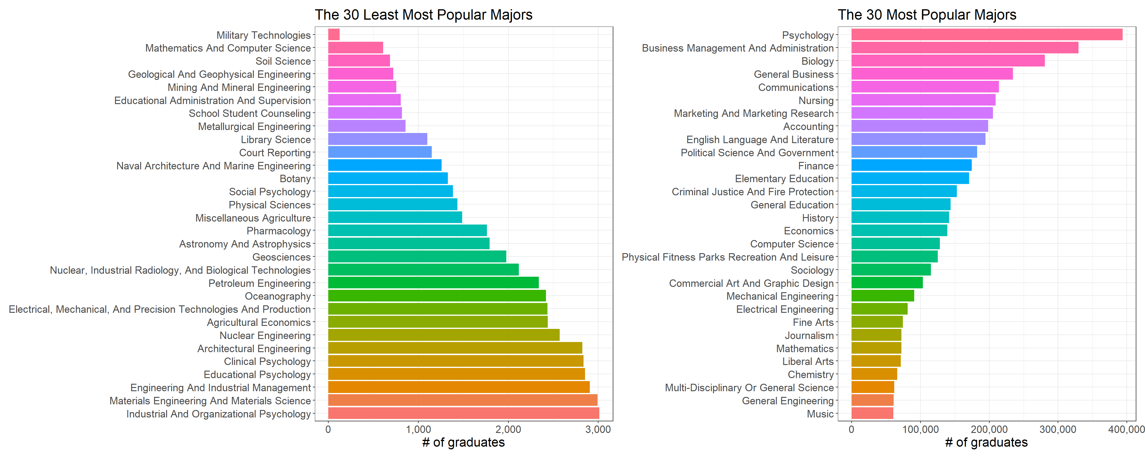
Based on the dataset, Psychology, Business and Biology are the 3 most popular majors, yet on the opposite of coin, Military Technologies, Math & CS and Soil Science are the least popular ones. It is a tad puzzling that both Math and CS are in the list of the top 30 popular-major list, so I believe it is rare for students to have both Math and CS major at the same time.
Employment Status
Having a major that can help students do well in job search is consequential, and students and parents should be prudent when it comes to choosing a college major. Hopefully, the following bar charts can shed some light on major choice in terms of employment situation.
recent_grads %>%
  slice_min(unemployment_rate, n = 30) %>%
  mutate(major = fct_reorder(major, unemployment_rate, .desc = TRUE)) %>%
  ggplot(aes(unemployment_rate, major, fill = unemployment_rate)) +
  geom_col() +
  theme_bw() +
  theme(
    axis.title.y = element_blank(),
    legend.position = "none"
  ) +
  scale_x_continuous(labels = percent) +
  labs(x = "Unemployment Rate", title = "The 30 Highest Employment Majors") +
recent_grads %>%
  slice_max(unemployment_rate, n = 30) %>%
  mutate(major = fct_reorder(major, unemployment_rate)) %>%
  ggplot(aes(unemployment_rate, major, fill = unemployment_rate)) +
  geom_col() +
  theme_bw() +
  scale_x_continuous(labels = percent) +
  theme(
    axis.title.y = element_blank(),
    legend.position = "none"
  ) +
  labs(x = "Unemployment Rate", title = "The 30 Lowest Employment Majors")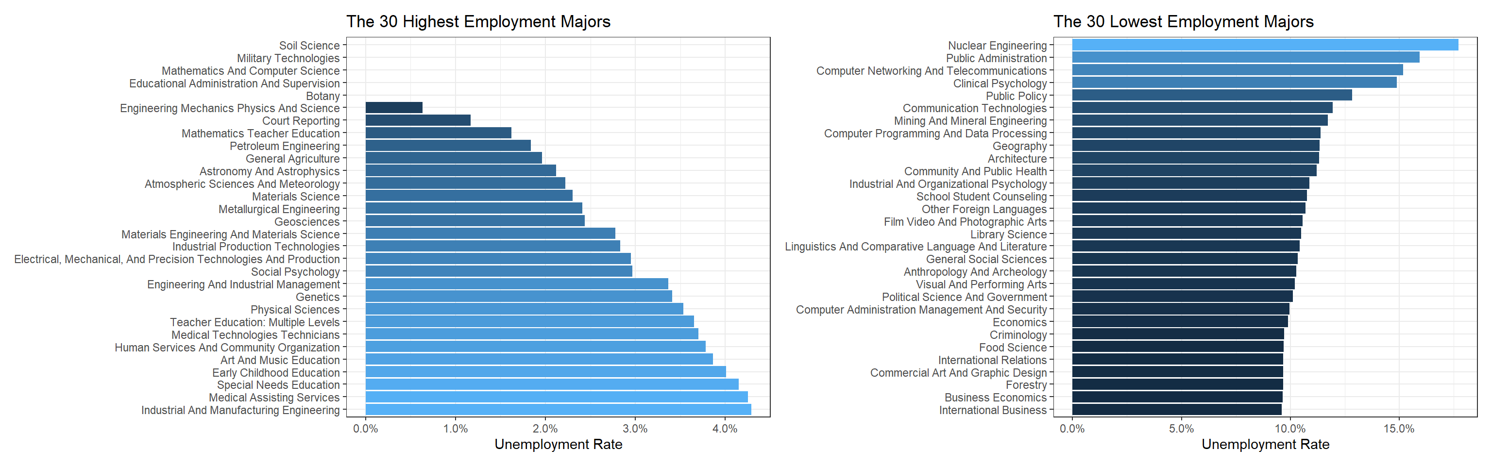
Ironically, the top 3 employment majors are the ones with the least popularity. Nuclear Engineering is the major having the highest unemployment rate.
Major Category
Besides each specific major, major category is the meta-major that includes a number of individual majors.
major_category <- recent_grads %>%
  group_by(major_category) %>%
  summarize(total_grad = sum(total, na.rm = TRUE),
            male = sum(men, na.rm = TRUE),
            female = sum(women, na.rm = TRUE),
            total_employed = sum(employed)) %>%
  mutate(employment_rate = total_employed/total_grad,
         major_category = fct_reorder(major_category, employment_rate))

major_category %>%
  ggplot(aes(employment_rate, major_category, fill = major_category)) +
  geom_col() +
  theme_bw() +
  theme(
    legend.position = "none",
    axis.title = element_text(size = 15),
    axis.text = element_text(size = 13),
    plot.title = element_text(size = 17)
  ) +
  scale_x_continuous(labels = percent) +
labs(x = "weighted employment rate", y = "major category", title = "Major Category Employment Rate") 
major_category %>%
  pivot_longer(cols = c("male", "female"),
               names_to = "gender",
               values_to = "count") %>%
  mutate(major_category = reorder_within(major_category, count, gender)) %>%
  ggplot(aes(count, major_category, fill = major_category)) +
  scale_y_reordered() +
  geom_col() +
  theme_bw() +
  theme(
    legend.position = "none",
    strip.text = element_text(size = 15, face = "bold"),
    axis.title = element_text(size = 15),
    axis.text = element_text(size = 13),
    plot.title = element_text(size = 17)
  ) +
  facet_wrap(~gender, scales = "free_y") +
  scale_x_continuous(labels = comma) +
  labs(x = "# of graduates", y = "major category", title = "Popular Major Categories between Male and Female")
The following bar chart conveys the same information as the one right above.
recent_grads %>%
  group_by(major_category) %>%
  summarize_at(vars(men, women), sum, na.rm = TRUE) %>%
  pivot_longer(cols = c(men, women), names_to = "gender", values_to = "count") %>%
  mutate(major_category = fct_reorder(major_category, count)) %>%
  ggplot(aes(count, major_category, fill = gender)) +
  geom_col() +
  theme_bw() +
  theme(
    axis.title.y = element_blank()
  ) +
  scale_x_continuous(labels = comma) +
  labs(x = "# of graduates", title = "Major Category Male and Female Graduate Counts")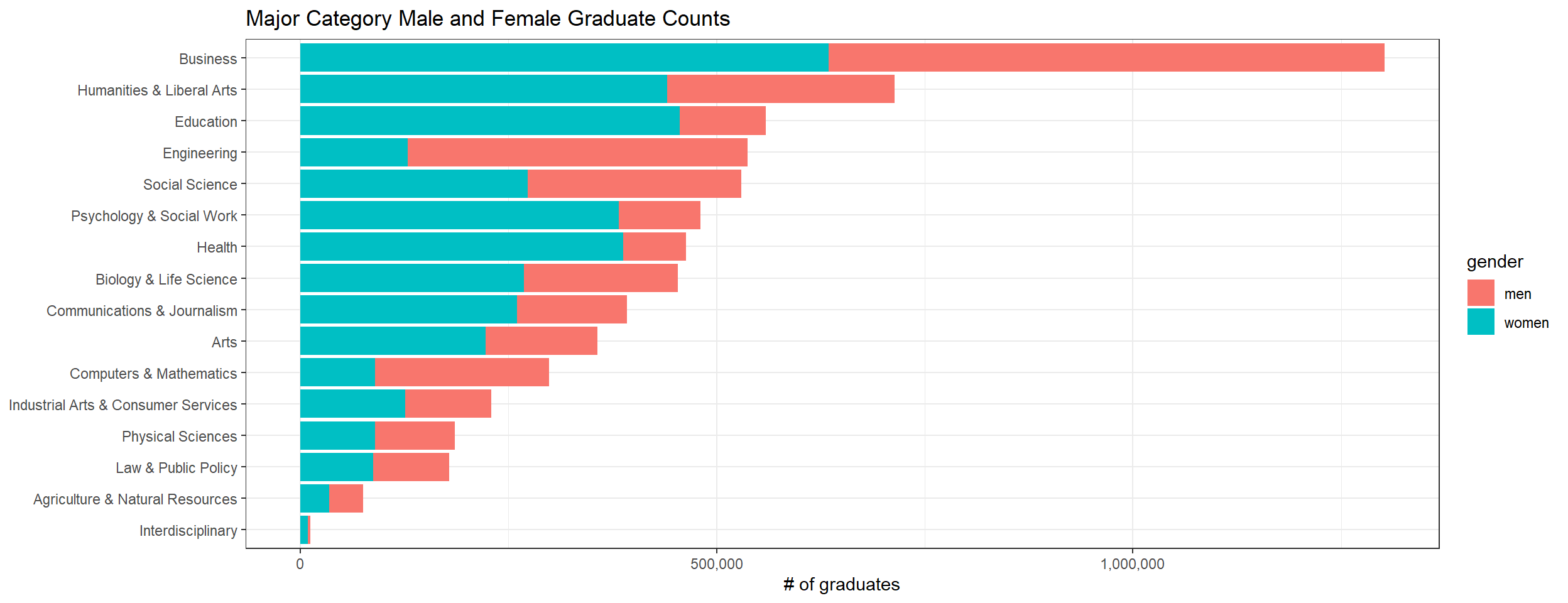
recent_grads %>%
  ggplot(aes(median, share_women, color = major_category, size = sample_size)) +
  geom_point() +
  geom_smooth(aes(group = 1), method = "lm") +
  scale_x_continuous(labels = dollar) +
  scale_y_continuous(labels = percent, limits = c(0,1)) +
  labs(y = "women percent", x = "median salary", title = "Median Salary V.S. Women Percent with respect to sample size")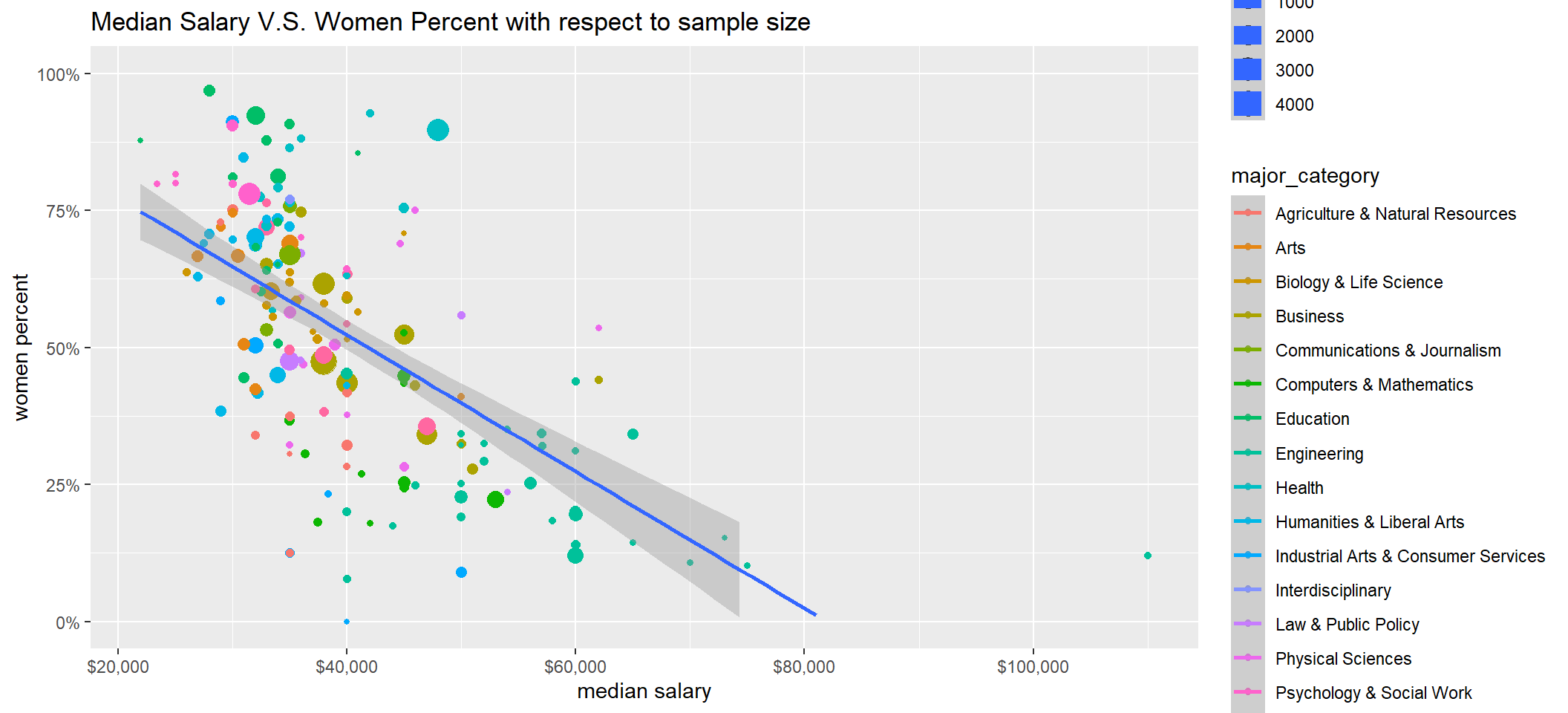
Functional Programming with nest() and unnest()
The following little chunk of code is borrowed from the link with some minor change. The reason why I include this part of anlaysis is that nest() and unnest() functions are a bit difficult to comprehend and to use, and some practice on using them with map() is necessary, strengthening my own understanding of using them.
recent_grads %>%
  nest(-major_category) %>%
  mutate(model = map(data, ~ lm(median ~ share_women, data = ., weights = sample_size)),
         tidied = map(model, tidy)) %>%
  unnest(tidied) %>%
  filter(term == "share_women") %>%
  arrange(estimate) %>%
  mutate(fdr = p.adjust(p.value, method = "fdr"))
## # A tibble: 16 x 9
## major_category data model term estimate std.error statistic p.value
## <chr> <list> <lis> <chr> <dbl> <dbl> <dbl> <dbl>
## 1 Biology & Life Sc~ <tibbl~ <lm> share~ -43735. 20982. -2.08 0.0592
## 2 Engineering <tibbl~ <lm> share~ -33912. 15418. -2.20 0.0366
## 3 Social Science <tibbl~ <lm> share~ -33667. 7248. -4.65 0.00236
## 4 Computers & Mathe~ <tibbl~ <lm> share~ -28694. 18552. -1.55 0.156
## 5 Business <tibbl~ <lm> share~ -28171. 9810. -2.87 0.0152
## 6 Industrial Arts &~ <tibbl~ <lm> share~ -17827. 6835. -2.61 0.0478
## 7 Psychology & Soci~ <tibbl~ <lm> share~ -16425. 8312. -1.98 0.0887
## 8 Agriculture & Nat~ <tibbl~ <lm> share~ -16263. 5975. -2.72 0.0297
## 9 Physical Sciences <tibbl~ <lm> share~ -12820. 13349. -0.960 0.365
## 10 Education <tibbl~ <lm> share~ -1996. 3084. -0.647 0.528
## 11 Humanities & Libe~ <tibbl~ <lm> share~ -1814. 4128. -0.439 0.668
## 12 Arts <tibbl~ <lm> share~ -1025. 13416. -0.0764 0.942
## 13 Law & Public Poli~ <tibbl~ <lm> share~ 2456. 34987. 0.0702 0.948
## 14 Communications & ~ <tibbl~ <lm> share~ 9612. 4045. 2.38 0.141
## 15 Health <tibbl~ <lm> share~ 54721. 23427. 2.34 0.0416
## 16 Interdisciplinary <tibbl~ <lm> share~ NA NA NA NA
## # ... with 1 more variable: fdr <dbl>When looking at fdr column, almost all corrected p-values are greater than 0.05, which means share_women is not a useful predictor for median salary. However, we set weights to be sample_size, and that whether the sample size in each major_category is large enough to draw such a conclusion is still a question.
Income
The following data analysis is inspired by this YouTube R screencast link
recent_grads %>%
  mutate(major_category = fct_reorder(major_category, median)) %>%
  ggplot(aes(median, major_category, fill = major_category)) +
  geom_boxplot() +
  theme_bw() +
  theme(
    legend.position = "none"
  ) +
  scale_x_continuous(labels = dollar) +
  labs(x = "median salary", y = "", title = "Major Category Median Salary")
recent_grads %>%
  arrange(desc(median)) %>%
  head(20) %>%
  mutate(major = fct_reorder(major, median)) %>%
  ggplot(aes(median, major, color = major_category)) +
  geom_point(aes(size = sample_size)) +
  geom_errorbar(aes(xmin = p25th, xmax = p75th)) +
  theme_bw() +
  theme(
    axis.text = element_text(size = 12)
  ) +
  labs(size = "sample size", color = "major category", x = "median salary", y = "", title = "Top 20 Median Salary Majors", subtitle = "Error bars refer to the 25th and 75th percentile") +
  scale_x_continuous(labels = dollar)
recent_grads %>%
  arrange(median) %>%
  head(20) %>%
  mutate(major = fct_reorder(major, median)) %>%
  ggplot(aes(median, major, color = major_category)) +
  geom_point(aes(size = sample_size)) +
  geom_errorbar(aes(xmin = p25th, xmax = p75th)) +
  theme_bw() +
  theme(
    axis.text = element_text(size = 12)
  ) +
  labs(size = "sample size", color = "major category", x = "median salary", y = "", title = "Bottom 20 Median Salary Majors", subtitle = "Error bars refer to the 25th and 75th percentile") +
  scale_x_continuous(labels = dollar)
College-degree Required Jobs
recent_grads %>%
  mutate(college_job_rate = college_jobs/employed) %>%
  arrange(desc(college_job_rate)) %>%
  head(30) %>%
  mutate(major = fct_reorder(major, college_job_rate)) %>%
  ggplot(aes(college_job_rate, major, color = major)) +
  geom_point() +
  scale_x_continuous(labels = percent, limits = c(0.5, 1)) +
  theme_bw() +
  theme(legend.position = "none") +
  labs(x = "job rates requiring college degree", y = "", title = "Top 30 Majors Finding Degree-related Jobs")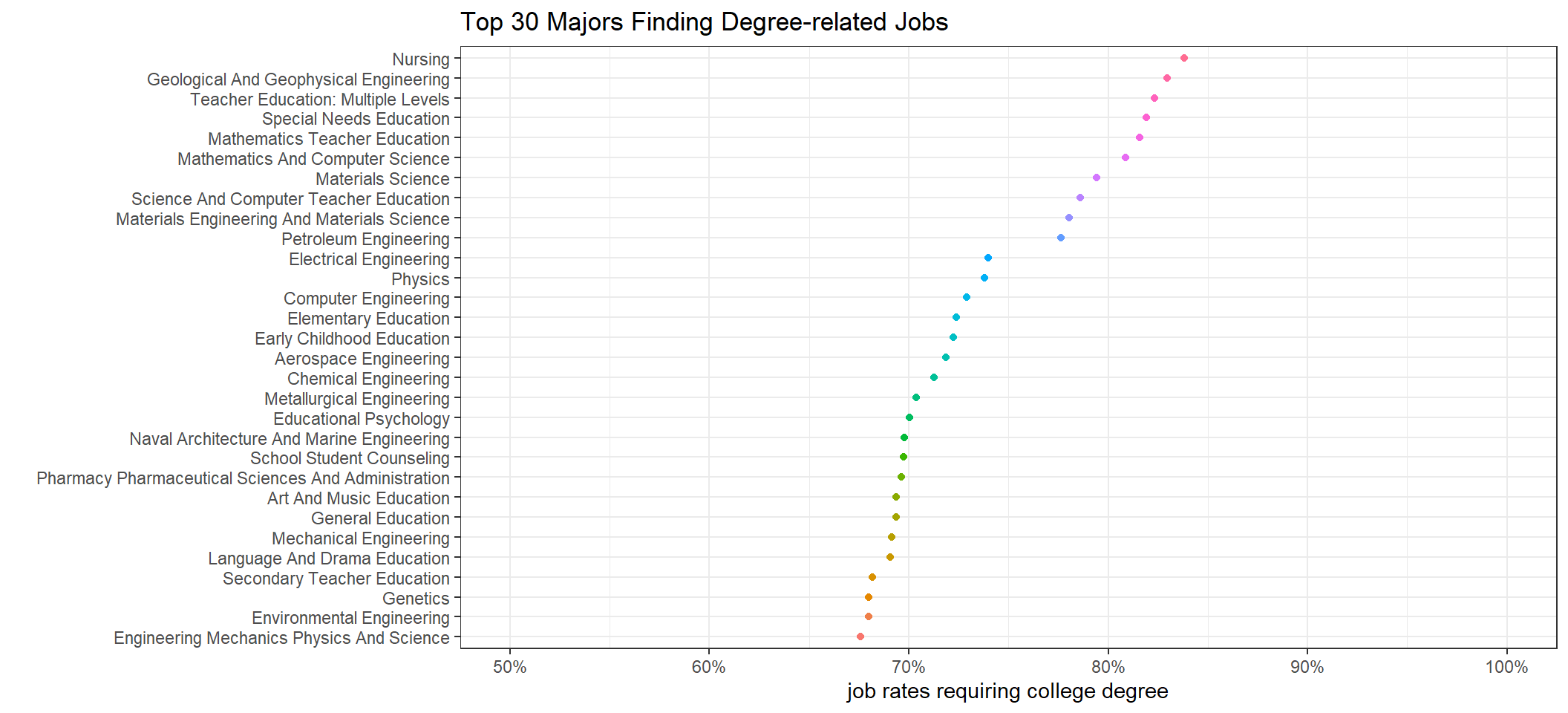
recent_grads %>%
  mutate(college_job_rate = college_jobs/employed) %>%
  arrange(college_job_rate) %>%
  head(30) %>%
  mutate(major = fct_reorder(major, college_job_rate)) %>%
  ggplot(aes(college_job_rate, major, color = major)) +
  geom_point() +
  scale_x_continuous(labels = percent) +
  theme_bw() +
  theme(legend.position = "none") +
  labs(x = "job rates requiring college degree", y = "", title = "Bottom 30 Majors Finding Degree-related Jobs")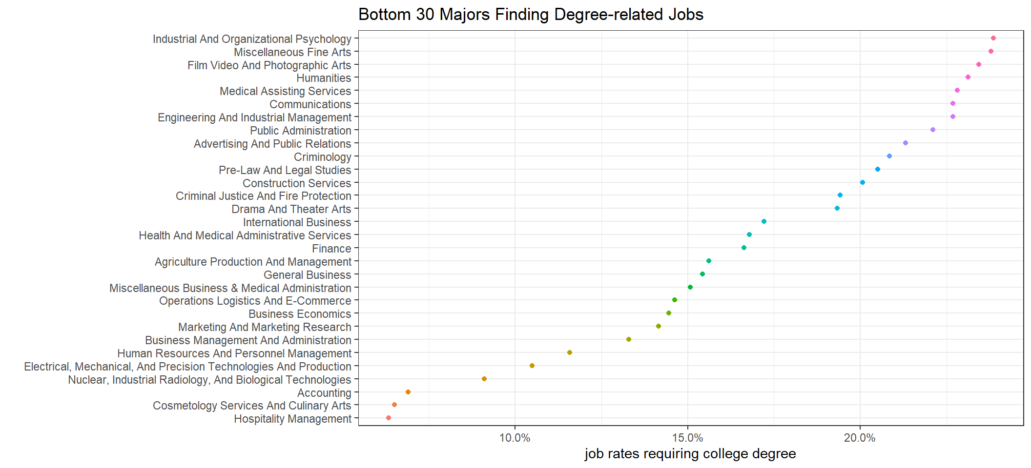
Unsurprisingly, Nursing is a professional field that needs a college degree the most. Hospitality Management, Culinary Arts and Accounting are the ones having the least college-degree requirement.
Conclusion
This project is a relatively easy one in large part because of the minimal amount of data cleaning. All visualizations carried out are standard. One thing we need to keep in mind is that sample sizes vary significantly, and the report might not reflect some majors accurately due to small sample size. When making error bar plots, the information about sample size is embedded. Hopefully, not only can this report show the standard process of data science visualization and reporting, it can also help send some useful message on choosing major or at least be aware of the situation of each major. The dataset, however, does not contain information about data science, but if it had contained the major, I would be curious where data science would be placed on all the plots generated above.