Malaria Data Visualization with World and Africa Maps included
Wed, Sep 8, 2021
5-minute read
The dataset for this blog post is from TidyTuesday about malaria situation across the world from different years. In the developed countries, this disease does not exist, yet in the developing countries across the world, especially in Africa, Malaria is still prevalent in some regions. Through this blog post, we would like to dive into the data, evaluating how malaria changed in different years.
library(tidyverse)
library(countrycode)
library(malariaAtlas)
theme_set(theme_bw())
Incidence Rate
malaria_inc <- read_csv("https://raw.githubusercontent.com/rfordatascience/tidytuesday/master/data/2018/2018-11-13/malaria_inc.csv") %>%
  rename(incidence_per_thousand = "Incidence of malaria (per 1,000 population at risk) (per 1,000 population at risk)", country = "Entity")

malaria_inc <- janitor::clean_names(malaria_inc)

head(malaria_inc)
## # A tibble: 6 x 4
## country code year incidence_per_thousand
## <chr> <chr> <dbl> <dbl>
## 1 Afghanistan AFG 2000 107.
## 2 Afghanistan AFG 2005 46.5
## 3 Afghanistan AFG 2010 23.9
## 4 Afghanistan AFG 2015 23.6
## 5 Algeria DZA 2000 0.0377
## 6 Algeria DZA 2005 0.00202top_30_countries <- malaria_inc %>%
group_by(country) %>%
summarize(avg_inc = mean(incidence_per_thousand)) %>%
arrange(desc(avg_inc)) %>%
head(30) %>%
select(country) %>%
pull()malaria_inc %>%
filter(country %in% top_30_countries) %>%
mutate(
country = fct_reorder(country, incidence_per_thousand, mean)
) %>%
ggplot(aes(incidence_per_thousand, country, fill = country)) +
geom_col(show.legend = F) +
geom_text(aes(label = round(incidence_per_thousand, 1), color = country), check_overlap = TRUE, hjust = 0.01) +
theme(
strip.text = element_text(size = 12, face = "bold"),
legend.position = "none"
) +
facet_wrap(~year) +
labs(x = "incidence per thousand", y = NULL, title = "Top 30 Countries with Highest Average Malaria Incidence Rate")
malaria_inc %>%
  group_by(country) %>%
  summarize(delta = max(incidence_per_thousand) - min(incidence_per_thousand)) %>%
  arrange(desc(delta)) %>%
  head(30) %>%
  mutate(country = fct_reorder(country, delta)) %>%
  ggplot(aes(delta, country)) +
  geom_col() +
  geom_text(aes(label = round(delta, 1), color = country), check_overlap = TRUE, hjust = 0.01) +
  labs(x = "change in incidence per thousand", y = NULL, title = "Top 30 Countries in terms of the Largest Incidence Rate Change") +
  theme(
    legend.position = "none"
  )
The data points from Turkey are suspicious, as there were 1741 incidences per 1000 residents. How can we interpret that?
malaria_inc %>%
  filter(country == "Turkey")
## # A tibble: 4 x 4
## country code year incidence_per_thousand
## <chr> <chr> <dbl> <dbl>
## 1 Turkey TUR 2000 1741
## 2 Turkey TUR 2005 296.
## 3 Turkey TUR 2010 0
## 4 Turkey TUR 2015 0The World Map
mean_world_map <- map_data("world") %>%
  group_by(region) %>%
  summarize(avg_long = mean(long), avg_lat = mean(lat)) %>%
  ungroup()


map_data("world") %>%
  left_join(malaria_inc, by = c("region" = "country")) %>%
  left_join(mean_world_map, by = "region") %>%
  filter(incidence_per_thousand > 0) %>%
  ggplot(aes(x = long, y = lat, group = group)) +
    geom_polygon(aes(fill = incidence_per_thousand)) +
    geom_text(aes(avg_long, avg_lat, label = if_else(incidence_per_thousand > 0, region, NULL), group = group), color = "red", check_overlap = TRUE) +
  labs(fill = "incidence per thousand", title = "The World Map with Incidence Rate among Countries Having Malaria") +
  theme_void() +
  theme(
    strip.text = element_text(size = 15)
  ) +
facet_wrap(~year) 
Death Rate
malaria_dea <- read_csv("https://raw.githubusercontent.com/rfordatascience/tidytuesday/master/data/2018/2018-11-13/malaria_deaths.csv") %>%
  rename(death_per_100thousand = `Deaths - Malaria - Sex: Both - Age: Age-standardized (Rate) (per 100,000 people)`, country = Entity)

malaria_dea <- janitor::clean_names(malaria_dea)

head(malaria_dea)
## # A tibble: 6 x 4
## country code year death_per_100thousand
## <chr> <chr> <dbl> <dbl>
## 1 Afghanistan AFG 1990 6.80
## 2 Afghanistan AFG 1991 6.97
## 3 Afghanistan AFG 1992 6.99
## 4 Afghanistan AFG 1993 7.09
## 5 Afghanistan AFG 1994 7.39
## 6 Afghanistan AFG 1995 7.41malaria_dea %>%
group_by(country) %>%
summarize(avg_inc = mean(death_per_100thousand)) %>%
arrange(desc(avg_inc)) %>%
head(30) %>%
select(country) %>%
pull()## [1] "Sierra Leone" "Burkina Faso"
## [3] "Uganda" "Equatorial Guinea"
## [5] "Cote d'Ivoire" "Nigeria"
## [7] "Niger" "Democratic Republic of Congo"
## [9] "Burundi" "Mali"
## [11] "Western Sub-Saharan Africa" "Cameroon"
## [13] "Mozambique" "Guinea"
## [15] "Central Sub-Saharan Africa" "Liberia"
## [17] "Togo" "Malawi"
## [19] "Ghana" "Sub-Saharan Africa"
## [21] "Benin" "Central African Republic"
## [23] "Congo" "Tanzania"
## [25] "Low SDI" "Senegal"
## [27] "Gabon" "Rwanda"
## [29] "Eastern Sub-Saharan Africa" "Zambia"Worldwide malaria death in 1990
map_data("world") %>%
  left_join(malaria_dea, by = c("region" = "country")) %>%
  left_join(mean_world_map, by = "region") %>%
  filter(year == 1990, death_per_100thousand > 0) %>%
  ggplot(aes(x = long, y = lat, group = group)) +
    geom_polygon(aes(fill = death_per_100thousand)) +
    geom_text(aes(avg_long, avg_lat, label = if_else(death_per_100thousand > 0, region, NULL), group = group), color = "red", check_overlap = TRUE) +
  labs(fill = "death per 100 thousand", title = "The World Map with Death Rate among Countries Having Malaria in 1990") +
theme_void() 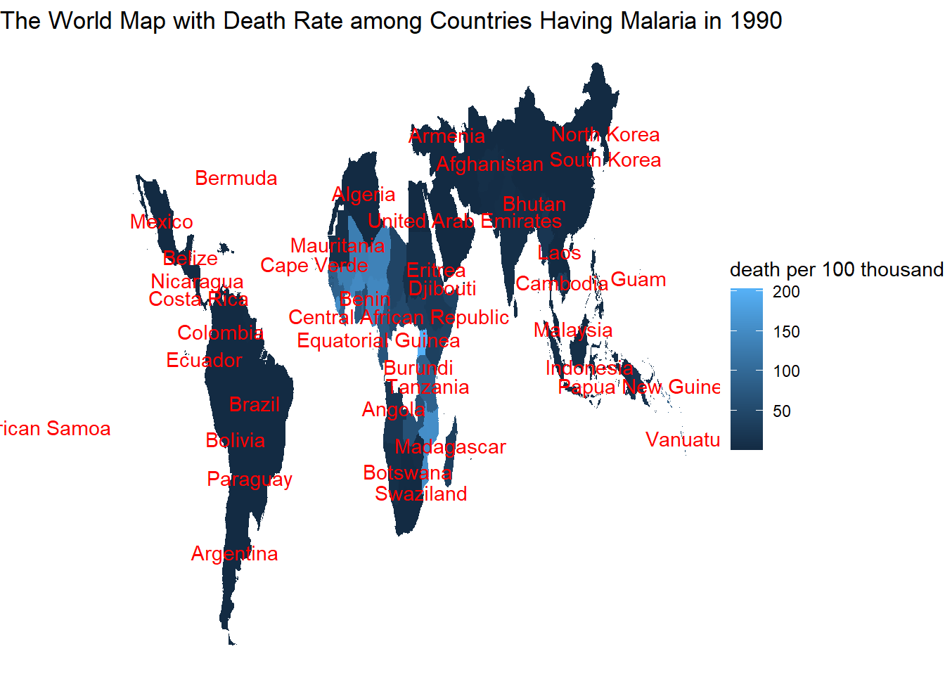
Worldwide malaria death in 2015
map_data("world") %>%
  left_join(malaria_dea, by = c("region" = "country")) %>%
  left_join(mean_world_map, by = "region") %>%
  filter(year == 2015, death_per_100thousand > 0) %>%
  ggplot(aes(x = long, y = lat, group = group)) +
    geom_polygon(aes(fill = death_per_100thousand)) +
    geom_text(aes(avg_long, avg_lat, label = if_else(death_per_100thousand > 0, region, NULL), group = group), color = "red", check_overlap = TRUE) +
  labs(fill = "death per 100 thousand", title = "The World Map with Death Rate among Countries Having Malaria in 2015") +
theme_void() 
The African Continent
The idea and part of the code below is inspired by David Robinson’s code.
map_data("world") %>%
  left_join(malaria_dea, by = c("region" = "country")) %>%
  left_join(mean_world_map, by = "region") %>%
  mutate(continent = countrycode(code, "iso3c", "continent")) %>%
  filter(continent == "Africa", year == 1990, death_per_100thousand > 0) %>%
  ggplot(aes(long, lat, group = group, fill = death_per_100thousand)) +
  geom_polygon() +
  scale_fill_gradient2(low = "blue", high = "red", midpoint = 100) +
  theme_void() +
  geom_text(aes(avg_long, avg_lat, label = if_else(death_per_100thousand > 0, region, NULL), group = group), color = "red", check_overlap = TRUE) +
  labs(fill = "death per 100 thousand", title = "African Malaria Deaths in 1990")
map_data("world") %>%
  left_join(malaria_dea, by = c("region" = "country")) %>%
  left_join(mean_world_map, by = "region") %>%
  mutate(continent = countrycode(code, "iso3c", "continent")) %>%
  filter(continent == "Africa", year == 2015, death_per_100thousand > 0) %>%
  ggplot(aes(long, lat, group = group, fill = death_per_100thousand)) +
  geom_polygon() +
  scale_fill_gradient2(low = "blue", high = "red", midpoint = 100) +
  theme_void() +
  geom_text(aes(avg_long, avg_lat, label = if_else(death_per_100thousand > 0, region, NULL), group = group), color = "red", check_overlap = TRUE) +
  labs(fill = "death per 100 thousand", title = "African Malaria Deaths in 2015")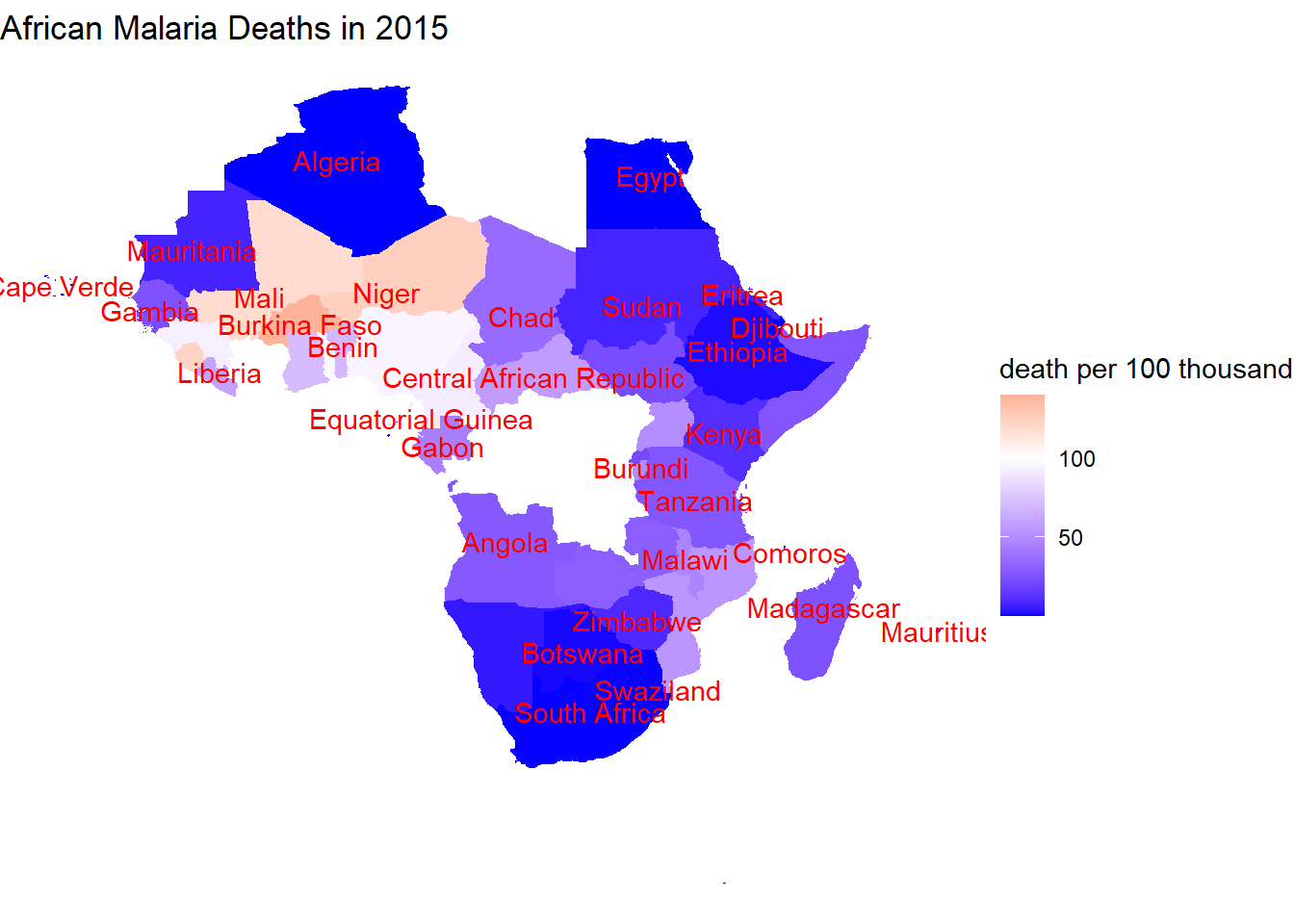
Malaria in China
chn_pr <- tbl_df(malariaAtlas::getPR(ISO = "CHN", species = "BOTH")) %>%
  filter(!is.na(pr))
chn_pr %>%
mutate(decade = 10 * floor(year_start/10)) %>%
ggplot(aes(longitude, latitude, color = pr)) +
borders("world", regions = "China") +
geom_point() +
facet_wrap(~decade) +
theme_void() +
coord_map() +
labs(color = "Prevalence",title = "Malaria in China") +
scale_color_continuous(labels = scales::percent)