Thanksgiving Dinner Survey Data Analysis and Visualization
The dataset analyzed in this blog post is from TidyTuesday about Thanksgiving meals.
library(tidyverse)
library(scales)
library(ggraph)
library(igraph)
library(widyr)
theme_set(theme_bw())
tg <- read_csv("https://raw.githubusercontent.com/rfordatascience/tidytuesday/master/data/2018/2018-11-20/thanksgiving_meals.csv")
tg## # A tibble: 1,058 x 65
## id celebrate main_dish main_dish_other main_prep main_prep_other stuffing
## <dbl> <chr> <chr> <chr> <chr> <chr> <chr>
## 1 4.34e9 Yes Turkey NA Baked NA Bread-b~
## 2 4.34e9 Yes Turkey NA Baked NA Bread-b~
## 3 4.34e9 Yes Turkey NA Roasted NA Rice-ba~
## 4 4.34e9 Yes Turkey NA Baked NA Bread-b~
## 5 4.34e9 Yes Tofurkey NA Baked NA Bread-b~
## 6 4.34e9 Yes Turkey NA Roasted NA Rice-ba~
## 7 4.34e9 Yes Turkey NA Baked NA Bread-b~
## 8 4.34e9 Yes Turkey NA Baked NA Rice-ba~
## 9 4.34e9 Yes Turkey NA Roasted NA Bread-b~
## 10 4.34e9 Yes Other (p~ Turkey and Ham Baked NA Bread-b~
## # ... with 1,048 more rows, and 58 more variables: stuffing_other <chr>,
## # cranberry <chr>, cranberry_other <chr>, gravy <chr>, side1 <chr>,
## # side2 <chr>, side3 <chr>, side4 <chr>, side5 <chr>, side6 <chr>,
## # side7 <chr>, side8 <chr>, side9 <chr>, side10 <chr>, side11 <chr>,
## # side12 <chr>, side13 <chr>, side14 <chr>, side15 <chr>, pie1 <chr>,
## # pie2 <chr>, pie3 <chr>, pie4 <chr>, pie5 <chr>, pie6 <chr>, pie7 <chr>,
## # pie8 <chr>, pie9 <chr>, pie10 <chr>, pie11 <chr>, pie12 <chr>, pie13 <chr>,
## # dessert1 <chr>, dessert2 <chr>, dessert3 <chr>, dessert4 <chr>,
## # dessert5 <chr>, dessert6 <chr>, dessert7 <chr>, dessert8 <chr>,
## # dessert9 <chr>, dessert10 <chr>, dessert11 <chr>, dessert12 <chr>,
## # prayer <chr>, travel <chr>, watch_program <chr>, kids_table_age <chr>,
## # hometown_friends <chr>, friendsgiving <chr>, black_friday <chr>,
## # work_retail <chr>, work_black_friday <chr>, community_type <chr>,
## # age <chr>, gender <chr>, family_income <chr>, us_region <chr>skimr::skim(tg)| Name | tg |
| Number of rows | 1058 |
| Number of columns | 65 |
| _______________________ | |
| Column type frequency: | |
| character | 64 |
| numeric | 1 |
| ________________________ | |
| Group variables | None |
Variable type: character
| skim_variable | n_missing | complete_rate | min | max | empty | n_unique | whitespace |
|---|---|---|---|---|---|---|---|
| celebrate | 0 | 1.00 | 2 | 3 | 0 | 2 | 0 |
| main_dish | 84 | 0.92 | 6 | 22 | 0 | 8 | 0 |
| main_dish_other | 1023 | 0.03 | 4 | 85 | 0 | 32 | 0 |
| main_prep | 84 | 0.92 | 5 | 22 | 0 | 5 | 0 |
| main_prep_other | 1007 | 0.05 | 1 | 33 | 0 | 32 | 0 |
| stuffing | 84 | 0.92 | 4 | 22 | 0 | 4 | 0 |
| stuffing_other | 1022 | 0.03 | 4 | 46 | 0 | 29 | 0 |
| cranberry | 84 | 0.92 | 4 | 22 | 0 | 4 | 0 |
| cranberry_other | 1033 | 0.02 | 3 | 61 | 0 | 24 | 0 |
| gravy | 84 | 0.92 | 2 | 3 | 0 | 2 | 0 |
| side1 | 903 | 0.15 | 15 | 15 | 0 | 1 | 0 |
| side2 | 816 | 0.23 | 7 | 7 | 0 | 1 | 0 |
| side3 | 970 | 0.08 | 11 | 11 | 0 | 1 | 0 |
| side4 | 594 | 0.44 | 4 | 4 | 0 | 1 | 0 |
| side5 | 823 | 0.22 | 9 | 9 | 0 | 1 | 0 |
| side6 | 843 | 0.20 | 11 | 11 | 0 | 1 | 0 |
| side7 | 372 | 0.65 | 32 | 32 | 0 | 1 | 0 |
| side8 | 852 | 0.19 | 19 | 19 | 0 | 1 | 0 |
| side9 | 241 | 0.77 | 15 | 15 | 0 | 1 | 0 |
| side10 | 292 | 0.72 | 14 | 14 | 0 | 1 | 0 |
| side11 | 887 | 0.16 | 6 | 6 | 0 | 1 | 0 |
| side12 | 849 | 0.20 | 15 | 15 | 0 | 1 | 0 |
| side13 | 427 | 0.60 | 27 | 27 | 0 | 1 | 0 |
| side14 | 947 | 0.10 | 22 | 22 | 0 | 1 | 0 |
| side15 | 947 | 0.10 | 4 | 78 | 0 | 89 | 0 |
| pie1 | 544 | 0.49 | 5 | 5 | 0 | 1 | 0 |
| pie2 | 1023 | 0.03 | 10 | 10 | 0 | 1 | 0 |
| pie3 | 945 | 0.11 | 6 | 6 | 0 | 1 | 0 |
| pie4 | 925 | 0.13 | 9 | 9 | 0 | 1 | 0 |
| pie5 | 1022 | 0.03 | 13 | 13 | 0 | 1 | 0 |
| pie6 | 1019 | 0.04 | 8 | 8 | 0 | 1 | 0 |
| pie7 | 1024 | 0.03 | 5 | 5 | 0 | 1 | 0 |
| pie8 | 716 | 0.32 | 5 | 5 | 0 | 1 | 0 |
| pie9 | 329 | 0.69 | 7 | 7 | 0 | 1 | 0 |
| pie10 | 906 | 0.14 | 12 | 12 | 0 | 1 | 0 |
| pie11 | 1018 | 0.04 | 4 | 4 | 0 | 1 | 0 |
| pie12 | 987 | 0.07 | 22 | 22 | 0 | 1 | 0 |
| pie13 | 987 | 0.07 | 5 | 46 | 0 | 61 | 0 |
| dessert1 | 948 | 0.10 | 13 | 13 | 0 | 1 | 0 |
| dessert2 | 1042 | 0.02 | 8 | 8 | 0 | 1 | 0 |
| dessert3 | 930 | 0.12 | 8 | 8 | 0 | 1 | 0 |
| dessert4 | 986 | 0.07 | 11 | 11 | 0 | 1 | 0 |
| dessert5 | 867 | 0.18 | 10 | 10 | 0 | 1 | 0 |
| dessert6 | 854 | 0.19 | 7 | 7 | 0 | 1 | 0 |
| dessert7 | 1015 | 0.04 | 5 | 5 | 0 | 1 | 0 |
| dessert8 | 792 | 0.25 | 9 | 9 | 0 | 1 | 0 |
| dessert9 | 955 | 0.10 | 13 | 13 | 0 | 1 | 0 |
| dessert10 | 763 | 0.28 | 4 | 4 | 0 | 1 | 0 |
| dessert11 | 924 | 0.13 | 22 | 22 | 0 | 1 | 0 |
| dessert12 | 924 | 0.13 | 3 | 59 | 0 | 92 | 0 |
| prayer | 99 | 0.91 | 2 | 3 | 0 | 2 | 0 |
| travel | 107 | 0.90 | 59 | 80 | 0 | 4 | 0 |
| watch_program | 556 | 0.47 | 13 | 13 | 0 | 1 | 0 |
| kids_table_age | 107 | 0.90 | 2 | 13 | 0 | 12 | 0 |
| hometown_friends | 107 | 0.90 | 2 | 3 | 0 | 2 | 0 |
| friendsgiving | 107 | 0.90 | 2 | 3 | 0 | 2 | 0 |
| black_friday | 107 | 0.90 | 2 | 3 | 0 | 2 | 0 |
| work_retail | 107 | 0.90 | 2 | 3 | 0 | 2 | 0 |
| work_black_friday | 988 | 0.07 | 2 | 13 | 0 | 3 | 0 |
| community_type | 110 | 0.90 | 5 | 8 | 0 | 3 | 0 |
| age | 33 | 0.97 | 3 | 7 | 0 | 4 | 0 |
| gender | 33 | 0.97 | 4 | 6 | 0 | 2 | 0 |
| family_income | 33 | 0.97 | 12 | 20 | 0 | 11 | 0 |
| us_region | 59 | 0.94 | 7 | 18 | 0 | 9 | 0 |
Variable type: numeric
| skim_variable | n_missing | complete_rate | mean | sd | p0 | p25 | p50 | p75 | p100 | hist |
|---|---|---|---|---|---|---|---|---|---|---|
| id | 0 | 1 | 4336731188 | 493783.4 | 4335894916 | 4336339486 | 4336796628 | 4337012140 | 4337954960 | ▅▃▇▂▂ |
Main dish and main way of preparation with stuffing
tg %>%
  count(main_dish, sort = T)
## # A tibble: 9 x 2
## main_dish n
## <chr> <int>
## 1 Turkey 859
## 2 NA 84
## 3 Other (please specify) 35
## 4 Ham/Pork 29
## 5 Tofurkey 20
## 6 Chicken 12
## 7 Roast beef 11
## 8 I don't know 5
## 9 Turducken 3tg %>%
count(main_dish, main_prep, stuffing, sort = T) %>%
drop_na() %>%
mutate(main_dish = fct_lump(main_dish, n = 10, w = n),
main_dish = fct_reorder(main_dish, n),
stuffing = paste("stuffing:", stuffing)) %>%
ggplot(aes(main_dish, main_prep, size = n)) +
geom_point() +
coord_flip() +
facet_wrap(~stuffing) +
theme(
axis.text.x = element_text(angle = 90)
) +
geom_text(aes(y = main_prep,
x = main_dish,
label = if_else(n < 50, n, NULL)),
size = 4,
hjust = 1,
vjust = 1,
check_overlap = TRUE,
color = "red",
position = position_dodge(0.9)) +
labs(y = "main preparation",
x = "main dish",
title = "# of survey respondents on Thanksgiving Meals",
size = "# of survey respondents")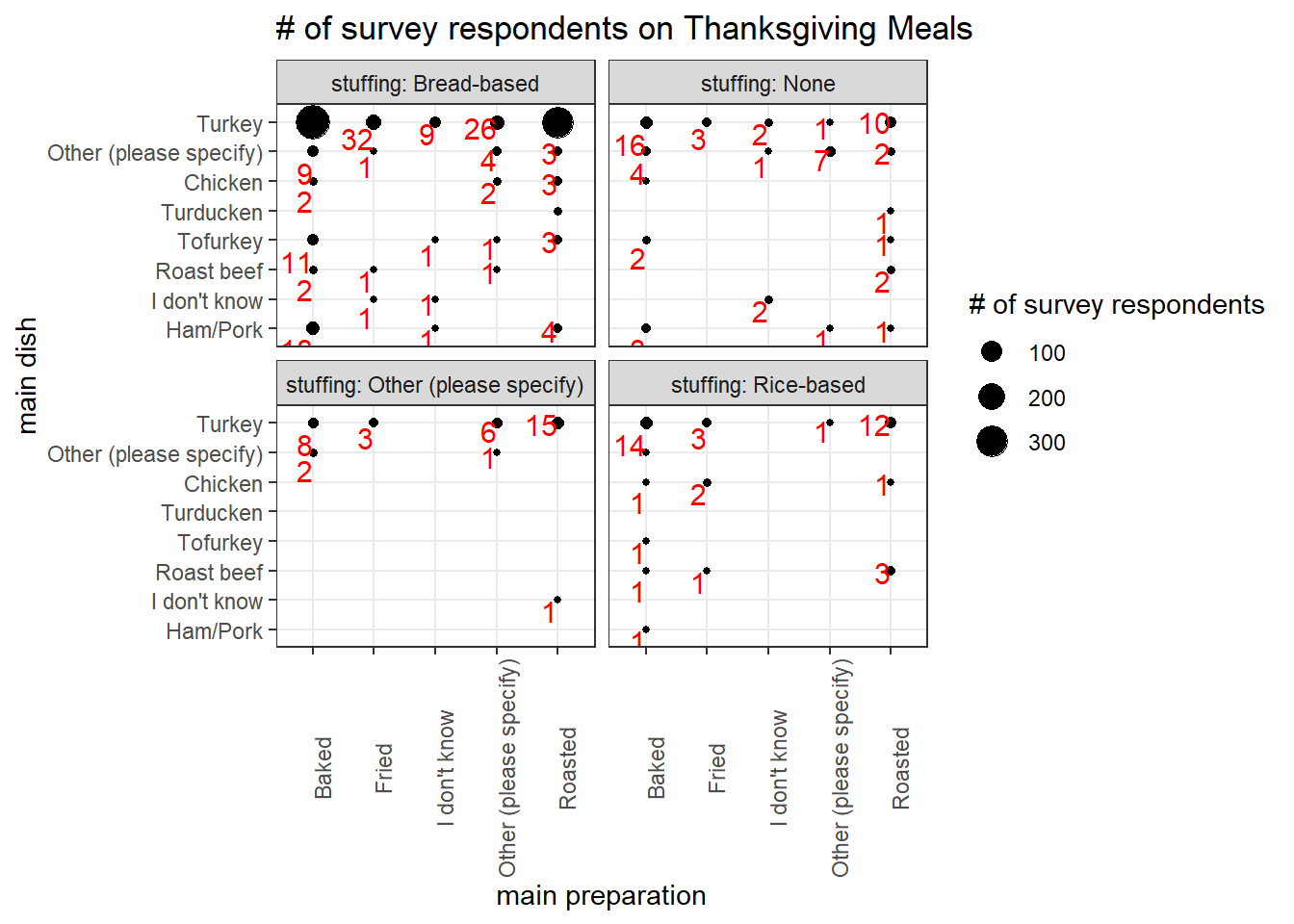
Prayer & Family Income
tg %>%
  count(family_income, prayer, sort = T) %>%
  mutate(
    family_income = reorder(family_income, parse_number(family_income))
  ) %>%
  ggplot(aes(prayer, family_income, fill = n)) +
  geom_tile() +
  scale_fill_gradient2(low = "blue", high = "red", mid = "white", midpoint = 60) +
  labs(x = "say a prayer?", y = "family income", fill = "# of respondents",
       title = "Prayer & Family Income Correlation")
Prayer & Region
tg %>%
  count(us_region, prayer, community_type, sort = T) %>%
  ggplot(aes(n, us_region, fill = prayer)) +
  geom_col(position = "stack") +
  facet_wrap(~community_type) +
  theme(
    strip.text = element_text(size = 12, face = "bold")
  ) +
  labs(x = "# of respondents", y = "US region", title = "Prayer & Region Relationship")
Pivot side, pie, and dessert
tg_pivot <- tg %>%
  select(-pie13, -dessert12, -side15) %>%
  pivot_longer(cols = starts_with("side"), names_to = "side_type", values_to = "side") %>%
  pivot_longer(cols = starts_with("pie"), names_to = "pie_type", values_to = "pie") %>%
  pivot_longer(cols = starts_with("dessert"), names_to = "dessert_type", values_to = "dessert")%>%
  separate(side, c("side"), sep = "/", extra = "drop")
tg_pivot %>%
mutate(
pie = case_when(
pie == "Other (please specify)" ~ "Other",
TRUE ~ as.character(pie)
)
) %>%
count(side, pie, dessert, sort = T) %>%
drop_na() %>%
mutate(
side = fct_lump(side, n = 10, w = n),
pie = fct_lump(pie, n = 10, w = n),
dessert = fct_lump(dessert, n = 4, w = n)
) %>%
filter(!dessert %in% c("None", "Other")) %>%
ggplot(aes(side, pie, fill = n)) +
geom_tile()+
facet_wrap(~dessert) +
theme(
axis.ticks = element_blank(),
axis.text.x = element_text(angle = 90)
) +
scale_fill_gradient2(low = "blue", high = "red", mid = "white", midpoint = 100) +
labs(fill = "# of respondents")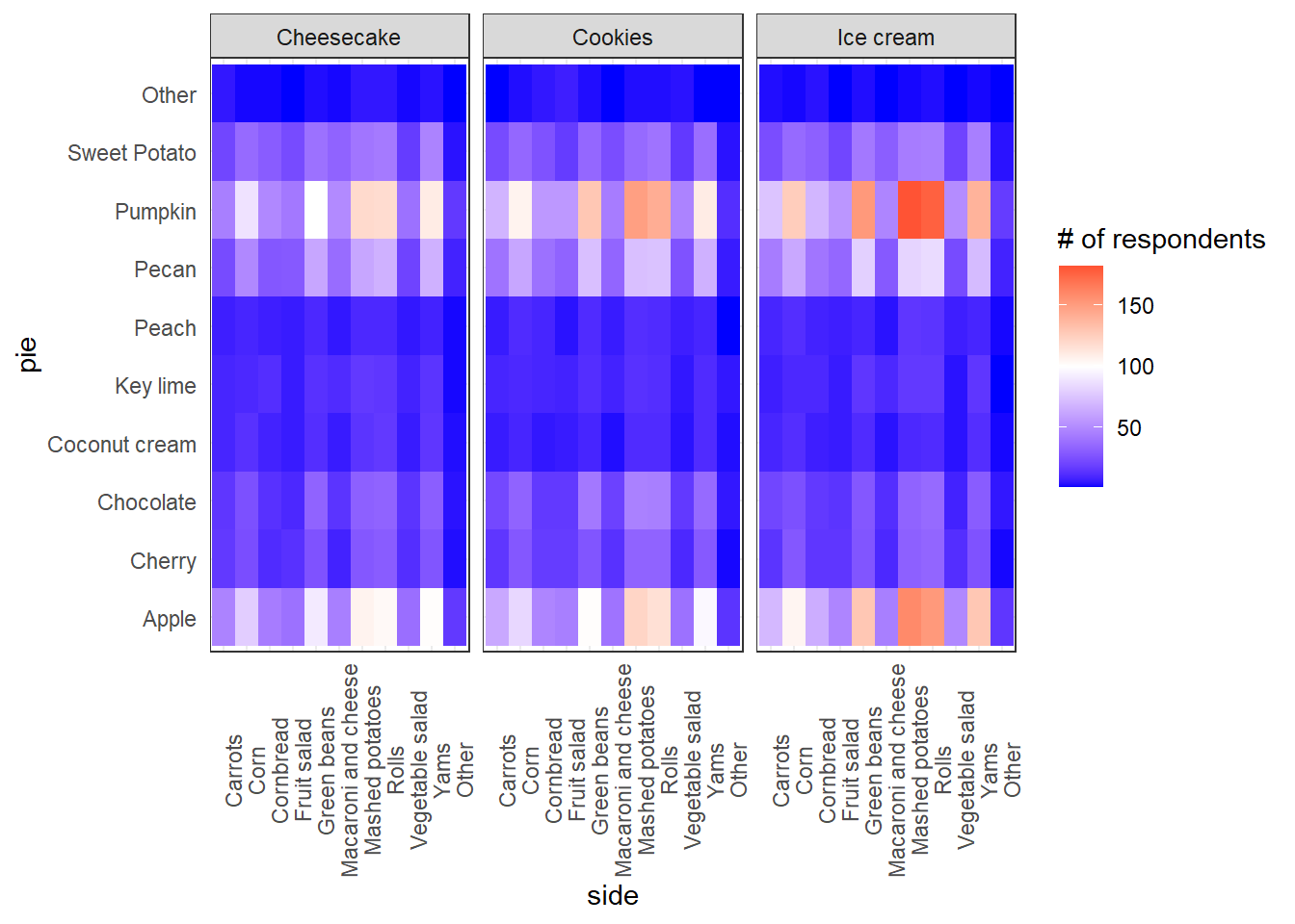
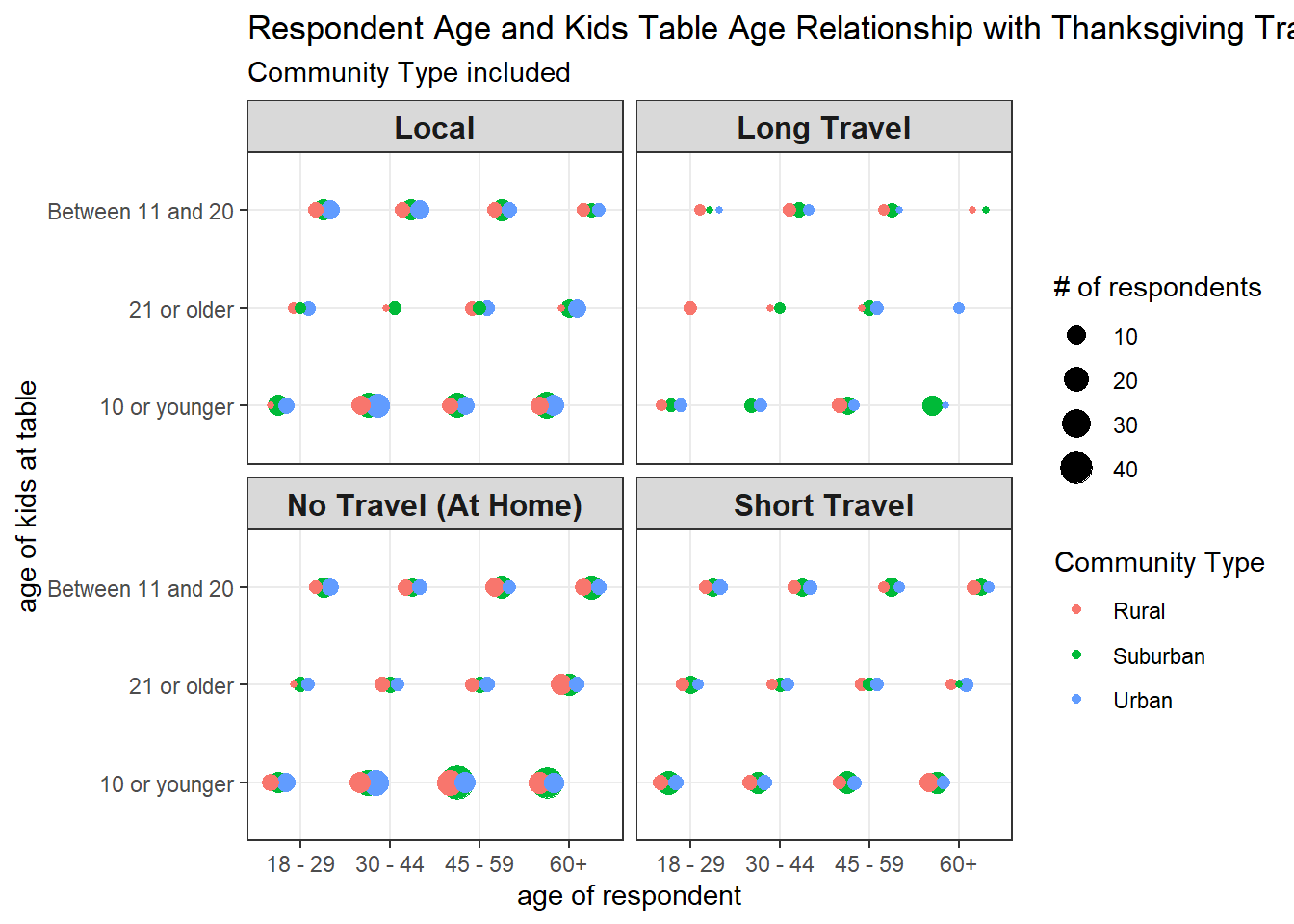
First time of using position_jitterdodge().
tg %>%
  mutate(kids_table_age = if_else(parse_number(kids_table_age) > 10 & parse_number(kids_table_age) < 21, "Between 11 and 20", kids_table_age),
         travel = case_when(
           travel == "Thanksgiving is happening at my home--I won't travel at all" ~ "No Travel (At Home)",
           travel == "Thanksgiving is local--it will take place in the town I live in" ~ "Local",
           travel == "Thanksgiving is out of town but not too far--it's a drive of a few hours or less" ~ "Short Travel",
           travel == "Thanksgiving is out of town and far away--I have to drive several hours or fly" ~ "Long Travel"
         )) %>%
  count(kids_table_age, travel, age, community_type, sort = T) %>%
  drop_na() %>%
  ggplot(aes(age, kids_table_age, size = n, color = community_type)) +
  geom_point(position = position_jitterdodge(jitter.width = 0.001, seed = 2021)) +
  facet_wrap(~travel) +
  labs(x = "age of respondent", y = "age of kids at table", size = "# of respondents",
       color = "Community Type",
       title = "Respondent Age and Kids Table Age Relationship with Thanksgiving Travel",
       subtitle = "Community Type included") +
  theme(
    strip.text = element_text(size = 12, face = "bold")
  )
Others
The following code, with some variation, is inspired by David Robinson’s code for learning purposes.
food_pivot <- tg %>%
  select(id, starts_with("side"), starts_with("pie"), starts_with("dessert")) %>%
  select(-pie13, -dessert12, -side15) %>%
  pivot_longer(!id, names_to = "type", values_to = "value") %>%
  mutate(
    type = str_remove(type, "\\d+")
  ) %>%
  filter(!is.na(value))

n_respondents <- n_distinct(food_pivot$id)
food_pivot %>%
count(type, value, sort = T) %>%
mutate(value = fct_reorder(value, n)) %>%
filter(!value %in% c("Other (please specify)", "None")) %>%
ggplot(aes(n / n_respondents, value, fill = type)) +
geom_col(show.legend = FALSE) +
facet_wrap(~ type, scales = "free_y", ncol = 1) +
theme(
strip.text = element_text(size = 12, face = "bold")
) +
labs(x = "% of respondents", y = NULL) +
scale_x_continuous(labels = percent)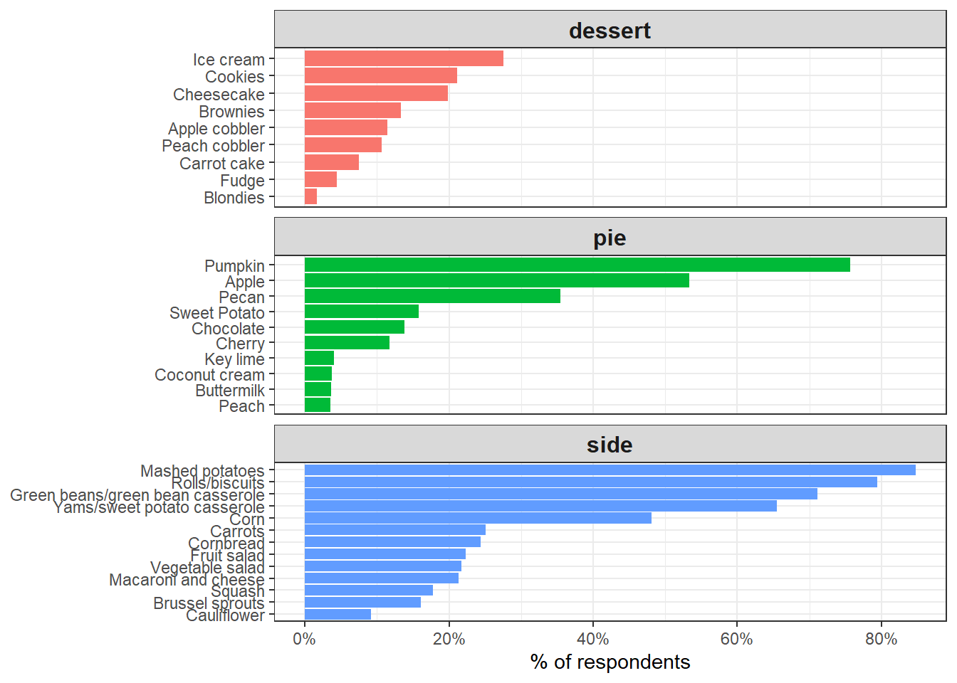
food_pivot %>%
  inner_join(tg, by = "id") %>%
  mutate(age_number = parse_number(age)) %>%
  group_by(value) %>%
  summarize(average_age = mean(age_number, na.rm = TRUE),
            total = n()) %>%
  arrange(desc(average_age))
## # A tibble: 34 x 3
## value average_age total
## <chr> <dbl> <int>
## 1 None 42.5 335
## 2 Other (please specify) 41.9 316
## 3 Fruit salad 41.3 215
## 4 Yams/sweet potato casserole 41.2 631
## 5 Coconut cream 41.1 36
## 6 Squash 40.5 171
## 7 Vegetable salad 40.4 209
## 8 Pecan 39.9 342
## 9 Apple 39.8 514
## 10 Mashed potatoes 39.8 817
## # ... with 24 more rowsfood_pivot %>%
inner_join(tg, by = "id") %>%
group_by(us_region) %>%
mutate(respondents = n_distinct(id)) %>%
count(us_region, respondents, type, value) %>%
ungroup() %>%
mutate(percent = n / respondents)%>%
filter(value == "Cornbread") %>%
arrange(desc(percent))## # A tibble: 10 x 6
## us_region respondents type value n percent
## <chr> <int> <chr> <chr> <int> <dbl>
## 1 West South Central 85 side Cornbread 34 0.4
## 2 East South Central 56 side Cornbread 16 0.286
## 3 Pacific 130 side Cornbread 37 0.285
## 4 South Atlantic 203 side Cornbread 53 0.261
## 5 Mountain 41 side Cornbread 10 0.244
## 6 Middle Atlantic 145 side Cornbread 33 0.228
## 7 NA 33 side Cornbread 7 0.212
## 8 New England 55 side Cornbread 10 0.182
## 9 West North Central 71 side Cornbread 12 0.169
## 10 East North Central 145 side Cornbread 23 0.159Relationship with income
tg %>%
  group_by(family_income) %>%
  summarize(celebrate = sum(celebrate == "Yes"),
            total = n(),
            low = qbeta(0.025, celebrate + .5, total - celebrate + .5),
            high = qbeta(0.975, celebrate + .5, total - celebrate + .5)) %>%
  ggplot(aes(family_income, celebrate / total, group = 1)) +
  geom_line() +
  geom_ribbon(aes(ymin = low, ymax = high), alpha = .2) +
  scale_y_continuous(labels = percent) +
  theme(axis.text.x = element_text(angle = 90, hjust = 1)) +
  labs(x = "Family income",
       y = "% celebrating Thanksgiving")
Orange ribbon stands for Jeffreys prior lower and upper bound, and its grey counterpart is the linear regression with 95% confidence interval.
tg %>%
  filter(cranberry %in% c("Canned", "Homemade")) %>%
  group_by(family_income) %>%
  summarize(homemade = sum(cranberry == "Homemade"),
            total = n(),
            low = qbeta(0.025, homemade + .5, total - homemade + .5),
            high = qbeta(0.975, homemade + .5, total - homemade + .5)) %>%
  ggplot(aes(family_income, homemade / total, group = 1)) +
  geom_line() +
  geom_smooth(method = "lm") +
  geom_ribbon(aes(ymin = low, ymax = high), alpha = .2, fill = "orange") +
  scale_y_continuous(labels = percent) +
  theme(axis.text.x = element_text(angle = 90, hjust = 1)) +
  labs(x = "Family income",
       y = "% serving homemade")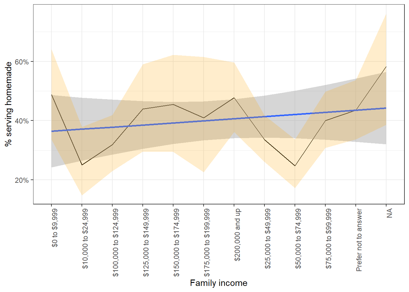
Network Data
This is also my first time using widyr package, and I should say it is a bit strange to work on this, as food_pivot is has a special structure after pivot_longer().
food_cors <- food_pivot %>%
  pairwise_cor(value, id, sort = TRUE)

food_types <- food_pivot %>%
  count(value,sort = TRUE)
The original code from Robinson does not work here and it throws me an error message. Instead, I removed type from food_type and it worked. Network data structure is not easy to implement, especially when the output error messages are difficult to decipher. Maybe more practice and attention should be allocated in this area.
food_cors %>%
  head(75) %>%
  graph_from_data_frame(vertices = food_types) %>%
  ggraph() +
  geom_edge_link() +
  geom_node_point(aes(size = n / n_respondents)) +
  geom_node_text(aes(label = name), vjust = 1, hjust = 1, repel = TRUE) +
  scale_size_continuous(labels = percent) +
  theme_void() +
  labs(title = "What foods get served together at Thanksgiving?",
       color = "",
       size = "% of respondents")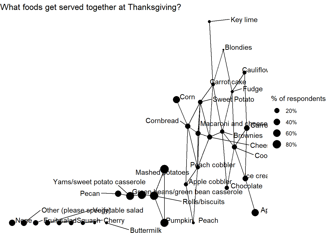
Conclusion
This is an interesting blog post that I first exposed to widyr and network data visualization. geom_ribbon(), which is also my first time to use, helps construct the lower and upper bound based on our preference. These skills are the fundamental building blocks of data processing and visualization.