Golden-Age TV Show Data Visualization & Show Survival Analysis
The dataset for this blog post is from TidyTuesday titled “TV’s golden age is real.”
library(tidyverse)
library(lubridate)
library(broom)
library(scales)
theme_set(theme_light())
tv_raw <- read_csv("https://raw.githubusercontent.com/rfordatascience/tidytuesday/master/data/2019/2019-01-08/IMDb_Economist_tv_ratings.csv")%>%
mutate(year = year(date))
tv_raw## # A tibble: 2,266 x 8
## titleId seasonNumber title date av_rating share genres year
## <chr> <dbl> <chr> <date> <dbl> <dbl> <chr> <dbl>
## 1 tt2879552 1 11.22.63 2016-03-10 8.49 0.51 Drama~ 2016
## 2 tt3148266 1 12 Monkeys 2015-02-27 8.34 0.46 Adven~ 2015
## 3 tt3148266 2 12 Monkeys 2016-05-30 8.82 0.25 Adven~ 2016
## 4 tt3148266 3 12 Monkeys 2017-05-19 9.04 0.19 Adven~ 2017
## 5 tt3148266 4 12 Monkeys 2018-06-26 9.14 0.38 Adven~ 2018
## 6 tt1837492 1 13 Reasons Why 2017-03-31 8.44 2.38 Drama~ 2017
## 7 tt1837492 2 13 Reasons Why 2018-05-18 7.51 2.19 Drama~ 2018
## 8 tt0285331 1 24 2002-02-16 8.56 6.67 Actio~ 2002
## 9 tt0285331 2 24 2003-02-09 8.70 7.13 Actio~ 2003
## 10 tt0285331 3 24 2004-02-09 8.72 5.88 Actio~ 2004
## # ... with 2,256 more rowsskimr::skim(tv_raw)| Name | tv_raw |
| Number of rows | 2266 |
| Number of columns | 8 |
| _______________________ | |
| Column type frequency: | |
| character | 3 |
| Date | 1 |
| numeric | 4 |
| ________________________ | |
| Group variables | None |
Variable type: character
| skim_variable | n_missing | complete_rate | min | max | empty | n_unique | whitespace |
|---|---|---|---|---|---|---|---|
| titleId | 0 | 1 | 9 | 9 | 0 | 876 | 0 |
| title | 0 | 1 | 1 | 51 | 0 | 868 | 0 |
| genres | 0 | 1 | 5 | 25 | 0 | 97 | 0 |
Variable type: Date
| skim_variable | n_missing | complete_rate | min | max | median | n_unique |
|---|---|---|---|---|---|---|
| date | 0 | 1 | 1990-01-03 | 2018-10-10 | 2012-12-07 | 1808 |
Variable type: numeric
| skim_variable | n_missing | complete_rate | mean | sd | p0 | p25 | p50 | p75 | p100 | hist |
|---|---|---|---|---|---|---|---|---|---|---|
| seasonNumber | 0 | 1 | 3.26 | 3.44 | 1.0 | 1.00 | 2.00 | 4.00 | 44.00 | ▇▁▁▁▁ |
| av_rating | 0 | 1 | 8.06 | 0.67 | 2.7 | 7.73 | 8.11 | 8.49 | 9.68 | ▁▁▁▇▅ |
| share | 0 | 1 | 1.28 | 3.38 | 0.0 | 0.10 | 0.32 | 1.09 | 55.65 | ▇▁▁▁▁ |
| year | 0 | 1 | 2010.44 | 6.81 | 1990.0 | 2007.00 | 2012.00 | 2016.00 | 2018.00 | ▁▁▂▅▇ |
This is a rather small dataset compared to datasets analyzed in other blog posts, yet its structure needs to be readjusted in a way that the genres column is separated by comma. Here separate() and pivot_longer() are used to process the data initially.
tv_pivot <- tv_raw %>%
  separate(genres, c("genre1", "genre2", "genre3"), sep = ",") %>%
  pivot_longer(cols = starts_with("genre"),
               names_to = "genre_num",
               values_to = "genre_type") %>%
  filter(!is.na(genre_type)) %>%
  mutate(year = year(date))
If we need to deal with the genres column, tv_pivot should be used. Otherwise, tv_raw is a better candidate to do the job.
Time-series genre counts
tv_year <- tv_pivot %>%
  group_by(year) %>%
  count(year, genre_type, sort = T) %>%
  ungroup() %>%
  mutate(
    genre_type = fct_lump(genre_type, n = 6, w = n),
    genre_type = fct_reorder(genre_type, n)
  ) %>%
  filter(genre_type != "Other")

genre_labels <- tv_year %>%
  group_by(genre_type) %>%
  slice_max(n, n = 1)

tv_year  %>%
  ggplot(aes(year, n, color = genre_type)) +
  geom_line(size = 1) +
  geom_text(data = genre_labels, aes(label = genre_type), check_overlap = TRUE,
            nudge_x = 1, nudge_y = 1) +
  scale_x_continuous(breaks = seq(1990, 2018, 2)) +
  theme(
    legend.position = "none"
  ) +
  labs(x = NULL,
       y = "# of TV dramas",
       title = "Time-Series Top 5 Popular Genre TV Dramas",
       subtitle = "Other genres are excluded")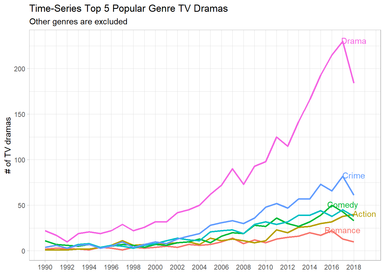
It looks like Drama was the most popular genre all the time, and Romance the least popular, although there were some crossings with other genres in the time interval shown on the plot above.
Genres and Ratings
tv_pivot %>%
  group_by(genre_type) %>%
  summarize(avg_rating = mean(av_rating),
         sd_rating = sd(av_rating)) %>%
  mutate(conf.low = avg_rating - 1.96 * sd_rating,
         conf.high = avg_rating + 1.96 * sd_rating) %>%
  mutate(
    genre_type = fct_reorder(genre_type, avg_rating)
  ) %>%
  ggplot(aes(avg_rating, genre_type)) +
  geom_point() +
  geom_errorbar(aes(xmin = conf.low,
                xmax = conf.high)) +
  theme(
    axis.title = element_text(size = 13),
    axis.text = element_text(size = 12)
  ) +
  labs(x = "average rating",
       y = NULL,
       title = "Average Rating along with Genres",
       subtitle = "95% CIs are included")
War genre type had the highest average rating, followed by Sport and History. It seems like Reality-TV shows enjoyed the least rating among all genre types.
Checking if title and titleId are one-to-one mapping
tv_raw %>%
  select(title, titleId) %>%
  distinct() %>%
  count(title, titleId, sort = T)
## # A tibble: 876 x 3
## title titleId n
## <chr> <chr> <int>
## 1 11.22.63 tt2879552 1
## 2 12 Monkeys tt3148266 1
## 3 13 Reasons Why tt1837492 1
## 4 24 tt0285331 1
## 5 24: Legacy tt5345490 1
## 6 24: Live Another Day tt1598754 1
## 7 666 Park Avenue tt2197797 1
## 8 7th Heaven tt0115083 1
## 9 8 Simple Rules tt0312081 1
## 10 9-1-1 tt7235466 1
## # ... with 866 more rowsIt turns out that both columns match to each other perfectly, which means we can use either column for our analysis.
Ratings of TV shows having more than 10 seasons
beyond_10_seasons <- tv_raw %>%
  count(title, sort = T) %>%
  filter(n > 10) %>%
  select(title) %>%
  pull()

tv_raw %>%
  filter(title %in% beyond_10_seasons) %>%
  group_by(title) %>%
  ggplot(aes(date, av_rating, color = title)) +
  geom_line(size = 2, show.legend = F) +
  facet_wrap(~title, scales = "free_x") +
  theme(
    axis.text.x = element_text(angle = 90),
    strip.text = element_text(size = 13, face = "bold", color = "Black"),
    axis.title = element_text(size = 13),
    axis.text = element_text(size = 10),
    plot.title = element_text(size = 16)
  ) +
  expand_limits(y = 0) +
  labs(x = NULL,
       y = "Rating",
       title = "Ratings of TV Dramas Having More Than 10 Seasons")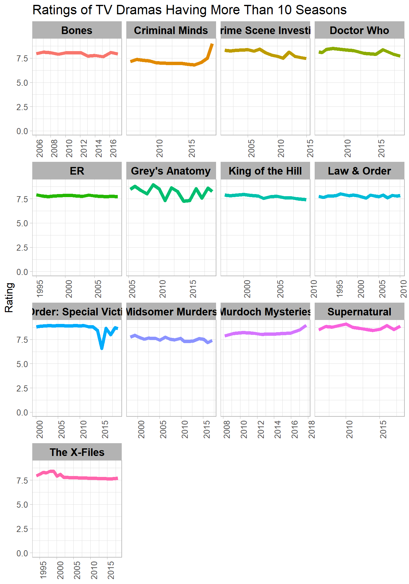
Overall Yearly Mean and Median Rating with minimum and maximum values
tv_raw %>%
  group_by(year) %>%
  summarize(median_rating = median(av_rating),
            mean_rating = mean(av_rating),
            max_rating = max(av_rating),
            min_rating = min(av_rating)) %>%
  ggplot(aes(x = year)) +
  geom_line(aes(y = median_rating, color = "median"), size = 2) +
  geom_line(aes(y = mean_rating, color = "mean"), size = 2) +
  geom_ribbon(aes(ymin = min_rating,
                  ymax = max_rating),
              alpha = 0.5,
              fill = "lightblue") +
  scale_x_continuous(breaks = seq(1990, 2018, by = 2)) +
  labs(x = NULL,
       y = "AV rating",
       title = "Yearly Mean and Median Rating",
       subtitle = "Yearly minimum and maximum ratings are covered by ribbon") +
  expand_limits(y = 0)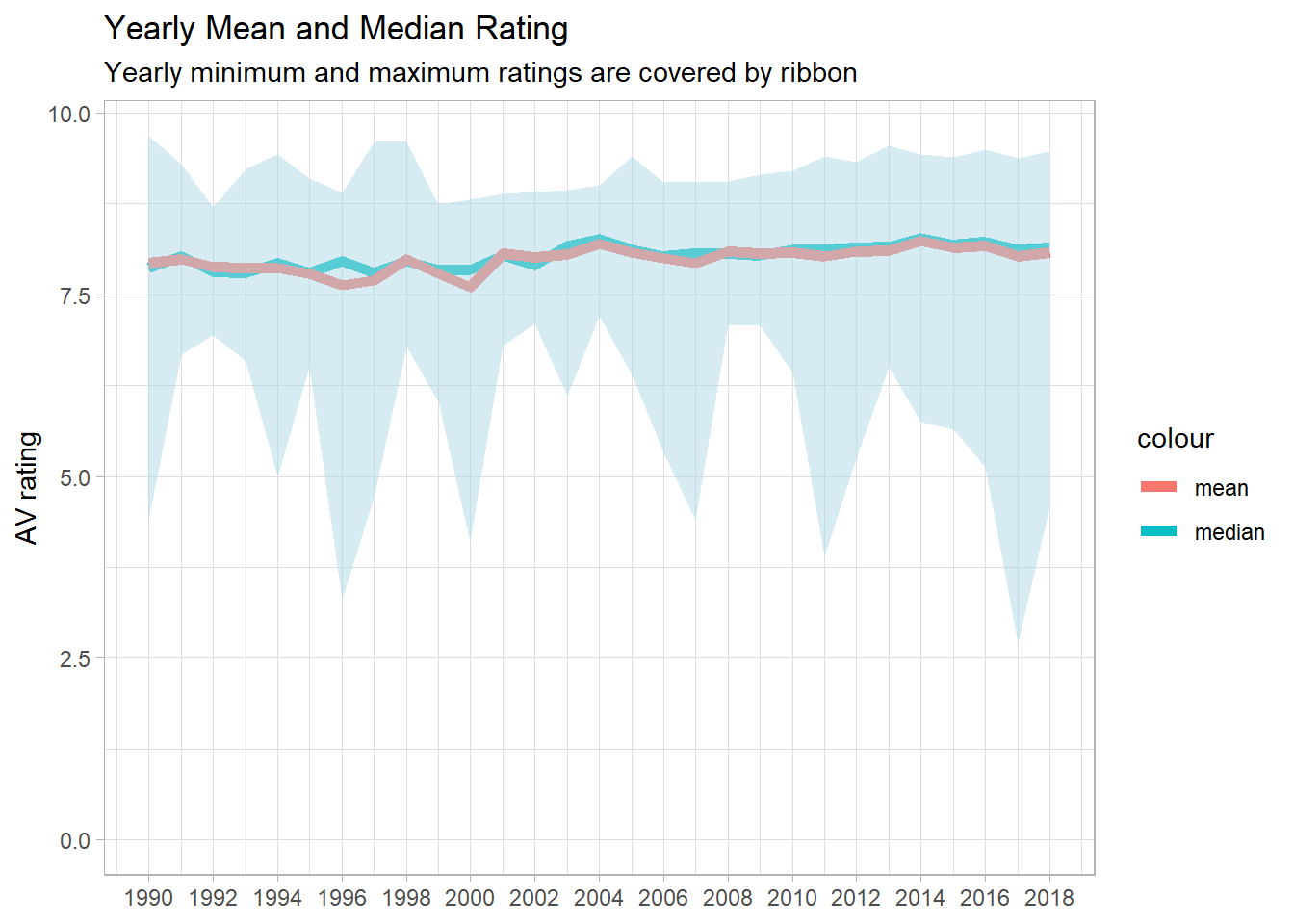
Genre-wise Overall Yearly Mean and Median Rating with minimum and maximum values
tv_pivot %>%
  group_by(year, genre_type) %>%
  summarize(median_rating = median(av_rating),
            mean_rating = mean(av_rating),
            max_rating = max(av_rating),
            min_rating = min(av_rating)) %>%
  ggplot(aes(x = year)) +
  geom_line(aes(y = median_rating, color = "median"), size = 2) +
  geom_line(aes(y = mean_rating, color = "mean"), size = 2) +
  geom_ribbon(aes(ymin = min_rating,
                  ymax = max_rating),
              alpha = 0.5,
              fill = "lightblue") +
  scale_x_continuous(breaks = seq(1990, 2018, by = 5)) +
  labs(x = NULL,
       y = "AV rating",
       title = "Yearly Mean and Median Rating",
       subtitle = "Yearly minimum and maximum ratings are covered by ribbon") +
  facet_wrap(~genre_type, scales = "free_x") +
  theme(
    strip.text = element_text(size = 12, face = "bold"),
    axis.text.x = element_text(angle = 90)
  ) +
  expand_limits(y = 0)
Drama, Action, Crime and Comedy had great fluctuations, and other genres were rather stable.
Show survival
The following chunks of code are largely adopted and inspired from David Robinson’s code with slight modifications, which has given me a great opportunity to learn a number of tricks of processing data.
first_three_seasons <- tv_raw %>%
  filter(seasonNumber <= 3) %>%
  group_by(title) %>%
  mutate(first_season_date = min(date)) %>%
  ungroup() %>%
  transmute(titleId,
            title,
            first_season_date,
            seasonNumber = paste0("season", seasonNumber),
            av_rating) %>%
  distinct(title, seasonNumber, .keep_all = TRUE) %>%
  pivot_wider(names_from = seasonNumber, values_from = av_rating)%>%
  filter(first_season_date <= "2017-01-01",
         !is.na(season1))
When I use pivot_wider() without having distinct() function above the line, it gives a strange warning and the wider format of data does not look right. The reason is that title and seasonNumber have duplicate rows, causing pivot_wider() not to function properly.
first_three_seasons %>%
  group_by(season_bins = cut(season1, c(0, 7, 7.5, 8, 8.5, 10)),
           year_bins = ifelse(first_season_date < "2000-01-01", "before 2000", "after 2000")) %>%
  summarize(had_second_season = mean(!is.na(season2)),
            observations = n()) %>%
  ggplot(aes(season_bins,
             had_second_season,
             color = year_bins,
             group = year_bins)) +
  geom_line(size = 1) +
  geom_point() +
  labs(x = "first season av rating",
       y = "average percentage of getting the second season",
       title = "First Season Rating Bins & Chance of Getting the Second Season",
       color = NULL)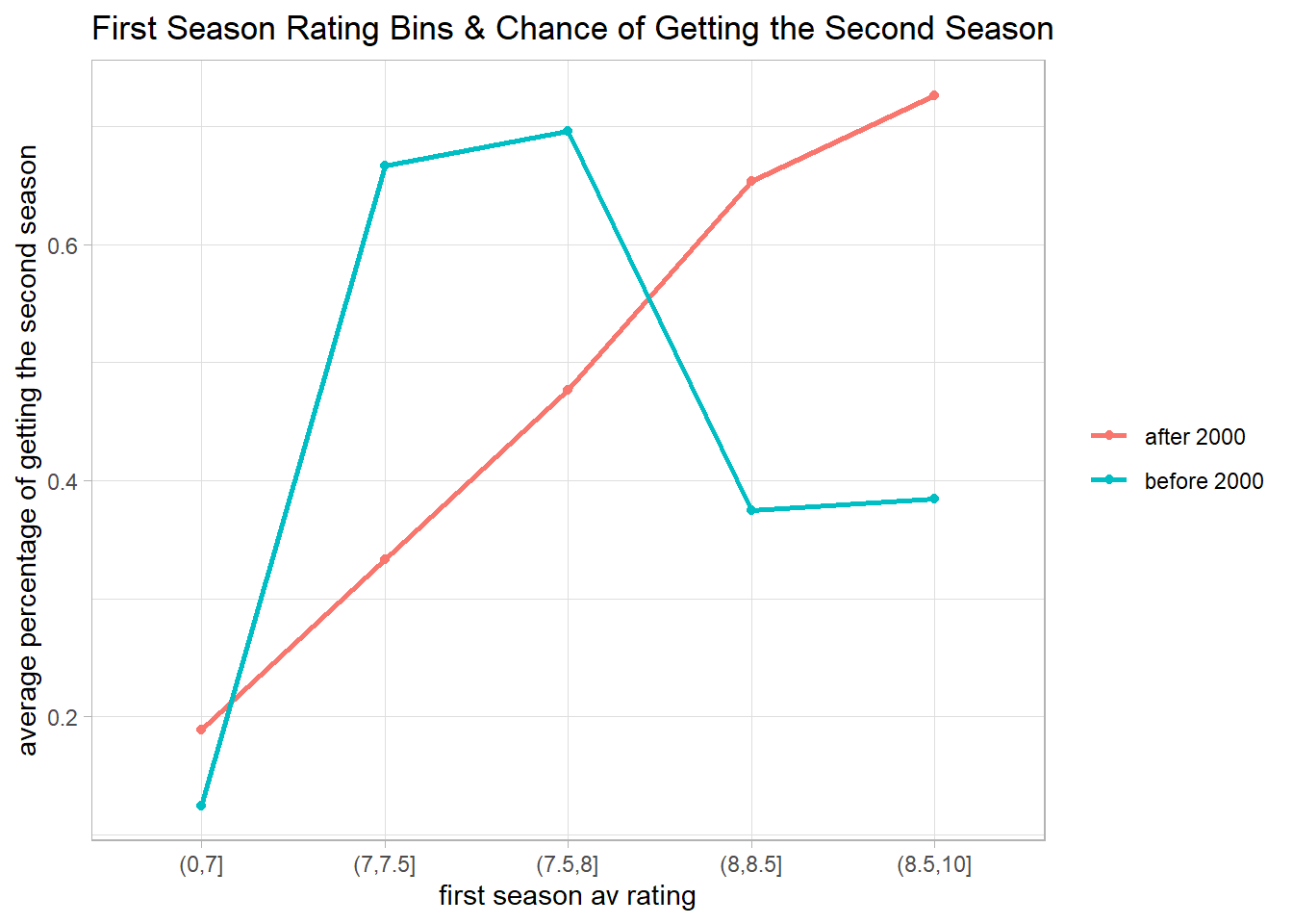
glm(!is.na(season2) ~ season1, data = first_three_seasons, family = "binomial") %>%
  tidy()
## # A tibble: 2 x 5
## term estimate std.error statistic p.value
## <chr> <dbl> <dbl> <dbl> <dbl>
## 1 (Intercept) -7.54 1.16 -6.49 8.32e-11
## 2 season1 0.968 0.146 6.64 3.08e-11new_data <- crossing(
year = 1990:2018,
season1 = seq(6, 9)
)
mod <- first_three_seasons %>%
mutate(year = year(first_season_date),
had_second_season = !is.na(season2)) %>%
glm(had_second_season ~ season1 * year, data = ., family = "binomial")
mod %>%
augment(newdata = new_data, type.predict = "response") %>%
ggplot(aes(year, .fitted, color = factor(season1))) +
geom_line(size = 2) +
scale_y_continuous(labels = percent) +
labs(color = "av rating for the first season",
x = NULL,
y = "chance of getting the second season",
title = "Yearly Chance of Getting the Second Season of Show Based on the First Season Rating")
From the code above, this blog post provides a great opportunity to use functions such as cut(), crossing(), and augment() in conjunction with ggplot(). When visualizing data, it is consequential to keep the techniques in mind as I encounter the analogous situations in the future.