U.S. Incarceration Data Visualization Analysis with Functional Programming
Mon, Sep 27, 2021
4-minute read
The datasets of this blog posts are from TidyTuesday about prison and pretrial in the U.S. in the last several decades.
library(tidyverse)
library(patchwork)
library(scales)
library(tidytext)
library(geofacet)
theme_set(theme_light())
Prison Summary
First off, let’s analyze the overall prison summary.
prison_summary <- read_csv("https://raw.githubusercontent.com/rfordatascience/tidytuesday/master/data/2019/2019-01-22/prison_summary.csv")

prison_summary
## # A tibble: 1,000 x 4
## year urbanicity pop_category rate_per_100000
## <dbl> <chr> <chr> <dbl>
## 1 1983 rural Black 1117.
## 2 1983 rural Female 22.8
## 3 1983 rural Male 574.
## 4 1983 rural Other 315.
## 5 1983 rural Total 248.
## 6 1983 rural White 155.
## 7 1983 small/mid Black 1138.
## 8 1983 small/mid Female 26.6
## 9 1983 small/mid Male 550.
## 10 1983 small/mid Other 87.5
## # ... with 990 more rowsTotal prison rate among different regions
p1 <- prison_summary %>%
  filter(pop_category == "Total") %>%
  ggplot(aes(year, rate_per_100000, color = urbanicity)) +
  geom_line() +
  geom_point() +
  facet_wrap(~urbanicity) +
  theme(
    legend.position = "none",
    strip.text = element_text(size = 15, face = "bold")
  ) +
  scale_x_continuous(breaks = seq(1970, 2020, by = 5)) +
  labs(y = "rate per 100,000",
       title = "Yearly Total Prison Rate Among Different Regions")
Prison rate among men and women
p2 <- prison_summary %>%
  filter(pop_category %in% c("Male", "Female")) %>%
  mutate(pop_category = fct_reorder(pop_category, -rate_per_100000, sum)) %>%
  ggplot(aes(year, rate_per_100000, color = pop_category)) +
  geom_line() +
  geom_point() +
  facet_wrap(~urbanicity) +
  theme(
    strip.text = element_text(size = 15, face = "bold")
  ) +
  scale_x_continuous(breaks = seq(1970, 2020, by = 10)) +
  labs(y = "rate per 100,000",
       title = "Yearly Gender Prison Rate Among Different Regions",
       color = NULL)
Prison rate from different races
p3 <- prison_summary %>%
  filter(pop_category %in% c("Asian", "Black", "Latino", "Native American", "White")) %>%
  ggplot(aes(year, rate_per_100000, color = urbanicity)) +
  geom_line() +
  geom_point() +
  facet_wrap(~pop_category) +
  theme(
    strip.text = element_text(size = 15, face = "bold")
  ) +
  scale_x_continuous(breaks = seq(1970, 2020, by = 10)) +
  labs(y = "rate per 100,000",
       title = "Yearly Prison Rate from Various Races Among Different Regions",
       color = NULL)
Now using patchwork to bind the three plot objects together
p1 / p2 / p3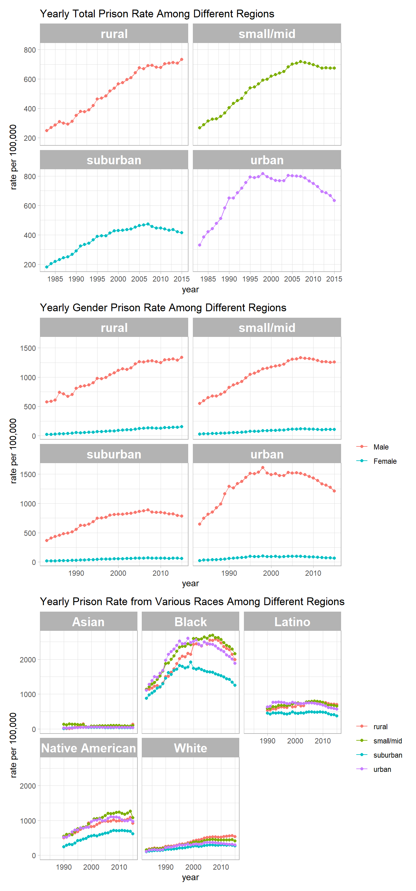
Prison Population
prison_pop <- read_csv("https://github.com/rfordatascience/tidytuesday/blob/master/data/2019/2019-01-22/prison_population.csv?raw=true")skimr::skim(prison_pop)| Name | prison_pop |
| Number of rows | 1327797 |
| Number of columns | 9 |
| _______________________ | |
| Column type frequency: | |
| character | 6 |
| numeric | 3 |
| ________________________ | |
| Group variables | None |
Variable type: character
| skim_variable | n_missing | complete_rate | min | max | empty | n_unique | whitespace |
|---|---|---|---|---|---|---|---|
| state | 0 | 1 | 2 | 2 | 0 | 51 | 0 |
| county_name | 0 | 1 | 10 | 33 | 0 | 1876 | 0 |
| urbanicity | 0 | 1 | 5 | 9 | 0 | 4 | 0 |
| region | 0 | 1 | 4 | 9 | 0 | 4 | 0 |
| division | 0 | 1 | 7 | 18 | 0 | 9 | 0 |
| pop_category | 0 | 1 | 4 | 15 | 0 | 9 | 0 |
Variable type: numeric
| skim_variable | n_missing | complete_rate | mean | sd | p0 | p25 | p50 | p75 | p100 | hist |
|---|---|---|---|---|---|---|---|---|---|---|
| year | 0 | 1.00 | 1993.00 | 13.56 | 1970 | 1981 | 1993 | 2005 | 2016 | ▇▇▇▇▇ |
| population | 273093 | 0.79 | 23079.75 | 107980.43 | 0 | 204 | 3527 | 13279 | 6974673 | ▇▁▁▁▁ |
| prison_population | 751787 | 0.43 | 141.56 | 936.79 | 0 | 0 | 6 | 59 | 58091 | ▇▁▁▁▁ |
Prison population percentage in each decade in every state
Functional programming is used to genreate line plots in each state in every population cateogry presented in the dataset.
prison_pop_map <- function(metric){
  prison_pop %>%
  filter(pop_category == metric) %>%
  group_by(state, year) %>%
  mutate(state_pop_year = sum(population),
         prison_pop_year = sum(prison_population, na.rm = TRUE)) %>%
  ungroup() %>%
  filter(prison_pop_year > 0) %>%
  mutate(prison_percentage = prison_pop_year/state_pop_year) %>%
  ggplot(aes(year, prison_percentage, color = state)) +
  geom_line(size = 1, show.legend = F) +
  facet_geo(~state) +
  scale_y_continuous(labels = percent) +
  labs(y = "yearly prison population percentage",
       title = paste("State-wise Prison Population Percentage among", metric),
       subtitle = "Missing values are prevalent in the dataset. A state without any line does not indicate it does not have any prisoner but rather due to missing values")

}

map(unique(prison_pop$pop_category), prison_pop_map)
## [[1]]
##
## [[2]]
##
## [[3]]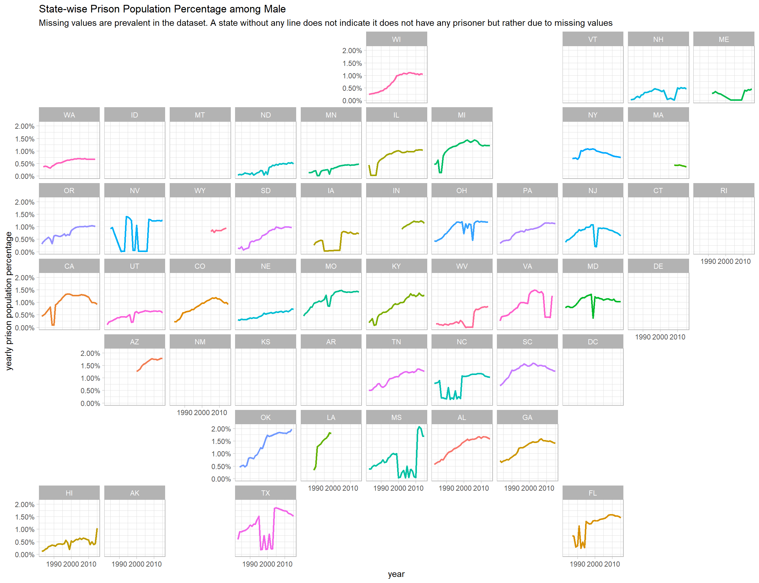
##
## [[4]]
##
## [[5]]
##
## [[6]]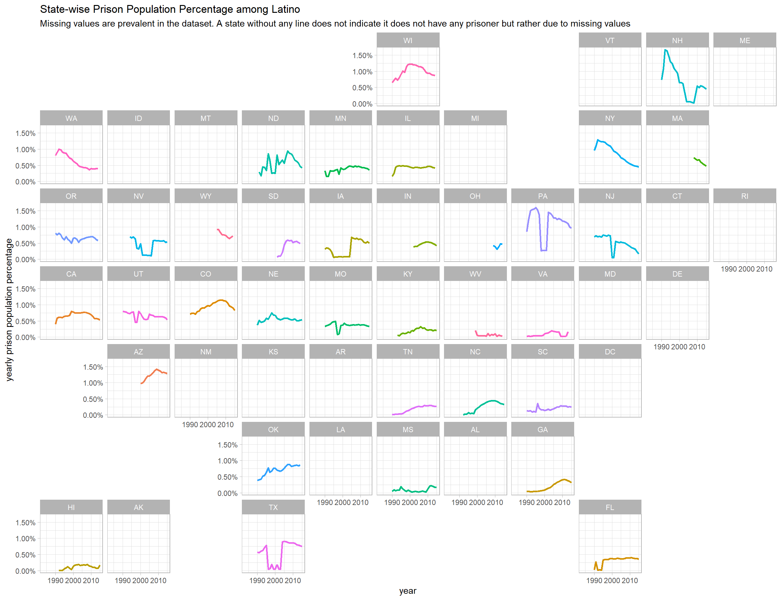
##
## [[7]]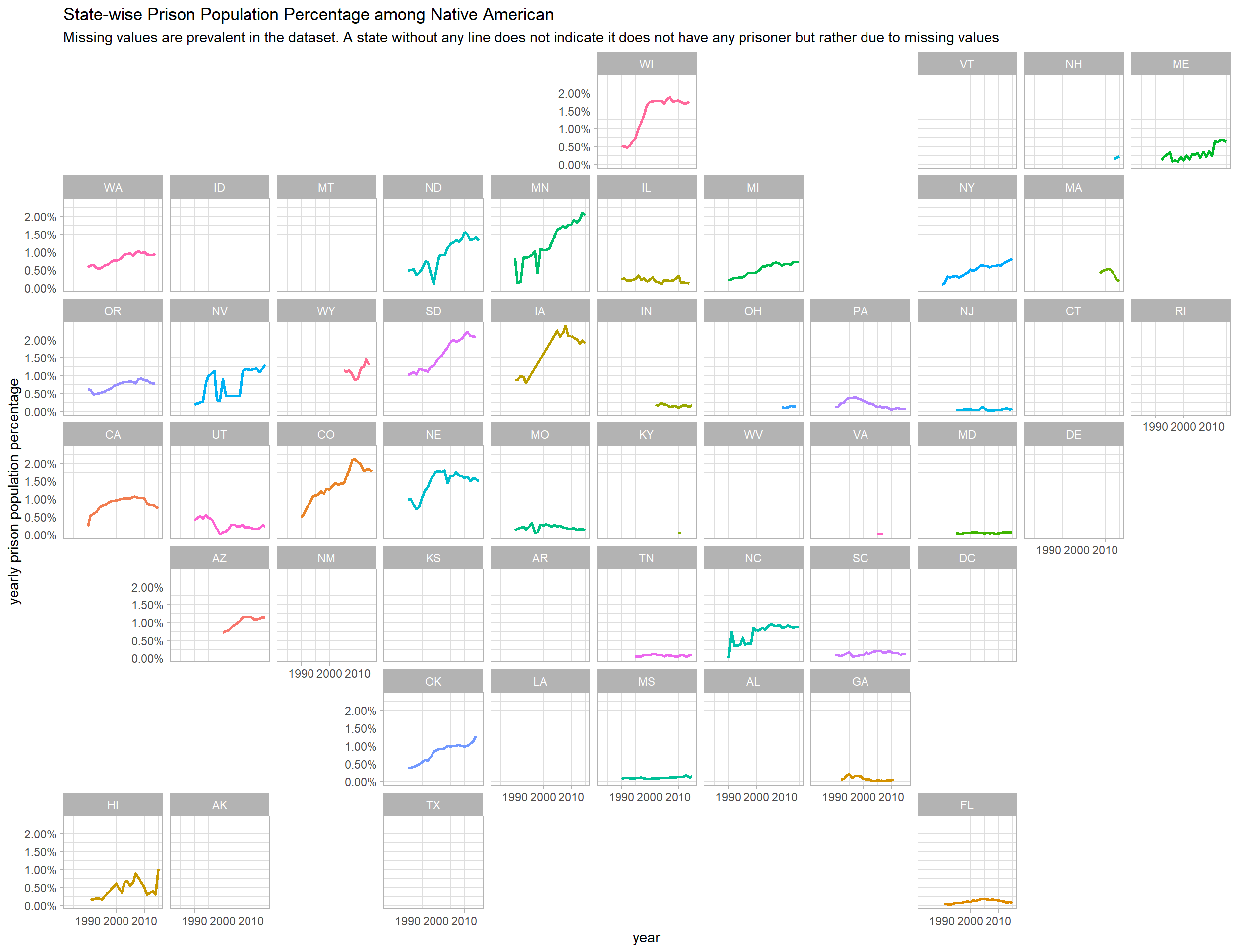
##
## [[8]]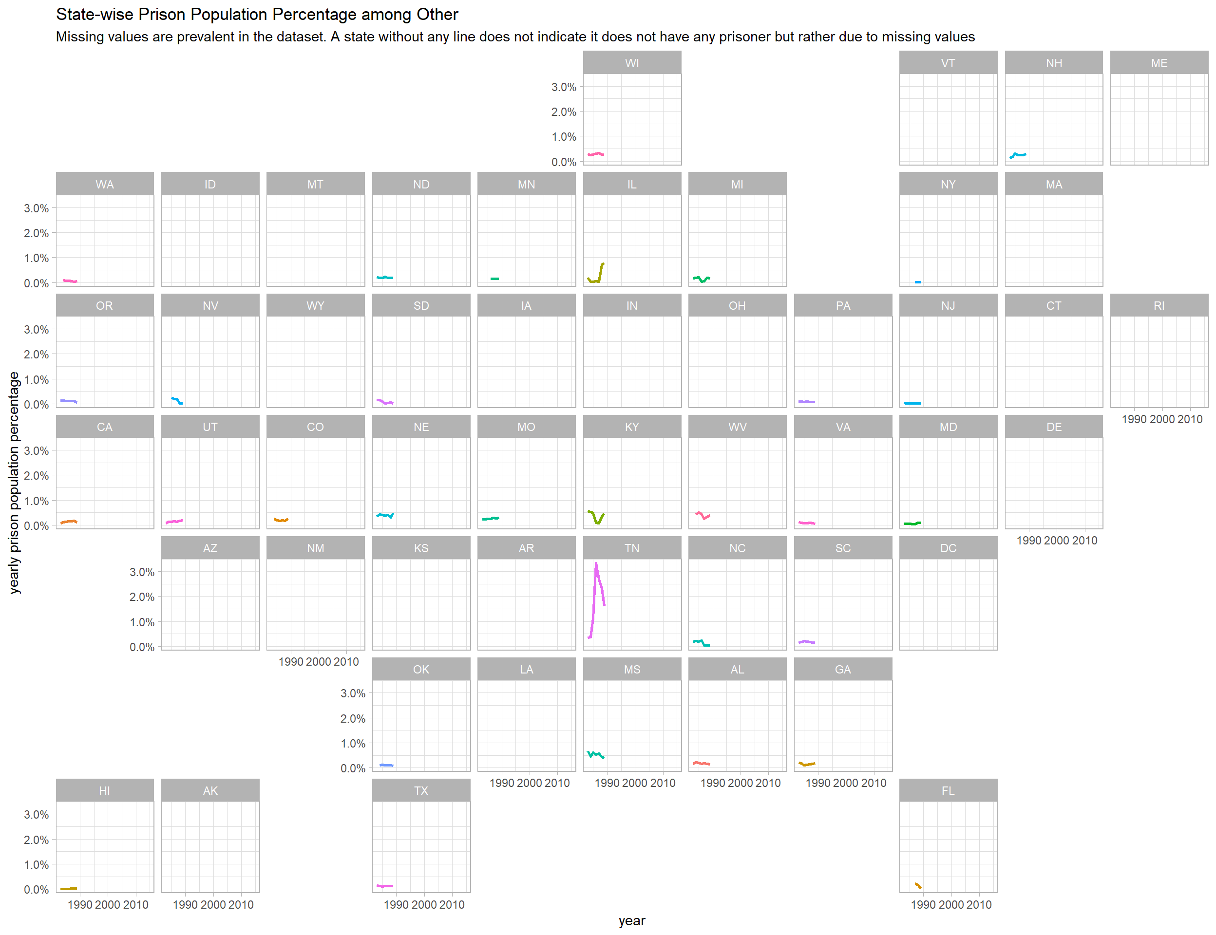
##
## [[9]]
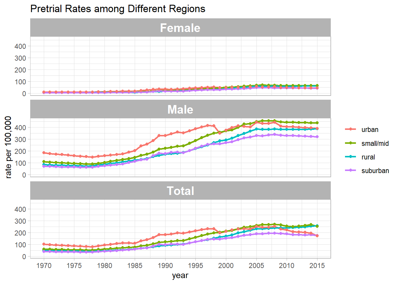
Pretrial Summary
pre_summary <- read_csv("https://raw.githubusercontent.com/rfordatascience/tidytuesday/master/data/2019/2019-01-22/pretrial_summary.csv")


pre_summary %>%
  mutate(urbanicity = fct_reorder(urbanicity, -rate_per_100000, sum)) %>%
  ggplot(aes(year, rate_per_100000, color = urbanicity)) +
  geom_line(size = 1) +
  geom_point() +
  facet_wrap(~pop_category, ncol = 1) +
  labs(y = "rate per 100,000",
       color = NULL,
       title = "Pretrial Rates among Different Regions") +
  scale_x_continuous(breaks = seq(1970, 2020, 5)) +
  theme(
    strip.text = element_text(size = 15, face = "bold")
  )
Pretrial Population
pre_pop <- read_csv("https://github.com/rfordatascience/tidytuesday/blob/master/data/2019/2019-01-22/pretrial_population.csv?raw=true")
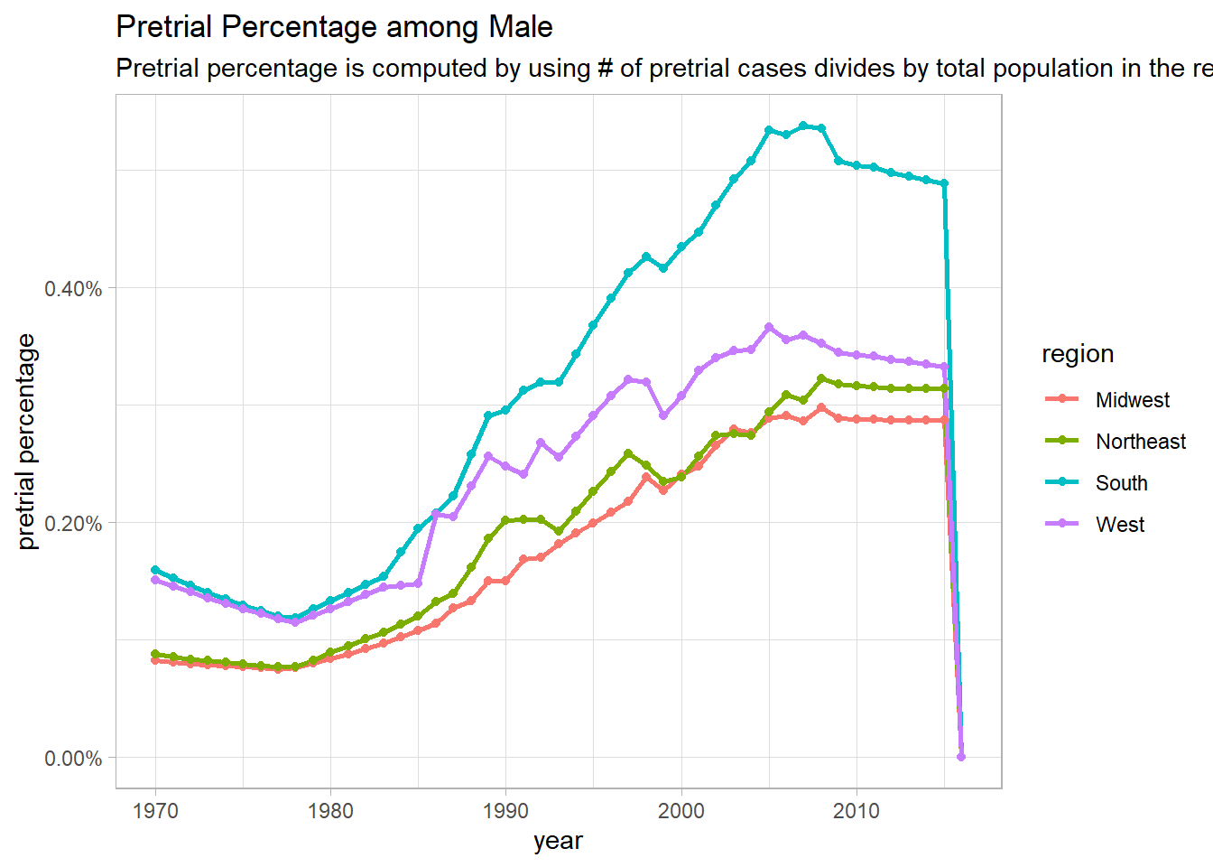
pre_pop_func <- function(category_metric){
pre_pop %>%
filter(pop_category == category_metric) %>%
group_by(year, region) %>%
summarize(pop = sum(population, na.rm = T),
pre_pop = sum(pretrial_population, na.rm = T)) %>%
ungroup() %>%
mutate(pre_percentage = pre_pop/pop) %>%
ggplot(aes(year, pre_percentage, color = region)) +
geom_line(size = 1) +
geom_point() +
scale_y_continuous(labels = percent) +
labs(y = "pretrial percentage",
title = paste("Pretrial Percentage among", category_metric),
subtitle = "Pretrial percentage is computed by using # of pretrial cases divides by total population in the region")
}
map(unique(pre_pop$pop_category)[1:3], pre_pop_func)## [[1]]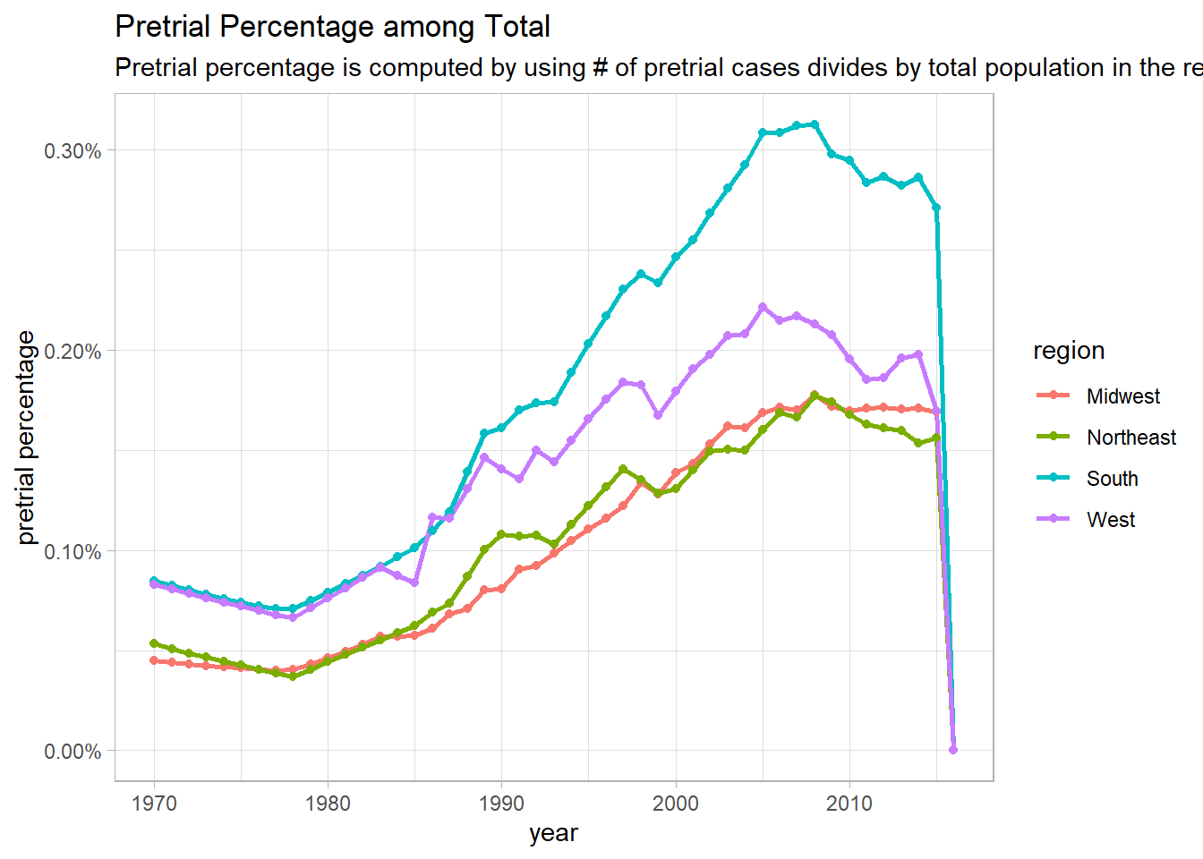
##
## [[2]]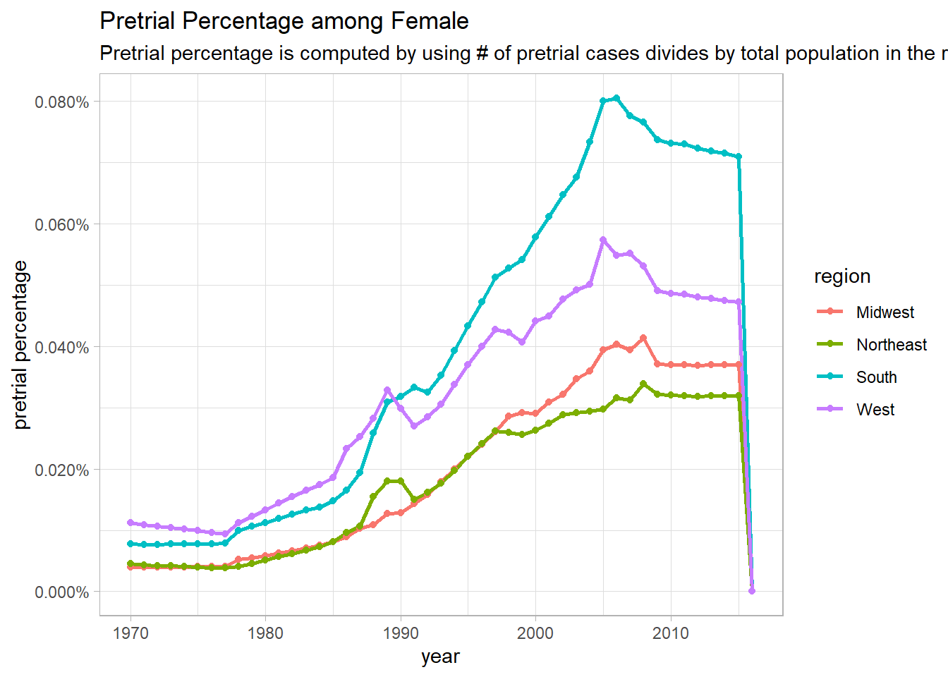
##
## [[3]]