French Train Data Processing & Visualization
Wed, Oct 6, 2021
4-minute read
The dataset of this blog post analyzes comes from TidyTuesday about train schedule delays in France across various stations.
Load the packages and the dataset.
library(tidyverse)
library(lubridate)
library(tidytext)
library(scales)
library(ggpmisc)
trains <- read_csv("https://raw.githubusercontent.com/rfordatascience/tidytuesday/master/data/2019/2019-02-26/full_trains.csv") %>%
mutate(departure_station = str_to_title(departure_station),
arrival_station = str_to_title(arrival_station),
date = make_date(year,month))
trains## # A tibble: 5,462 x 28
## year month service departure_station arrival_station journey_time_avg
## <dbl> <dbl> <chr> <chr> <chr> <dbl>
## 1 2017 9 National Paris Est Metz 85.1
## 2 2017 9 National Reims Paris Est 47.1
## 3 2017 9 National Paris Est Strasbourg 116.
## 4 2017 9 National Paris Lyon Avignon Tgv 161.
## 5 2017 9 National Paris Lyon Bellegarde (Ain) 164.
## 6 2017 9 National Paris Lyon Besancon Franche ~ 129.
## 7 2017 9 National Chambery Challes Le~ Paris Lyon 184.
## 8 2017 9 National Paris Lyon Grenoble 186.
## 9 2017 9 National Lyon Part Dieu Paris Lyon 121.
## 10 2017 9 National Paris Lyon Macon Loche 97.4
## # ... with 5,452 more rows, and 22 more variables: total_num_trips <dbl>,
## # num_of_canceled_trains <dbl>, comment_cancellations <lgl>,
## # num_late_at_departure <dbl>, avg_delay_late_at_departure <dbl>,
## # avg_delay_all_departing <dbl>, comment_delays_at_departure <lgl>,
## # num_arriving_late <dbl>, avg_delay_late_on_arrival <dbl>,
## # avg_delay_all_arriving <dbl>, comment_delays_on_arrival <chr>,
## # delay_cause_external_cause <dbl>, ...top_6_departure_delays <- trains %>%
group_by(departure_station) %>%
summarize(total_delay = sum(num_late_at_departure)) %>%
arrange(desc(total_delay)) %>%
select(departure_station) %>%
head(6) %>%
pull()
trains %>%
filter(departure_station %in% top_6_departure_delays) %>%
group_by(date, departure_station) %>%
summarize(total_delay = sum(num_late_at_departure)) %>%
ungroup() %>%
mutate(departure_station = fct_reorder(departure_station, -total_delay, sum)) %>%
ggplot(aes(date, total_delay, color = departure_station)) +
geom_line(size = 1) +
labs(x = NULL,
y = "Total # of delays",
color = "departure station",
title = "Top 6 Overall Departure Delay Stations")
trains %>%
  filter(departure_station %in% top_6_departure_delays) %>%
  group_by(date, departure_station) %>%
  summarize(avg_delay = mean(avg_delay_late_at_departure)) %>%
  ggplot(aes(date, avg_delay, color = departure_station)) +
  geom_line(size = 1) +
  geom_point() +
  geom_smooth(method = "lm", se = FALSE) +
  stat_poly_eq(aes(label = paste0("atop(", ..eq.label.., ",", ..rr.label.., ")")), parse = TRUE) +
  facet_wrap(~departure_station) +
  labs(x = NULL,
       y = "average delay (minutes)") +
  theme(legend.position = "none",
        axis.text.x = element_text(angle = 90),
        strip.text = element_text(size = 13, face = "bold"))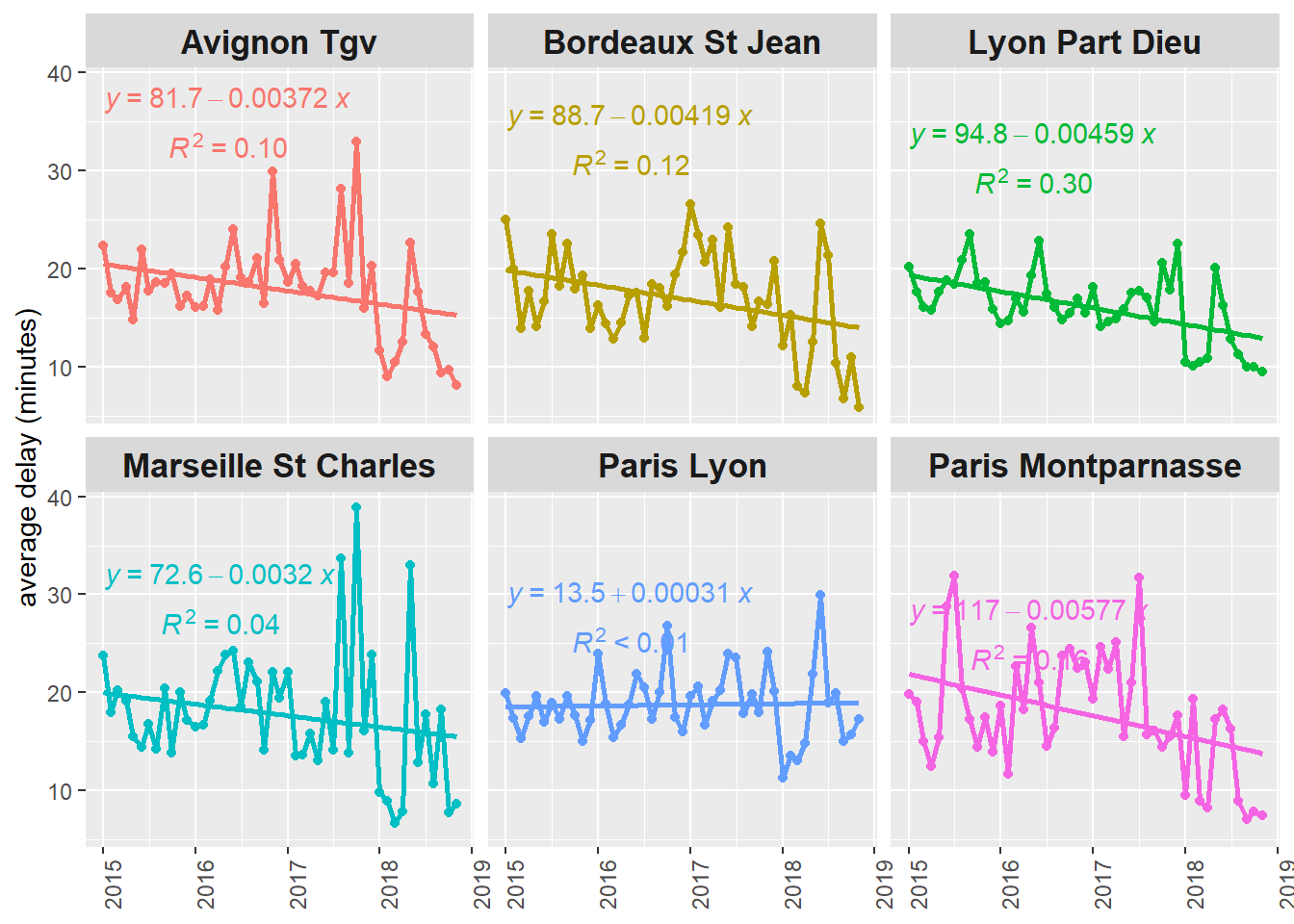
trains %>%
  group_by(date, arrival_station) %>%
  summarize(total_delay = sum(num_arriving_late)) %>%
  arrange(desc(total_delay)) %>%
  ungroup() %>%
  filter(!is.na(total_delay)) %>%
  complete(date, arrival_station, fill = list(n = 0)) %>%
  # mutate(arrival_station = fct_lump(arrival_station, n = 6, w = total_delay),
  #        arrival_station = fct_reorder(arrival_station, -total_delay, sum)) %>%
  #filter(arrival_station != "Other") %>%
  ggplot(aes(date, arrival_station, fill = total_delay)) +
  geom_tile() +
  labs(x = NULL,
       y = "arrival station",
       fill = "# of total delays",
       title = "Arrival Delay Stations on # of Delays (2015 - 2018)",
       subtitle = "Grey blocks indicate missingness due to various reasons") +
  #scale_fill_viridis_c() +
  scale_fill_gradient2(high = "red",
                       low = "blue",
                       mid = "white",
                       midpoint = 500) +
  scale_y_discrete(expand = c(0,0)) +
  scale_x_date(expand = c(0,0)) +
  theme(axis.title = element_text(size = 15),
        axis.text = element_text(size = 13),
        plot.title = element_text(size = 18),
        legend.title = element_text(size = 13),
        legend.text = element_text(size = 11))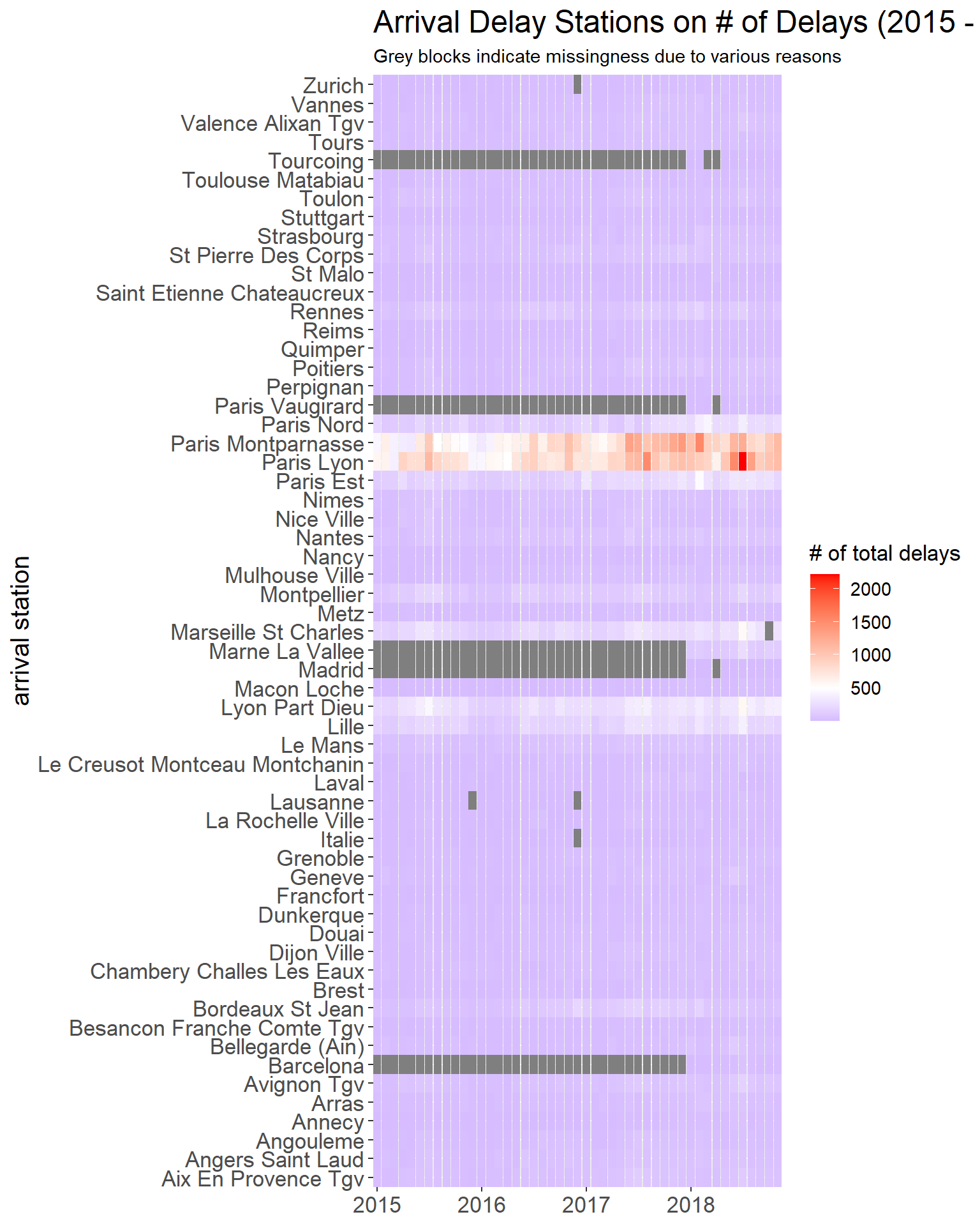
delay_cause_with_percentage <- trains %>%
  pivot_longer(cols = contains("delay_cause"), names_to = "delay_cause", values_to = "percentage") %>%
  mutate(delay_cause = str_remove(delay_cause, "delay_cause_"),
         delay_cause = str_replace(delay_cause, "_", " "),
         delay_cause = str_to_title(delay_cause))


num_month_cross <- tibble(month = c(1:12), month_abb = factor(month.abb, levels=month.abb))

delay_cause_with_percentage <- delay_cause_with_percentage %>%
  left_join(num_month_cross, by = "month")
Missing values always mess up with reorder_within(). Be mindful to check missingness if visualization goes awry once reordered.
delay_cause_with_percentage %>%
  filter(!is.na(percentage)) %>%
  mutate(delay_cause = reorder_within(delay_cause, by = percentage, within = month_abb, fun = median)) %>%
  ggplot(aes(x = percentage, y = delay_cause, fill = delay_cause)) +
  geom_boxplot(show.legend = F) +
  scale_y_reordered() +
  facet_wrap(~month_abb, scales = "free_y") +

  theme(
    strip.text = element_text(size = 13, face = "bold"),
    plot.title = element_text(size = 18)
  ) +
  scale_x_continuous(labels = percent) +
  labs(x = NULL,
       y = "delay cause",
       title = "Overall Delay Cause Per Month")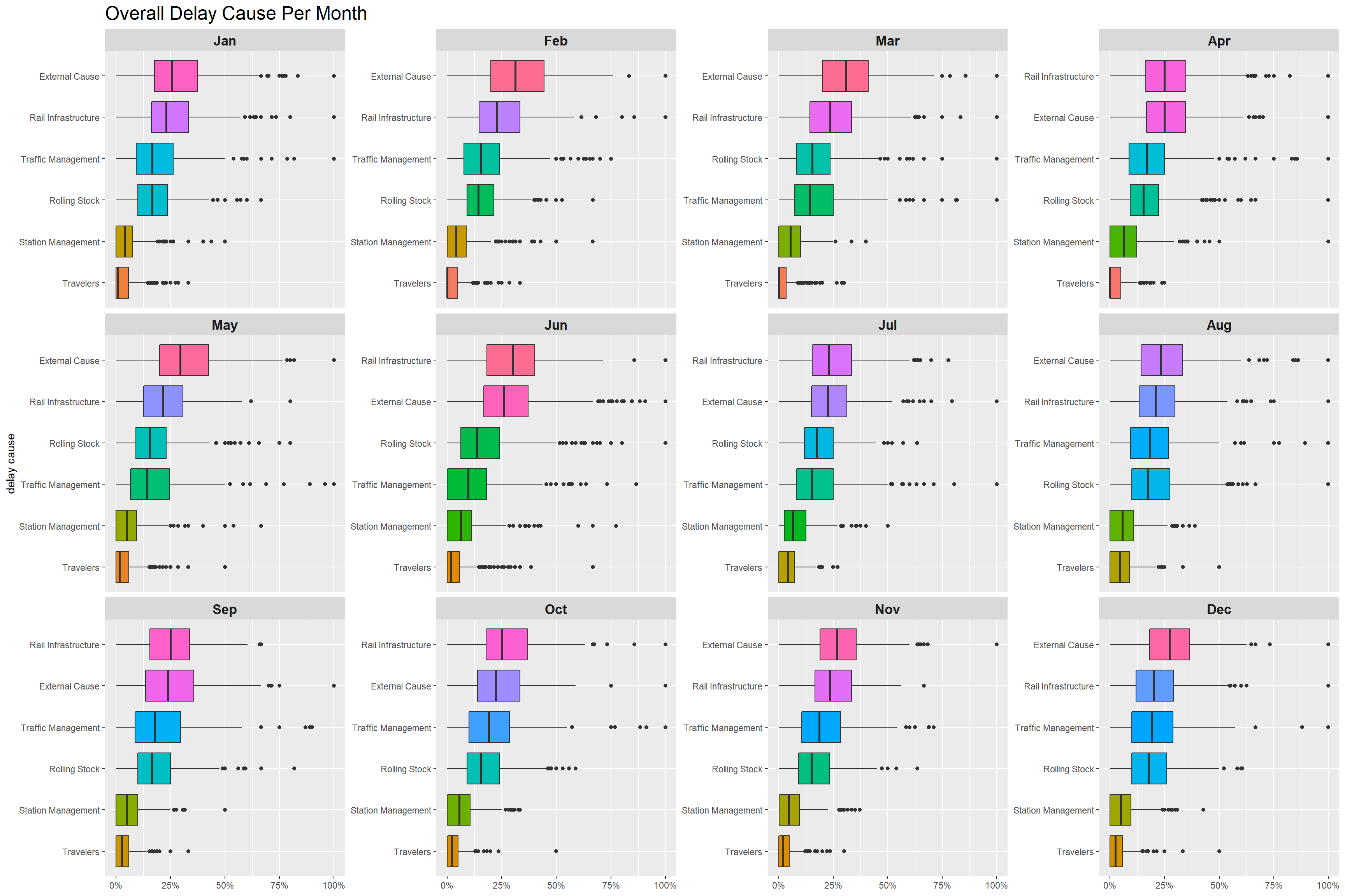
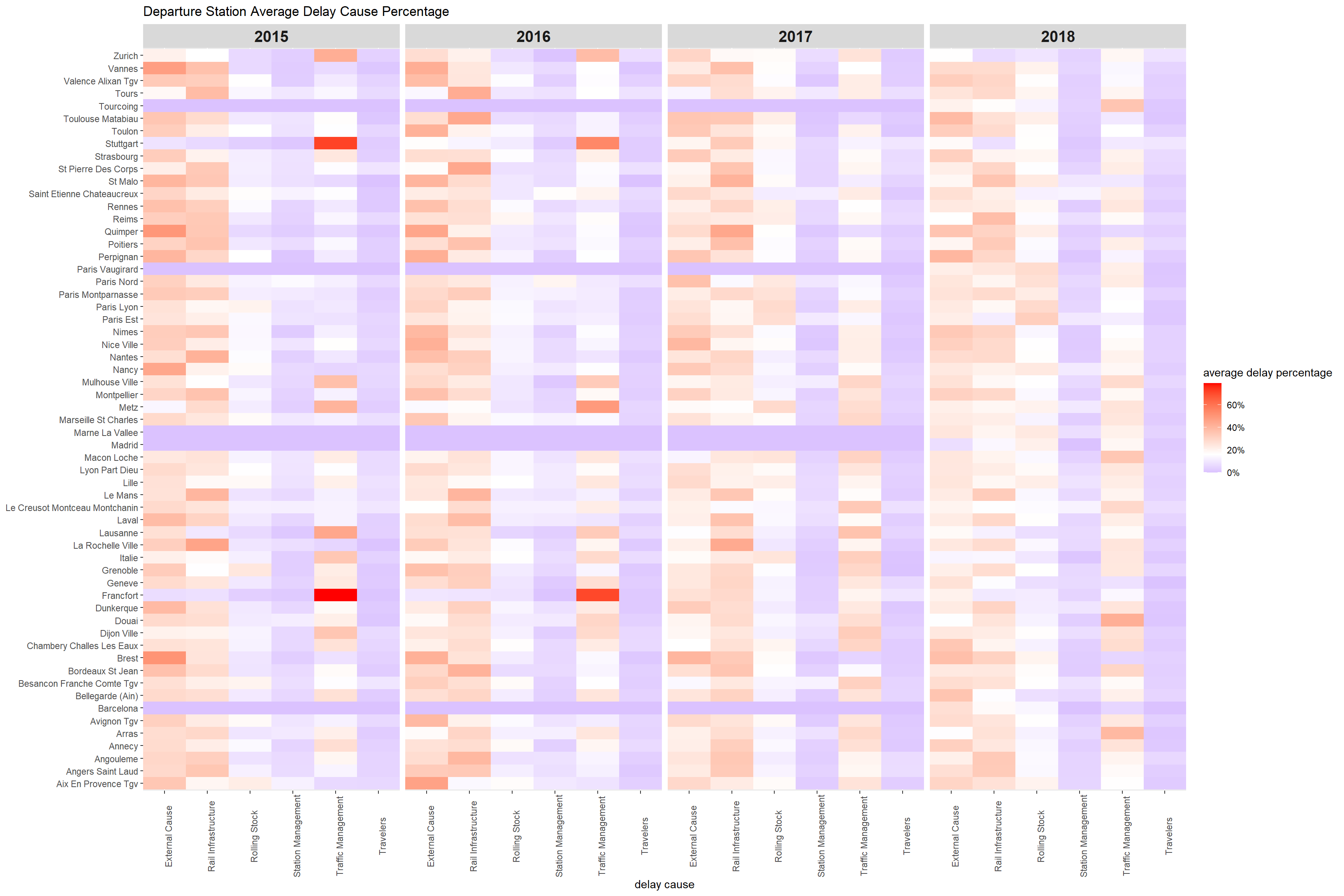
delay_cause_with_percentage %>%
  complete(year, nesting(departure_station, delay_cause), fill = list(percentage = 0)) %>%
  group_by(departure_station, year, delay_cause) %>%
  mutate(avg_delay_perc = mean(percentage, na.rm = T)) %>%
  #mutate(percentage = ifelse(percentage == 0, NA, percentage)) %>%
  ggplot(aes(delay_cause, departure_station, fill = avg_delay_perc)) +
  geom_tile() +
  theme(
    axis.text.x = element_text(angle = 90),
    strip.text = element_text(size = 15, face = "bold")
  ) +
  scale_fill_gradient2(low = "blue",
                       high = "red",
                       mid = "white",
                       midpoint = 0.162,
                       labels = percent) +
  scale_x_discrete(expand = c(0,0)) +
  labs(x = "delay cause",
       y = NULL,
       fill = "average delay percentage",
       title = "Departure Station Average Delay Cause Percentage") +
  facet_wrap(~year, nrow = 1)