Teacher-student Ratio and WDI Package Exploration
Thu, Oct 28, 2021
3-minute read
The dataset is from TidyTuesday about teacher-student ratio in each country. Also, this is a great opportunity to harness the package WDI for GDP, population and other key pieces of information about each country.
library(tidyverse)
library(tidytext)
library(scales)
library(WDI)
theme_set(theme_bw())
ratio <- read_csv("https://raw.githubusercontent.com/rfordatascience/tidytuesday/master/data/2019/2019-05-07/student_teacher_ratio.csv")
ratio## # A tibble: 5,189 x 8
## edulit_ind indicator country_code country year student_ratio flag_codes
## <chr> <chr> <chr> <chr> <dbl> <dbl> <chr>
## 1 PTRHC_2 Lower Seco~ MRT Mauritania 2013 56.6 <NA>
## 2 PTRHC_2 Lower Seco~ MRT Mauritania 2014 51.9 <NA>
## 3 PTRHC_2 Lower Seco~ MRT Mauritania 2015 53.2 <NA>
## 4 PTRHC_2 Lower Seco~ MRT Mauritania 2016 38.2 <NA>
## 5 PTRHC_1 Primary Ed~ COD Democrati~ 2012 34.7 <NA>
## 6 PTRHC_1 Primary Ed~ COD Democrati~ 2013 37.1 <NA>
## 7 PTRHC_1 Primary Ed~ COD Democrati~ 2014 35.3 <NA>
## 8 PTRHC_1 Primary Ed~ COD Democrati~ 2015 33.2 <NA>
## 9 PTRHC_3 Upper Seco~ SYR Syrian Ar~ 2013 8.47 <NA>
## 10 PTRHC_02 Pre-Primar~ GNQ Equatoria~ 2012 17.5 <NA>
## # ... with 5,179 more rows, and 1 more variable: flags <chr>Top 10 countries with highest and lowest teacher-student ratio
ratio %>%
  filter(!is.na(student_ratio)) %>%
  group_by(year) %>%
  arrange(desc(student_ratio)) %>%
  slice(c(1:10, seq(n() - 10, n()))) %>%
  ungroup() %>%
  mutate(country = reorder_within(country, student_ratio, year)) %>%
  ggplot(aes(student_ratio, country, fill = indicator)) +
  geom_col() +
  facet_wrap(~year, scales = "free_y") +
  scale_y_reordered() +
  scale_x_continuous(labels = percent_format(scale = 1)) +
  labs(x = "teacher student ratio",
       y = NULL,
       title = "Top 10 Countries with Highest and Lowest Teacher-Student Ratio") +
  theme(strip.text = element_text(size = 15, face = "bold"),
        axis.title = element_text(size = 14),
        axis.text = element_text(size = 11),
        plot.title = element_text(size = 18))
The WDI Package Exploration
WDIsearch() and WDI() are two functions. One is to search the right term, and the other one is to find the corresponding data.
# WDIsearch("public.*education") %>%
#   as_tibble() %>%
#   arrange(str_length(name)) %>%
#   View()
#
# WDI(indicator = c('SE.XPD.TOTL.GD.ZS'), start = 2016, end = 2016, extra = T)
joined_2016 <- WDI(indicator = c('SP.POP.TOTL', 'NY.GDP.PCAP.KD', 'SE.ADT.LITR.ZS', 'SE.XPD.TOTL.GD.ZS'),
start = 2016, end = 2016, extra = T) %>%
as_tibble() %>%
rename(country_code = "iso3c") %>%
select(country_code, NY.GDP.PCAP.KD, SP.POP.TOTL, SE.ADT.LITR.ZS, SE.XPD.TOTL.GD.ZS) %>%
inner_join(ratio %>% filter(year == 2016), by = "country_code")joined_2016 %>%
ggplot(aes(student_ratio, NY.GDP.PCAP.KD, color = country)) +
geom_point() +
geom_text(aes(label = country), vjust = 1, hjust = 1, check_overlap = T) +
facet_wrap(~indicator) +
scale_y_log10() +
scale_x_log10(label = percent_format(scale = 1)) +
theme(
legend.position = "none",
strip.text = element_text(size = 13, face = "bold"),
plot.title = element_text(size = 18)
) +
labs(x = "teacher-student ratio",
y = "GDP per capita",
title = "Various Education Level Teacher-Student Ratio and GDP Per Capita")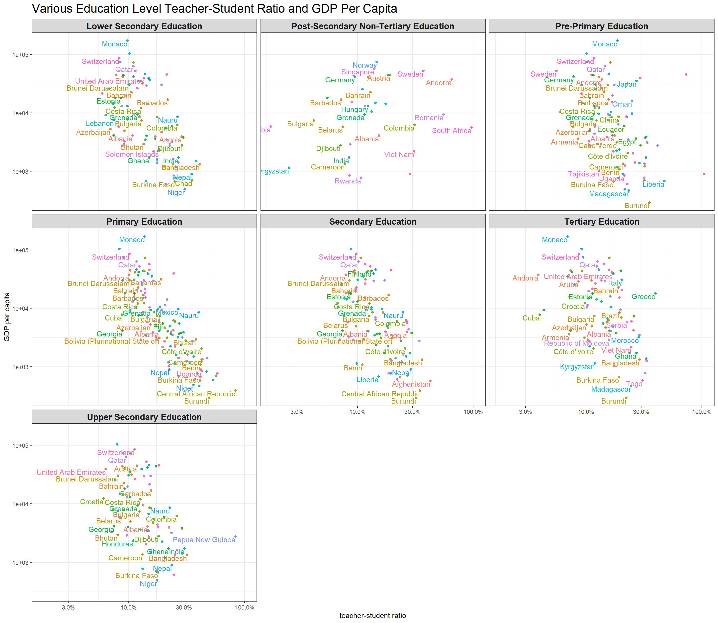
Not surprisingly, there is a negative correlation between teacher-student ratio and GDP per capita. That is to say, affluent countries tend to have smaller teacher-student ratio.
joined_2016 %>%
  ggplot(aes(student_ratio, SP.POP.TOTL, color = country)) +
  geom_point() +
  geom_text(aes(label = country), vjust = 1, hjust = 1, check_overlap = T) +
  facet_wrap(~indicator) +
  scale_y_log10() +
  scale_x_log10(label = percent_format(scale = 1)) +
  theme(
    legend.position = "none",
    strip.text = element_text(size = 13, face = "bold"),
    plot.title = element_text(size = 18)
  ) +
  labs(x = "teacher-student ratio",
       y = "population total",
       title = "Various Education Level Teacher-Student Ratio and Total Population")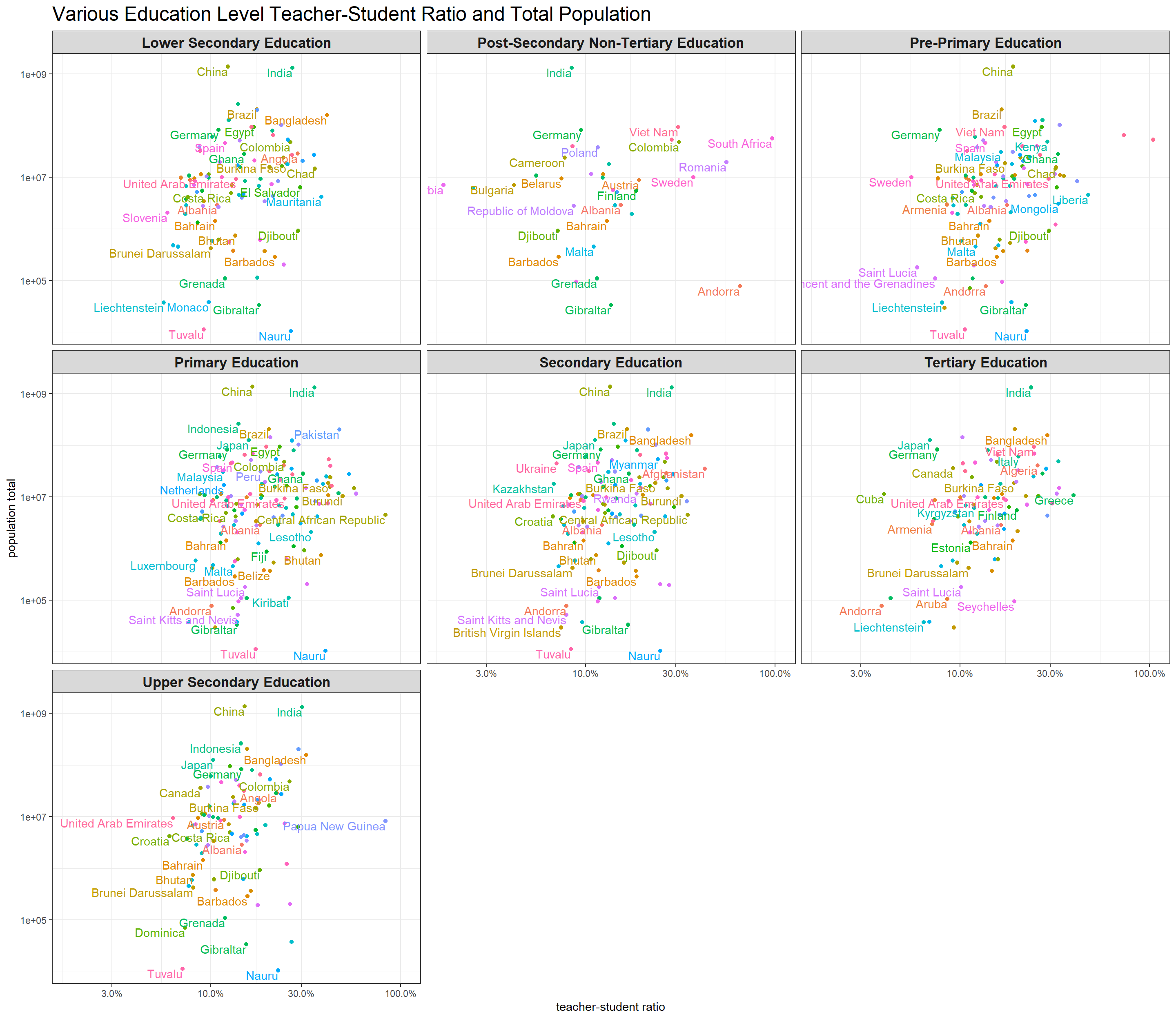
There is a positive trend between total population and teacher-student ratio.
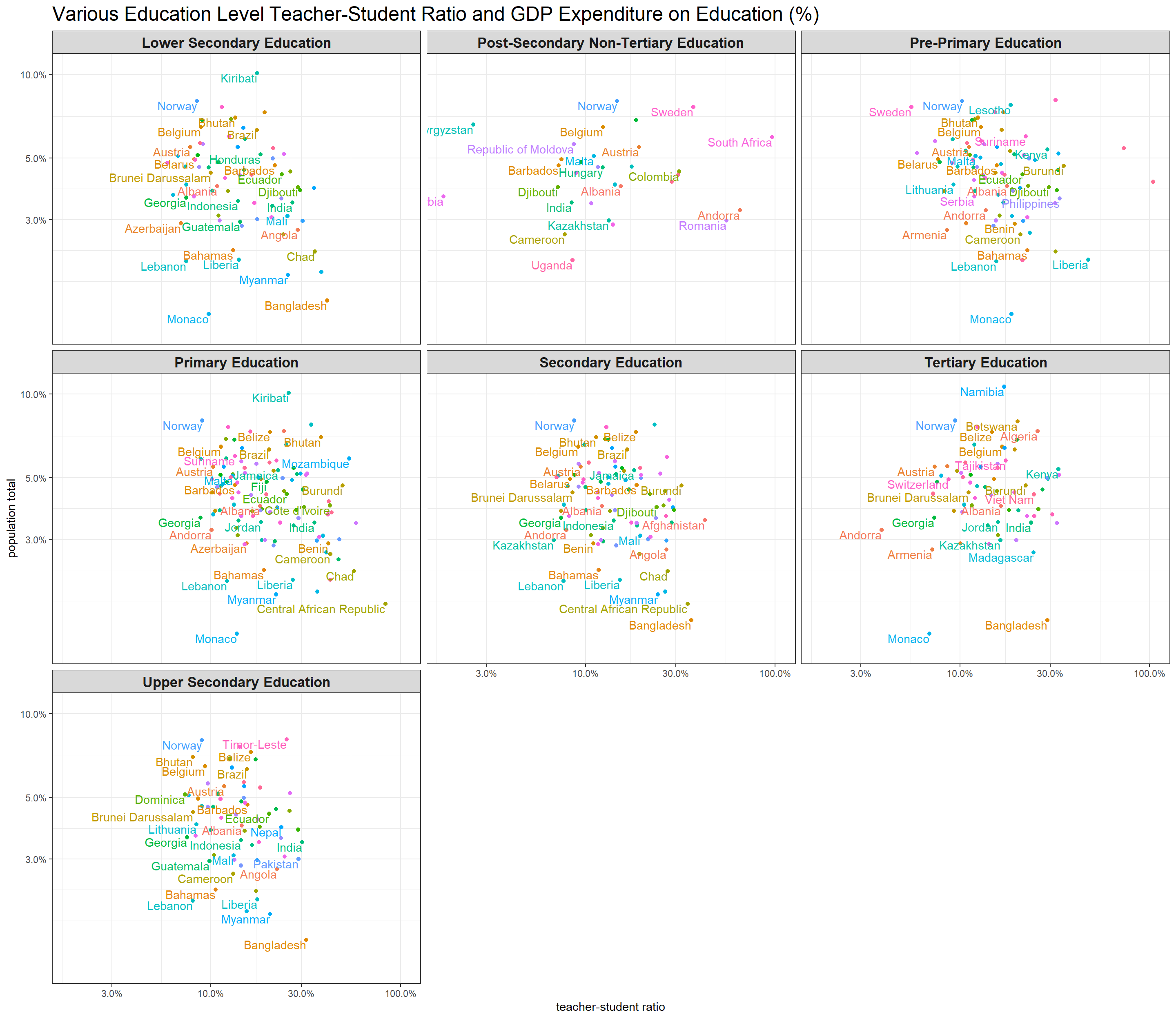
joined_2016 %>%
  ggplot(aes(student_ratio, SE.XPD.TOTL.GD.ZS, color = country)) +
  geom_point() +
  geom_text(aes(label = country), vjust = 1, hjust = 1, check_overlap = T) +
  facet_wrap(~indicator) +
  scale_y_log10(label = percent_format(scale = 1)) +
  scale_x_log10(label = percent_format(scale = 1)) +
  theme(
    legend.position = "none",
    strip.text = element_text(size = 13, face = "bold"),
    plot.title = element_text(size = 18)
  ) +
  labs(x = "teacher-student ratio",
       y = "population total",
       title = "Various Education Level Teacher-Student Ratio and GDP Expenditure on Education (%)")