Bob Ross's Painting Graph Visualization & PCA
Bob Ross’s paintings are beautiful. In this blog post, I will analyze his painting dataset, which can be downloaded from the link with visualization and PCA.
Load the necessary libraries.
library(tidyverse)
library(ggraph)
library(igraph)
library(widyr)
library(reshape2)
library(broom)
library(tidytext)
library(scales)
Use str_to_title() to transform title and then remove "" from the title by using str_remove_all().
painting <- read_csv("https://raw.githubusercontent.com/rfordatascience/tidytuesday/master/data/2019/2019-08-06/bob-ross.csv") %>%
  janitor::clean_names() %>%
  mutate(title = str_to_title(title),
         title = str_remove_all(title, '"'))

painting
## # A tibble: 403 x 69
## episode title apple_frame aurora_borealis barn beach boat bridge building
## <chr> <chr> <dbl> <dbl> <dbl> <dbl> <dbl> <dbl> <dbl>
## 1 S01E01 A Walk~ 0 0 0 0 0 0 0
## 2 S01E02 Mt. Mc~ 0 0 0 0 0 0 0
## 3 S01E03 Ebony ~ 0 0 0 0 0 0 0
## 4 S01E04 Winter~ 0 0 0 0 0 0 0
## 5 S01E05 Quiet ~ 0 0 0 0 0 0 0
## 6 S01E06 Winter~ 0 0 0 0 0 0 0
## 7 S01E07 Autumn~ 0 0 0 0 0 0 0
## 8 S01E08 Peacef~ 0 0 0 0 0 0 0
## 9 S01E09 Seasca~ 0 0 0 1 0 0 0
## 10 S01E10 Mounta~ 0 0 0 0 0 0 0
## # ... with 393 more rows, and 60 more variables: bushes <dbl>, cabin <dbl>,
## # cactus <dbl>, circle_frame <dbl>, cirrus <dbl>, cliff <dbl>, clouds <dbl>,
## # conifer <dbl>, cumulus <dbl>, deciduous <dbl>, diane_andre <dbl>,
## # dock <dbl>, double_oval_frame <dbl>, farm <dbl>, fence <dbl>, fire <dbl>,
## # florida_frame <dbl>, flowers <dbl>, fog <dbl>, framed <dbl>, grass <dbl>,
## # guest <dbl>, half_circle_frame <dbl>, half_oval_frame <dbl>, hills <dbl>,
## # lake <dbl>, lakes <dbl>, lighthouse <dbl>, mill <dbl>, moon <dbl>, ...Pivot painting into a long format
Besides reshaping the dataset, I divide the episode column into two separate columns season and episode by separate().
painting_pivot <- painting %>%
  pivot_longer(-c(episode, title), names_to = "element") %>%
  separate(episode, into = c("season", "episode"), sep = 3)


painting_pivot
## # A tibble: 27,001 x 5
## season episode title element value
## <chr> <chr> <chr> <chr> <dbl>
## 1 S01 E01 A Walk In The Woods apple_frame 0
## 2 S01 E01 A Walk In The Woods aurora_borealis 0
## 3 S01 E01 A Walk In The Woods barn 0
## 4 S01 E01 A Walk In The Woods beach 0
## 5 S01 E01 A Walk In The Woods boat 0
## 6 S01 E01 A Walk In The Woods bridge 0
## 7 S01 E01 A Walk In The Woods building 0
## 8 S01 E01 A Walk In The Woods bushes 1
## 9 S01 E01 A Walk In The Woods cabin 0
## 10 S01 E01 A Walk In The Woods cactus 0
## # ... with 26,991 more rowsMaking a summary dataset
It might be ueseful to aggregate how many elements in each painting and how many elements in the entire season.
painting_summary <- painting_pivot %>%
  filter(value == 1) %>%
  group_by(title) %>%
  mutate(title_element_count = n()) %>%
  group_by(season) %>%
  mutate(season_element_count = n()) %>%
  mutate(element = str_replace_all(element, "_", " ")) %>%
  group_by(element) %>%
  mutate(element_total_count = n()) %>%
  ungroup()


painting_summary
## # A tibble: 3,221 x 8
## season episode title element value title_element_c~ season_element_~
## <chr> <chr> <chr> <chr> <dbl> <int> <int>
## 1 S01 E01 A Walk In The Woods bushes 1 6 97
## 2 S01 E01 A Walk In The Woods deciduous 1 6 97
## 3 S01 E01 A Walk In The Woods grass 1 6 97
## 4 S01 E01 A Walk In The Woods river 1 6 97
## 5 S01 E01 A Walk In The Woods tree 1 6 97
## 6 S01 E01 A Walk In The Woods trees 1 6 97
## 7 S01 E02 Mt. Mckinley cabin 1 9 97
## 8 S01 E02 Mt. Mckinley clouds 1 9 97
## 9 S01 E02 Mt. Mckinley conifer 1 9 97
## 10 S01 E02 Mt. Mckinley mountain 1 9 97
## # ... with 3,211 more rows, and 1 more variable: element_total_count <int>Work on the summary dataset
Title elements
painting_summary %>%
  distinct(title, .keep_all = T) %>%
  slice_max(title_element_count, n = 20) %>%
  mutate(title = fct_reorder(title, title_element_count)) %>%
  ggplot(aes(title_element_count, title, fill = season)) +
  geom_col() +
  labs(x = "# of elements",
title = "Top 20 Paintings with Most # of Elements") 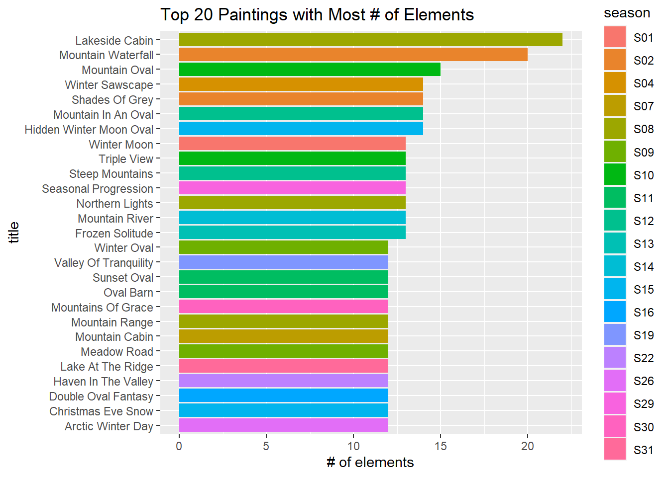
Seasonal elements
painting_summary %>%
  mutate(element = fct_reorder(element, value, sum)) %>%
  ggplot(aes(season, element, fill = value)) +
  geom_tile() +
  theme(legend.position = "none",
        panel.grid = element_blank(),
        axis.text = element_text(size = 13),
        plot.title = element_text(size = 18)) +
  ggtitle("Element Popularity across All Seasons")
Total elements
painting_summary %>%
  distinct(season, element, element_total_count) %>%
  mutate(element = fct_reorder(element, element_total_count, sum)) %>%
  filter(element_total_count > 10) %>%
  ggplot(aes(element_total_count, element, fill = season)) +
  geom_col() +
  labs(x = "element count",
       title = "Popular Elements & Their Count")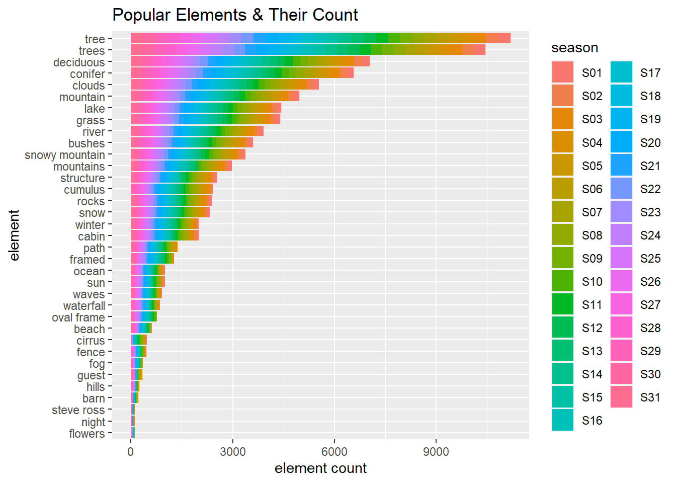
From here to the end of the blog post everything is inspired by David Robinson’s code.
Drawing a graph to connect elements
set.seed(2021)
painting_pivot %>%
  filter(value == 1) %>%
  add_count(element) %>%
  filter(n > 5) %>%
  pairwise_cor(element, episode, sort = T) %>%
  head(100) %>%
  graph_from_data_frame() %>%
  ggraph() +
  geom_edge_link(aes(alpha = correlation)) +
  geom_node_point() +
  geom_node_text(aes(label = name), vjust = 1, hjust = 1) +
  theme_void()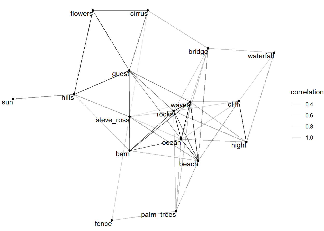
PCA
Using acast() to make a matrix for title and element.
Constructing a binary matrix for title and element
binary_matrix <- painting_pivot %>%
  filter(value == 1) %>%
  acast(title ~ element)
## Aggregation function missing: defaulting to lengthNormalize the binary matrix
norm_matrix <- binary_matrix - colMeans(binary_matrix)

svd_results <- svd(norm_matrix)
SVD: columns
tidy(svd_results, "v") %>%
  mutate(element = colnames(binary_matrix)[column]) %>%
  filter(PC < 5) %>%
  group_by(PC) %>%
  slice_max(abs(value), n = 20) %>%
  ungroup() %>%
  mutate(PC = paste("Principal Component", PC),
         element = reorder_within(element, value, PC)) %>%
  ggplot(aes(value, element, fill = factor(PC))) +
  geom_col(show.legend = F) +
  scale_y_reordered() +
  facet_wrap(~PC, scales = "free_y") +
  ggtitle("First Four Principal Components of the Elements of Bob Ross's Paintings")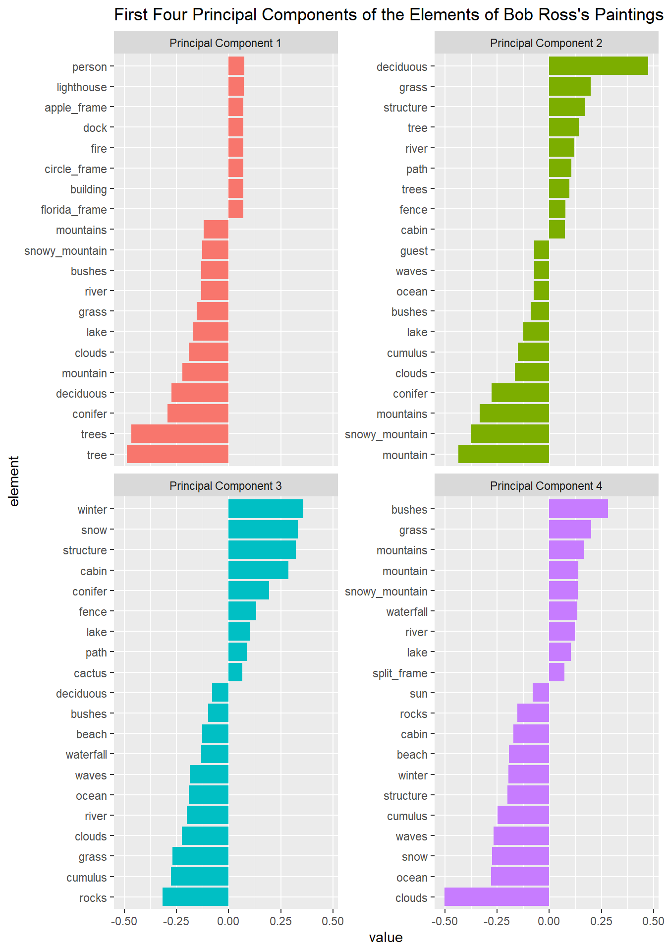
SVD: rows
tidy(svd_results, "u") %>%
  mutate(title = rownames(binary_matrix)[row]) %>%
  filter(PC < 5) %>%
  group_by(PC) %>%
  slice_max(abs(value), n = 20) %>%
  ungroup() %>%
  mutate(PC = paste("Principal Component", PC),
         title = reorder_within(title, value, PC)) %>%
  ggplot(aes(value, title, fill = factor(PC))) +
  geom_col(show.legend = F) +
  scale_y_reordered() +
  facet_wrap(~PC, scales = "free_y") +
  ggtitle("First Four Principal Components of Bob Ross's Paintings")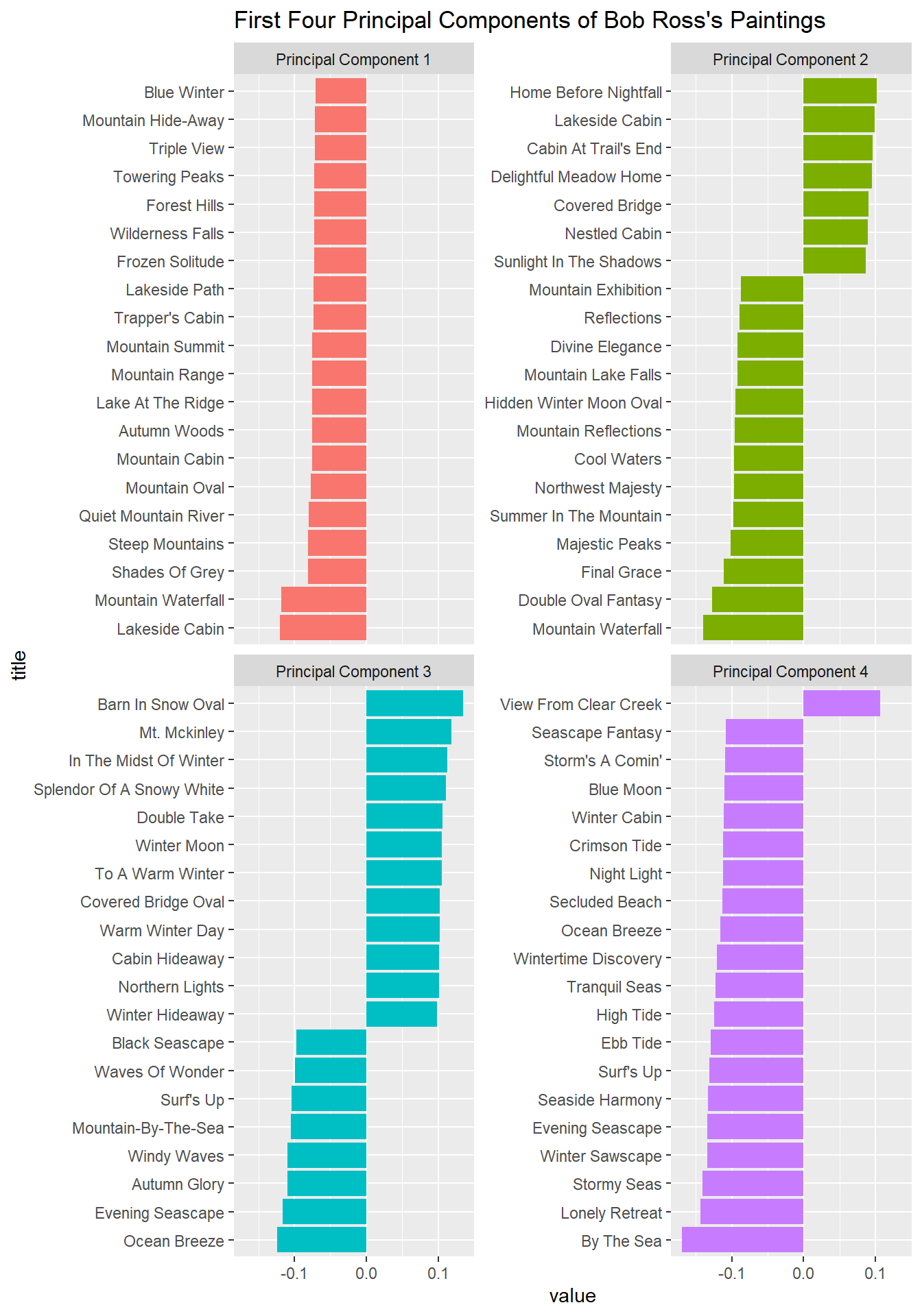
SVD: principal components
tidy(svd_results, "d") %>%
  ggplot(aes(PC, percent)) +
  geom_line() +
  geom_point() +
  scale_y_continuous(labels = percent) +
  scale_x_continuous(breaks = seq(1, 60, 2)) +
  geom_vline(xintercept = 6, linetype = 2, color = "red")
The first 6 components explain more than 50% of the variance.