Car Visualization & Natual Spline Fitting
mtcars is a classical dataset that is used to illustrate how to use ggplot2 in some good visualization reference. Here in this blog post, I will analyze a much larger version of mtcars dataset from TidyTuesday.
library(tidyverse)
library(tidytext)
library(splines)
library(broom)
library(scales)
car_economy <- read_csv("https://raw.githubusercontent.com/rfordatascience/tidytuesday/master/data/2019/2019-10-15/big_epa_cars.csv") %>%
rename(city_mpg = "city08",
highway_mpg = "highway08",
fuel_type = "fuelType",
combined_mpg = "comb08",
model_year = "year") %>%
mutate(fuel_type = fct_recode(fuel_type, Hybrid = "Regular Gas and Electricity"))
car_economy## # A tibble: 41,804 x 83
## barrels08 barrelsA08 charge120 charge240 city_mpg city08U cityA08 cityA08U
## <dbl> <dbl> <dbl> <dbl> <dbl> <dbl> <dbl> <dbl>
## 1 15.7 0 0 0 19 0 0 0
## 2 30.0 0 0 0 9 0 0 0
## 3 12.2 0 0 0 23 0 0 0
## 4 30.0 0 0 0 10 0 0 0
## 5 17.3 0 0 0 17 0 0 0
## 6 15.0 0 0 0 21 0 0 0
## 7 13.2 0 0 0 22 0 0 0
## 8 13.7 0 0 0 23 0 0 0
## 9 12.7 0 0 0 23 0 0 0
## 10 13.2 0 0 0 23 0 0 0
## # ... with 41,794 more rows, and 75 more variables: cityCD <dbl>, cityE <dbl>,
## # cityUF <dbl>, co2 <dbl>, co2A <dbl>, co2TailpipeAGpm <dbl>,
## # co2TailpipeGpm <dbl>, combined_mpg <dbl>, comb08U <dbl>, combA08 <dbl>,
## # combA08U <dbl>, combE <dbl>, combinedCD <dbl>, combinedUF <dbl>,
## # cylinders <dbl>, displ <dbl>, drive <chr>, engId <dbl>, eng_dscr <chr>,
## # feScore <dbl>, fuelCost08 <dbl>, fuelCostA08 <dbl>, fuel_type <fct>,
## # fuelType1 <chr>, ghgScore <dbl>, ghgScoreA <dbl>, highway_mpg <dbl>, ...The dataset has too many extraneous columns. In this analysis, I will select a number of interesting ones so that the column number can be lowered, thus easier to work with.
car_clean <- car_economy %>%
  select(make, model, model_year, city_mpg, displ, highway_mpg, co2TailpipeGpm, combined_mpg, cylinders, drive, fuel_type, trany, VClass, youSaveSpend) %>%
  separate(trany, into = c("transmission", "transmission_number"), sep = " ") %>%
  janitor::clean_names()

car_clean
## # A tibble: 41,804 x 15
## make model model_year city_mpg displ highway_mpg co2tailpipe_gpm
## <chr> <chr> <dbl> <dbl> <dbl> <dbl> <dbl>
## 1 Alfa Romeo Spider Veloce 2000 1985 19 2 25 423.
## 2 Ferrari Testarossa 1985 9 4.9 14 808.
## 3 Dodge Charger 1985 23 2.2 33 329.
## 4 Dodge B150/B250 Wagon 2WD 1985 10 5.2 12 808.
## 5 Subaru Legacy AWD Turbo 1993 17 2.2 23 468.
## 6 Subaru Loyale 1993 21 1.8 24 404.
## 7 Subaru Loyale 1993 22 1.8 29 355.
## 8 Toyota Corolla 1993 23 1.6 26 370.
## 9 Toyota Corolla 1993 23 1.6 31 342.
## 10 Toyota Corolla 1993 23 1.8 30 355.
## # ... with 41,794 more rows, and 8 more variables: combined_mpg <dbl>,
## # cylinders <dbl>, drive <chr>, fuel_type <fct>, transmission <chr>,
## # transmission_number <chr>, v_class <chr>, you_save_spend <dbl>Fuel economy from the most popular makes
car_clean %>%
  filter(fuel_type != "Electricity") %>%
  mutate(make = fct_lump(make, n = 10)) %>%
  filter(make != "Other") %>%
  mutate(make = fct_reorder(make, city_mpg, median)) %>%
  ggplot(aes(city_mpg, make)) +
  geom_boxplot() +
  labs(x = "city MPG",
       y = NULL,
       title = "Top 10 Popular Makes on City MPG",
       subtitle = "Electric vehicles are excluded")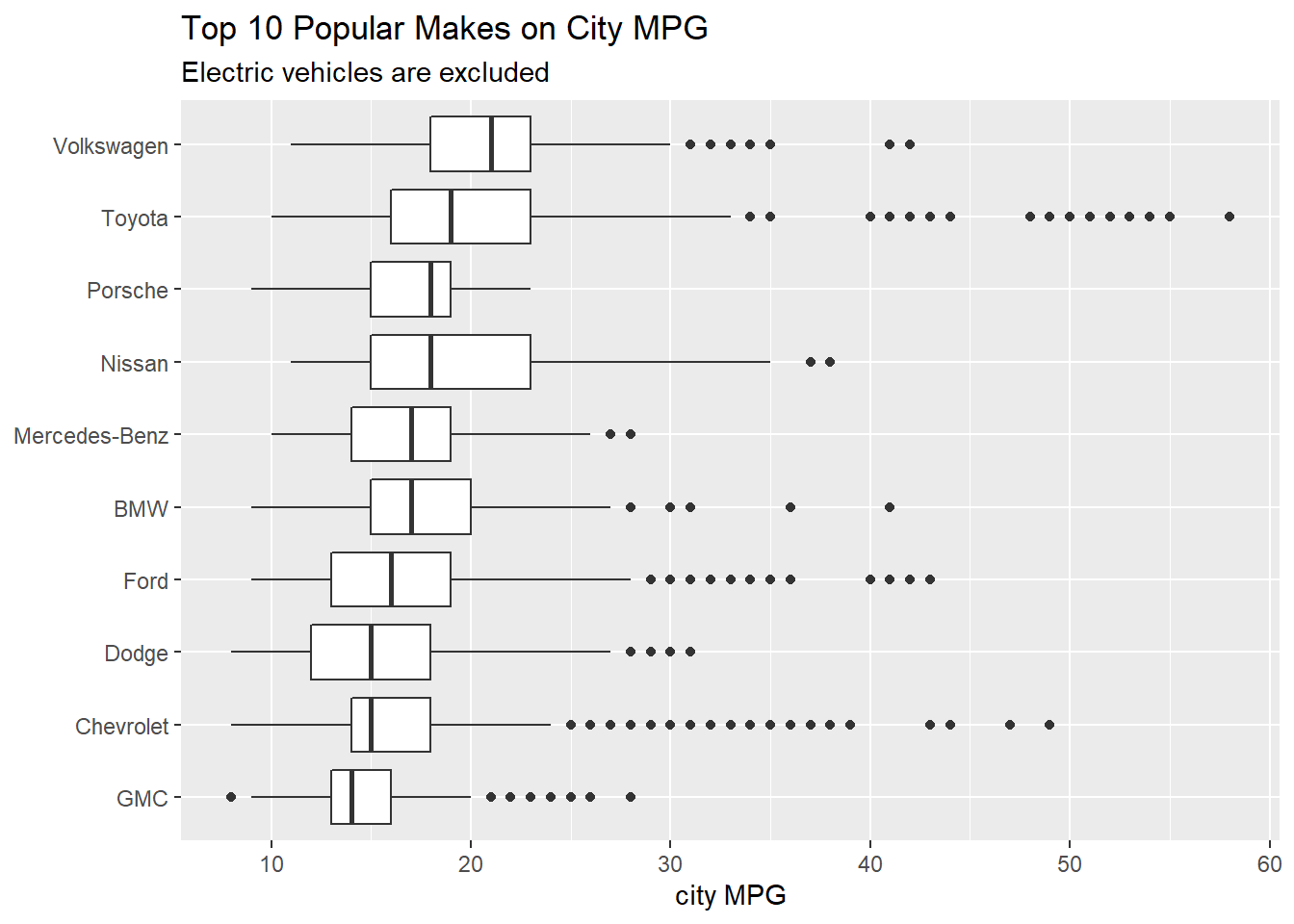
car_clean %>%
  filter(fuel_type != "Electricity") %>%
  mutate(make = fct_lump(make, n = 10)) %>%
  filter(make != "Other") %>%
  mutate(make = fct_reorder(make, highway_mpg, median)) %>%
  ggplot(aes(highway_mpg, make)) +
  geom_boxplot() +
  labs(x = "highway MPG",
       y = NULL,
       title = "Top 10 Popular Makes on Highway MPG",
       subtitle = "Electric vehicles are excluded")
I am a bit surprised that Volkswagen is more efficient on its median MPG than Toyota.
The most energy efficient models
car_clean %>%
  filter(fuel_type != "Electricity") %>%
  group_by(model) %>%
  slice_max(combined_mpg, n = 1, with_ties = F) %>%
  ungroup() %>%
  slice_max(combined_mpg, n = 30) %>%
  pivot_longer(cols = contains("mpg")) %>%
  mutate(name = str_replace(name, "_", " ")) %>%
  mutate(model = reorder_within(model, value, name)) %>%
  ggplot(aes(value, model, fill = fuel_type)) +
  geom_col() +
  facet_wrap(~name, scales = "free_y") +
  scale_y_reordered() +
  labs(x = "MPG",
       y = NULL,
       fill = "fuel type",
       title = "30 Most Energy Efficient Models")
The most energy costly models
car_clean %>%
  filter(fuel_type != "Electricity") %>%
  group_by(model) %>%
  slice_min(combined_mpg, n = 1, with_ties = F) %>%
  ungroup() %>%
  slice_min(combined_mpg, n = 30) %>%
  pivot_longer(cols = contains("mpg")) %>%
  mutate(name = str_replace(name, "_", " ")) %>%
  mutate(model = reorder_within(model, value, name)) %>%
  ggplot(aes(value, model, fill = fuel_type)) +
  geom_col() +
  facet_wrap(~name, scales = "free_y") +
  scale_y_reordered() +
  labs(x = "MPG",
       y = NULL,
       fill = "fuel type",
       title = "30 Most Gas-Guzzeling Models")
Which models can save or cost money most?
car_clean %>%
  filter(fuel_type != "Electricity") %>%
  group_by(model) %>%
  summarize(money_saved = mean(you_save_spend)) %>%
  ungroup() %>%
  mutate(save_or_spend = if_else(money_saved > 0, TRUE, FALSE)) %>%
  group_by(save_or_spend) %>%
  slice_max(abs(money_saved), n = 20) %>%
  mutate(model = fct_reorder(model, money_saved)) %>%
  ggplot(aes(money_saved, model, fill = save_or_spend)) +
  geom_col() +
  labs(x = "money saved",
       y = NULL,
       title = "Top 20 models for $ saved/spent on average") +
  theme(legend.position = "none") +
  scale_x_continuous(labels = dollar)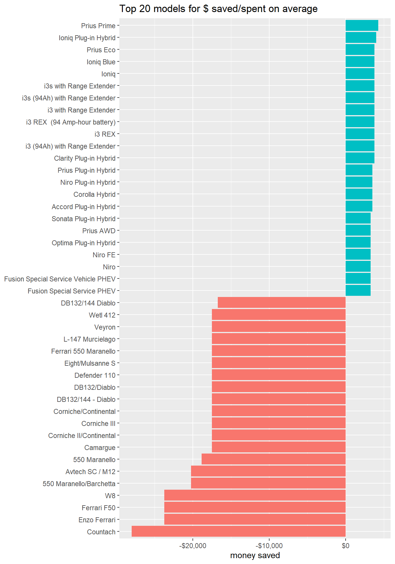
Compared to the models that help save money, those luxury vehicles can cost much more.
Analyzing Toyota
I am a loyal customer of Toyota, which is famous for its reliability, durability, and energy efficiency. Here in this section I will analyze Toyota vehicles presented in the dataset in particular.
toyota <- car_clean %>%
  filter(make == "Toyota")

toyota
## # A tibble: 2,109 x 15
## make model model_year city_mpg displ highway_mpg co2tailpipe_gpm
## <chr> <chr> <dbl> <dbl> <dbl> <dbl> <dbl>
## 1 Toyota Corolla 1993 23 1.6 26 370.
## 2 Toyota Corolla 1993 23 1.6 31 342.
## 3 Toyota Corolla 1993 23 1.8 30 355.
## 4 Toyota Corolla 1993 23 1.8 30 342.
## 5 Toyota Camry 1993 18 2.2 26 423.
## 6 Toyota Camry 1993 19 2.2 27 404.
## 7 Toyota Camry 1993 16 3 22 468.
## 8 Toyota Camry 1993 16 3 22 494.
## 9 Toyota Corolla Wagon 1993 23 1.8 30 355.
## 10 Toyota Corolla Wagon 1993 23 1.8 30 342.
## # ... with 2,099 more rows, and 8 more variables: combined_mpg <dbl>,
## # cylinders <dbl>, drive <chr>, fuel_type <fct>, transmission <chr>,
## # transmission_number <chr>, v_class <chr>, you_save_spend <dbl>As two of the most popular sedans in America for more than 30 years, Corolla and Camry are worth of being singled out for visualization purposes.
toyota %>%
  filter(model %in% c("Corolla", "Camry")) %>%
  group_by(model, model_year, transmission) %>%
  mutate(avg_mpg = mean(combined_mpg)) %>%
  ungroup() %>%
  mutate(model = fct_reorder(model, -avg_mpg, sum)) %>%
  ggplot(aes(model_year, avg_mpg, color = model)) +
  geom_line() +
  geom_smooth(method = "lm", se = F) +
  geom_point() +
  labs(x = "model year",
       y = "mean MPG",
       color = NULL,
       title = "Corolla V.S. Camry on MPG with linear model fitting line") +
  scale_x_continuous(breaks = seq(1985, 2020, 5)) +
  facet_wrap(~transmission)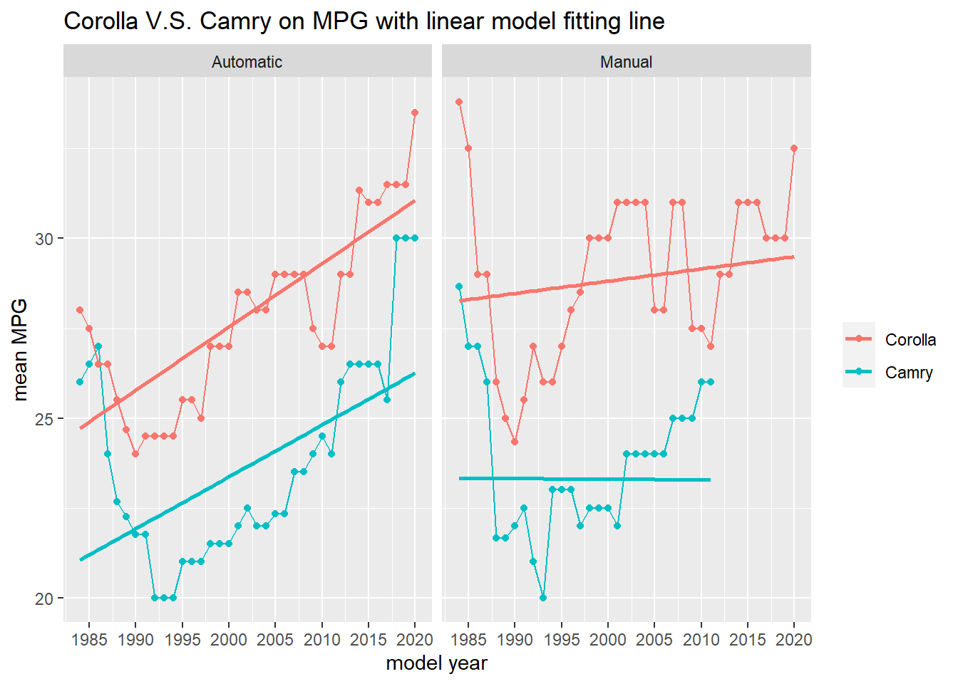
Although declining in some years, there is a upward trend for MPG for both models. Also, Corolla has always been more energy efficient than Camry, and what is surprising is that manual transmission is not more energy efficient than its automatic counterparts for the same model.
Natural Spline Fitting
This little section is inspired by David Robinson’s code on spline fitting.
We would like to use displ to predict combined_mpg.
car_clean %>%
  filter(fuel_type != "Electricity") %>%
  ggplot(aes(displ, combined_mpg)) +
  geom_point() +
  labs(x = "engine displacement",
       y = "combined MPG")
As we can see from the scatter plot above, there is no linear relationship. Therefore, it is not wise to use linear regression. Instead, natural spline model is used here.
Making training_set.
training_set <- car_clean %>%
  filter(fuel_type != "Electricity",
         !is.na(displ)) %>%
  filter(row_number() %% 5 != 0)
lm(combined_mpg ~ ns(displ, 2), data = training_set) %>%
augment(data = training_set) %>%
ggplot(aes(displ, .resid)) +
geom_point()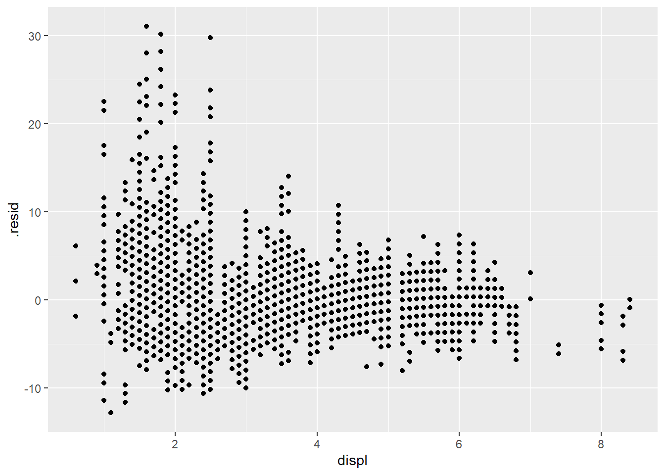
The residual plot above has a specific pattern, indicating the fitting is not good.
Now trying degree of freedom from 1 to 10 for the natural spline model:
augment_unnest <- tibble(df = seq(1,10)) %>%
  mutate(ns_model = map(df, ~lm(combined_mpg ~ ns(displ, df = .), data = training_set)),
         tidied = map(ns_model, tidy)) %>%
  mutate(augmented = map(ns_model, augment, data = training_set)) %>%
  unnest(augmented)

augment_unnest %>%
  ggplot(aes(displ, combined_mpg)) +
  geom_point() +
  geom_line(aes(y = .fitted, color = factor(df)), size = 2) +
  labs(x = "engine displacement",
       y = "combined MPG",
color = "ns degree of freedom") 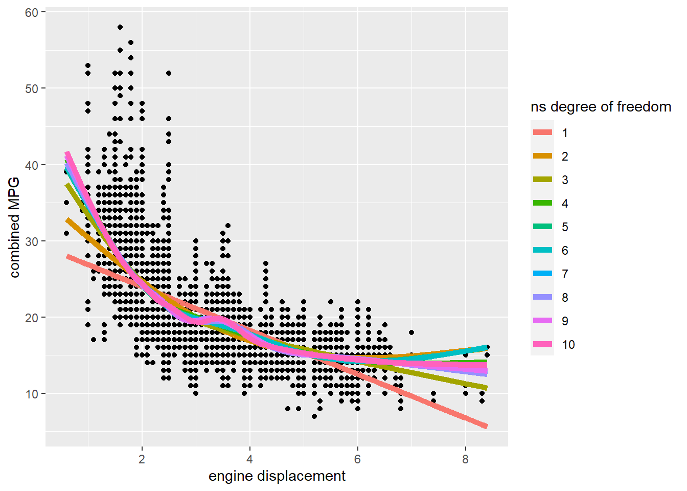
Residual plots
augment_unnest %>%
  ggplot(aes(displ, .resid)) +
  geom_point() +
  facet_wrap(~ df) +
  labs(title = "residual plot with df from 1 to 10")
It is difficult to tell which degree of freedom fits the data the best.