U.S. Beer Consumption & Tax Data Visualization
In this blog post, I will analyze four beer related datasets from TidyTuesday.
library(tidyverse)
library(lubridate)
library(geofacet)
theme_set(theme_bw())
Processing datasets!
brewing_materials <- read_csv('https://raw.githubusercontent.com/rfordatascience/tidytuesday/master/data/2020/2020-03-31/brewing_materials.csv') %>%
  select(-c(contains("ytd"), data_type)) %>%
  mutate(type = str_remove(type, " \\(.+\\)")) %>%
  group_by(year, month, material_type, type) %>%
  mutate(month_current = sum(month_current),
         month_prior_year = sum(month_prior_year)) %>%
  distinct() %>%
  ungroup() %>%
  mutate(date = make_date(year, month),
         type = str_remove(type, " and .+"))

beer_taxed <- read_csv('https://raw.githubusercontent.com/rfordatascience/tidytuesday/master/data/2020/2020-03-31/beer_taxed.csv') %>%
  mutate(type = str_remove(type, " end-of-month|,.+"),
         type = str_remove(type, ":"),
         date = make_date(year, month))


brewer_size <- read_csv('https://raw.githubusercontent.com/rfordatascience/tidytuesday/master/data/2020/2020-03-31/brewer_size.csv') %>%
  mutate(brewer_size = str_remove_all(brewer_size, ",| Barrels"),
         brewer_size = str_replace(brewer_size, " to ", "-")) %>%
  filter(!brewer_size %in% c("Zero", "Under 1 Barrel", "Total")) %>%
  mutate(brewer_size = fct_reorder(brewer_size, parse_number(brewer_size)))

beer_states <- read_csv('https://raw.githubusercontent.com/rfordatascience/tidytuesday/master/data/2020/2020-03-31/beer_states.csv')
Working on brewing_materials
Everything in total used:
brewing_materials %>%
  filter(str_detect(material_type, "Total")) %>%
  ggplot(aes(date, month_current, color = material_type)) +
  geom_line() +
  geom_point() +
  theme(legend.position = "bottom") +
  labs(x = NULL,
       y = "monthly consumption (barrels)",
       color = NULL,
       title = "Total beer matrials consumption")
There is a clear seasonality for all three lines. It seems like they all peak at the summertime and reach to the bottom during the wintertime.
Grain products visualization
brewing_materials %>%
  filter(material_type == "Grain Products") %>%
  mutate(type = fct_reorder(type, -month_current, sum)) %>%
  ggplot(aes(date, month_current, color = type)) +
  geom_line() +
  geom_point() +
  facet_wrap(~type, ncol = 1) +
  theme(legend.position = "none",
        strip.text = element_text(size = 15),
        plot.title = element_text(size = 18)) +
  labs(x = NULL,
       y = "monthly consumption (barrels)",
       title = "Grain products monthly consumption") +
  scale_x_date(breaks = "1 year", date_labels = "%Y")
Monthly malt consumption was rather stable until the year of 2016, where there was a sudden drop. And both rice and corn had the same trend, although it is not as obvious as its of malt. Maybe there was something happening during that period of time?
Non-grain products visualization
brewing_materials %>%
  filter(material_type == "Non-Grain Products") %>%
  mutate(type = fct_reorder(type, -month_current, sum)) %>%
  ggplot(aes(date, month_current, fill = type)) +
  geom_col() +
  facet_wrap(~type, ncol = 1) +
  labs(x = NULL,
       y = "monthly consumption",
       title = "Non-grain products monthly consumption (log-scale)") +
  theme(legend.position = "none",
        strip.text = element_text(size = 15),
        plot.title = element_text(size = 18)) +
  scale_y_log10()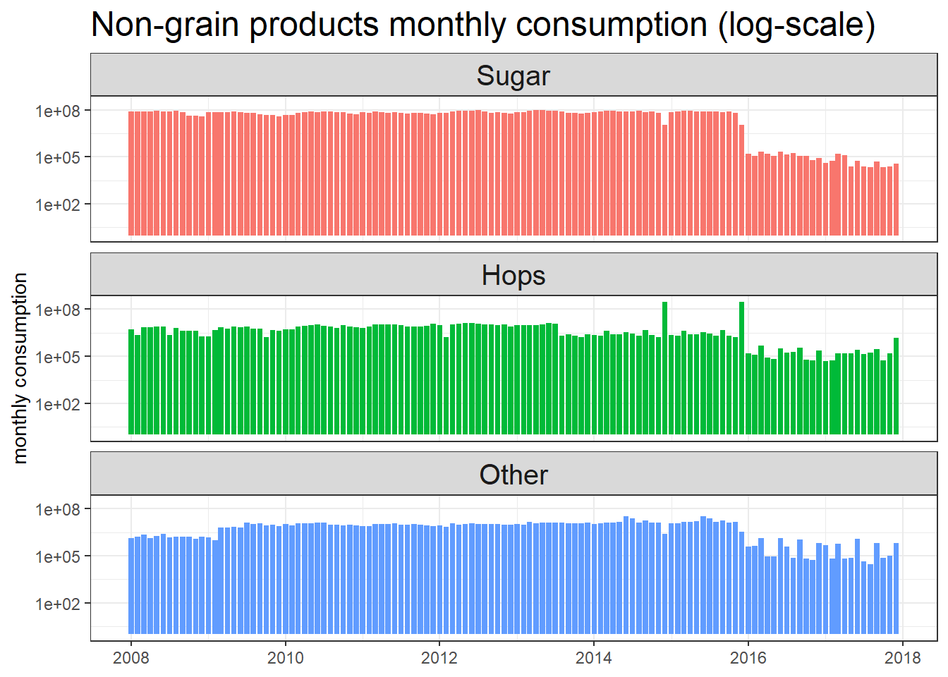
Sugar is mostly needed for beer production, but we can observe a similar trend at the begining of 2016 when the consumption began to lower significantly.
Which states produced most beer?
beer_states %>%
  filter(state != "total") %>%
  ggplot(aes(year, barrels, color = type)) +
  geom_line() +
  geom_point() +
  facet_geo(~state) +
  theme(axis.text.x = element_text(angle = 90),
        strip.text = element_text(face = "bold")) +
  scale_x_continuous(breaks = seq(2007, 2018, 2)) +
  labs(title = "Which states produced most beer?")
## Warning: Removed 19 rows containing missing values (geom_point).
Surprisingly, Ohio produced most of the beer in bottles and cans besides California and Colorado.
beer_taxed %>%
  mutate(tax_status = fct_reorder(tax_status, -month_current, sum),
         type = fct_reorder(type, -month_current, sum)) %>%
  ggplot(aes(date, month_current, color = type)) +
  geom_line() +
  geom_point() +
  facet_wrap(~tax_status) +
  theme(legend.position = c(0.8, 0.25))  +
  labs(x = NULL,
       y = "monthly barrels",
title = "Monthly Barrels for all types facted by tax status") 
brewer_size %>%
  ggplot(aes(year, brewer_size, fill = n_of_brewers)) +
  geom_tile() +
  scale_x_continuous(breaks = seq(2009, 2019), expand = c(0,0)) +
  scale_y_discrete(expand = c(0,0)) +
  theme(panel.grid = element_blank()) +
  scale_fill_gradient2(low = "red",
                       high = "green",
                       mid = "pink",
                       midpoint = 1500) +
  labs(x = NULL,
       y = "brewer size (barrels)",
       fill = "# of brewers",
title = "# of brewers for all sizes over the 10-year period") 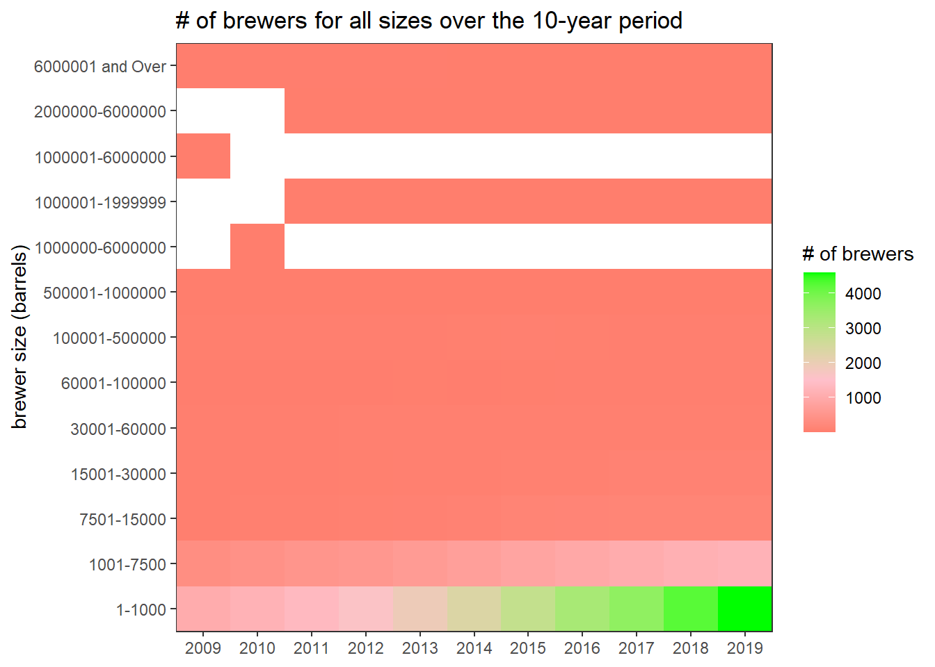
There had been more smallest-size brewers as year progressed, and there was a smiliar but much less subtle trend for “1001-7500” size brewers. Other sizes stayed pretty much the same.