Caribou Tracking Location Data Visualization
In this blog post, we will analyze caribou tracking datasets from TidyTuesday.
library(tidyverse)
library(scales)
library(lubridate)
library(glue)
theme_set(theme_bw())
individuals <- read_csv('https://raw.githubusercontent.com/rfordatascience/tidytuesday/master/data/2020/2020-06-23/individuals.csv')
locations <- read_csv('https://raw.githubusercontent.com/rfordatascience/tidytuesday/master/data/2020/2020-06-23/locations.csv')Check the missing values for individuals
individuals %>%
  map_dfr(~ mean(is.na(.)) * 100) %>%
  pivot_longer(everything(), names_to = "var", values_to = "missing_percentage(%)")
## # A tibble: 14 x 2
## var `missing_percentage(%)`
## <chr> <dbl>
## 1 animal_id 0
## 2 sex 0
## 3 life_stage 76.6
## 4 pregnant 93.4
## 5 with_calf 70.6
## 6 death_cause 81.1
## 7 study_site 0
## 8 deploy_on_longitude 46.5
## 9 deploy_on_latitude 46.5
## 10 deploy_on_comments 69.6
## 11 deploy_off_longitude 80.4
## 12 deploy_off_latitude 80.4
## 13 deploy_off_type 0
## 14 deploy_off_comments 80.4How's deployment type of each study site?
Based on the data introduction in the link, deployment refers to the animal was put on a location-tracking tag.
individuals %>%
  group_by(study_site, deploy_off_type) %>%
  summarize(n = n())
## # A tibble: 23 x 3
## # Groups: study_site [8]
## study_site deploy_off_type n
## <chr> <chr> <int>
## 1 Burnt Pine dead 3
## 2 Burnt Pine other 2
## 3 Burnt Pine removal 4
## 4 Graham unknown 55
## 5 Hart Ranges dead 4
## 6 Hart Ranges other 3
## 7 Hart Ranges removal 4
## 8 Hart Ranges unknown 41
## 9 Kennedy dead 15
## 10 Kennedy other 5
## # ... with 13 more rowsby_study_site <- individuals %>%
count(study_site, deploy_off_type, sort = T) %>%
group_by(study_site) %>%
mutate(percent_type_per_site = n/sum(n)) %>%
ungroup()
by_study_site %>%
ggplot(aes(percent_type_per_site, study_site, fill =deploy_off_type)) +
geom_col() +
scale_x_continuous(labels = percent) +
labs(x = "percentage of type per site",
y = "study site",
fill = "deploy off type",
title = "The site-wise percentage of deployment type",
subtitle = '"Deployment" refers to when the animal was fitted with a location-tracking tag.')
locations %>%
  mutate(year = year(timestamp)) %>%
  count(year, season, sort = T) %>%
  ggplot(aes(year, n, color = season)) +
  geom_line(size = 1) +
  scale_x_continuous(breaks = seq(1990, 2020, 5)) +
  labs(x = NULL,
       y = "# of events",
       color = NULL,
       title = glue("# of measurement events from {min(year(locations$timestamp))} to {max(year(locations$timestamp))}"))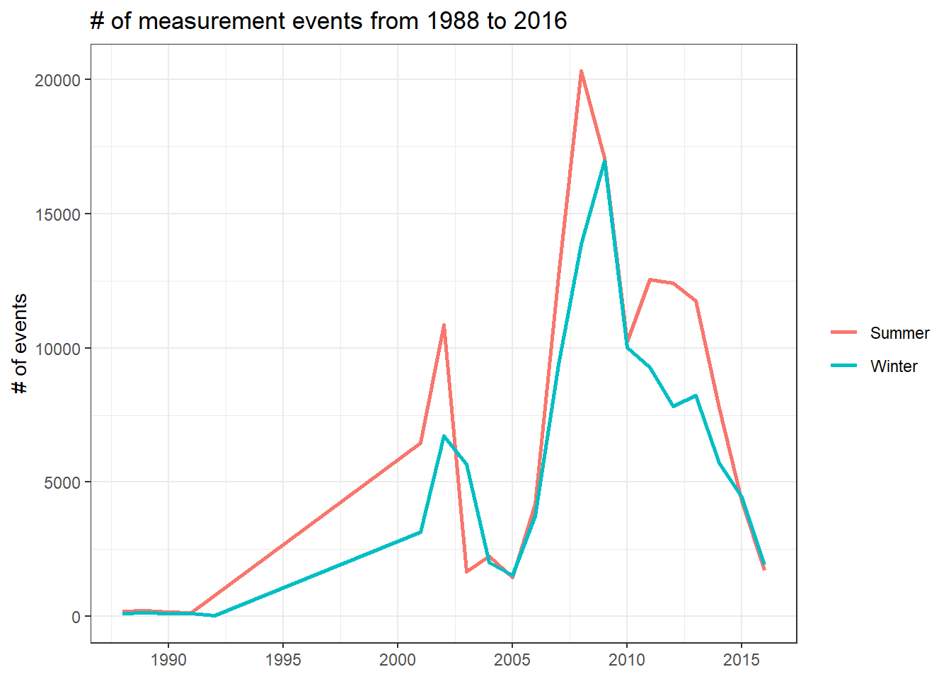
Where are the study sites located?
locations %>%
  ggplot(aes(longitude, latitude, color = study_site)) +
  geom_point() +
  labs(color = "study site",
       title = "Where are the study sites?")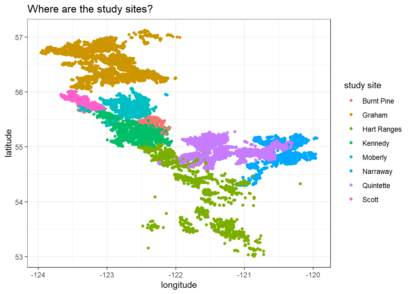
Trying to obtain the maximum and minimum coordinate values of Canada before drawing a map.
canada_coords <- map_data("world") %>%
  filter(region == "Canada") %>%
  summarize(max_long = max(long), min_long = min(long),
            max_lat = max(lat), min_lat = min(lat))

canada_coords
## max_long min_long max_lat min_lat
## 1 -52.65366 -141.0022 83.11611 41.67485Adding borders:
locations %>%
  ggplot(aes(longitude, latitude, color = study_site)) +
  geom_point() +
  borders("world",
          xlim = c(canada_coords$min_long, canada_coords$max_long),
          ylim = c(canada_coords$min_lat, canada_coords$max_lat)) +
  labs(color = "study site",
       title = "Where are the caribou locations?")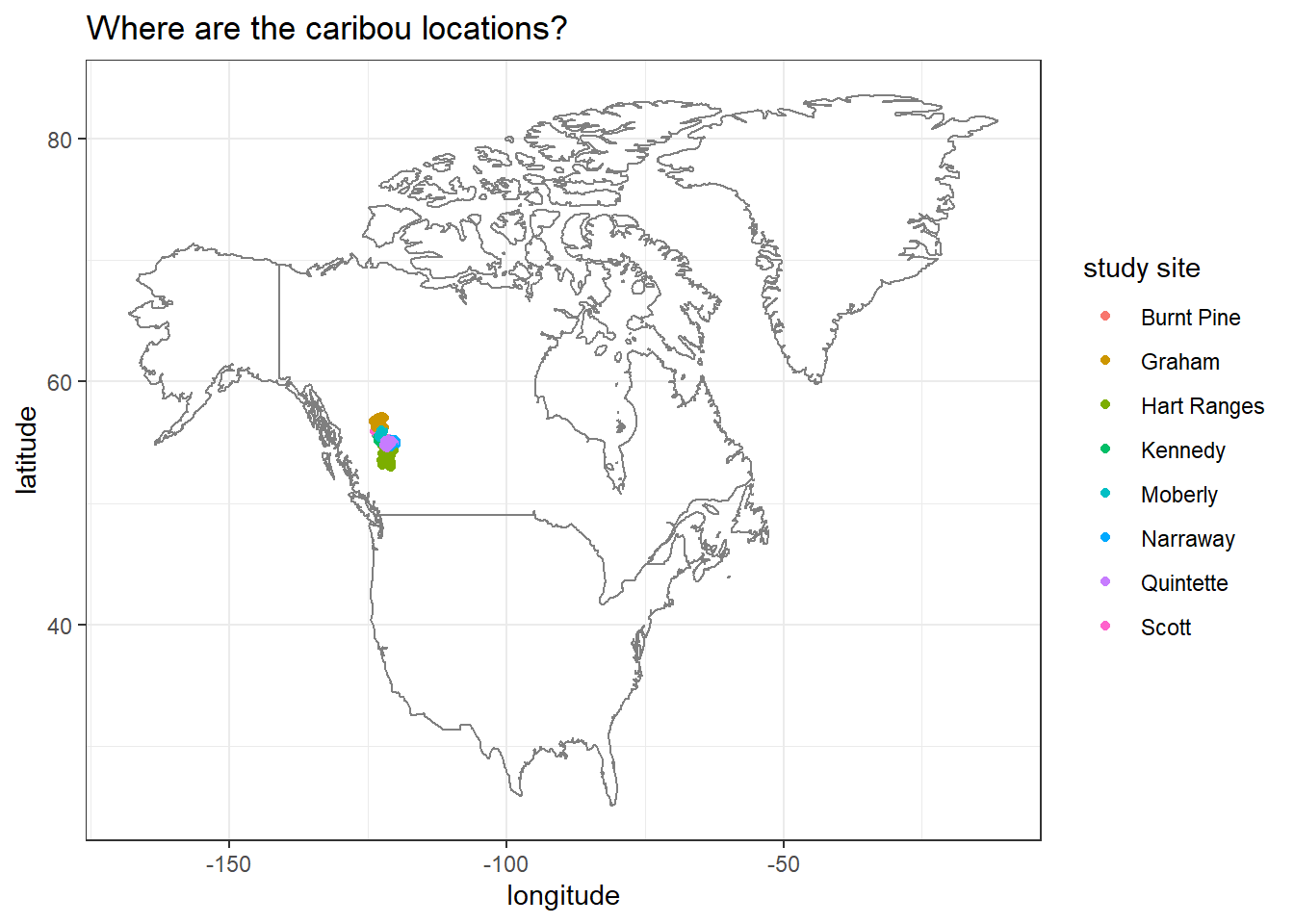
We can zoom into the map a bit, because the previous map is difficult to see exactly where the study sites are located.
locations %>%
  ggplot(aes(longitude, latitude, color = study_site)) +
  geom_point() +
  borders("world",
          xlim = c(-110, -105),
          ylim = c(55, 60)) +
  theme_void() +
  labs(color = "study site",
       title = "Where are the caribou locations?")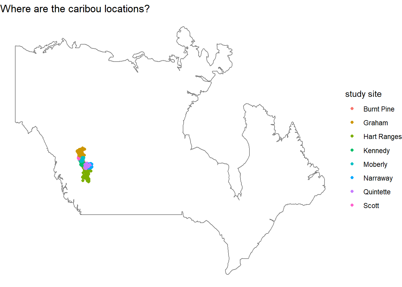
locations %>%
  group_by(animal_id) %>%
  summarize(max_duration = difftime(max(timestamp), min(timestamp), units = "days"),
            max_duration = as.numeric(max_duration))
## # A tibble: 260 x 2
## animal_id max_duration
## <chr> <dbl>
## 1 BP_car022 1822.
## 2 BP_car023 151.
## 3 BP_car032 492.
## 4 BP_car043 548.
## 5 BP_car100 613.
## 6 BP_car101 534.
## 7 BP_car115 587.
## 8 BP_car144 150.
## 9 BP_car145 959.
## 10 GR_C01 762.
## # ... with 250 more rowsThe path of a random caribou
This is my first time using geom_path() to visualize data. Let's see how it goes. This little section is inspired by David Robinson's code.
set.seed(2022)
locations %>%
  filter(animal_id == sample(animal_id, 2)) %>%
  arrange(timestamp) %>%
  ggplot(aes(longitude, latitude, color = animal_id)) +
  geom_path() +
  geom_point() +
labs(title = "Two random caribous' tracking records") 
One thing needs to remember is that geom_path() does not make sense if the data is not rearranged by timestamp for this very visualization.
Join two tibbles together
joined <- individuals %>%
  select(animal_id, study_site, deploy_off_type) %>%
  right_join(
    locations, by = c("animal_id", "study_site")
  ) %>%
  group_by(animal_id) %>%
  mutate(max_duration = difftime(max(timestamp), min(timestamp), units = "days"),
            max_duration = as.numeric(max_duration)) %>%
  ungroup()
Maximum days of tracking
joined %>%
  distinct(animal_id, study_site, deploy_off_type, max_duration) %>%
  ggplot(aes(max_duration, deploy_off_type, fill = deploy_off_type)) +
  geom_violin(show.legend = F) +
  facet_wrap(~study_site) +
  theme(strip.text = element_text(size = 13),
        axis.text = element_text(size = 11),
        axis.title = element_text(size = 12),
        plot.title = element_text(size = 15)) +
  labs(x = "maximum days of tracking locations",
       y = "deploy off type",
       title = "Maximum days of tracking with respect to deploy off type")
Checking if the initial and final tracking locations for each animal_id are different:
joined %>%
  group_by(animal_id) %>%
  mutate(ts_min = min(timestamp),
         ts_max = max(timestamp)) %>%
  ungroup() %>%
  filter(timestamp == ts_min | timestamp == ts_max) %>%
  group_by(animal_id) %>%
  summarize(n = n_distinct(study_site)) %>%
  arrange(desc(n))
## # A tibble: 260 x 2
## animal_id n
## <chr> <int>
## 1 BP_car022 1
## 2 BP_car023 1
## 3 BP_car032 1
## 4 BP_car043 1
## 5 BP_car100 1
## 6 BP_car101 1
## 7 BP_car115 1
## 8 BP_car144 1
## 9 BP_car145 1
## 10 GR_C01 1
## # ... with 250 more rowsIt turns out they are the same, as n = 1.
joined %>%
  group_by(animal_id) %>%
  summarize(n = n_distinct(study_site)) %>%
  arrange(desc(n))
## # A tibble: 260 x 2
## animal_id n
## <chr> <int>
## 1 BP_car022 1
## 2 BP_car023 1
## 3 BP_car032 1
## 4 BP_car043 1
## 5 BP_car100 1
## 6 BP_car101 1
## 7 BP_car115 1
## 8 BP_car144 1
## 9 BP_car145 1
## 10 GR_C01 1
## # ... with 250 more rowsThese caribous have never crossed any of the study sites, as the largest n is 1.
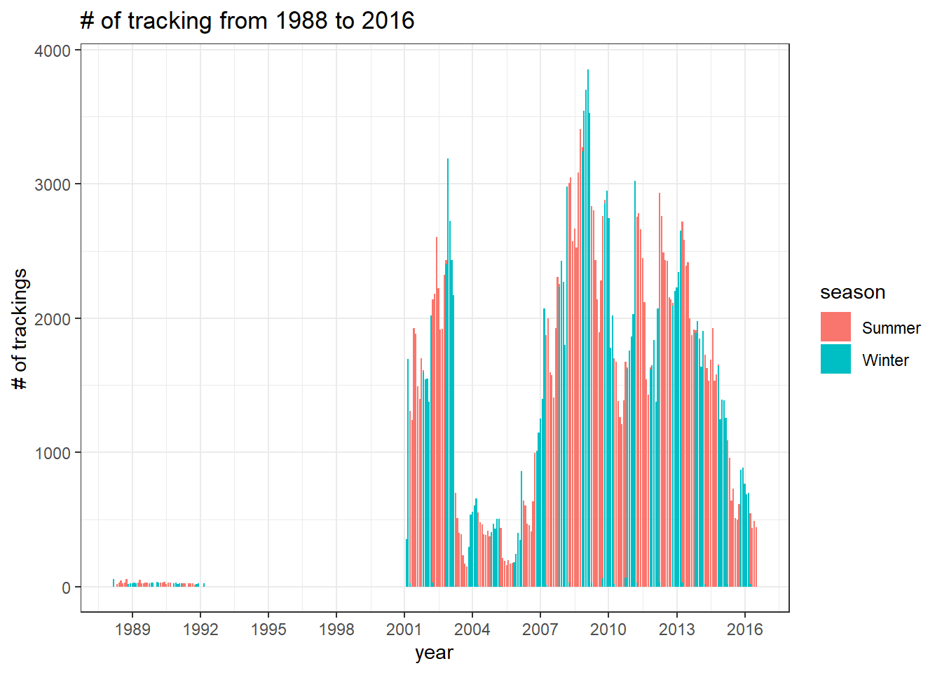
The number of trackings
joined %>%
  mutate(year = year(timestamp),
         month = month(timestamp)) %>%
  mutate(year_month = ym(paste0(year,"-",month))) %>%
  count(year_month, season, sort = T) %>%
  ggplot(aes(year_month, n, fill = season)) +
  geom_col() +
  scale_x_date(date_breaks = "3 years", date_labels = "%Y") +
  labs(x = "year",
       y = "# of trackings",
       title = glue("# of tracking from {min(year(joined$timestamp))} to {max(year(joined$timestamp))}"))