Coffee Rating Data Visualization/Modeling
I am obssessed with coffee. I do drink it every day, especially when doing data science work. Although I have a penchant for coffee, little do I know about the techniques and evaluations of coffee beans. In this dataset, we will analyze a coffee dataset from TidyTuesday by visualizing it and using some model on it. Hopefully, after this data analysis, we will know more technical details about coffee rating.
Let's load the packages for this analysis.
library(tidyverse)
library(tidytext)
library(widyr)
library(broom)
library(ggraph)
theme_set(theme_bw())
coffee <- read_csv("https://raw.githubusercontent.com/rfordatascience/tidytuesday/master/data/2020/2020-07-07/coffee_ratings.csv") %>%
filter(total_cup_points > 0) %>%
mutate(country_of_origin = str_remove(country_of_origin, "\\?"))
coffee## # A tibble: 1,338 x 43
## total_cup_points species owner country_of_origin farm_name lot_number mill
## <dbl> <chr> <chr> <chr> <chr> <chr> <chr>
## 1 90.6 Arabica metad~ Ethiopia "metad pl~ <NA> meta~
## 2 89.9 Arabica metad~ Ethiopia "metad pl~ <NA> meta~
## 3 89.8 Arabica groun~ Guatemala "san marc~ <NA> <NA>
## 4 89 Arabica yidne~ Ethiopia "yidnekac~ <NA> wole~
## 5 88.8 Arabica metad~ Ethiopia "metad pl~ <NA> meta~
## 6 88.8 Arabica ji-ae~ Brazil <NA> <NA> <NA>
## 7 88.8 Arabica hugo ~ Peru <NA> <NA> hvc
## 8 88.7 Arabica ethio~ Ethiopia "aolme" <NA> c.p.~
## 9 88.4 Arabica ethio~ Ethiopia "aolme" <NA> c.p.~
## 10 88.2 Arabica diamo~ Ethiopia "tulla co~ <NA> tull~
## # ... with 1,328 more rows, and 36 more variables: ico_number <chr>,
## # company <chr>, altitude <chr>, region <chr>, producer <chr>,
## # number_of_bags <dbl>, bag_weight <chr>, in_country_partner <chr>,
## # harvest_year <chr>, grading_date <chr>, owner_1 <chr>, variety <chr>,
## # processing_method <chr>, aroma <dbl>, flavor <dbl>, aftertaste <dbl>,
## # acidity <dbl>, body <dbl>, balance <dbl>, uniformity <dbl>,
## # clean_cup <dbl>, sweetness <dbl>, cupper_points <dbl>, moisture <dbl>, ...Ratings for coffee beans and their country of origin
coffee %>%
  ggplot(aes(total_cup_points, processing_method, fill = species)) +
  geom_boxplot() +
  labs(x = "bean rating",
       y = "processing method",
       title = "Is there any difference between coffee bean processing method and rating?")
coffee %>%
  filter(!is.na(country_of_origin)) %>%
  count(species, country_of_origin, sort = T) %>%
  mutate(country_of_origin = fct_reorder(country_of_origin, n, sum)) %>%
  ggplot(aes(n, country_of_origin, n, fill = species)) +
  geom_col() +
  labs(x = "count",
       y = "coffee bean origin",
       title = "Where are the beans from?",
       fill = "") +
  theme(plot.title = element_text(size = 18),
        legend.text = element_text(size = 13))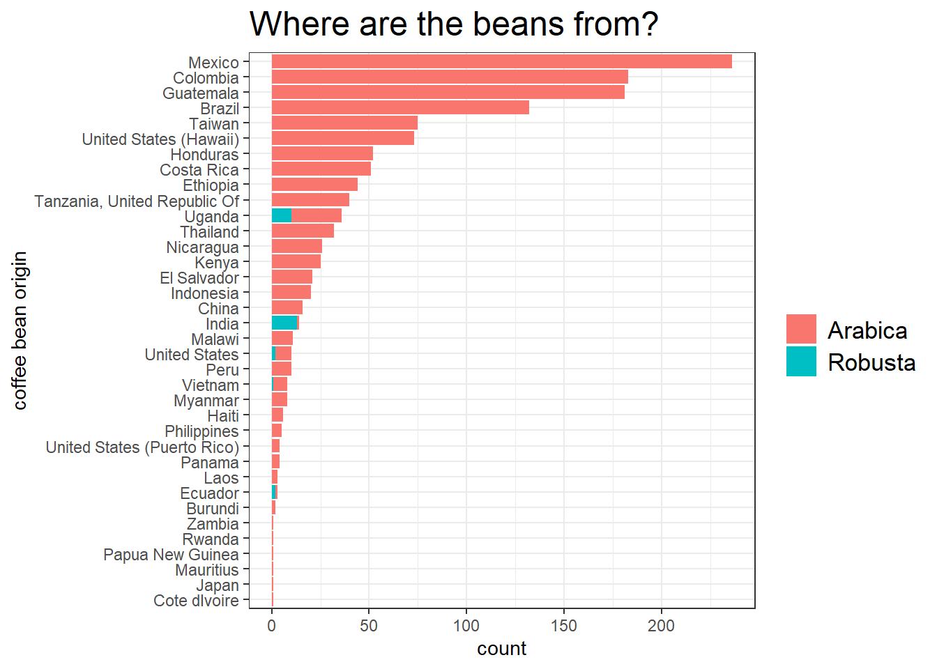
We can see that Arabica beans dominate the bar plot, making their Robusta beans a minority.
coffee_metric <- coffee %>%
  mutate(coffee_id = row_number()) %>%
  select(coffee_id, total_cup_points, species, country_of_origin, aroma:moisture, altitude_mean_meters) %>%
  pivot_longer(cols = c(aroma:moisture)) %>%
  mutate(name = str_replace(name, "_", " "),
         name = str_to_title(name))

coffee_metric %>%
  ggplot(aes(value, total_cup_points)) +
  geom_point(aes(color = species)) +
  geom_text(aes(label = country_of_origin), alpha = 0.3, vjust = 1, hjust = 0, check_overlap = T) +
  scale_y_log10() +
  facet_wrap(~name, scales = "free_x") +
  theme(strip.text = element_text(size = 13),
        plot.title = element_text(size = 16),
        axis.title = element_text(size = 14),
        axis.text = element_text(size = 10),
        legend.position = c(0.9, 0.2)) +
  labs(x = "respective facet value",
       y = "total cup points",
       title = "Coffee beans' respective information against rating",
       subtitle = "Text refers to the bean country of origin")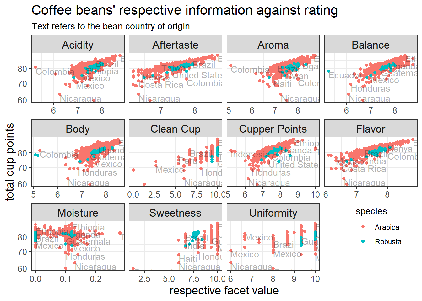
Besides moisture, sweetness, and uniformity, there is a clear upward trend for all coffee bean features, meaning that higher values lead to higher ratings.
The following graph, PCA, and learning model are inspired by David Robinson's code.
How are coffee metrics correlated?
set.seed(2022)

coffee_metric %>%
  pairwise_cor(name, coffee_id, value, sort = T) %>%
  head(60) %>%
  ggraph(layout = "fr") +
  geom_edge_link(aes(width = correlation, color = correlation), alpha = 0.5) +
  geom_node_point() +
  geom_node_text(aes(label = name), hjust = 1, vjust = 1, check_overlap = T, size = 5) +
  theme_void() +
  guides(color = "none", edge_color = "none") +
  labs(edge_width = "correlation",
       title = "How are the coffee metrics correlated?") +
  theme(plot.title = element_text(size = 18))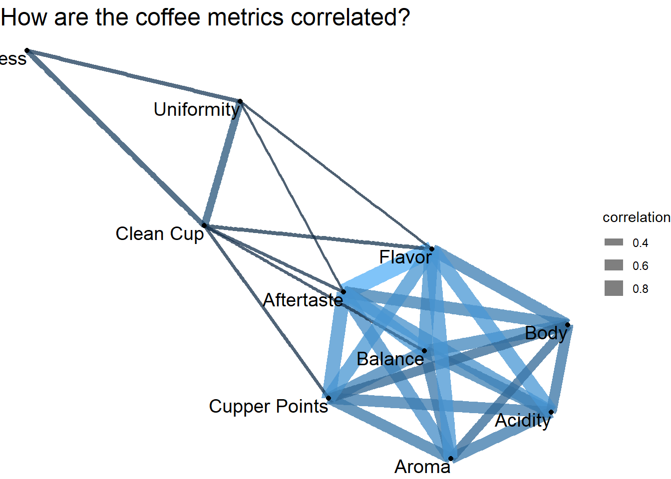
PCA
coffee_metric %>%
  group_by(name) %>%
  mutate(centered = value - mean(value)) %>%
  ungroup() %>%
  widely_svd(name, coffee_id, centered) %>%
  filter(dimension <= 4) %>%
  mutate(dimension = paste0("Dimension: ", dimension)) %>%
  mutate(name = reorder_within(name, value, dimension)) %>%
  ggplot(aes(value, name, fill = value > 0)) +
  geom_col() +
  scale_y_reordered() +
  facet_wrap(~dimension, scales = "free_y") +
  theme(legend.position = "none",
        strip.text = element_text(size = 13)) +
  labs(x = "",
       y = NULL,
       title = "PCA on coffee metrics")
Linear model:
coffee_metric %>%
  filter(altitude_mean_meters < 3000,
         altitude_mean_meters > 1) %>%
  mutate(altitude_km = altitude_mean_meters/1000) %>%
  group_by(name) %>%
  summarize(model = list(lm(value ~ altitude_km))) %>%
  mutate(tidied = map(model, tidy, conf.int = T)) %>%
  unnest(tidied) %>%
  filter(term == "altitude_km") %>%
  mutate(name = fct_reorder(name, estimate)) %>%
  ggplot(aes(y = name, color = p.value > 0.05)) +
  geom_point(aes(x = estimate)) +
  geom_errorbarh(aes(xmin = conf.low,
                     xmax = conf.high)) +
  labs(y = NULL,
       title = "How does altitude impact coffee metrics based on the linear model?")
Altitude V.S. Coffee ratings
Altitudes have different units (meters, ft) presented in the dataset. To make sure our visualization is accurate, let's tranform ft to meters first.
coffee_unit_processed <- coffee %>%
  filter(unit_of_measurement == "ft") %>%
  mutate(across(altitude_low_meters:altitude_mean_meters, ~.x/3.28),
         unit_of_measurement = "m") %>%
  bind_rows(coffee %>% filter(unit_of_measurement == "m"))

coffee_unit_processed %>%
  filter(altitude_low_meters > 20,
         altitude_high_meters < 3000) %>%
  mutate(rating_range = cut(total_cup_points, breaks = c(50, 70, 75, 80, 85, 90, 100))) %>%
  group_by(rating_range) %>%
  summarize(min_altitude = min(altitude_low_meters, na.rm = T),
            max_altitude = max(altitude_high_meters, na.rm = T),
            mean_altitude = mean(altitude_mean_meters, na.rm = T),
            n = n()) %>%
  ggplot(aes(y = rating_range)) +
  geom_point(aes(x = mean_altitude, size = n)) +
  geom_errorbarh(aes(xmin = min_altitude,
                     xmax = max_altitude), height = 0.3) +
  labs(x = "altitude (meters)",
       y = "coffee bean rating range",
       size = "count",
       title = "How high are the coffee beans grown with respect to their rating?") +
  scale_size_continuous(range = c(2,5), breaks = c(10, 100, 300, 800)) +
  scale_x_continuous(breaks = seq(0, 3000, 500)) +
  theme(axis.title = element_text(size = 13),
        axis.text = element_text(size = 11),
        plot.title = element_text(size = 16))