Australian Animal Data Visualization
In this blog post, we will analyze the animal overall situations in Australia. These datasets include people complaining animals and how these animals being dealt with afterwards. The data is from the amazing project TidyTuesday run by R for Data Science community. So far I have personally learned a lot from the community, and my R skills have been grown exponentially. All kudos to R4DS!
Load the packages before going into the actual analysis.
library(tidyverse)
library(lubridate)
library(scales)
theme_set(theme_light())
animal_outcomes <- read_csv('https://raw.githubusercontent.com/rfordatascience/tidytuesday/master/data/2020/2020-07-21/animal_outcomes.csv')
animal_complaints <- read_csv('https://raw.githubusercontent.com/rfordatascience/tidytuesday/master/data/2020/2020-07-21/animal_complaints.csv')
brisbane_complaints <- read_csv('https://raw.githubusercontent.com/rfordatascience/tidytuesday/master/data/2020/2020-07-21/brisbane_complaints.csv')Working on animal_complaints
animal_complaints ## # A tibble: 42,413 x 5
## `Animal Type` `Complaint Type` `Date Received` Suburb `Electoral Divis~
## <chr> <chr> <chr> <chr> <chr>
## 1 dog Aggressive Animal June 2020 Alice River Division 1
## 2 dog Noise June 2020 Alice River Division 1
## 3 dog Noise June 2020 Alice River Division 1
## 4 dog Private Impound June 2020 Alice River Division 1
## 5 dog Wandering June 2020 Alice River Division 1
## 6 dog Attack June 2020 Black River Division 1
## 7 dog Enclosure June 2020 Black River Division 1
## 8 dog Wandering June 2020 Black River Division 1
## 9 dog Enclosure June 2020 Bluewater Division 1
## 10 dog Enclosure June 2020 Bluewater Division 1
## # ... with 42,403 more rowsCarrying out some simple data processing steps for animal_complaints (i.e., processing column names, dealing with the date column):
animal_complaints <- animal_complaints %>%
  janitor::clean_names() %>%
  mutate(date_received = my(date_received))
animal_complaints %>%
count(animal_type, complaint_type, date_received, sort = T) %>%
ggplot(aes(date_received, n, fill = complaint_type)) +
geom_col() +
facet_wrap(~animal_type, ncol = 1) +
scale_x_date(date_breaks = "6 months", date_labels = "%Y-%m") +
theme(strip.text = element_text(size = 15),
plot.title = element_text(size = 17),
axis.title = element_text(size = 13),
axis.text = element_text(size = 12)) +
labs(x = "complaint received (year-month)",
y = "# of complaints",
fill = "complaint type",
title = "Which animal gets more complaints?")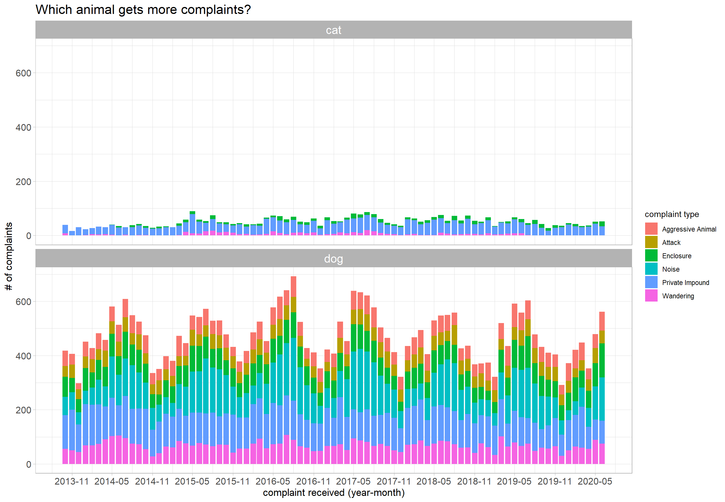
It seems like dogs cause more trouble than cats!
Let's see if there is any difference among complaints across all electoral divisions!
By electoral division:
by_electoral_divisons <- animal_complaints %>%
  count(electoral_division, complaint_type, sort = T) %>%
  group_by(electoral_division) %>%
  mutate(total_electoral_division = sum(n)) %>%
  ungroup()

by_electoral_divisons %>%
  mutate(division_complaint_ratio = n/total_electoral_division,
         electoral_division = fct_reorder(electoral_division, parse_number(electoral_division))) %>%
  ggplot(aes(complaint_type, electoral_division, fill = division_complaint_ratio)) +
  geom_tile() +
  theme(axis.text.x = element_text(angle = 90),
        axis.title = element_text(size = 13),
        plot.title = element_text(size = 18),
        legend.position = "bottom") +
  scale_fill_gradient(high = "red", low = "green", labels = percent) +
  labs(x = "complaint type",
       y = "electoral division",
       fill = "division complaint type ratio",
       title = "Complaint Type Ratio among All Divisions",
subtitle = "Scan the heatmap horizontally") 
By complaint type:
animal_complaints %>%
  count(electoral_division, complaint_type, sort = T) %>%
  group_by(complaint_type) %>%
  mutate(total_complaints = sum(n)) %>%
  ungroup() %>%
  mutate(complaint_ratio = n / total_complaints,
         electoral_division = fct_reorder(electoral_division, parse_number(electoral_division))) %>%
  ggplot(aes(complaint_type, electoral_division, size = complaint_ratio, color = complaint_type)) +
  geom_point() +
  theme(axis.text.x = element_text(angle = 90),
        axis.title = element_text(size = 13),
        plot.title = element_text(size = 18),
        legend.position = "bottom",
        panel.grid = element_blank()) +
  labs(x = "complaint type",
       y = "electoral division",
       size = "complaint ratio",
       title = "Electoral Division Ratio among All Complaint Types",
       subtitle = "Scan the plot vertically") +
  scale_size_continuous(labels = percent, range = c(2, 5)) +
guides(color = "none") 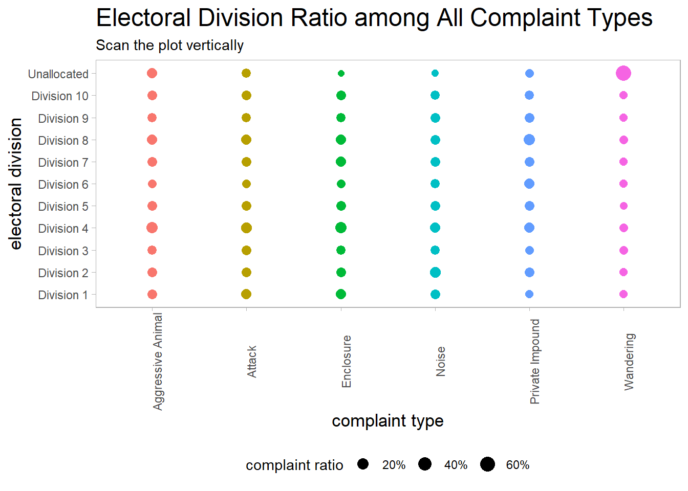
brisbane_complaints is a messy dataset. A significant amount of cleaning is required in order to use it.
brisbane_cleaned <- brisbane_complaints %>%
  filter(animal_type %in% c("Dog", "Cat")) %>%
  mutate(date_range = str_remove(date_range, ".csv"),
         date_range = str_extract_all(date_range, "[:digit:]{4}")) %>%
  unnest(date_range) %>%
  select(-c(nature, city)) %>%
  filter(!is.na(category)) %>%
  mutate(suburb = str_to_title(suburb),
         category = fct_lump(category, n = 6),
         date_range = as.numeric(date_range)) %>%
  filter(category != "Other")
brisbane_cleaned %>%
count(animal_type, category, date_range, sort = T) %>%
ggplot(aes(date_range, n, color = animal_type)) +
geom_line(size = 2) +
facet_wrap(~category) +
labs(x = "year",
y = "# of complaints",
color = NULL,
title = "The 6 Major Complaint Types in Brisbane") +
theme(axis.title = element_text(size = 13),
strip.text = element_text(size = 15),
plot.title = element_text(size = 18),
legend.position = "bottom")
Working on animal_outcomes:
Most of the column names are about the Australian states in a shortcut format. I will replace the abbreviations by the full names.
animal_outcomes_processed <- animal_outcomes %>%
  rename(`Australian Capital Territory` = ACT,
         `New South Wales` = NSW,
         `Northern Territory` = NT,
          Queensland = QLD,
          `South Australia` = SA,
          Tasmania = TAS,
         Victoria = VIC,
         `Western Australian` = WA)

animal_outcomes_processed
## # A tibble: 664 x 12
## year animal_type outcome `Australian Cap~ `New South Wale~ `Northern Terri~
## <dbl> <chr> <chr> <dbl> <dbl> <dbl>
## 1 1999 Dogs Reclaim~ 610 3140 205
## 2 1999 Dogs Rehomed 1245 7525 526
## 3 1999 Dogs Other 12 745 955
## 4 1999 Dogs Euthani~ 360 9221 9
## 5 1999 Cats Reclaim~ 111 201 22
## 6 1999 Cats Rehomed 1442 3913 269
## 7 1999 Cats Other 0 447 0
## 8 1999 Cats Euthani~ 1007 8205 847
## 9 1999 Horses Reclaim~ 0 0 1
## 10 1999 Horses Rehomed 1 12 3
## # ... with 654 more rows, and 6 more variables: Queensland <dbl>,
## # South Australia <dbl>, Tasmania <dbl>, Victoria <dbl>,
## # Western Australian <dbl>, Total <dbl>animal_outcomes_processed %>%
pivot_longer(c(4:11), values_to = "count", names_to = "state") %>%
ggplot(aes(year, count, fill = outcome)) +
geom_col() +
facet_wrap(~state) +
scale_x_continuous(breaks = seq(1999, 2018, 3)) +
theme(axis.title = element_text(size = 13),
strip.text = element_text(size = 15),
plot.title = element_text(size = 18),
legend.position = "bottom") +
labs(title = "How were the animals dealt with?")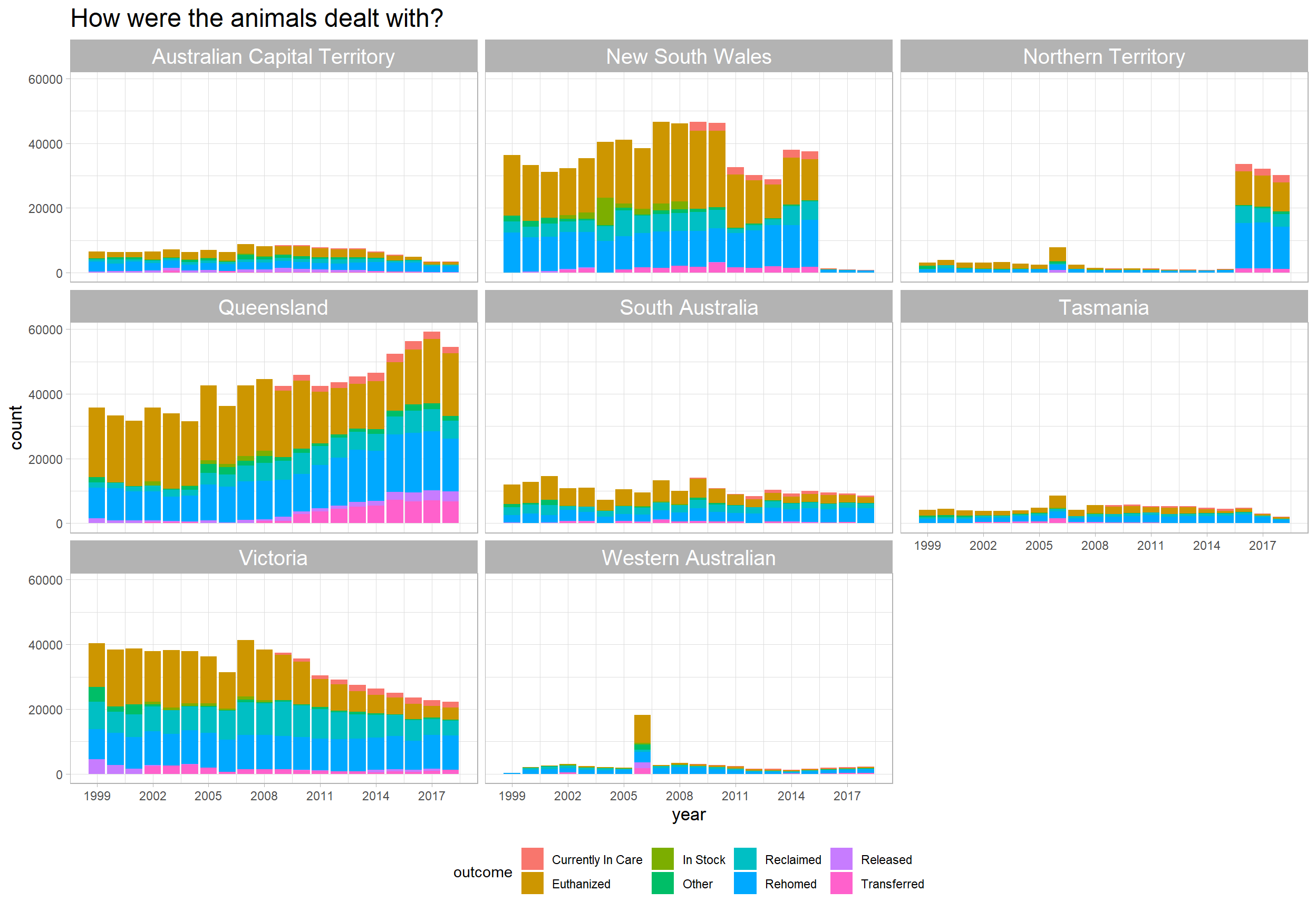
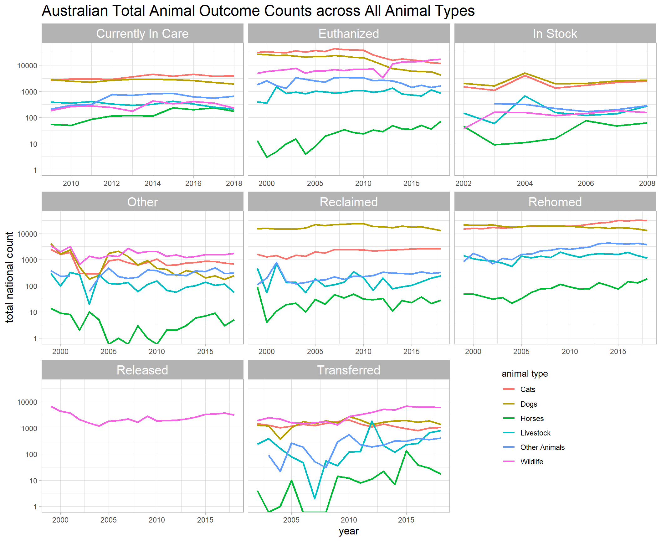
animal_outcomes_processed %>%
  group_by(year, animal_type, outcome) %>%
  summarize(aus_total = sum(Total)) %>%
  ungroup() %>%
  ggplot(aes(year, aus_total, color = animal_type)) +
  geom_line(size = 1) +
  facet_wrap(~outcome, scales = "free_x") +
  scale_y_log10() +
  theme(axis.title = element_text(size = 13),
        strip.text = element_text(size = 15),
        plot.title = element_text(size = 18),
        legend.position = c(0.8, 0.2)) +
  labs(title = "Australian Total Animal Outcome Counts across All Animal Types",
       y = "total national count",
       color = "animal type")