Europe Energy Production Data Visualization (with ggflags used)
In this blog post, I will analyze energy productions among the European countries. As usual, the datasets are from the TidyTuesday project. You can find them here. Since so many countries are involved in the data, this is a great opportunity to harness the ggflags package, making the country flags on visualization.
library(tidyverse)
library(tidytext)
library(patchwork)
#install.packages("ggflags")
library(ggflags)
theme_set(theme_light())
energy_types <- read_csv('https://raw.githubusercontent.com/rfordatascience/tidytuesday/master/data/2020/2020-08-04/energy_types.csv') %>%
mutate(country_name = if_else(is.na(country_name), country, country_name))
country_totals <- read_csv('https://raw.githubusercontent.com/rfordatascience/tidytuesday/master/data/2020/2020-08-04/country_totals.csv') %>%
select(-level) %>%
mutate(country_name = if_else(is.na(country_name), country, country_name)) Working on energy_types.
Total energy consumption for all countries:
energy_types %>%
  pivot_longer(c(`2016`:`2018`), names_to = "year") %>%
  group_by(year, type) %>%
  summarize(value = sum(value)) %>%
  ungroup() %>%
  mutate(year = as.numeric(year)) %>%
  ggplot(aes(year, value, fill = type)) +
  geom_col()  +
  labs(x = NULL,
       y = "total energy consumption in GWh",
       color = "energy type",
       title = "Total Energy Consumption Across Energy Types for All Countries") +
  theme(plot.title = element_text(size = 17)) +
  scale_y_continuous(labels = scales::comma)
The European energy consumption has changed little both in total and in various types, although there was a slight drop for consumption on the conventional thermal type.
Top 9 energy consumption countries:
energy_types %>%
  pivot_longer(c(`2016`:`2018`), names_to = "year") %>%
  mutate(year = as.integer(year),
         country_name = fct_lump(country_name, w = value, n = 9)) %>%
  filter(country_name != "Other") %>%
  mutate(type = fct_reorder(type, -value, sum),
         country_name = fct_reorder(country_name, -value, sum)) %>%
  ggplot(aes(year, value, color = type)) +
  geom_line(size = 1) +
  geom_point() +
  facet_wrap(~country_name) +
  scale_y_continuous(labels = scales::comma) +
  scale_x_continuous(breaks = c(2016:2018)) +
  labs(x = NULL,
       y = "energy consumption in GWh",
       color = "energy type",
       title = "Top 9 Energy Consumption Countries Across Energy Types") +
  theme(strip.text = element_text(size = 15),
        plot.title = element_text(size = 17))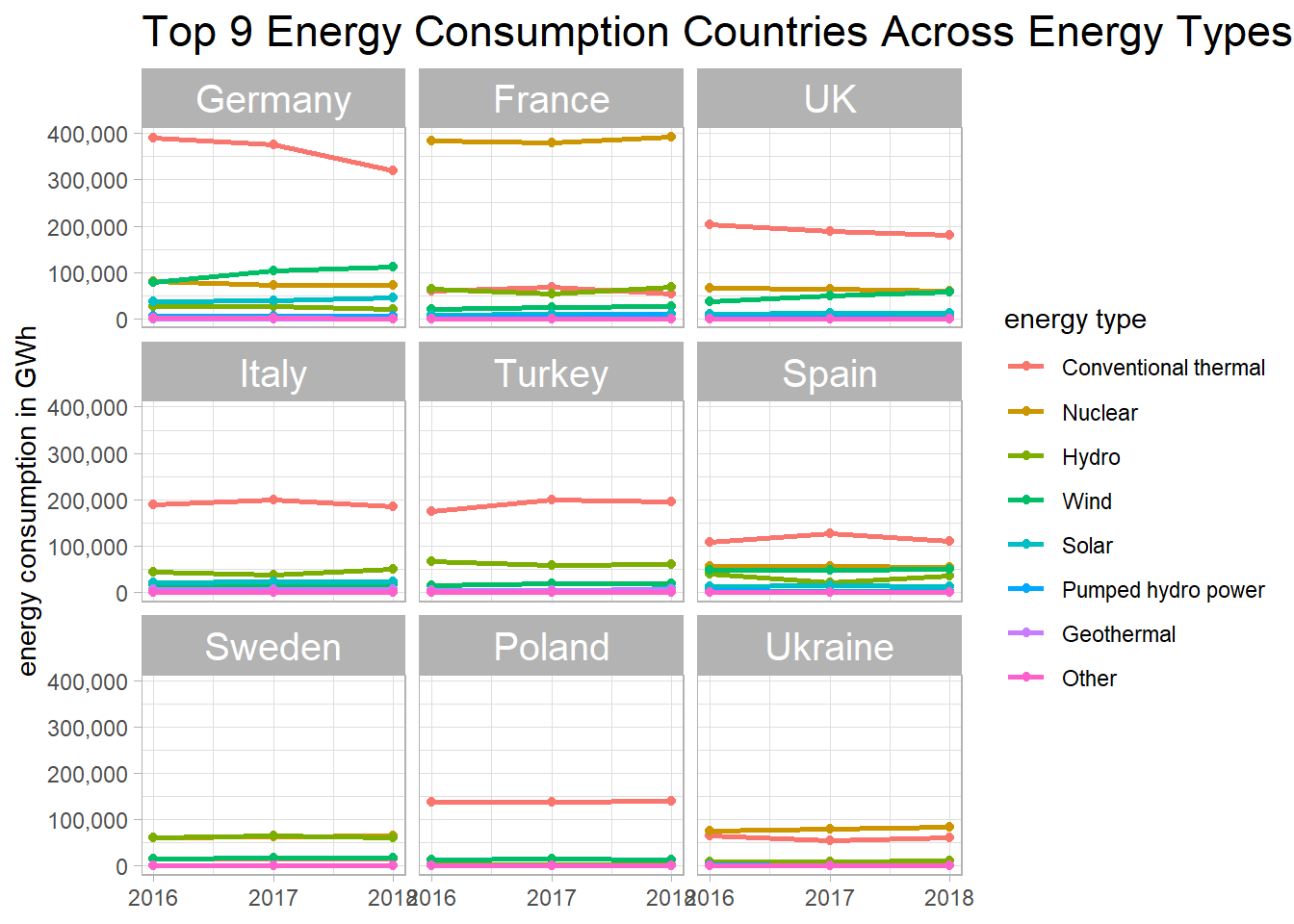
Working on country_totals
How does each country break down their energy types?
total_pivot <- country_totals %>%
  pivot_longer(c(`2016`:`2018`), names_to = "year")

total_pivot %>%
  group_by(country_name, year) %>%
  mutate(total_yearly_value = sum(value),
         country_name = str_remove(country_name, "\\s&.+$")) %>%
  ungroup() %>%
  mutate(type_ratio = value/total_yearly_value,
         type = fct_reorder(type, type_ratio, sum, na.rm = T)) %>%
  ggplot(aes(type, country_name, fill = type_ratio)) +
  geom_tile() +
  facet_wrap(~year) +
  theme(axis.text.x = element_text(angle = 90),
        strip.text = element_text(size = 15),
        axis.title.y = element_text(size = 14),
        axis.text.y = element_text(size = 13),
        plot.title = element_text(size = 18)) +
  labs(y = NULL,
       x = "energy type",
       fill = "type ratio",
       title = "Energy Type Ratio for All European Countries from 2016 to 2018",
       subtitle = "Scan the heatmap horizontally within each facet") +
  scale_fill_gradient(labels = scales::percent,
                       low = "green",
                       high = "red") +
scale_x_discrete(expand = c(0,0)) 
total_pivot %>%
  filter(value > 0) %>%
  mutate(country_name = reorder_within(country_name, log10(value), year, sum, na.rm = T)) %>%
  ggplot(aes(value, country_name, fill = type)) +
  geom_col() +
  scale_x_log10() +
  scale_y_reordered() +
  facet_wrap(~year, scales = "free_y") +
  theme(strip.text = element_text(size = 13),
        plot.title = element_text(size = 16)) +
  labs(x = "energy consumption value per type",
       y = NULL,
title = "How did Countries' Energy Distribution Look Like between 2016 to 2018") 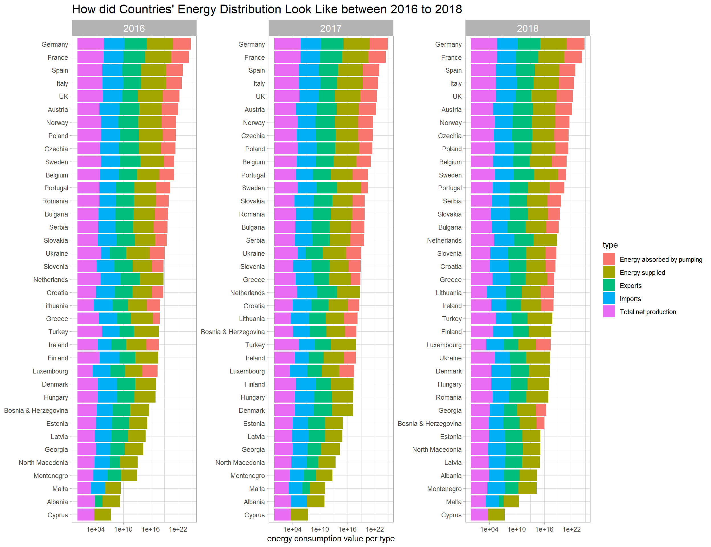
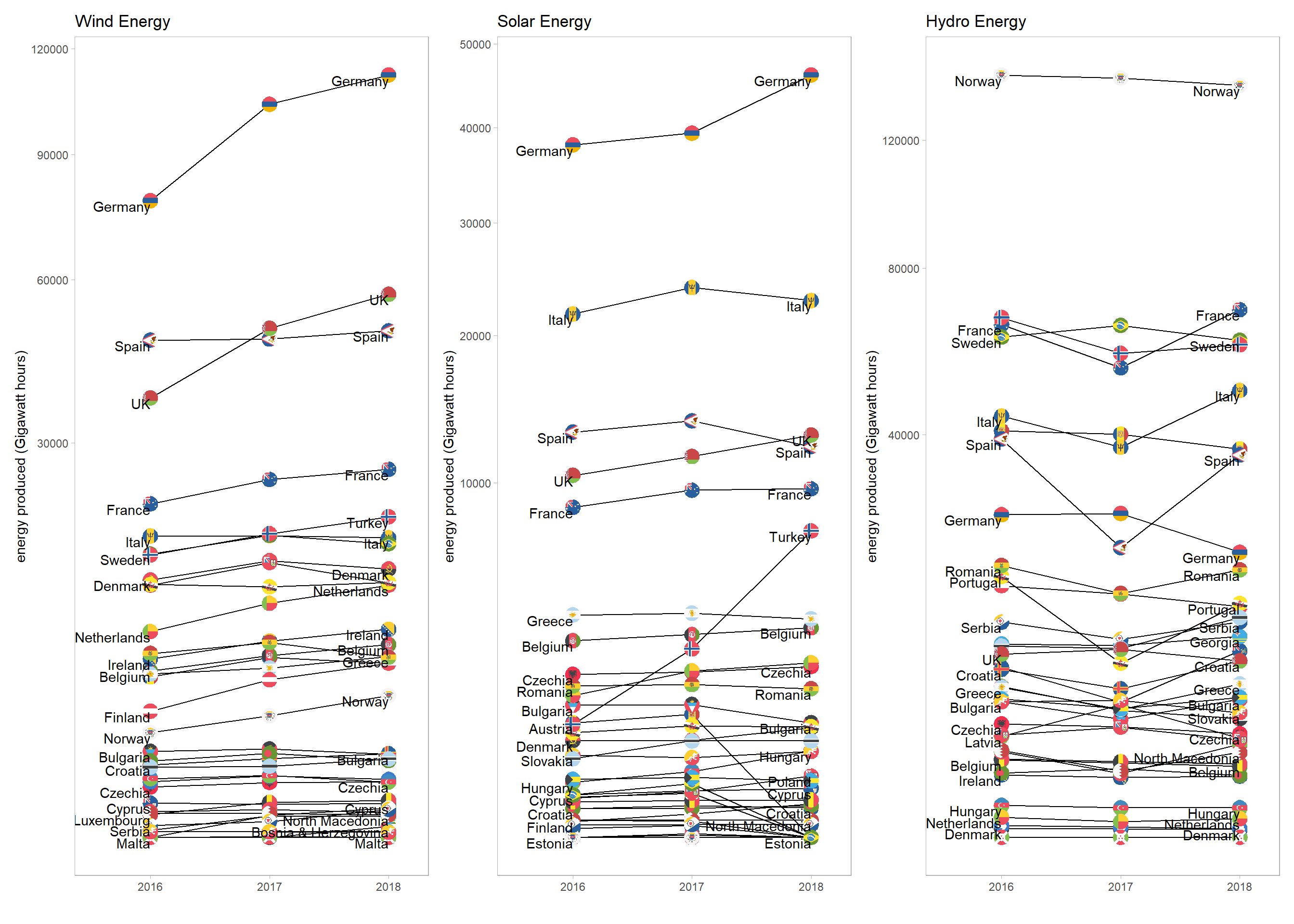
The following section uses the ggflags package inspired by David Robinson’s code. This is my first time actually using the package, although I’ve seen similar visualization before.
Here I am considering the renewable energy sources (e.g., wind, solar, hydro):
renewable_energy <- energy_types %>%
  filter(type %in% c("Wind", "Solar", "Hydro")) %>%
  pivot_longer(cols = contains("2"), names_to = "year", values_to = "energy") %>%
  mutate(country = str_to_lower(country),
         country = fct_recode(country, gb = "uk"),
         year = as.numeric(year))
flag_plot <- function(energy_source){
renewable_energy %>%
filter(type == energy_source) %>%
ggplot(aes(year, energy)) +
geom_line(aes(group = country_name)) +
geom_flag(aes(country = country)) +
geom_text(aes(label = if_else(year != 2017, country_name, NA_character_)),
vjust = 1, hjust = 1, check_overlap = T) +
scale_x_continuous(breaks = c(2016, 2017, 2018),
limits = c(2015.5, 2018.2)) +
scale_y_sqrt() +
theme(panel.grid = element_blank()) +
labs(x = "",
y = "energy produced (Gigawatt hours)",
title = paste(energy_source, "Energy"))
}
flag_plots <- map(c("Wind", "Solar", "Hydro"), flag_plot)
reduce(flag_plots, `+`)