NCAA Women's Basketball Data Visualiztion
Wed, Feb 23, 2022
4-minute read
The NCAA dataset is from TidyTuesday.
library(tidyverse)
library(scales)
theme_set(theme_light())
tournament <- read_csv('https://raw.githubusercontent.com/rfordatascience/tidytuesday/master/data/2020/2020-10-06/tournament.csv') %>%
mutate(tourney_finish = factor(tourney_finish, levels = c("1st", "2nd", "RSF", "RF", "NSF", "N2nd", "Champ")))
tournament## # A tibble: 2,092 x 19
## year school seed conference conf_w conf_l conf_percent conf_place reg_w
## <dbl> <chr> <dbl> <chr> <dbl> <dbl> <dbl> <chr> <dbl>
## 1 1982 Arizona S~ 4 Western C~ NA NA NA - 23
## 2 1982 Auburn 7 Southeast~ NA NA NA - 24
## 3 1982 Cheyney 2 Independe~ NA NA NA - 24
## 4 1982 Clemson 5 Atlantic ~ 6 3 66.7 4th 20
## 5 1982 Drake 4 Missouri ~ NA NA NA - 26
## 6 1982 East Caro~ 6 Independe~ NA NA NA - 19
## 7 1982 Georgia 5 Southeast~ NA NA NA - 21
## 8 1982 Howard 8 Mid-Easte~ NA NA NA - 14
## 9 1982 Illinois 7 Big Ten NA NA NA - 21
## 10 1982 Jackson S~ 7 Southwest~ NA NA NA - 28
## # ... with 2,082 more rows, and 10 more variables: reg_l <dbl>,
## # reg_percent <dbl>, how_qual <chr>, x1st_game_at_home <chr>,
## # tourney_w <dbl>, tourney_l <dbl>, tourney_finish <fct>, full_w <dbl>,
## # full_l <dbl>, full_percent <dbl>How many school teams per conference over the years?
tournament %>%
  filter(fct_lump(conference, n = 9) != "Other") %>%
  count(year, conference, sort = T) %>%
  mutate(conference = fct_reorder(conference, -n, sum)) %>%
  ggplot(aes(year, n, color = conference)) +
  geom_line() +
  geom_point() +
  facet_wrap(~conference) +
  theme(legend.position = "none",
        plot.title = element_text(size = 18),
        strip.text = element_text(size = 15)) +
  scale_y_continuous(breaks = seq(1,10)) +
  labs(x = NULL,
       y = "# of teams",
       title = "How Many Teams per Conference?")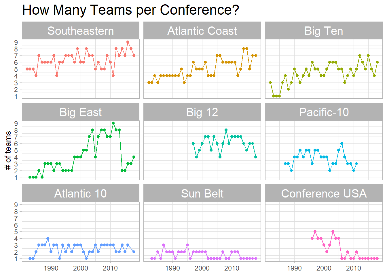
The highest overall winning percentage per year:
tournament %>%
  group_by(year) %>%
  slice_max(full_percent, n = 1) %>%
  ungroup() %>%
  ggplot(aes(year, full_percent)) +
  geom_point(aes(color = tourney_finish), size = 3) +
  geom_line() +
  geom_text(aes(label = school), hjust = 0, vjust = 1, check_overlap = T) +
  scale_y_continuous(label = percent_format(scale = 1)) +
  scale_x_continuous(breaks = seq(min(tournament$year), max(tournament$year), 2)) +
  labs(x = NULL,
       y = "overall winning percentage",
       color = "tournament ended",
       title = "Yearly Team with the Highest Winning Percentage") +
  theme(axis.text.x = element_text(angle = 90))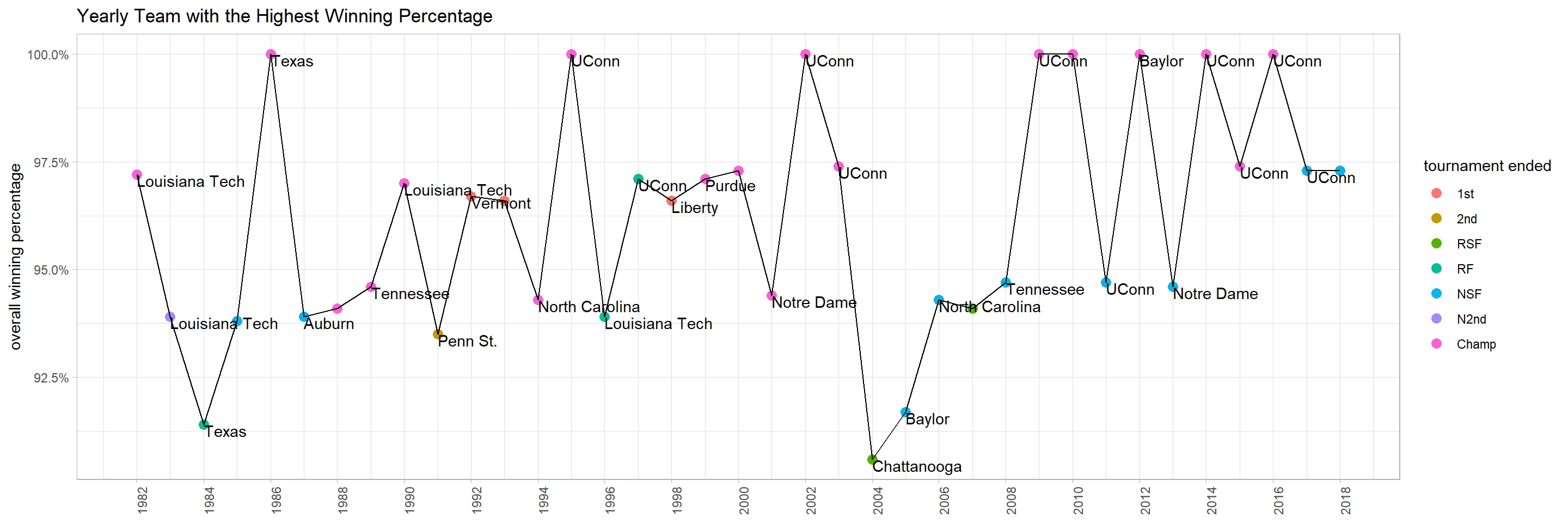
Champs:
tournament %>%
  filter(tourney_finish == "Champ") %>%
  count(conference, how_qual, sort = T) %>%
  mutate(conference = fct_reorder(conference, n, sum)) %>%
  ggplot(aes(n, conference, fill = how_qual)) +
  geom_col() +
  scale_x_continuous(breaks = seq(1,10, 2)) +
  labs(x = "# of champs",
       y = NULL,
       fill = "how qualified",
       title = "# of Champs per Conference")
tournament %>%
  filter(full_l < 20) %>%
  mutate(tourney_finish = if_else(tourney_finish == "Champ", "Champ", "Non-Champ")) %>%
  ggplot(aes(full_w, full_l, color = tourney_finish)) +
  geom_point(aes(size = if_else(tourney_finish == "Champ", 4, 3))) +
  facet_wrap(~year) +
  scale_size_continuous(guide = NULL) +
  labs(x = "# of wins",
       y = "# of losses",
       color = "",
title = "How did Champ Perform per Year?") 
Seeds:
tournament %>%
  filter(!is.na(tourney_finish)) %>%
  group_by(seed, tourney_finish) %>%
  summarize(n = n()) %>%
  ungroup() %>%
  group_by(seed) %>%
  mutate(nn = sum(n),
         percentage = n/nn) %>%
  ungroup() %>%
  ggplot(aes(tourney_finish, seed, fill = percentage)) +
  geom_tile() +
  geom_text(aes(label = paste0(round(percentage * 100), "%")), check_overlap = T) +
  scale_y_reverse(breaks = seq(1,16), expand = c(0,0)) +
  scale_x_discrete(expand = c(0,0)) +
  scale_fill_gradient(high = "red",
                      low = "green",
                      label = percent) +
  theme(panel.grid = element_blank()) +
  labs(x = "tournament finished at ...",
       y = "seed #",
       fill = NULL,
       title = "How Likely Each Seed Will Be Finished at the Tournament?")
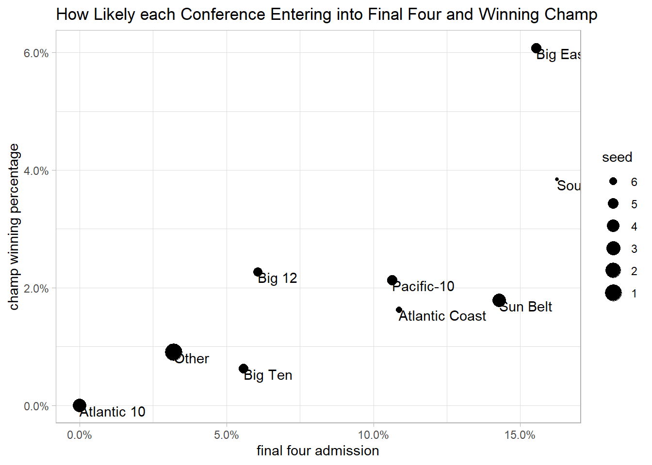
The following code is inspired by David Robinson’s code
tournament %>%
  mutate(conference = fct_lump(conference, 8)) %>%
  group_by(conference) %>%
  summarize(n = n(),
            seed = mean(seed, na.rm = T),
            pct_win = mean(tourney_finish == "Champ", na.rm = T),
            pct_final_four = mean(tourney_finish %in% c("Champ", "N2nd", "NSF"))) %>%
  ungroup() %>%
  ggplot(aes(pct_final_four, pct_win)) +
  geom_point(aes(size = seed)) +
  geom_text(aes(label = conference), check_overlap = T, hjust = 0, vjust = 1) +
  scale_size_continuous(breaks = seq(1,10),
                        labels = seq(10,1)) +
  scale_x_continuous(labels = percent) +
  scale_y_continuous(labels = percent) +
  labs(x = "final four admission",
       y = "champ winning percentage",
       title = "How Likely each Conference Entering into Final Four and Winning Champ")