Data Visualization on Historical Phone Usage
This blog post analyzes historical phone usage around the world. The phone usage is divided into the landline and mobile categories. As usual, the data comes from TidyTuesday.
library(tidyverse)
library(scales)
library(broom)
theme_set(theme_light())
mobile <- read_csv('https://raw.githubusercontent.com/rfordatascience/tidytuesday/master/data/2020/2020-11-10/mobile.csv')
landline <- read_csv('https://raw.githubusercontent.com/rfordatascience/tidytuesday/master/data/2020/2020-11-10/landline.csv')I would like to join mobile and landline together, but total_pop is not lined up well. Maybe this is a data issue.
joined <- landline %>%
  inner_join(mobile %>%
               select(-total_pop, -gdp_per_cap, -continent),
             by = c("entity", "code", "year"))

joined
## # A tibble: 6,215 x 8
## entity code year total_pop gdp_per_cap landline_subs continent mobile_subs
## <chr> <chr> <dbl> <dbl> <dbl> <dbl> <chr> <dbl>
## 1 Afghan~ AFG 1990 12412000 NA 0.296 Asia 0
## 2 Afghan~ AFG 1991 13299000 NA 0.285 Asia 0
## 3 Afghan~ AFG 1992 14486000 NA 0.207 Asia 0
## 4 Afghan~ AFG 1993 15817000 NA 0.192 Asia 0
## 5 Afghan~ AFG 1994 17076000 NA 0.179 Asia 0
## 6 Afghan~ AFG 1995 18111000 NA 0.170 Asia 0
## 7 Afghan~ AFG 1996 18853000 NA 0.163 Asia 0
## 8 Afghan~ AFG 1997 19357000 NA 0.158 Asia 0
## 9 Afghan~ AFG 1998 19738000 NA 0.154 Asia 0
## 10 Afghan~ AFG 1999 20171000 NA 0.149 Asia 0
## # ... with 6,205 more rowsjoined %>%
rename(landline = landline_subs,
mobile = mobile_subs) %>%
group_by(continent, year) %>%
summarize(across(c(landline, mobile), mean, na.rm = T)) %>%
pivot_longer(cols = c(3,4), names_to = "type", values_to = "subscription") %>%
ungroup() %>%
ggplot(aes(year, subscription, fill = type)) +
geom_area(alpha = 0.7) +
facet_wrap(~continent) +
scale_x_continuous(breaks = seq(1990, 2020, 5)) +
scale_y_continuous(labels = percent_format(scale = 1)) +
theme(strip.text = element_text(size = 15),
plot.title = element_text(size = 18),
legend.position = c(0.8, 0.2)) +
labs(y = "average subscription per 100 people",
x = "",
fill = "",
title = "Average Mobile/Landline Subscriptions Per 100 People")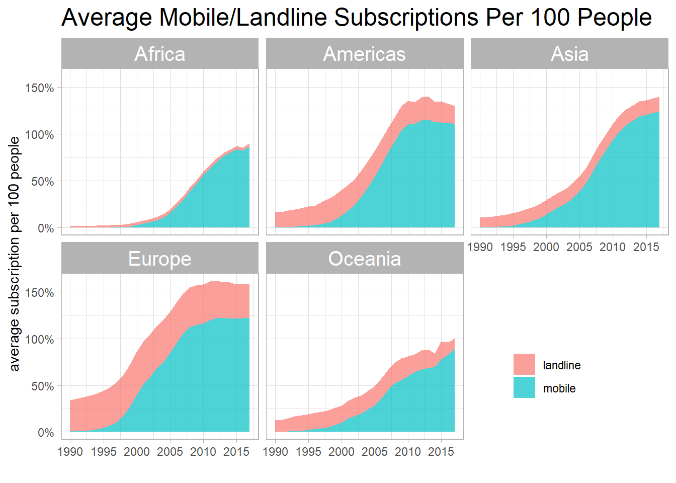
Not surprisingly, landline stayed the same throughout the entire period, but mobile subscriptions had gone up significantly across 5 states.
Which entities grew fastest on landline?
joined %>%
  group_by(entity, continent) %>%
  summarize(mobile_diff = max(mobile_subs, na.rm = T) - min(mobile_subs, na.rm = T)) %>%
  ungroup() %>%
  arrange(desc(mobile_diff)) %>%
  head(20) %>%
  mutate(entity = fct_reorder(entity, mobile_diff),
         continent = fct_reorder(continent, -mobile_diff, sum)) %>%
  ggplot(aes(mobile_diff, entity, fill = continent)) +
  geom_col() +
  scale_x_continuous(labels = percent_format(scale = 1)) +
  labs(x = "maximum difference on mobile subscritions",
       y = NULL,
       fill = NULL,
       title = "Top 20 Entities with Most Progress on Mobile Subscriptions")
Total population VS mobile usage:
joined %>%
  filter(mobile_subs > 0,
         year == 2017) %>%
  ggplot(aes(total_pop, mobile_subs, color = continent)) +
  geom_point() +
  geom_text(aes(label = entity), hjust = 1, vjust = 1, check_overlap = T) +
  scale_x_log10() +
  scale_y_continuous(labels = percent_format(scale = 1)) +
  labs(x = "total population",
       y = "mobible subscriptions per 100 people",
       color = NULL,
       title = "Total Population VS Mobile Subscription")
GLM model on predicting mobile_sub:
joined %>%
  summarize(model = list(glm(mobile_subs ~ year + total_pop + gdp_per_cap + continent))) %>%
  mutate(tidied = map(model, tidy, conf.int = T)) %>%
  unnest(tidied) %>%
  filter(term != "(Intercept)") %>%
  mutate(term = str_remove(term, "continent")) %>%
  ggplot(aes(estimate, term)) +
  geom_point() +
  geom_vline(xintercept = 0, lty = 2, color = "red") +
  geom_errorbarh(aes(xmin = conf.low, xmax = conf.high), height = 0.2) +
  labs(x = "GLM estimate",
       y = "",
       title = "GLM Estimation on Mobile Subscriptions")
It seems like year is a useful predictor contributing to the mobile subscriptions all over the world, and surprisingly, gdp_per_cap is not a factor that contributes to the mobile subscriptions.
GLM model on predicting mobile_subs based on continent:
joined %>%
  group_by(continent) %>%
  summarize(model = list(glm(mobile_subs ~ year + total_pop + gdp_per_cap))) %>%
  mutate(tidied = map(model, tidy, conf.int = T)) %>%
  unnest(tidied) %>%
  filter(term != "(Intercept)") %>%
  ggplot(aes(estimate, term)) +
  geom_point() +
  geom_errorbarh(aes(xmin = conf.low, xmax = conf.high), height = 0.2) +
facet_wrap(~continent) 
It looks like year is the only factor that contributes to mobile_subs.
Landline VS Mobile:
joined %>%
  group_by(entity, continent) %>%
  summarize(correlation = cor(landline_subs, mobile_subs)) %>%
  filter(!is.na(correlation)) %>%
  ungroup() %>%
  group_by(correlation > 0) %>%
  slice_max(abs(correlation), n = 10) %>%
  ungroup() %>%
  mutate(entity = paste0(entity, " (", continent, ")"),
         entity = fct_reorder(entity, correlation)) %>%
  ggplot(aes(correlation, entity, fill = correlation > 0)) +
  geom_col() +
  theme(legend.position = "none") +
  labs(x = "correlation between landline and mobile",
       y = NULL,
       title = "Top 10 Entities with Highest and Lowest Correlation",
       subtitle = "Correlation is between landline and mobile subscription")
Total population and GDP per capita:
joined %>%
  filter(year == 2017) %>%
  ggplot(aes(total_pop, gdp_per_cap)) +
  geom_point() +
  geom_smooth() +
  scale_x_log10() +
  labs(x = "total population",
       y = "GDP per capita",
       title = "The Relationship between GDP per Capita and Total Population") +
scale_y_continuous(labels = dollar) 
There is no an obvious relationship between population and GDP per capita.