Global Big Mac Price Index Visualization
This is an interesting dataset about the McDonald’s Big Mac Pricing around the world. There is a similar background story about Starbucks as people complain some parts of world Starbucks Coffee is more expensive than the other ones. As usual, the data comes from TidyTuesday.
library(tidyverse)
library(lubridate)
library(scales)
library(countrycode)
library(WDI)
library(broom)
theme_set(theme_light())
big_mac <- read_csv('https://raw.githubusercontent.com/rfordatascience/tidytuesday/master/data/2020/2020-12-22/big-mac.csv') %>%
mutate(year = year(date)) %>%
rename(iso3c = iso_a3) %>%
inner_join(WDI(start = 2000, end = 2020, extra = T) %>%
tibble() %>%
select(iso3c, income, year, NY.GDP.PCAP.KD) %>%
rename(gdp_per_capita_2015 = NY.GDP.PCAP.KD),
by = c("year", "iso3c")) %>%
mutate(continent = countrycode(iso3c, origin = "iso3c", destination = "continent"))
big_mac## # A tibble: 1,320 x 23
## date iso3c currency_code name local_price dollar_ex dollar_price
## <date> <chr> <chr> <chr> <dbl> <dbl> <dbl>
## 1 2000-04-01 ARG ARS Argentina 2.5 1 2.5
## 2 2000-04-01 AUS AUD Australia 2.59 1.68 1.54
## 3 2000-04-01 BRA BRL Brazil 2.95 1.79 1.65
## 4 2000-04-01 CAN CAD Canada 2.85 1.47 1.94
## 5 2000-04-01 CHE CHF Switzerland 5.9 1.7 3.47
## 6 2000-04-01 CHL CLP Chile 1260 514 2.45
## 7 2000-04-01 CHN CNY China 9.9 8.28 1.20
## 8 2000-04-01 CZE CZK Czech Repu~ 54.4 39.1 1.39
## 9 2000-04-01 DNK DKK Denmark 24.8 8.04 3.08
## 10 2000-04-01 GBR GBP Britain 1.9 0.633 3.00
## # ... with 1,310 more rows, and 16 more variables: usd_raw <dbl>,
## # eur_raw <dbl>, gbp_raw <dbl>, jpy_raw <dbl>, cny_raw <dbl>,
## # gdp_dollar <dbl>, adj_price <dbl>, usd_adjusted <dbl>, eur_adjusted <dbl>,
## # gbp_adjusted <dbl>, jpy_adjusted <dbl>, cny_adjusted <dbl>, year <dbl>,
## # income <chr>, gdp_per_capita_2015 <dbl>, continent <chr>big_mac %>%
group_by(year, continent) %>%
summarize(avg_price = mean(dollar_price),
n = n()) %>%
ungroup() %>%
mutate(continent = fct_reorder(continent, -avg_price)) %>%
ggplot(aes(year, avg_price, color = continent)) +
geom_line(size = 1) +
geom_point(aes(size = n)) +
scale_y_continuous(labels = dollar) +
labs(x = "",
y = "average big-mac price (USD)",
title = "Yearly Average Price of Big Mac per Continent")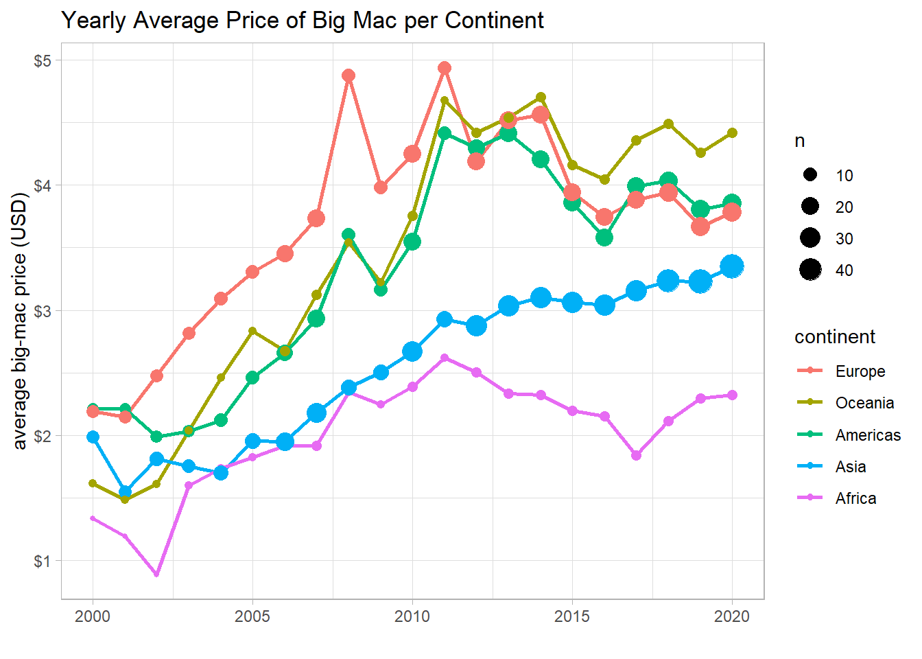
There isn’t so much data about the African continent, although its big mac was the cheapest in USD among all the continents.
map_data("world") %>%
  tibble() %>%
  mutate(iso3c = countrycode(region, origin = "country.name", destination = "iso3c"),
         continent = countrycode(region, origin = "country.name", destination = "continent")) %>%
  left_join(big_mac %>% filter(year == max(year, na.rm = T)), by = "iso3c") %>%
  ggplot(aes(long, lat, group = group, fill = dollar_price)) +
  geom_polygon() +
  scale_fill_gradient(high = "red",
                      low = "green",
                      labels = dollar) +
  theme_void() +
  labs(fill = "big-mac price",
title = "Year 2020") 
This world map confirms that there are a lot of missing countries in the big_mac data, as South Africa is the only African country that shows up on the map.
big_mac %>%
  select(iso3c, name, local_price, dollar_price, year, income, continent, gdp_per_capita_2015) %>%
  group_by(continent) %>%
  summarize(model = list(lm(dollar_price ~ year + gdp_per_capita_2015))) %>%
  ungroup() %>%
  mutate(tidied = map(model, tidy, conf.int = T)) %>%
  unnest(tidied) %>%
  filter(term != "(Intercept)") %>%
  ggplot(aes(estimate, term)) +
  geom_point() +
  geom_errorbarh(aes(xmin = conf.low,
                     xmax = conf.high),
                 height = 0.2) +
  facet_wrap(~continent) +
  labs(x = "linear regression estimate",
       y = "predictor",
       title = "How does Predictor Affect Big-Mac Pricing",
       subtitle = "This model is based upon linear regression")
year is a contributing factor to the price of big mac among all continents. This makes sense, as not just big mac, everything get more and more expensive as time progresses. GDP per capita, however, is not an important factor contributing to the model.
Big mac inflation rates based on the local currency and USD:
big_mac %>%
  select(name, local_price, dollar_price, year) %>%
  distinct(name, year, .keep_all = T) %>%
  group_by(name) %>%
  mutate(price_lag_usd = lag(dollar_price),
         price_lag_local = lag(local_price),
         inflation_rate_usd = (dollar_price - price_lag_usd)/price_lag_usd,
         inflation_rate_local = (local_price - price_lag_local)/price_lag_local) %>%
  ungroup() %>%
  filter(name %in% c("China", "Japan", "Britain", "United States")) %>%
  pivot_longer(cols = starts_with("inflation_rate"),
               names_to = "inflation_type",
               values_to = "inflation_rate") %>%
  mutate(inflation_type = fct_recode(inflation_type,
                                     Local = "inflation_rate_local",
                                     USD = "inflation_rate_usd")) %>%
  ggplot(aes(year, inflation_rate, color = inflation_type)) +
  geom_line(size = 1) +
  geom_point() +
  facet_wrap(~name) +
  labs(x = NULL,
       y = "big mac inflation rate",
       color = "currency",
       title = "The Annual Big Mac Inflation Rate among Four Countries") +
  scale_y_continuous(labels = percent) +
  theme(plot.title = element_text(size = 18),
        strip.text = element_text(size = 15))
Exchange rate vs GDP per capita:
big_mac %>%
  mutate(decade = 10 * (year %/% 10),
         decade = paste("decade:", decade)) %>%
  group_by(decade, income, name) %>%
  summarize(avg_dollar_ex = mean(dollar_ex, na.rm = T),
            avg_gdp = mean(gdp_per_capita_2015, na.rm = T)) %>%
  ggplot(aes(avg_gdp, avg_dollar_ex, color = income)) +
  geom_point() +
  geom_text(aes(label = name),
            check_overlap = T,
            vjust = 1,
            hjust = 0) +
  scale_y_log10(labels = comma) +
  facet_wrap(~decade) +
  labs(x = "average GDP per capita",
       y = "average exchange rate to USD",
       title = "The Relationship between Exchange Rate and GDP Per Capita") +
  theme(plot.title = element_text(size = 18),
        strip.text = element_text(size = 15))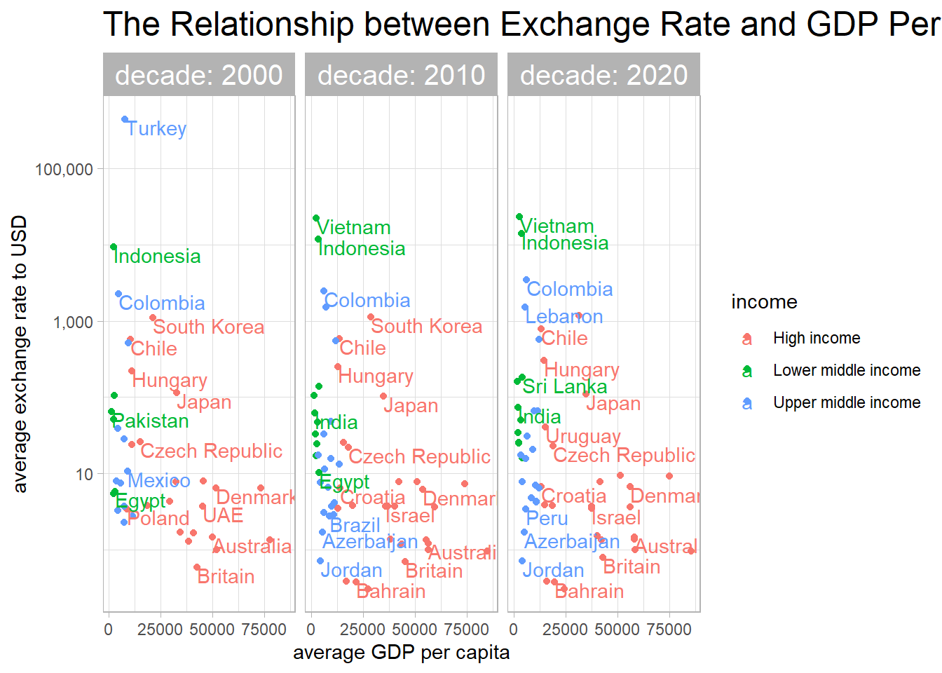
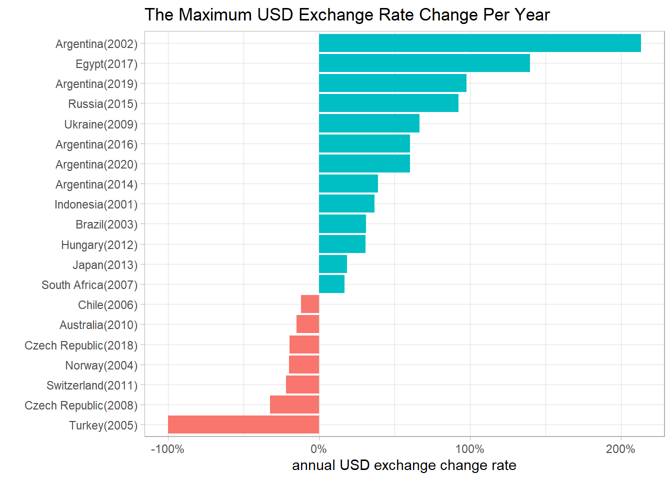
The countries with largest exchange rate change to USD:
big_mac %>%
  select(name, dollar_ex, year) %>%
  distinct(name, year, .keep_all = T) %>%
  group_by(name) %>%
  mutate(dollar_ex_lag = lag(dollar_ex),
         dollar_exchange_rate = (dollar_ex - dollar_ex_lag)/dollar_ex_lag) %>%
  ungroup() %>%
  group_by(year) %>%
  slice_max(abs(dollar_exchange_rate)) %>%
  ungroup() %>%
  mutate(name = paste0(name, "(", year, ")"),
         name = fct_reorder(name, dollar_exchange_rate)) %>%
  ggplot(aes(dollar_exchange_rate, name, fill = dollar_exchange_rate > 0)) +
  geom_col(show.legend = F) +
  scale_x_continuous(labels = percent) +
  labs(x = "annual USD exchange change rate",
       y = "",
       title = "The Maximum USD Exchange Rate Change Per Year")