Kenya Census Visualization (Map Included)
Tue, Mar 8, 2022
3-minute read
In this blog, I will analyze a few of the TidyTuesday datasets about the Kenya census. You can get the datasets from here.
library(tidyverse)
library(janitor)
library(scales)
theme_set(theme_bw())
gender <- read_csv('https://raw.githubusercontent.com/rfordatascience/tidytuesday/master/data/2021/2021-01-19/gender.csv') %>%
clean_names() %>%
filter(county != "Total") %>%
mutate(county = str_replace_all(county, "([a-z])([A-Z])", "\\1 \\2"))
crops <- read_csv('https://raw.githubusercontent.com/rfordatascience/tidytuesday/master/data/2021/2021-01-19/crops.csv') %>%
clean_names() %>%
mutate(sub_county = str_to_title(sub_county)) %>%
filter(sub_county != "Kenya") %>%
rename(county = sub_county)
households <- read_csv('https://raw.githubusercontent.com/rfordatascience/tidytuesday/master/data/2021/2021-01-19/households.csv') %>%
clean_names() %>%
filter(county != "Kenya") %>%
mutate(county = str_replace_all(county, "([a-z])([A-Z])", "\\1 \\2"))Join households and gender together:
house_gender_joined <- households %>%
  inner_join(gender, by = "county")

house_gender_joined
## # A tibble: 47 x 8
## county population number_of_house~ average_househo~ male female intersex
## <chr> <dbl> <dbl> <dbl> <dbl> <dbl> <dbl>
## 1 Mombasa 1190987 378422 3.1 610257 598046 30
## 2 Kwale 858748 173176 5 425121 441681 18
## 3 Kilifi 1440958 298472 4.8 704089 749673 25
## 4 Tana Riv~ 314710 68242 4.6 158550 157391 2
## 5 Lamu 141909 37963 3.7 76103 67813 4
## 6 Taita/Ta~ 335747 96429 3.5 173337 167327 7
## 7 Garissa 835482 141394 5.9 458975 382344 34
## 8 Wajir 775302 127932 6.1 415374 365840 49
## 9 Mandera 862079 125763 6.9 434976 432444 37
## 10 Marsabit 447150 77495 5.8 243548 216219 18
## # ... with 37 more rows, and 1 more variable: total <dbl>It is ideally compact to include all house_gender_joined information on one plot:
house_gender_joined %>%
  ggplot(aes(male, female)) +
  geom_point(aes(size = average_household_size,
                 color = average_household_size),
             alpha = 0.5) +
  geom_abline(color = "lightblue") +
  geom_text(aes(label = county),
            hjust = 1,
            vjust = 1,
            check_overlap = T) +
  scale_x_log10(label = comma) +
  scale_y_log10(label = comma) +
  scale_color_gradient(low = "green",
                       high = "red",
                       guide = "none") +
  theme(legend.position = "bottom") +
  labs(x = "# of male",
       y = "# of female",
       size = "average household size",
       title = "Male and Female Relationship with Average Household Size",
       subtitle = "The smaller average household size, more spacious")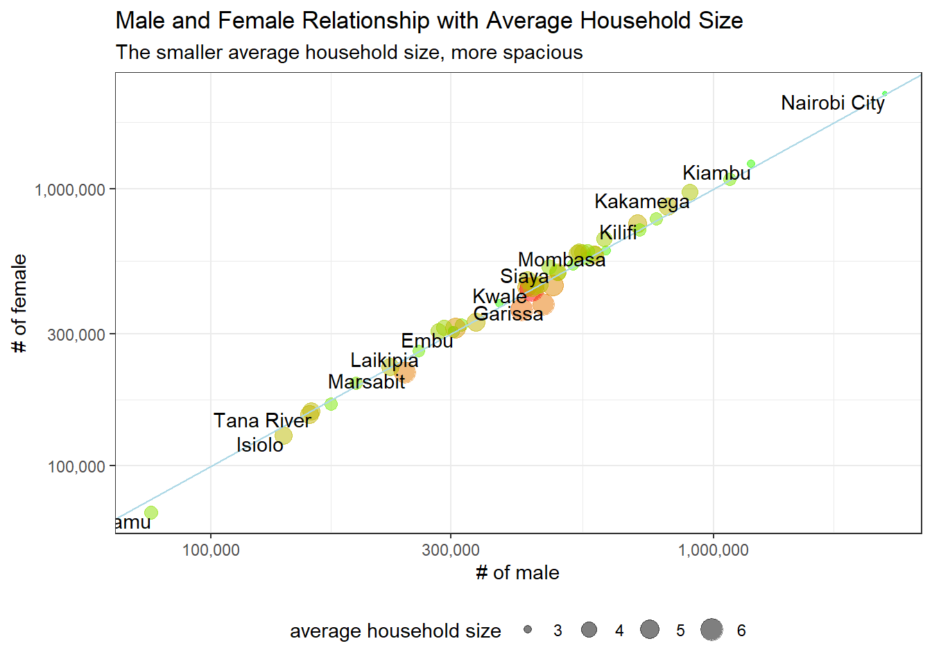
We can see from the above plot that the ratio between male and female is roughly 1 across all counties, and counties with # of people in the middle range are more crowded than counties on either side.
crop_county <- crops %>%
  pivot_longer(cols = c(2:11),
               names_to = "crop",
               values_to = "household") %>%
  mutate(crop = str_replace(crop, "_", " ")) %>%
  left_join(house_gender_joined %>% select(county, number_of_households),
            by = "county") %>%
  mutate(pct_crop = household/number_of_households,
         county = fct_reorder(county, pct_crop, sum, na.rm = T))

crop_county %>%
  ggplot(aes(pct_crop, county, fill = crop)) +
  geom_col() +
  scale_x_continuous(labels = percent) +
  labs(x = "crop percentage",
       y = "",
       title = "County-Level Crop Production in Kenya")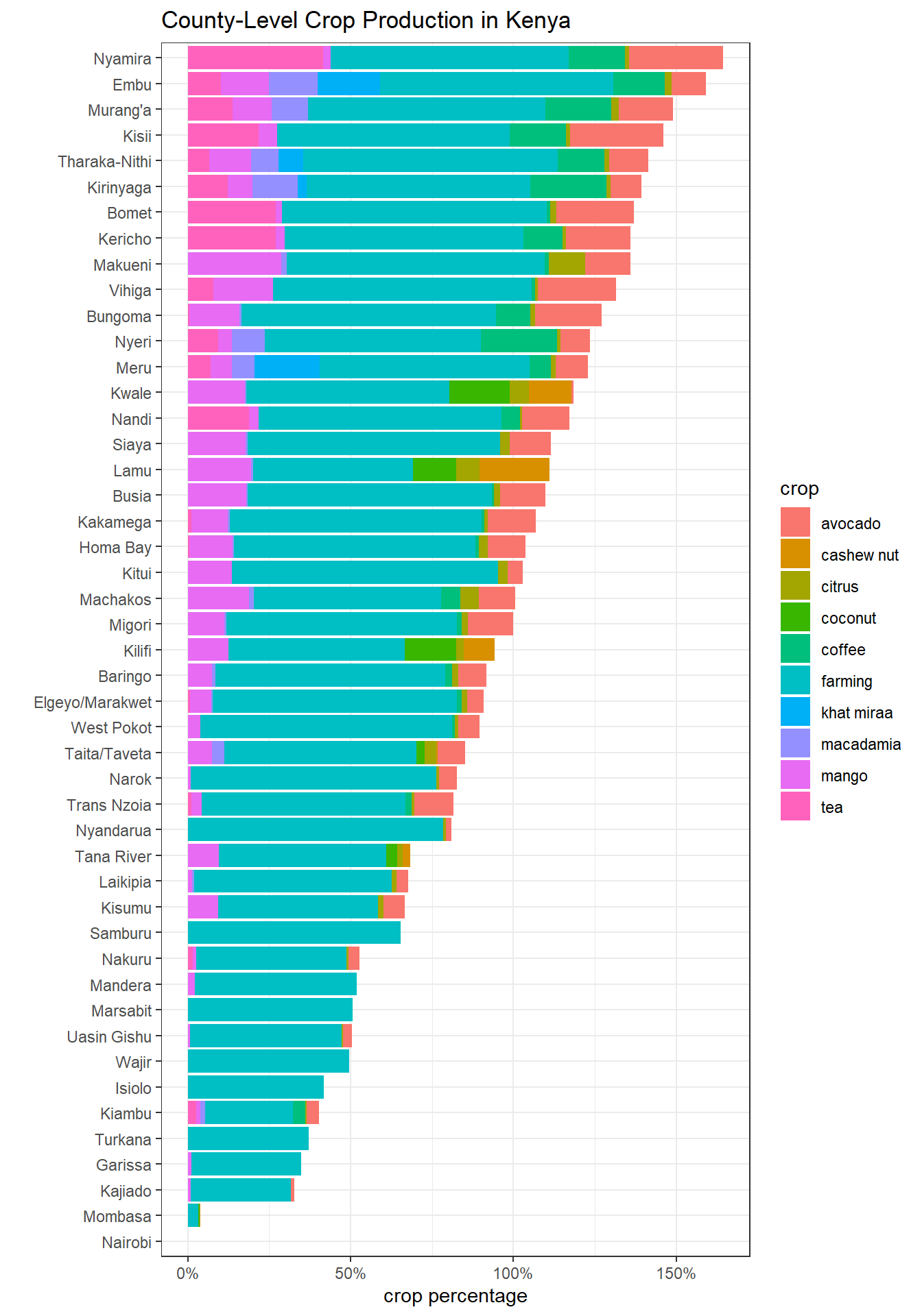
The reason why some crop percentage goes above 100% is that there are households that produce multiple types of crops (double counting).
The following code is inspired by David Robinson. You can find his code here.
Making a map by using the rKenyaCensus package:
#remotes::install_github("Shelmith-Kariuki/rKenyaCensus")
library(rKenyaCensus)
library(sf)
kenya_sf <- KenyaCounties_SHP %>%
st_as_sf() %>%
st_simplify(dTolerance = 200) %>%
mutate(county = str_to_title(County)) %>%
left_join(crop_county, by = "county")
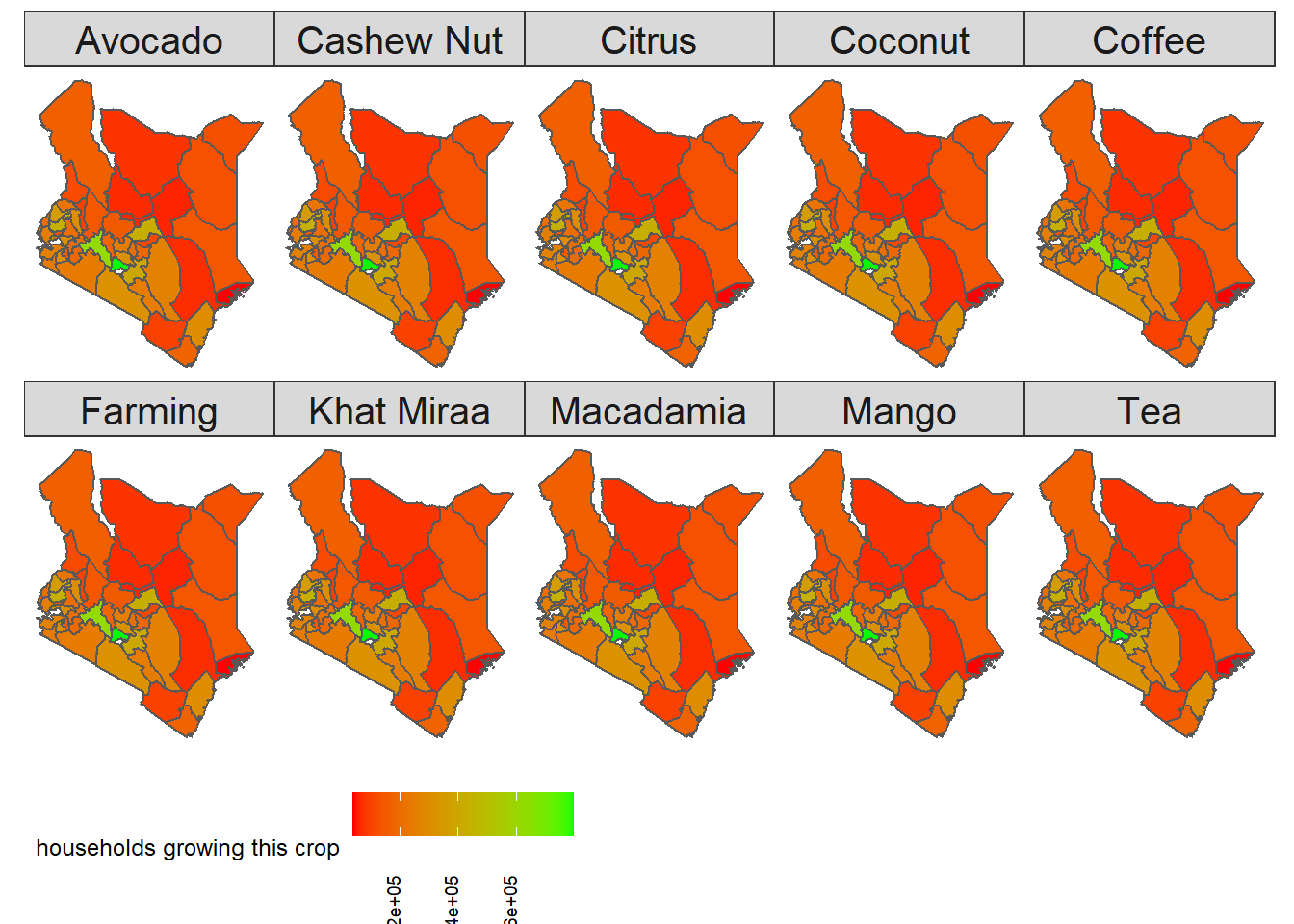
kenya_sf %>%
filter(!is.na(crop)) %>%
mutate(crop = str_to_title(crop)) %>%
ggplot(aes(fill = number_of_households)) +
geom_sf() +
ggthemes::theme_map() +
labs(fill = "households growing this crop") +
facet_wrap(~crop, ncol = 5) +
scale_fill_gradient(high = "green",
low = "red") +
theme(legend.position = "bottom",
strip.text = element_text(size = 15),
plot.title = element_text(size = 18),
legend.text = element_text(angle = 90, vjust = 0))