Wealth and Income Data Visualization
Mon, Mar 14, 2022
4-minute read
This blog post analyzes data from TidyTuesday. Unlike the previous blog posts, this one has some many data to analyze. If we see many datasets, it is natural to think about joining them together.
Load the libraries.
library(tidyverse)
library(scales)
library(patchwork)
library(ggDoubleHeat)
theme_set(theme_bw())
lifetime_earn <- read_csv('https://raw.githubusercontent.com/rfordatascience/tidytuesday/master/data/2021/2021-02-09/lifetime_earn.csv')
student_debt <- read_csv('https://raw.githubusercontent.com/rfordatascience/tidytuesday/master/data/2021/2021-02-09/student_debt.csv')
retirement <- read_csv('https://raw.githubusercontent.com/rfordatascience/tidytuesday/master/data/2021/2021-02-09/retirement.csv')
home_owner <- read_csv('https://raw.githubusercontent.com/rfordatascience/tidytuesday/master/data/2021/2021-02-09/home_owner.csv')
race_wealth <- read_csv('https://raw.githubusercontent.com/rfordatascience/tidytuesday/master/data/2021/2021-02-09/race_wealth.csv')
income_time <- read_csv('https://raw.githubusercontent.com/rfordatascience/tidytuesday/master/data/2021/2021-02-09/income_time.csv')
income_limits <- read_csv('https://raw.githubusercontent.com/rfordatascience/tidytuesday/master/data/2021/2021-02-09/income_limits.csv')
income_aggregate <- read_csv('https://raw.githubusercontent.com/rfordatascience/tidytuesday/master/data/2021/2021-02-09/income_aggregate.csv') %>%
filter(race != "All Races") %>%
#mutate(race = str_remove_all(race, " or in .+$| \\(.+$")) %>%
rename(income_quantile = income_quintile)
income_distribution <- read_csv('https://raw.githubusercontent.com/rfordatascience/tidytuesday/master/data/2021/2021-02-09/income_distribution.csv') %>%
filter(race != "All Races") %>%
mutate(income_bracket = fct_reorder(income_bracket, parse_number(income_bracket)),
income_bracket = fct_relevel(income_bracket, "Under $15,000")) %>%
rename(household_num = number)
income_mean <- read_csv('https://raw.githubusercontent.com/rfordatascience/tidytuesday/master/data/2021/2021-02-09/income_mean.csv')Lifetime earn:
lifetime_earn %>%
  ggplot(aes(gender, lifetime_earn, fill = race)) +
  geom_col(position = "dodge") +
  scale_y_continuous(labels = dollar) +
  labs(x = NULL,
       y = "lifetime earnings",
       fill = NULL,
title = "Lifetime Earnings per Race and Gender") 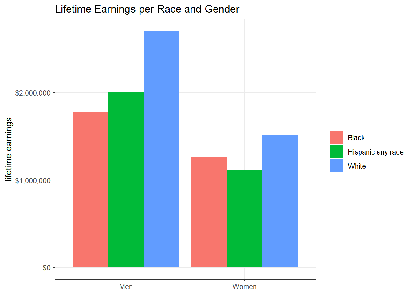
Student debt:
student_debt %>%
  mutate(race = fct_reorder(race, -loan_debt, sum)) %>%
  ggplot(aes(year, loan_debt, color = race)) +
  geom_line() +
  geom_point(aes(size = loan_debt_pct)) +
  scale_size_continuous(labels = percent) +
  scale_x_continuous(breaks = seq(1990, 2020, 5)) +
  scale_y_continuous(breaks = seq(1000, 15000, 2000),
                     labels = dollar) +
  labs(x = NULL,
       y = "loan debt",
       size = "loan pct of family sharing",
       title = "Yearly Loan Debt per Race") +
  theme(plot.title.position = "plot")
Retirement pensions and homeownership:
p_retirment <- retirement %>%
  mutate(race = fct_reorder(race, -retirement, sum)) %>%
  ggplot(aes(year, retirement, color = race)) +
  geom_line() +
  geom_point() +
  scale_x_continuous(breaks = seq(1990, 2020, 5)) +
  scale_y_continuous(labels = dollar) +
  labs(x = NULL,
       y = "retirement dollar",
       color = NULL,
       title = "Yearly Retirement Pension per Race")


p_homeowner <- home_owner %>%
  mutate(race = fct_reorder(race, -home_owner_pct, sum)) %>%
  ggplot(aes(year, home_owner_pct, color = race)) +
  geom_line() +
  geom_point() +
  scale_x_continuous(breaks = seq(1975, 2020, 5)) +
  scale_y_continuous(labels = percent) +
  labs(x = NULL,
       y = "pct of homeownership",
       color = NULL,
       title = "Yearly Homeownership Percentage per Race")

p_retirment / p_homeowner
home_owner %>%
  ggplot(aes(year, home_owner_pct, color = race)) +
  geom_line() +
  geom_point() +
  scale_x_continuous(breaks = seq(1990, 2020, 5)) +
  scale_y_continuous(labels = dollar) +
  labs(x = NULL,
       y = "retirement dollar",
       color = NULL,
title = "Yearly Retirement Pension per Race") 
Family wealth per race:
race_wealth %>%
  pivot_wider(names_from = type,
              values_from = wealth_family) %>%
  drop_na() %>%
  ggplot(aes(year, race)) +
  geom_heat_grid(outside = Average,
                 inside = Median,
                 labels = dollar) +
  theme_heat() +
  labs(x = NULL,
       title = "Family Wealth per Year",
       subtitle = "The numbers are adjusted to 2016")
Income distribution
income_distribution %>%
  select(-income_bracket, -income_distribution) %>%
  distinct() %>%
  mutate(income_median_lower = income_median - income_med_moe,
         income_median_upper = income_median + income_med_moe,
         income_mean_lower = income_mean - income_mean_moe,
         income_mean_upper = income_mean + income_mean_moe) %>%
  distinct(year, race, .keep_all = T) %>%
  filter(!is.na(income_mean),
         !is.na(race)) %>%
  mutate(race = fct_reorder(race, -income_mean, last)) %>%
  ggplot(aes(year, income_mean, fill = race)) +
  geom_line() +
  geom_ribbon(aes(ymin = income_mean_lower,
                  ymax = income_mean_upper),
              alpha = 0.7) +
  labs(x = NULL,
       y = "average income",
       fill = NULL,
       title = "Average Income per Race",
       subtitle = "Upper and lower bounds are included")
income_distribution %>%
  select(year, race, income_median, income_mean, income_bracket, income_distribution) %>%
  ggplot(aes(year, race)) +
  geom_heat_grid(outside = income_median,
                 inside = income_mean,
                 outside_name = "median income",
                 inside_name = "mean income") +
  coord_flip() +
  remove_padding(breaks = seq(1960, 2020, 5)) +
  labs(x = NULL,
       y = NULL,
title = "Mean and Median Income per Race") 
Income breakdown per race:
income_distribution %>%
  filter(!str_detect(race, "or in Combination")) %>%
  select(year, race, household_num, income_bracket, income_distribution) %>%
  mutate(income_count = household_num * income_distribution/100) %>%
  ggplot(aes(year, income_count, fill = income_bracket)) +
  geom_col() +
  facet_wrap(~race) +
  labs(y = "raw count",
fill = "income breakdown") 
income_distribution %>%
  filter(!str_detect(race, "or in Combination")) %>%
  select(year, race, income_bracket, income_distribution) %>%
  distinct() %>%
  ggplot(aes(year, income_distribution, fill = income_bracket)) +
  geom_col() +
  facet_wrap(~race) +
  scale_y_continuous(labels = percent_format(scale = 1)) +
  labs(y = "income distribution (pct)",
       fill = "income breakdown",
title = "Income Breakdown by Race") 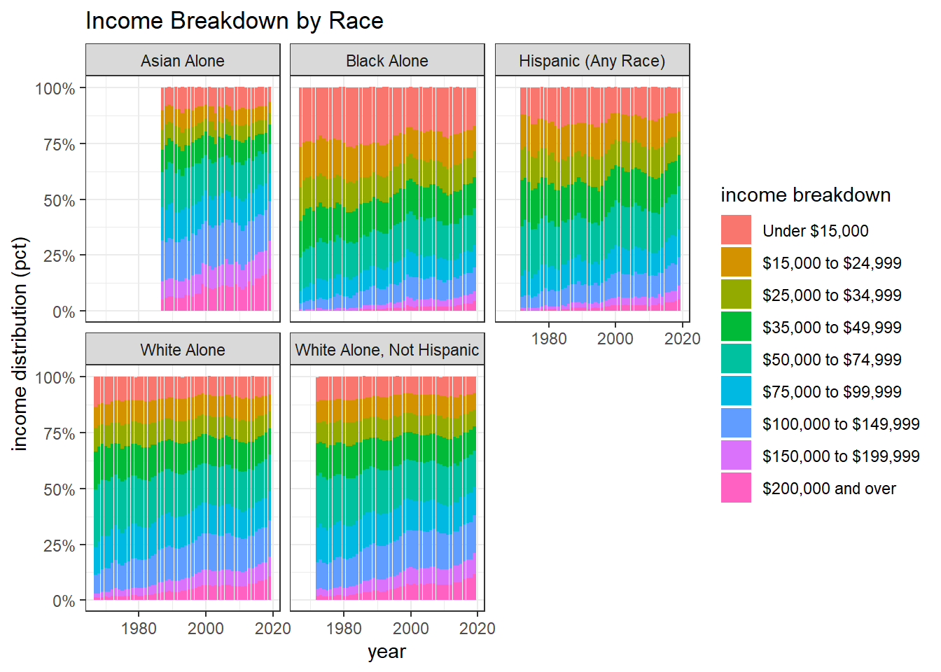
The following plot is inspired by David Robinson (link), and this is my first time using fct_inorder() from the wonderful forcats package.
income_aggregate %>%
  filter(income_quantile != "Top 5%",
         !str_detect(race, "Combination")) %>%
  mutate(income_quantile = fct_inorder(income_quantile)) %>%
  ggplot(aes(year, income_share, fill = income_quantile)) +
  geom_area() +
  facet_wrap(~ race) +
  scale_y_continuous(labels = percent_format(scale = 1)) +
  labs(x = NULL,
       y = "income share",
       fill = "income quantile",
title = "Income Quantile per Race") 