Employed Status Data Visualization
Wed, Mar 16, 2022
3-minute read
In this blog post, I will analyze employment data from TidyTuesday, and I will also use my own R package ggDoubleHeat to make some visualization.
Load the packages:
library(tidyverse)
library(scales)
library(ggDoubleHeat)
theme_set(theme_bw())
Data loading and initial cleaning:
employed <- read_csv('https://raw.githubusercontent.com/rfordatascience/tidytuesday/master/data/2021/2021-02-23/employed.csv') %>%
  mutate(minor_occupation = str_remove_all(minor_occupation, "\\-")) %>%
  add_count(industry) %>%
  filter(n > 100,
         !is.na(industry)) %>%
  select(-n) %>%
  mutate(dimension = case_when(race_gender == "TOTAL" ~ "Total",
                               race_gender %in% c("Men", "Women") ~ "Gender",
                               TRUE ~ "Race"))

earn <- read_csv('https://raw.githubusercontent.com/rfordatascience/tidytuesday/master/data/2021/2021-02-23/earn.csv') %>%
  filter(age %in% c("16 to 19 years", "20 to 24 years", "25 to 34 years",
                    "35 to 44 years", "45 to 54 years", "55 to 64 years",
                    "65 years and over"),
         sex %in% c("Men", "Women")) %>%
  mutate(year_quarter = paste(year, quarter, sep = "-")) %>%
  select(-c(race, ethnic_origin))
Yearly industry employment:
employed %>%
  filter(dimension == "Gender") %>%
  distinct(industry, industry_total, year, .keep_all = T) %>%
  mutate(industry = fct_reorder(industry, industry_total, sum)) %>%
  ggplot(aes(industry_total, industry, fill = factor(year))) +
  geom_col() +
  labs(x = "industry total",
       y = "",
       fill = NULL,
       title = "Yearly Industry Employment #") +
  facet_wrap(~race_gender) +
  theme(axis.text.x = element_text(angle = 90))
employed %>%
  filter(dimension == "Race") %>%
  mutate(industry = fct_lump(industry, n = 6, w = industry_total)) %>%
  distinct(industry, industry_total, year, .keep_all = T) %>%
  mutate(industry = fct_reorder(industry, industry_total, sum)) %>%
  ggplot(aes(industry_total, industry, fill = factor(year))) +
  geom_col() +
  labs(x = "industry total",
       y = "",
       fill = NULL,
       title = "Yearly Industry Employment #") +
  facet_wrap(~race_gender) +
  theme(axis.text.x = element_text(angle = 90))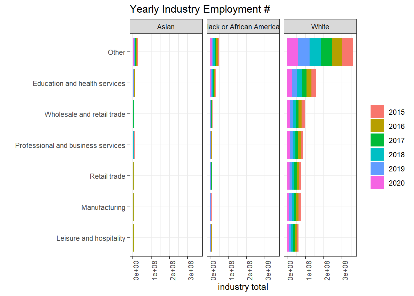
Number of employees:
employed %>%
  group_by(year, major_occupation, dimension, race_gender) %>%
  summarize(employ_n = sum(employ_n)) %>%
  ungroup() %>%
  filter(dimension == "Gender") %>%
  ggplot(aes(employ_n, major_occupation, fill = race_gender)) +
  geom_col(position = "dodge") +
  facet_wrap(~year) +
  theme(axis.text.x = element_text(angle = 90)) +
  labs(x = "# of employees",
       y = NULL,
       fill = NULL,
       title = "Yearly # of Employees for Major Occupations")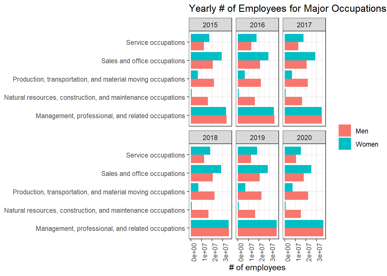
I’d like to see how COVID-19 impacted the job market.
employed_2019_2020 <- employed %>%
  filter(year %in% c(2019, 2020),
         dimension == "Race") %>%
  group_by(industry, minor_occupation, year, race_gender) %>%
  summarize(employ_n = sum(employ_n)) %>%
  ungroup() %>%
  pivot_wider(names_from = "year",
              values_from = "employ_n") %>%
  mutate(change = (`2020` - `2019`)/`2019`)
employed_2019_2020 %>%
ggplot(aes(industry, minor_occupation)) +
geom_heat_grid(outside = `2020`,
inside = `2019`) +
theme(axis.text.x = element_text(angle = 90)) +
labs(y = "minor occupation",
title = "Employment Number in 2019 and 2020") +
facet_wrap(~race_gender)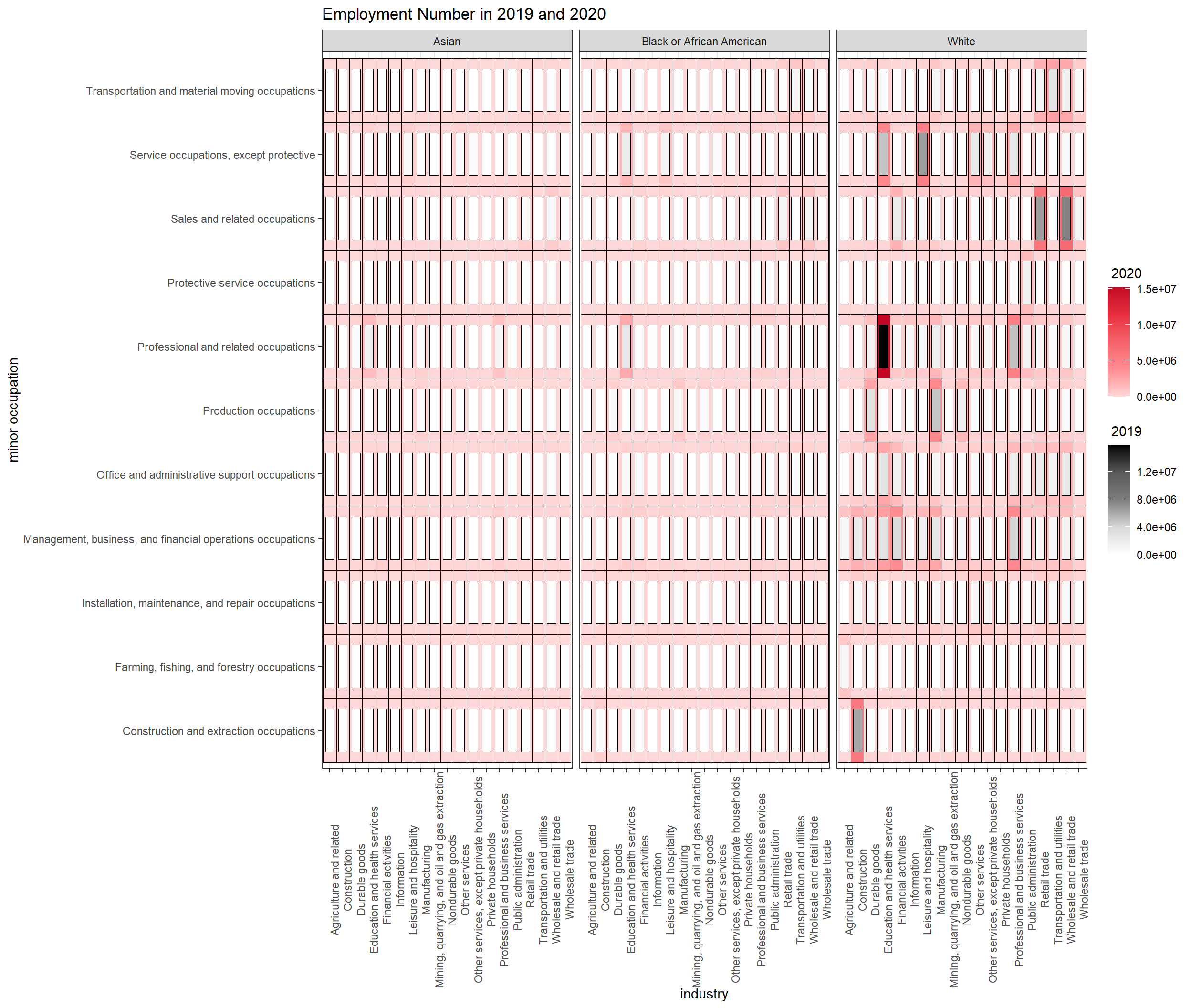
employed_2019_2020 %>%
  filter(change < 1) %>%
  mutate(industry = fct_reorder(industry, change)) %>%
  ggplot(aes(change, industry, fill = race_gender)) +
  geom_boxplot() +
  scale_x_continuous(labels = percent) +
  labs(x = "% of change from 2019 to 2020",
       fill = NULL,
title = "How has the pandemic caused the industry job change per race?") 
Earnings:
earn %>%
  ggplot(aes(factor(year), median_weekly_earn, fill = sex)) +
  geom_boxplot() +
  facet_wrap(~age) +
  labs(x = "year",
       y = "median weekly earn",
       fill = NULL,
       title = "Median Weekly Earn per Age Group per Gender") +
  scale_y_continuous(label = dollar) +
  theme(axis.text.x = element_text(angle = 90))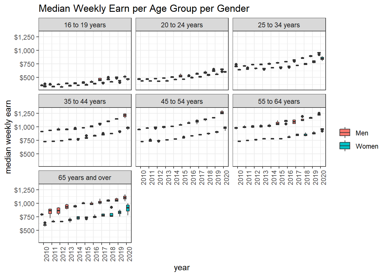
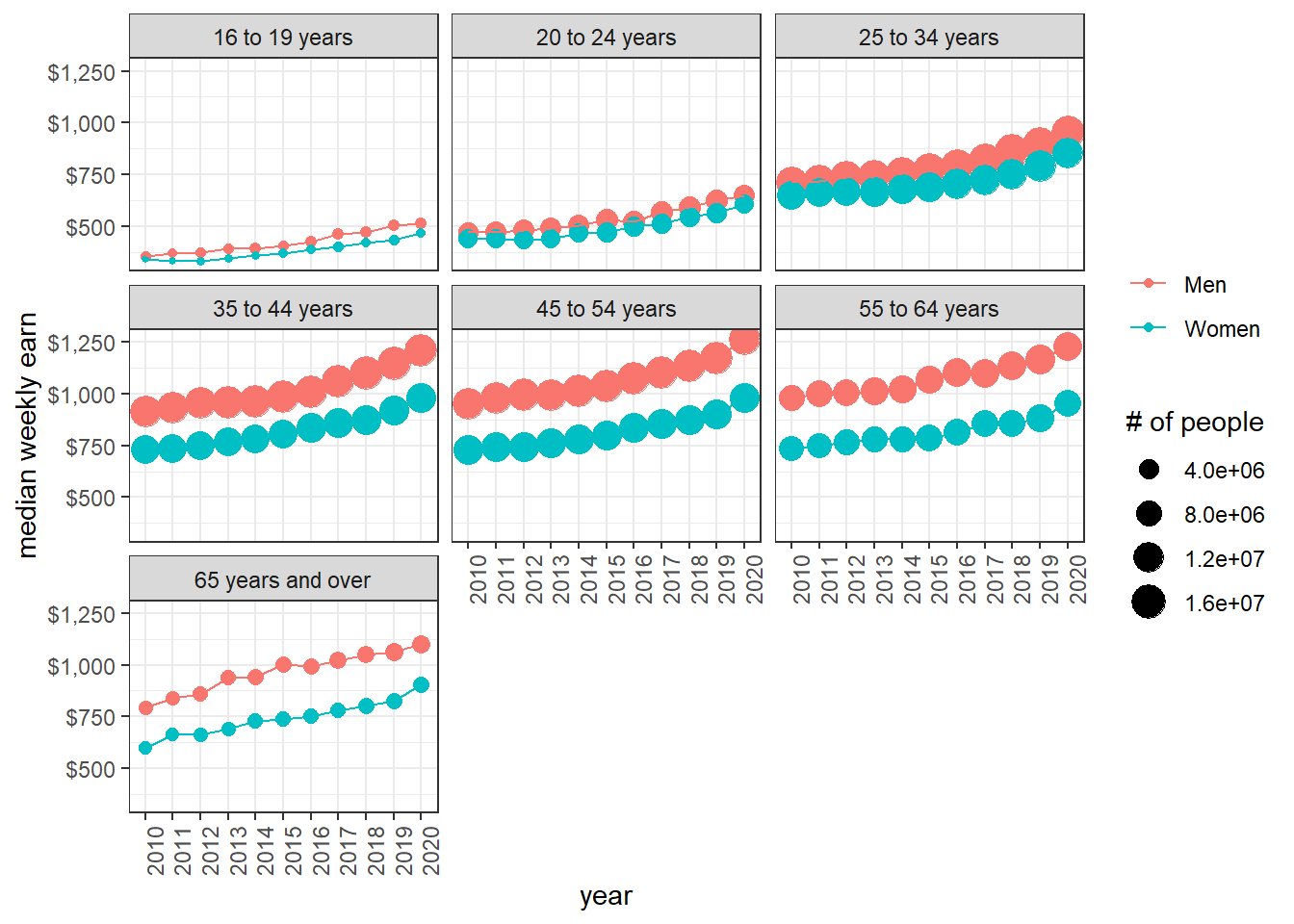
Not surprisingly, adults earn more than teenagers and young adults (25 to 34 yrs old), and men make more money than women among each age group, although the wage gap might be the smallest in the younger age group.
earn %>%
  group_by(age, sex, year) %>%
  summarize(across(n_persons:median_weekly_earn, mean)) %>%
  ungroup() %>%
  ggplot(aes(factor(year), median_weekly_earn, color = sex, group = sex)) +
  geom_point(aes(size = n_persons)) +
  geom_line() +
  facet_wrap(~age) +
  labs(size = "# of people",
       color = NULL,
       x = "year",
       y = "median weekly earn") +
  scale_y_continuous(label = dollar) +
  theme(axis.text.x = element_text(angle = 90))