U.N. Votes Data Visualization
Mon, Mar 21, 2022
4-minute read
In this blog post, I will carry a slew of interesting data visualizations on the votes in the U.N. The datasets are from TidyTuesday. Also, this is my first time using my own package worlddatajoin. You can download it from my Github by typing devtools::install_github("PursuitOfDataScience/worlddatajoin") at the console.
library(tidyverse)
library(scales)
library(lubridate)
#devtools::install_github("PursuitOfDataScience/worlddatajoin")
library(worlddatajoin)
library(tidytext)
library(widyr)
theme_set(theme_bw())
unvotes <- read_csv('https://raw.githubusercontent.com/rfordatascience/tidytuesday/master/data/2021/2021-03-23/unvotes.csv')
roll_calls <- read_csv('https://raw.githubusercontent.com/rfordatascience/tidytuesday/master/data/2021/2021-03-23/roll_calls.csv') %>%
mutate(short = str_to_title(short),
descr = str_to_lower(descr))
issues <- read_csv('https://raw.githubusercontent.com/rfordatascience/tidytuesday/master/data/2021/2021-03-23/issues.csv') %>%
mutate(short_name = str_to_upper(short_name))U.N. Amendment Votes:
unvotes %>%
  group_by(rcid) %>%
  summarize(avg_vote = mean(vote == "yes")) %>%
  ungroup() %>%
  inner_join(roll_calls %>% filter(amend == 1) %>% select(rcid, date),
             by = "rcid") %>%
  mutate(type = "Amendment") %>%
  bind_rows(unvotes %>%
              group_by(rcid) %>%
              summarize(avg_vote = mean(vote == "yes")) %>%
              ungroup() %>%
              inner_join(roll_calls %>% filter(para == 1) %>% select(rcid, date),
                         by = "rcid") %>%
              mutate(type = "Paragraph")) %>%
  distinct(date, type, .keep_all = T) %>%
  ggplot(aes(date, avg_vote, color = type)) +
  geom_line() +
  geom_point() +
  scale_y_continuous(labels = percent) +
  scale_x_date(date_breaks = "5 years",
               date_labels = "%Y") +
  labs(x = NULL,
       y = "approval pct",
       color = NULL,
       title = "U.N. Amendment Approal Percentage") +
  facet_wrap(~type, ncol = 1) +
  theme(legend.position = "none")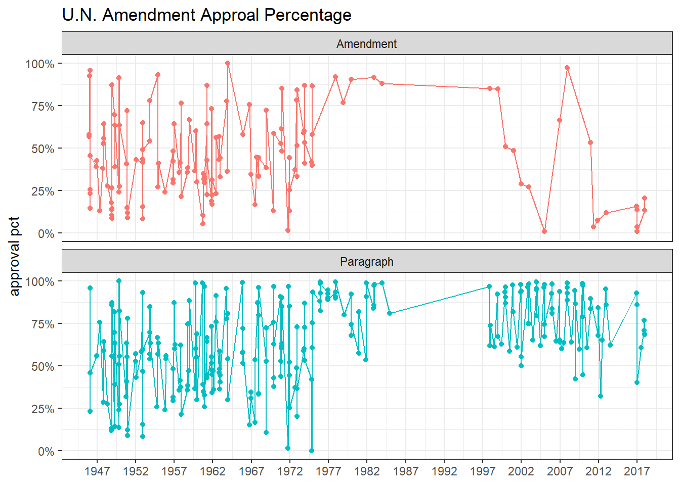
of U.N. calls:
roll_calls %>%
  pivot_longer(amend:para) %>%
  group_by(year = year(date), name) %>%
  summarize(call_count = sum(value, na.rm = T)) %>%
  ungroup() %>%
  mutate(name = fct_reorder(name, -call_count, sum)) %>%
  ggplot(aes(year, call_count, color = name)) +
  geom_line(size = 1) +
  labs(x = NULL,
       y = "call count",
       color = NULL,
title = "U.N. Call Count") 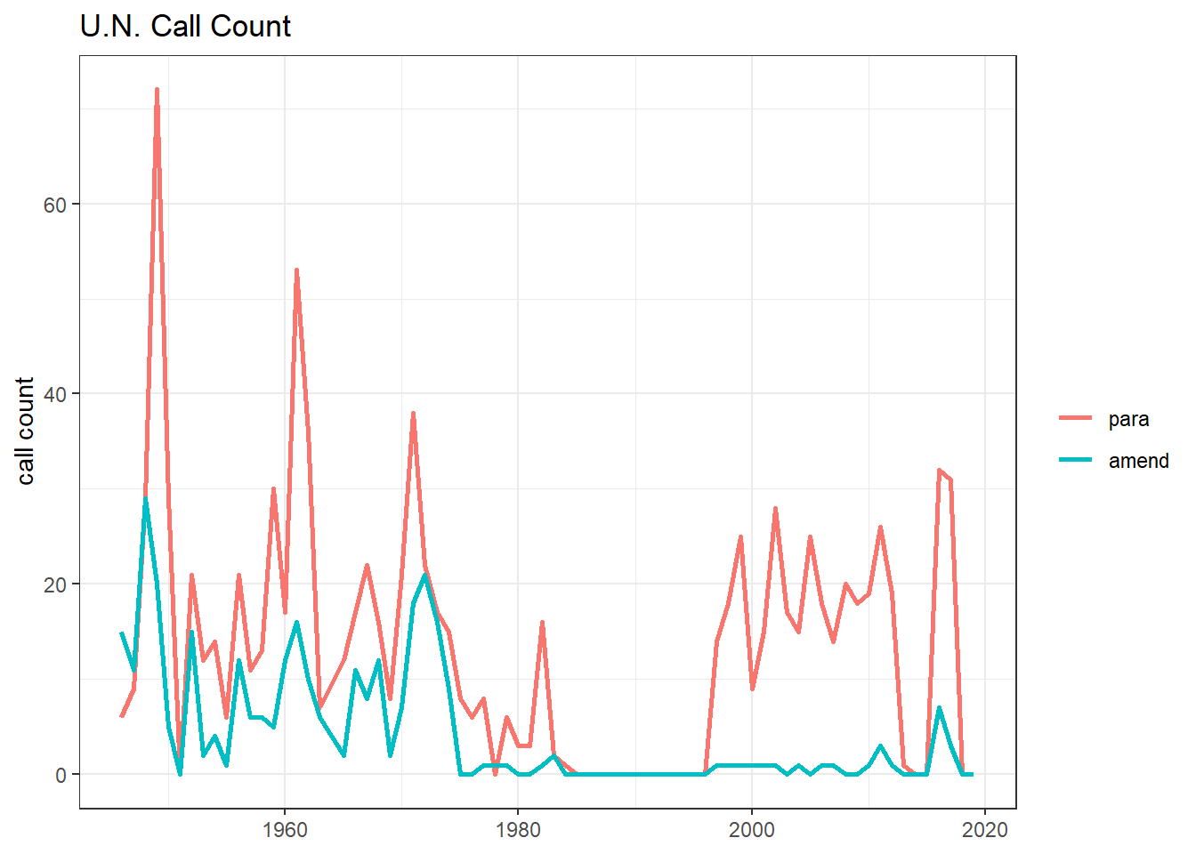
World map on coutries’ voting results:
map_joined <- unvotes %>%
  group_by(country, country_code) %>%
  summarize(pct_vote_yes = mean(vote == "yes"),
            n = n()) %>%
  ungroup() %>%
  right_join(
    worlddatajoin::world_data(2020) %>%
      select(long, lat, group, region, iso2c, continent),
    by = c("country_code" = "iso2c")
)

map_joined %>%
  ggplot(aes(long, lat, group = group, fill = pct_vote_yes)) +
  geom_polygon() +
  theme_void() +
  scale_fill_gradient2(high = "green",
                       low = "red",
                       mid = "pink",
                       midpoint = 0.5,
                       labels = percent) +
  labs(fill = "pct voting yes",
       title = "Average Pct of Voting Yes per Country")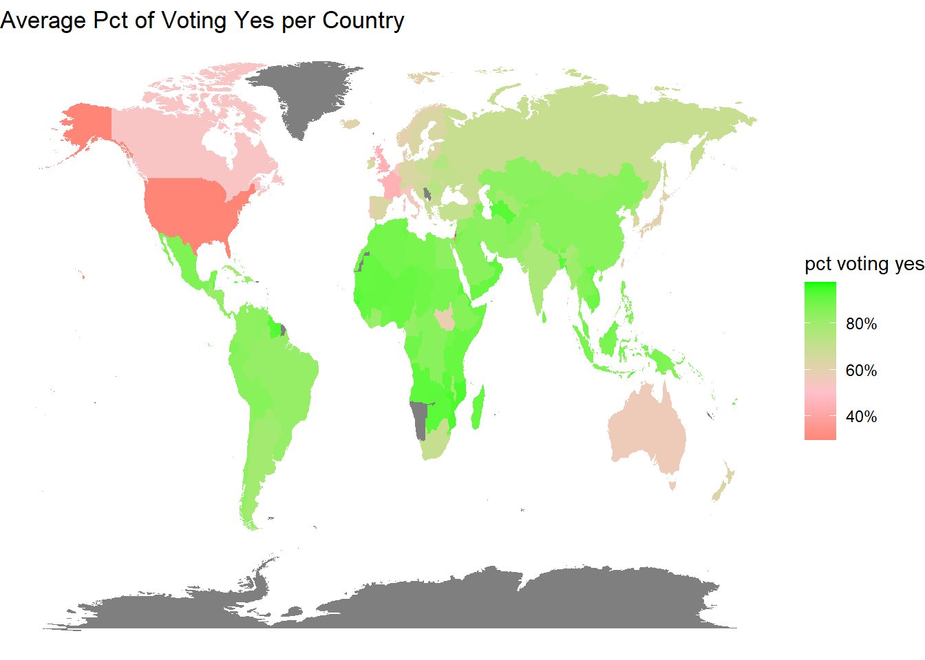
map_joined %>%
  filter(!is.na(continent)) %>%
  distinct(country, pct_vote_yes, continent) %>%
  mutate(continent = fct_reorder(continent, pct_vote_yes, na.rm = T)) %>%
  ggplot(aes(pct_vote_yes, continent, fill = continent)) +
  geom_boxplot(show.legend = F) +
  scale_x_continuous(labels = percent) +
  labs(x = "pct voting yes",
       y = NULL,
       title = "Voting Yes per Continent")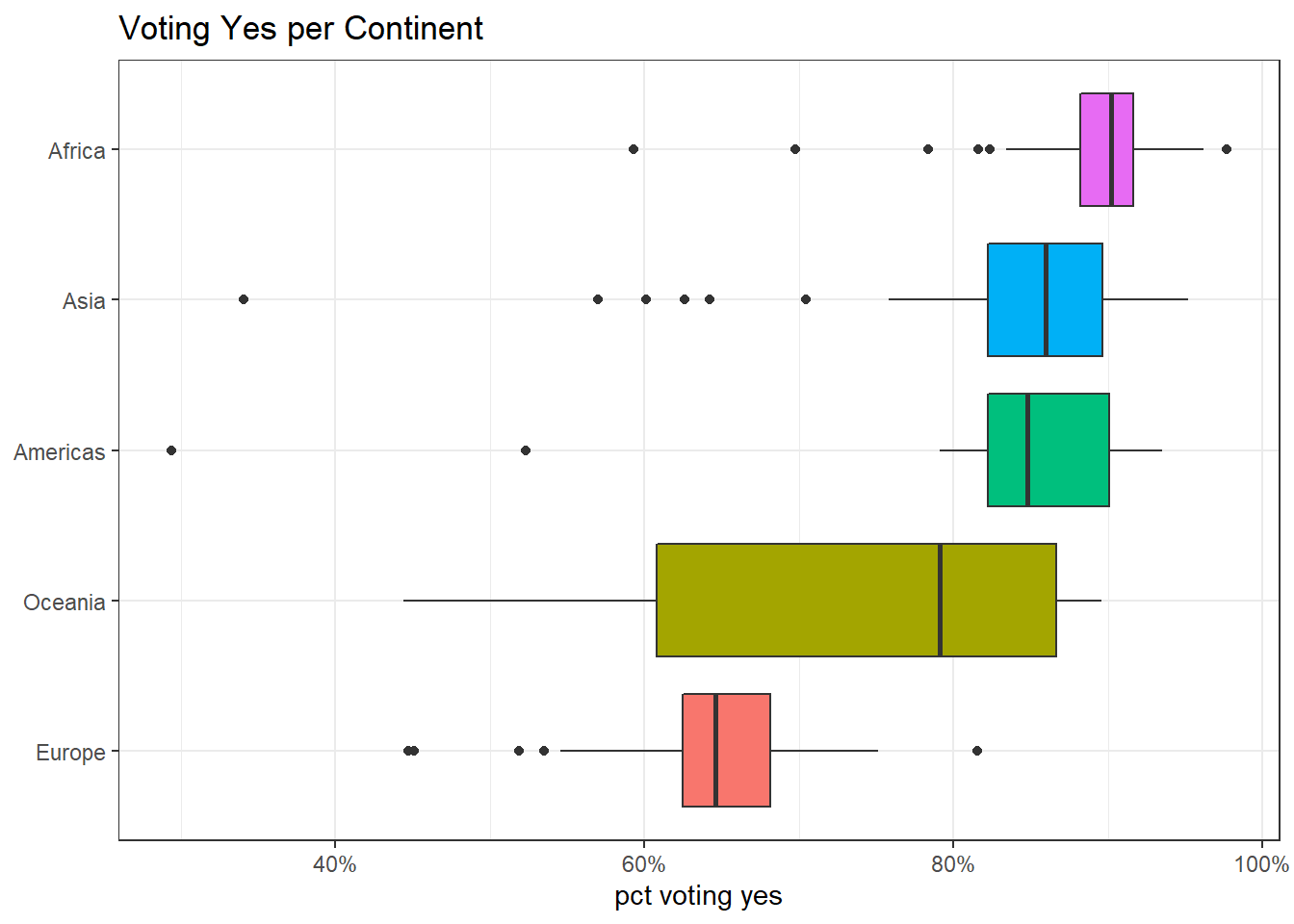
Average voting yes per continent
unvotes %>%
  inner_join(issues, by = "rcid") %>%
  inner_join(map_joined %>% distinct(country_code, continent), by = c("country_code")) %>%
  group_by(issue, continent) %>%
  summarize(avg_yes = mean(vote == "yes")) %>%
  ungroup() %>%
  mutate(issue = reorder_within(issue, avg_yes, continent)) %>%
  ggplot(aes(avg_yes, issue, fill = issue)) +
  geom_col(show.legend = F) +
  scale_y_reordered() +
  scale_x_continuous(labels = percent) +
  facet_wrap(~continent, scales = "free_y") +
  labs(x = "voting yes",
       y = NULL,
       title = "Average Voting Yes on Issues per Continent")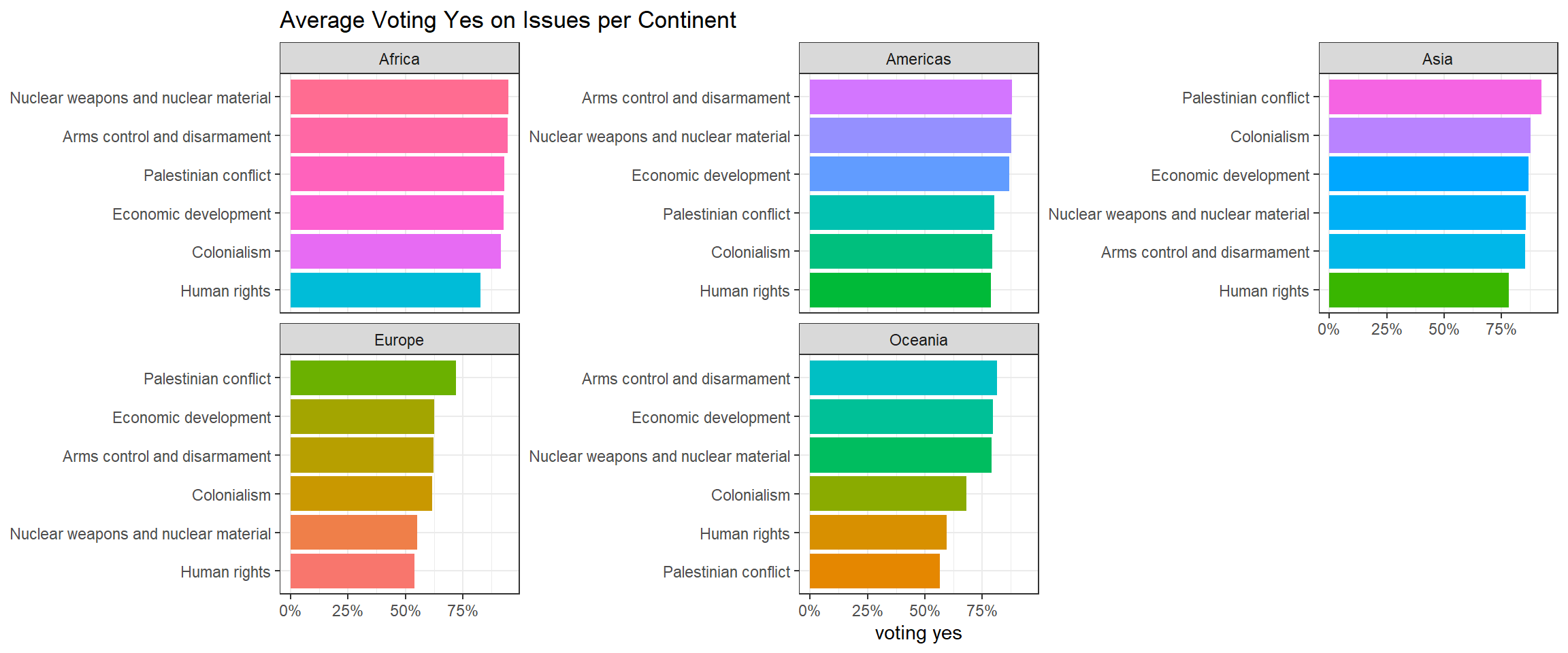
Most voted issues:
unvotes %>%
  group_by(rcid) %>%
  summarize(voted_yes = sum(vote == "yes"),
            voted_no = sum(vote == "no")) %>%
  ungroup() %>%
  inner_join(
    roll_calls,
    by = "rcid"
) %>%
  select(short, voted_yes, voted_no) %>%
  mutate(total = voted_yes + voted_no,
         pct_yes = voted_yes / total) %>%
  filter(!is.na(short)) %>%
  arrange(desc(total)) %>%
  distinct(short, .keep_all = T) %>%
  mutate(short = str_trunc(short, 30),
         short = paste0(short, "(", total, ")")) %>%
  head(20) %>%
  mutate(short = fct_reorder(short, pct_yes)) %>%
  ggplot(aes(pct_yes, short, fill = short)) +
  geom_col(show.legend = F, position = "dodge") +
  scale_x_continuous(labels = percent) +
  labs(x = "pct voting yes",
       y = NULL,
       title = "Most Voted Issues",
       subtitle = "Numbers refers to the votes")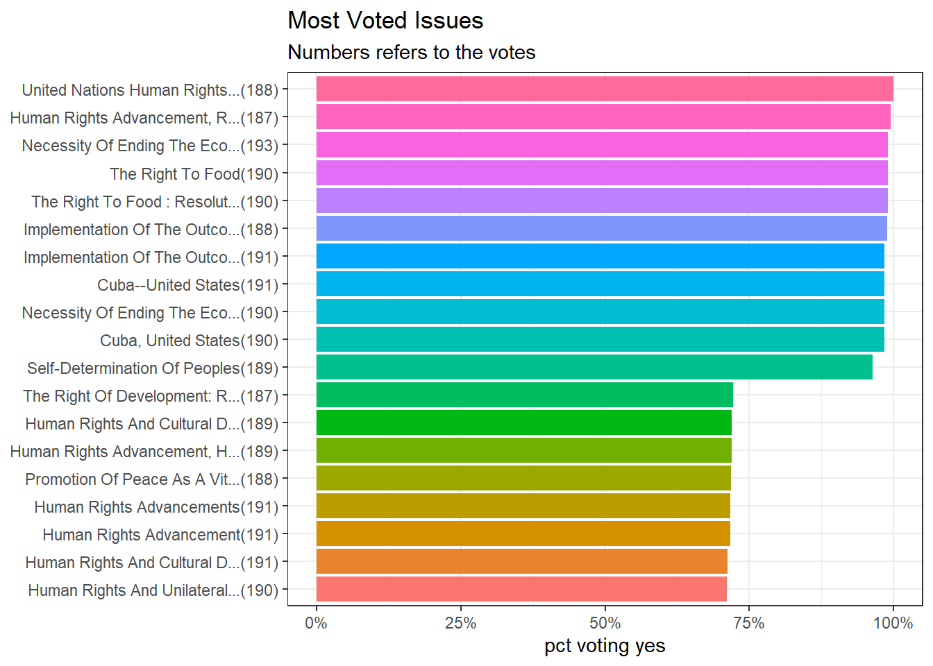
The following ideas are inspired by David Robinson from his code.
Correlations:
country_cor <- unvotes %>%
  mutate(vote_numeric = case_when(vote == "yes" ~ 1,
                                  vote == "no" ~ -1,
                                  TRUE ~ 0)) %>%
  pairwise_cor(country, rcid, vote_numeric, sort = T)

country_cor
## # A tibble: 39,800 x 3
## item1 item2 correlation
## <chr> <chr> <dbl>
## 1 Slovakia Czechia 0.975
## 2 Czechia Slovakia 0.975
## 3 Slovakia Slovenia 0.965
## 4 Slovenia Slovakia 0.965
## 5 Lithuania Estonia 0.962
## 6 Estonia Lithuania 0.962
## 7 Lithuania Latvia 0.961
## 8 Latvia Lithuania 0.961
## 9 Bulgaria Hungary 0.957
## 10 Hungary Bulgaria 0.957
## # ... with 39,790 more rowscountry_cor %>%
filter(item1 %in% c("United States", "China", "Japan", "Mexico", "France", "Israel")) %>%
group_by(item1, correlation > 0) %>%
slice_max(abs(correlation), n = 5) %>%
ungroup() %>%
mutate(item2 = reorder_within(item2, correlation, item1)) %>%
ggplot(aes(correlation, item2, fill = item1)) +
geom_col(show.legend = F) +
scale_y_reordered() +
facet_wrap(~item1, scales = "free_y") +
labs(y = NULL,
title = "How are contries correlated with others?") +
theme(strip.text = element_text(size = 15),
plot.title = element_text(size = 18))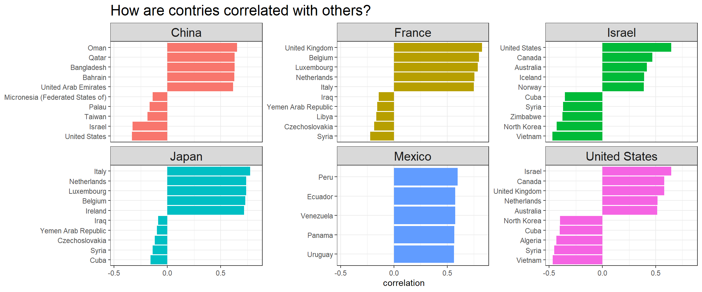
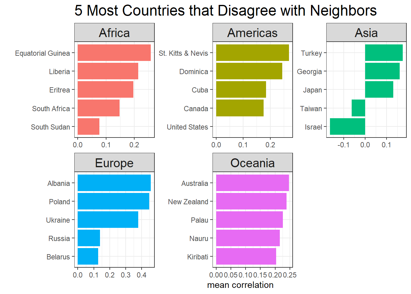
Which countries are most disagreeable to other countries in the same continents?
country_cor %>%
  inner_join(map_joined %>%
               distinct(country, continent1 = continent),
             by = c("item1" = "country")) %>%
  inner_join(map_joined %>%
               distinct(country, continent2 = continent),
             by = c("item2" = "country")) %>%
  filter(continent1 == continent2) %>%
  group_by(item1, continent1) %>%
  summarize(mean_cor = mean(correlation, na.rm = T),
            median_cor = median(correlation)) %>%
  ungroup() %>%
  group_by(continent1) %>%
  slice_min(mean_cor, n = 5) %>%
  ungroup() %>%
  mutate(item1 = reorder_within(item1, mean_cor, continent1)) %>%
  ggplot(aes(mean_cor, item1, fill = continent1)) +
  geom_col(show.legend = F) +
  scale_y_reordered() +
  facet_wrap(~continent1, scales = "free") +
  theme(strip.text = element_text(size = 15),
        plot.title = element_text(size = 18)) +
  labs(x = "mean correlation",
       y = "",
       title = "5 Most Countries that Disagree with Neighbors")