Salary Survey Data Visualization
Sun, Apr 24, 2022
4-minute read
This blog post analyzes salary survey from a wide range of perspectives, including race, gender, etc. As usual, the data comes from TidyTuesday.
library(tidyverse)
library(lubridate)
library(scales)
library(broom)
library(geofacet)
theme_set(theme_bw())
survey <- read_csv('https://raw.githubusercontent.com/rfordatascience/tidytuesday/master/data/2021/2021-05-18/survey.csv') %>%
filter(!is.na(state),
!is.na(highest_level_of_education_completed),
!is.na(race),
currency == "USD",
annual_salary > 2000,
fct_lump(state, n = 51) != "Other") %>%
mutate(timestamp = mdy_hms(timestamp),
highest_level_of_education_completed = str_to_title(str_remove_all(highest_level_of_education_completed, "\\s[d|D]egree.*$")),
race = str_remove_all(race, ",?\\s.*$"),
race = fct_lump(race, n = 4)) %>%
rename(age = how_old_are_you,
education_level = highest_level_of_education_completed) %>%
mutate(education_level = factor(education_level,
levels = c("High School",
"Some College",
"College",
"Master's",
"Phd",
"Professional")),
education_level = fct_recode(education_level,
"PhD" = "Phd"))
survey ## # A tibble: 21,148 x 18
## timestamp age industry job_title additional_cont~ annual_salary
## <dttm> <chr> <chr> <chr> <chr> <dbl>
## 1 2021-04-27 11:02:10 25-34 Education~ Research~ <NA> 55000
## 2 2021-04-27 11:02:38 25-34 Accountin~ Marketin~ <NA> 34000
## 3 2021-04-27 11:02:41 25-34 Nonprofits Program ~ <NA> 62000
## 4 2021-04-27 11:02:42 25-34 Accountin~ Accounti~ <NA> 60000
## 5 2021-04-27 11:02:46 25-34 Education~ Scholarl~ <NA> 62000
## 6 2021-04-27 11:02:51 25-34 Publishing Publishi~ <NA> 33000
## 7 2021-04-27 11:03:00 25-34 Education~ Librarian High school, FT 50000
## 8 2021-04-27 11:03:01 45-54 Computing~ Systems ~ Data developer/~ 112000
## 9 2021-04-27 11:03:02 35-44 Accountin~ Senior A~ <NA> 45000
## 10 2021-04-27 11:03:07 35-44 Education~ Deputy T~ <NA> 62000
## # ... with 21,138 more rows, and 12 more variables: other_monetary_comp <dbl>,
## # currency <chr>, currency_other <chr>, additional_context_on_income <chr>,
## # country <chr>, state <chr>, city <chr>,
## # overall_years_of_professional_experience <chr>,
## # years_of_experience_in_field <chr>, education_level <fct>, gender <chr>,
## # race <fct>State-wise salary based on education level:
survey %>%
  ggplot(aes(education_level, annual_salary, fill = education_level, color = education_level)) +
  geom_boxplot(alpha = 0.5) +
  facet_geo(~state) +
  scale_y_log10(labels = dollar) +
  theme(axis.text.x = element_blank(),
        axis.ticks = element_blank(),
        panel.grid = element_blank()) +
  labs(x = NULL,
       y = "annual salary",
       fill = "",
       color = "")
Does degree help make more money?
survey %>%
  filter(age != "under 18") %>%
  group_by(age, education_level) %>%
  summarize(avg_salary = mean(annual_salary),
            n = n()) %>%
  ungroup() %>%
  filter(n >= 3) %>%
  ggplot(aes(age, avg_salary, fill = education_level)) +
  geom_col(show.legend = F) +
  facet_wrap(~education_level) +
  scale_y_continuous(labels = dollar) +
  theme(panel.grid = element_blank(),
        strip.text = element_text(size = 13),
        plot.title = element_text(size = 15)) +
  labs(y = "average annual salary",
       title = "Average Annual Salary per Age Group per Education Level")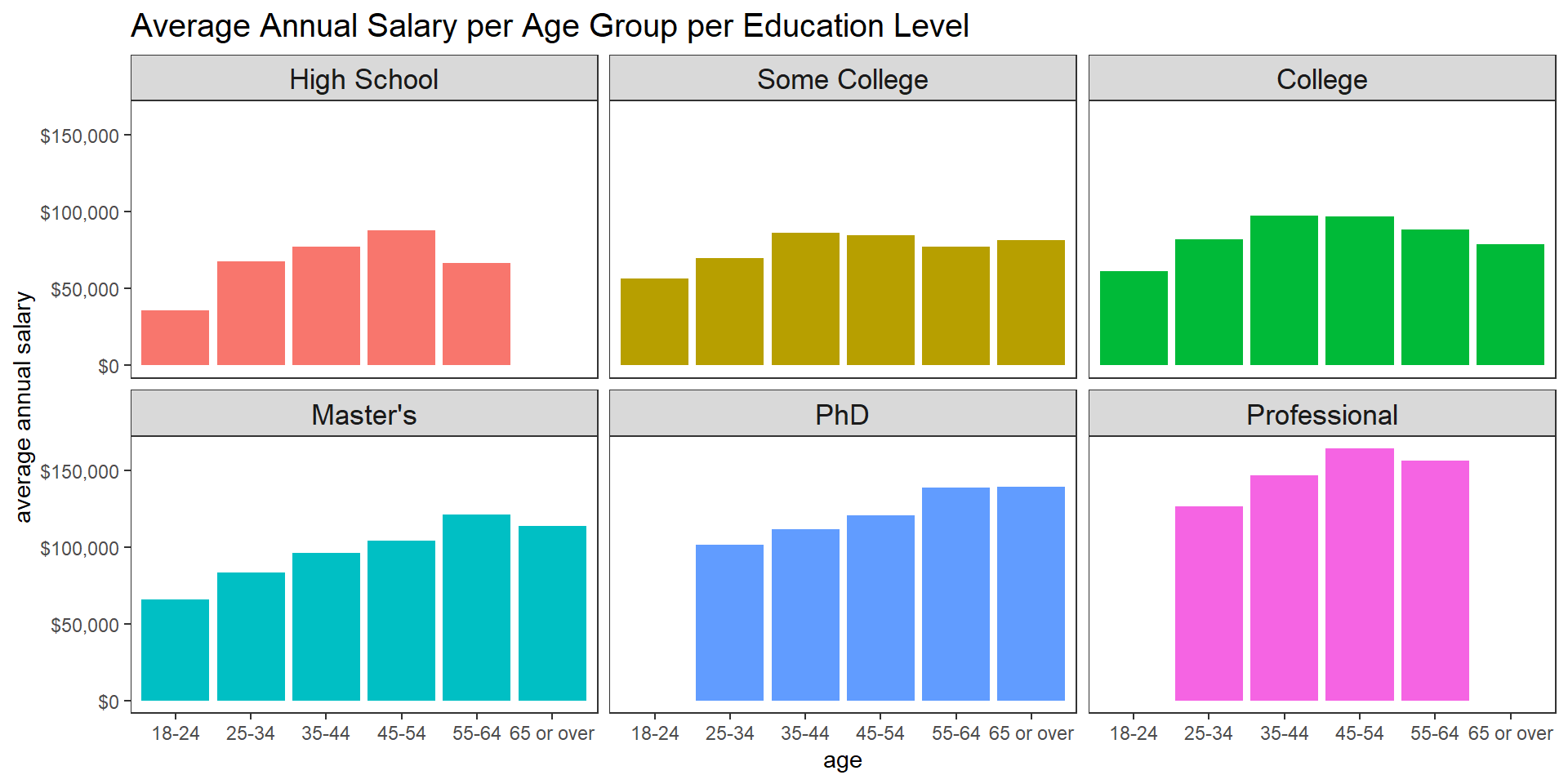
Linear model for predicting annual salary:
survey %>%
  filter(age != "under 18") %>%
  select(age, annual_salary, education_level, gender, race) %>%
  summarize(model = list(lm(annual_salary ~ ., data = .))) %>%
  mutate(model = map(model, tidy, conf.int = T)) %>%
  unnest(model) %>%
  filter(term != "(Intercept)",
         !str_detect(term, "Prefer not to answer")) %>%
  mutate(term = fct_reorder(term, estimate)) %>%
  ggplot(aes(x = estimate,
             y = term)) +
  geom_point() +
  geom_errorbarh(aes(xmin = conf.low,
                     xmax = conf.high),
                 height = 0.2) +
  geom_vline(xintercept = 0, size = 1.2, lty = 2, color = "red") +
  labs(y = NULL,
       title = "Linear Regression Term Estimate and 95% CI on Annual Salary")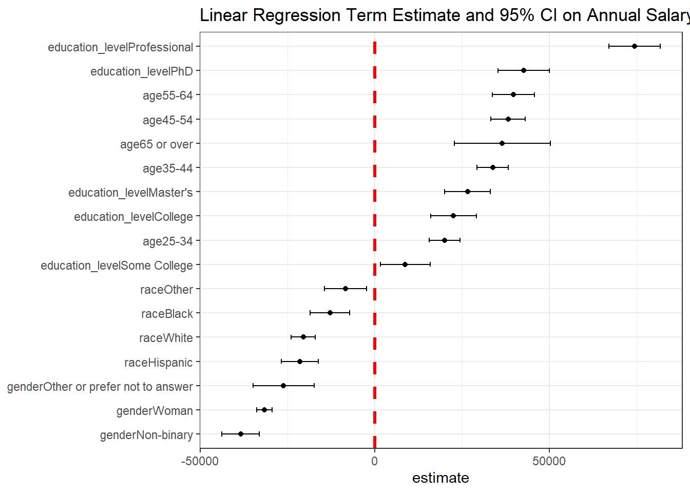
T-test on race annual salary:
survey %>%
  filter(age != "under 18") %>%
  select(age, annual_salary, education_level, gender, race) %>%
  nest(data = -race) %>%
  mutate(model = map(data, ~t.test(.$annual_salary)),
         tidied = map(model, tidy)) %>%
  unnest(tidied) %>%
  mutate(race = fct_reorder(race, estimate)) %>%
  ggplot(aes(estimate, race)) +
  geom_point() +
  geom_errorbarh(
    aes(xmin = conf.low,
        xmax = conf.high),
    height = 0.2
    ) +
  scale_x_continuous(labels = dollar) +
  labs(y = NULL,
       title = "One-sample T-Test on Races Impacting Annual Salary")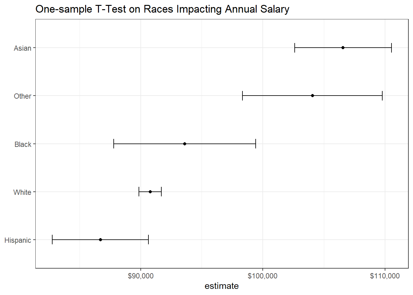
Men and women’s annual salary:
survey %>%
  filter(age != "under 18") %>%
  select(age, annual_salary, education_level, gender, race) %>%
  filter(gender %in% c("Man", "Woman")) %>%
  nest(data = -gender) %>%
  mutate(model = map(data, ~t.test(.$annual_salary)),
         tidied = map(model, tidy)) %>%
  unnest(tidied) %>%
  ggplot(aes(gender, estimate, fill = gender)) +
  geom_col(alpha = 0.5) +
  geom_errorbar(aes(ymin = conf.low,
                    ymax = conf.high),
                width = 0.5) +
  theme(panel.grid = element_blank(),
        legend.position = "none") +
  labs(x = NULL,
       y = "estimated annual salary",
       title = "Men and Women T-test Estimated Annual Salary") +
scale_y_continuous(labels = dollar) 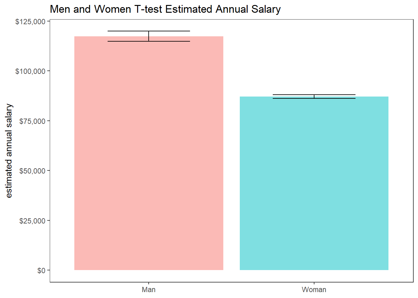
Where does Ph.D. go?
survey %>%
  filter(education_level == "PhD",
         gender %in% c("Man", "Woman")) %>%
  group_by(industry, gender) %>%
  summarize(avg_salary = mean(annual_salary),
            n = n()) %>%
  ungroup() %>%
  filter(n > 5) %>%
  mutate(industry = paste0(industry, "(", n, ")"),
         industry = fct_reorder(industry, avg_salary)) %>%
  ggplot(aes(avg_salary, industry)) +
  geom_col() +
  scale_x_continuous(labels = dollar) +
  labs(x = "average annual salary",
       title = "Where does Ph.D. go?") +
  facet_wrap(~gender, scales = "free_y") +
  theme(strip.text = element_text(size = 13),
plot.title = element_text(size = 15)) 