Separating the Operator From the Market: Repricing Behaviour in 12.8 Million Rental Listings
Contents 8 sections
- The oldest buildings are not the story. The newest ones are
- Who changes prices is not who owns the listings
- And yet none of this moves the price index
- Timing belongs to the firm; magnitude belongs to the place
- The spatial pattern that was not there
- The statistic can decide the answer
- What remains unexplained
- What the exercise taught about method
A rental listing carries an asking price, and when a landlord changes that price the change is recorded. Collect enough of those records and two different questions become answerable. The first is about the market: how fast are rents rising, and where. The second is about behaviour: who decides to change a price, and when.
This article reports on both, and on a result that appears only once they are kept apart. The data are a research extract of United States rental listings, 307 GB supplied by Dwellsy and acquired by Chicago Booth’s Center for Applied Artificial Intelligence: 12,796,708 de-duplicated listings, a separate log of 24,330,475 timestamped rent revisions, and a 101-week panel that records a rent for every listing every week.
One limitation governs everything below, and it is not a small one. These are asking prices. No lease is signed in this dataset, no rent is paid, and no tenant is observed. A price that falls may have found a tenant or may simply have been withdrawn; the records cannot distinguish the two.
The oldest buildings are not the story. The newest ones are
Rent growth in this data is markedly slower for recently built stock, and the pattern is not a gentle gradient by vintage. It is concentrated in the first years of a building’s life and it disappears.
To measure it without confusing building age with the calendar, each cell of buildings is compared against pre-2010 stock in the same metropolitan area and the same calendar window. Zero on the vertical axis therefore means “grew exactly like the older buildings across the street”, which removes the market conditions of the moment rather than assuming they are absent.
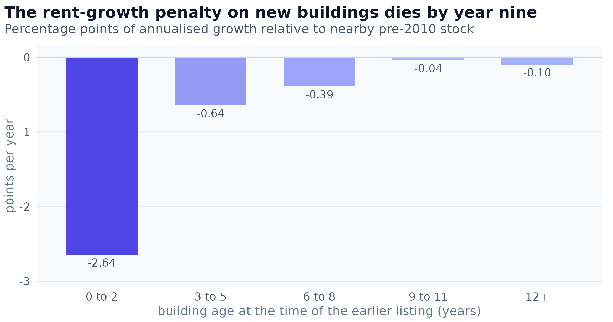
Figure 1: Annualised asking-rent growth by building age, measured against pre-2010 stock in the same metro and the same calendar window, so zero means growth identical to the older buildings nearby. Each bar rests on between 9,700 and 172,509 matched repeat pairs. A placebo that shuffles building vintages within each metro never exceeds 0.11 points on this scale, so the leftmost bar is roughly 24 times the null.
The shape is what matters. A penalty attached to a building’s vintage would persist as the building aged; a penalty attached to its age decays, and this one is statistically indistinguishable from zero by the ninth year. That is consistent with a building letting up its initial units at a discount, though the data cannot confirm that reading: nothing here records a concession, a delivery date or an occupancy rate.
Two further tests failed to make the pattern go away. Measured by vintage rather than by age, the same slowdown widens rather than shrinks once a fixed effect for the operating company is added, so it is not a matter of which firms happen to own new buildings. The age profile above also survives dropping the annualisation entirely and restricting every comparison to a narrow band of re-listing intervals.
Who changes prices is not who owns the listings
Concentration is usually reported over holdings: what share of listings does the largest landlord control. That statistic turns out to be almost irrelevant to the question of who moves prices, because the flow of changes is concentrated on a completely different scale from the stock of listings.
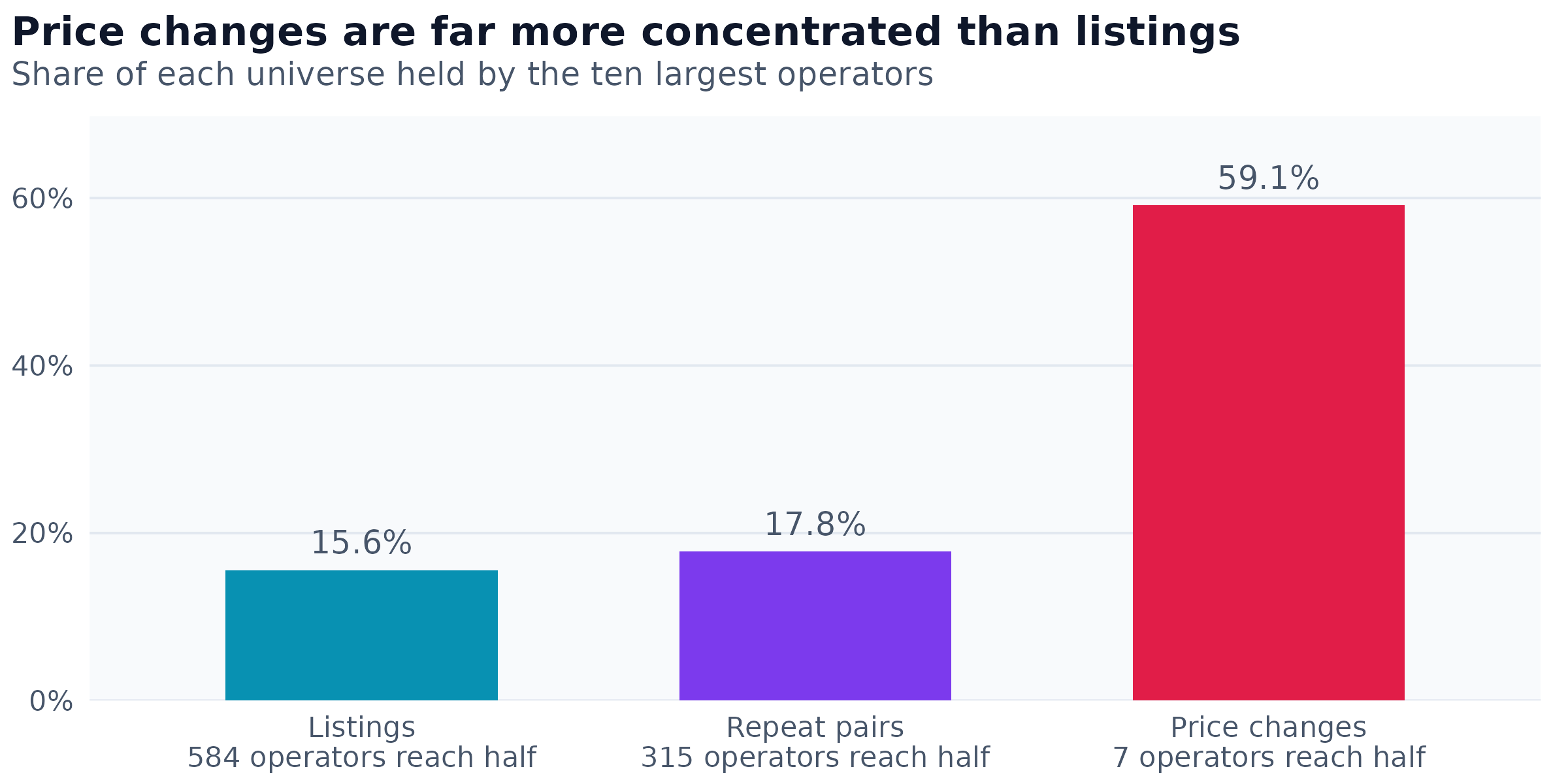
Figure 2: Share of each universe held by the ten largest operators, and the number of operators required to account for half of it. Listings are the stock of advertisements; repeat pairs are the matched re-listings a rent index is built from; changes are timestamped price revisions. The three counts are 12,796,708 listings, 5,775,959 pairs and 15,429,568 changes.
A handful of companies account for half of every recorded rent change, where it takes several hundred to account for half of the listings. The gap is not explained by the largest firms owning more, because their share of the stock is modest. It is explained by how often they act.
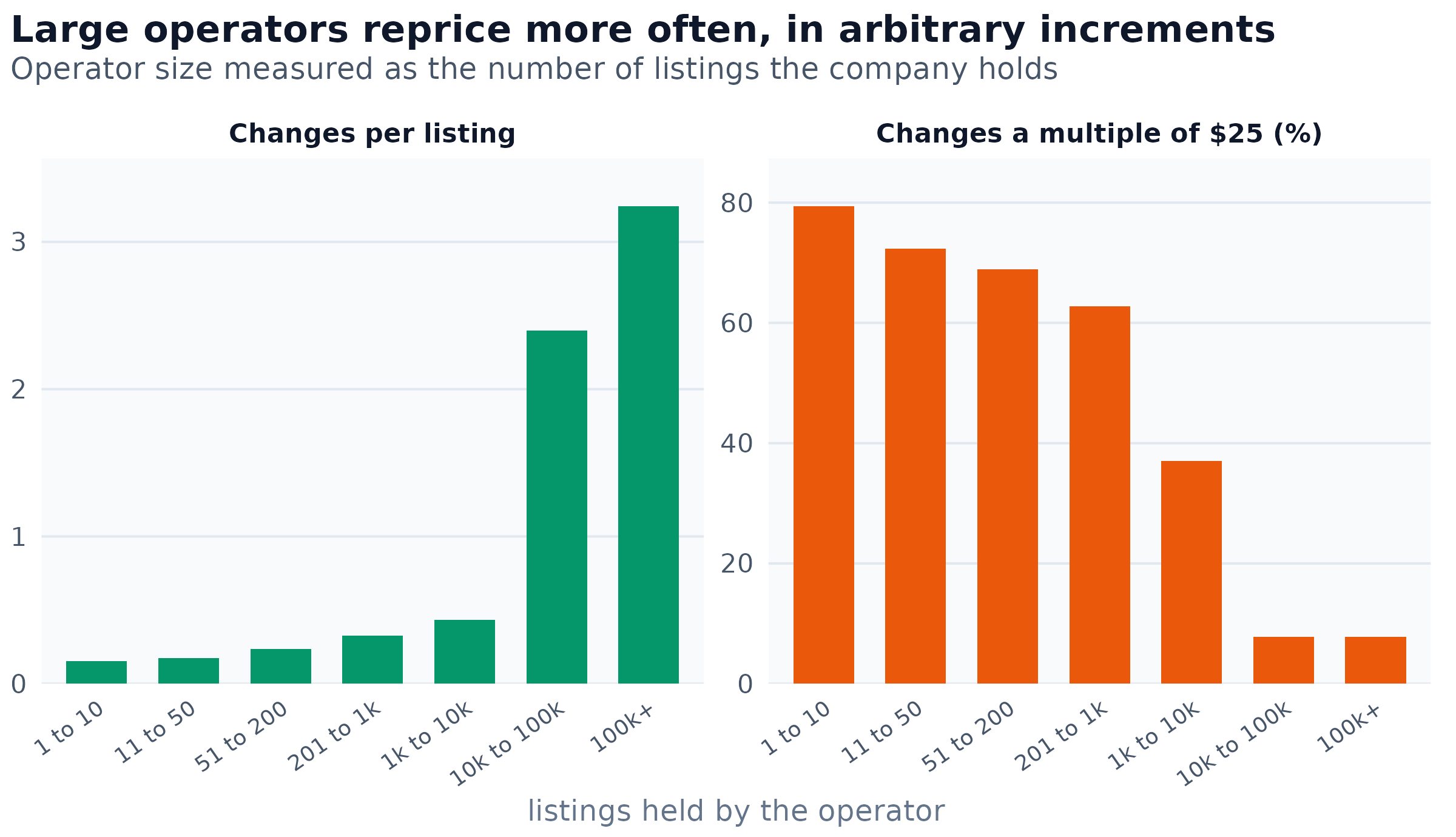
Figure 3: Repricing behaviour by operator size, over 15,429,568 changes. The left panel is the number of recorded price changes per listing; the right is the share of those changes that are a whole multiple of 25 dollars. The eleven largest operators hold 16.5 per cent of listings and make 44.7 per cent of the changes.
Repricing intensity spans a factor of 21 from the smallest operators to the largest, and the convention changes with it. Small landlords move a rent in round steps; the largest move it in amounts that look arbitrary. The modal change across the whole dataset is five dollars, not the twenty-five or fifty a menu-cost account would predict, and a one-dollar change is among the ten most common.
And yet none of this moves the price index
The natural inference from the previous section is that a rent index built on this data is substantially a report on a handful of firms. It is not. Removing the largest operators entirely, and with them up to a third of the matched pairs, barely moves the five-year national figure.
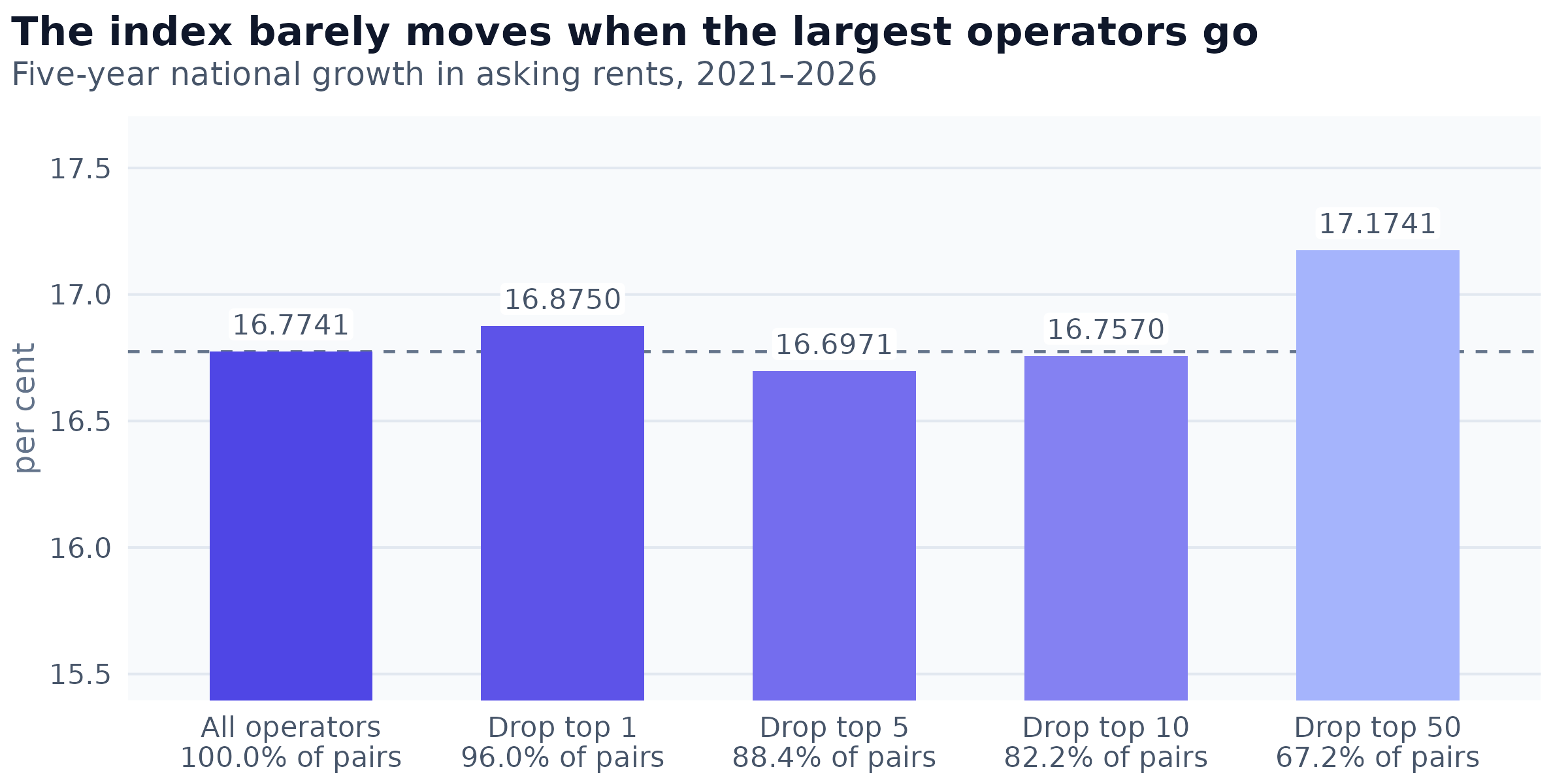
Figure 4: The national repeat-rent index recomputed with the largest operators removed, against the share of matched pairs each arm retains. The dashed line is the published figure of 16.7741 per cent. Dropping the fifty largest operators discards 32.8 per cent of the sample and moves the index by four tenths of a point.
The reconciliation is in how a repeat-rent index is constructed. It compares a unit against itself and estimates each month from millions of matched pairs at once, so no single firm’s decisions can move a monthly figure. Concentration in the flow of changes and robustness in the level of the index are therefore both true, and they are not in tension.
There is a related warning worth stating plainly, because it is easy to get wrong. The ten largest operators’ own indices span 33 points, and their pair-weighted average is 24.9 per cent against a national 16.8. Pooling exactly the same pairs into one index gives 16.99 per cent. A weighted mean of sub-indices is not the pooled estimate, and here the two differ by 7.9 points.
Timing belongs to the firm; magnitude belongs to the place
If the operator organises repricing, the natural next question is what part of it. Weekly price changes can be split into two components that multiply: whether a listing is repriced at all, and how much it moves given that it is.
Attributing variance between overlapping explanations is order-dependent, and the ordering chosen can change the answer several-fold. Averaging each factor’s marginal contribution across all 24 possible absorption orders gives an order-free attribution, with the spread across orders reported alongside it.
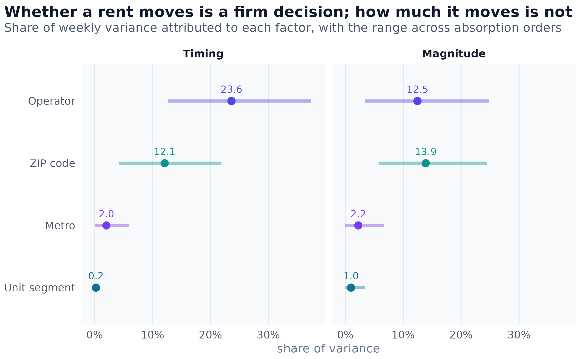
Figure 5: Order-free variance attribution for weekly repricing, on 21,936,924 consecutive-week observations. The point is the mean marginal contribution across all 24 absorption orders; the segment spans the minimum and maximum any single order produces. Each factor is interacted with the week, and the national week effect is removed first. A placebo that permutes operator identities across listings within a metro leaves a floor of 3.4 per cent for magnitude and 4.3 per cent for timing.
Two readings follow, and they are different in kind. For timing, the operator is the dominant factor by close to two to one over the neighbourhood, and the market and the unit type are negligible under every ordering. That answers a question the sequential decomposition could not: the operator effect is not an artefact of which cities or which unit types a firm happens to hold.
For magnitude, the operator and the neighbourhood are indistinguishable. Both carry wide ranges across orderings, which is the signature of a large shared component: a company’s buildings sit in particular postal codes, so firm policy and micro-geography cannot be told apart for how far a rent moves.
The spatial pattern that was not there
Slow rent growth is known to co-move locally in this data, reaching roughly ten kilometres. Weekly repricing looked like it did the same. Correlating each postal code’s weekly repricing rate against every other postal code’s in the same metro produces a clean decay curve that reaches zero between five and ten kilometres, which is exactly what a shared local demand shock would look like.
It is not a demand shock. It is the same company pressing the same button in buildings it happens to own near each other.
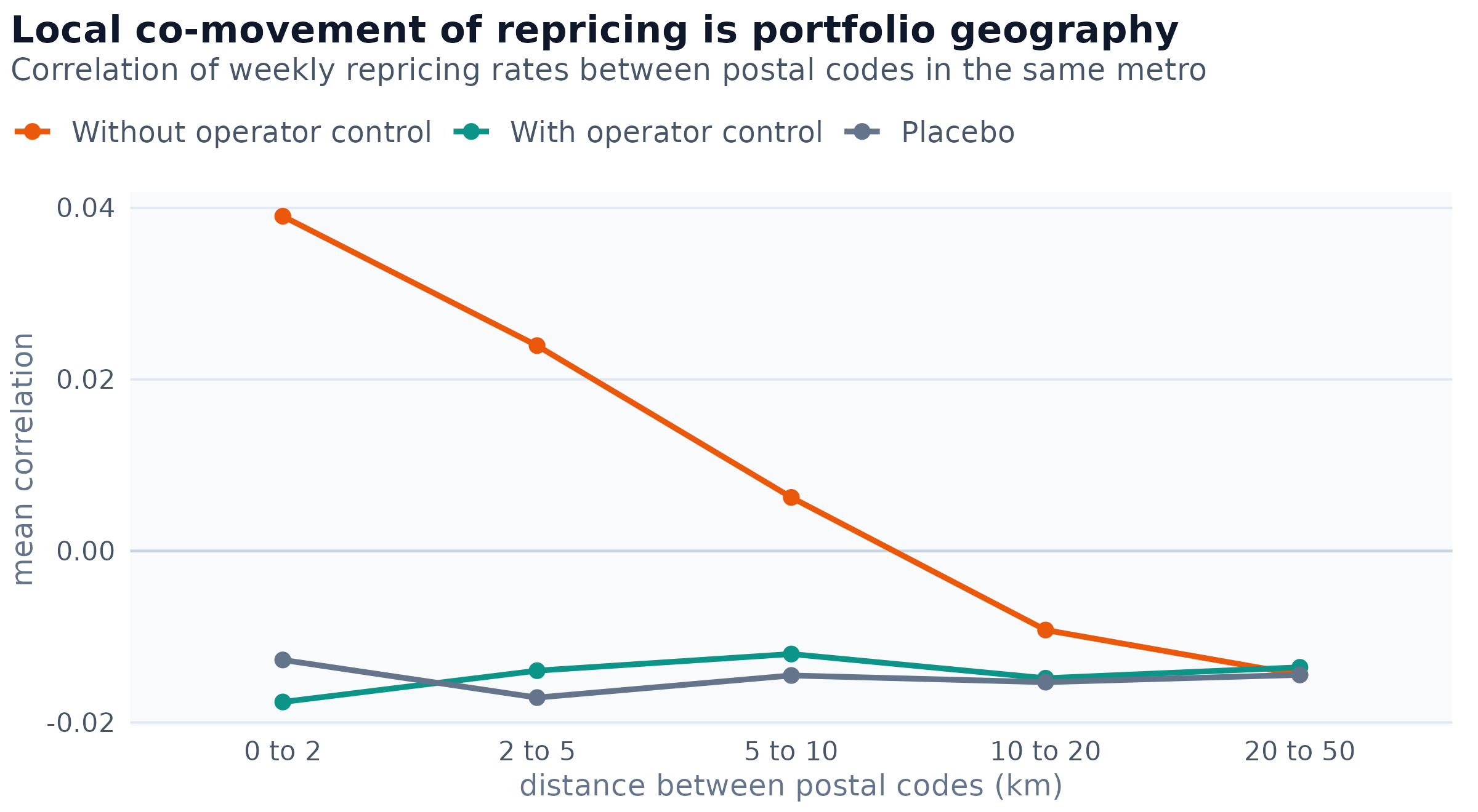
Figure 6: Mean correlation between two postal codes’ weekly repricing rates, by the distance between them, over 14,765 postal codes. The warm series removes only the metro-wide weekly average; the cool series additionally removes what each operator did nationally that week. The placebo reassigns listings to postal codes within their metro, preserving every postal code’s size while destroying which listings share one.
Once the operator is accounted for, the curve is flat across the entire range and lies on top of the placebo. There is no decay because there is no signal to decay. The correlation at short distance is not merely inflated by portfolio clustering, it is created by it: the uncontrolled value is smaller than the artefact removed from it.
The negative level of all three series is worth a sentence, because reading them against zero would produce a spurious finding of negative co-movement everywhere. Removing a metro-wide weekly average forces the postal codes inside that metro to sum to approximately zero, which gives every pairwise correlation a small negative bias by construction. The placebo, not zero, is the correct reference.
The statistic can decide the answer
Across this work, the choice of summary statistic changed a conclusion more than once. The clearest case concerns seasonality, where two statistics computed on identical data disagree about whether a seasonal pattern exists at all.
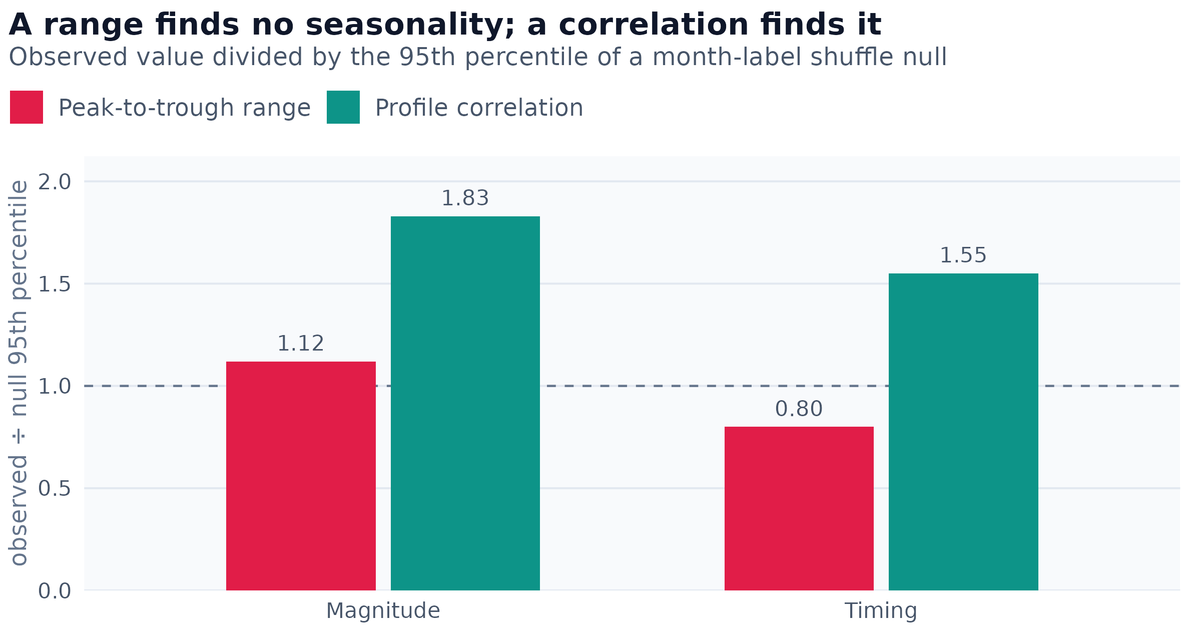
Figure 7: Two statistics applied to the same month-of-year profiles, each divided by the 95th percentile of its own null distribution. A ratio above one clears the null. The range statistic uses two of twelve monthly values and discards the rest; the correlation compares two years’ full profiles. Magnitude is measured on five years of the revision log, timing on three years of the weekly panel.
The first pass used the peak-to-trough range of the twelve monthly values, found that neither channel cleared a month-label shuffle, and concluded that seasonality was not established. The second pass correlated one set of years’ profiles against another’s. That statistic clears its null in both channels, and every one of the ten possible year pairs agrees, with a mean correlation of 0.785 and a minimum of 0.579. The first conclusion was a property of the statistic, not of the data: a range uses two of twelve values and throws the rest away.
A seasonal pattern in repricing therefore does recur, year after year. It is also small, and both statements belong together. The measured amplitudes are half a point for magnitude and five points for timing, which is a stable pattern rather than an important one.
One further caution came out of the same exercise. The monthly profiles have split-half reliabilities above 0.997, which is tempting to read as evidence that the seasonal is real. It is not evidence of that at all. Split-half reliability across halves of the same months measures sampling noise within each month, which is negligible when a month holds millions of observations. Whether the pattern across months is more structured than a permutation is a different question, and with only three to five years of observations per month, the year-to-year variation is precisely what a permutation reproduces.
What remains unexplained
Two questions resisted every design available in this data, and the honest form of each is a bound rather than an answer.
The first is why new buildings grow more slowly. Advertised concessions can be ruled out: at building age zero to two the rate is statistically indistinguishable from nearby older stock, on 544,055 described listings. The other candidate channels, how often a price is cut and how long a listing remains posted, cannot be tested, because building age, calendar period and vintage are exactly collinear and the outcomes most exposed to that collinearity are the ones that move.
The second is why the age gradient differs so much between cities. It is a real and stable property of a metro rather than noise: the same metro’s gradient estimated from two disjoint halves of its data correlates at 0.78, and steepness varies eight and a half fold across metros. Four pre-registered predictors, drawn from a disjoint half of each metro’s data to avoid shared sampling error, produced an R-squared of 0.055 against a permutation null whose mean is 0.105. The specification fits worse than chance.
Both are now recorded as bounded negative results rather than open leads, which is the more useful outcome. A future design would need external data: a delivery or occupancy panel for the first question, and a metro-level supply or land-use panel, along with more metros, for the second.
What the exercise taught about method
Of the phases in this pass, roughly a fifth corrected an earlier one, and in every case the error ran toward the more interesting result. A leverage effect was reported and then withdrawn when the sign test turned out to be a range-restriction artefact. An autocorrelation was attributed to overlapping observations, and the mechanism was later measured with the opposite sign. A variance attribution was published at what turned out to be its maximum over orderings. A seasonality null was a power failure.
None of those were caught by rereading the code. They were caught by placebos, permutation nulls and agreement checks between two routes to the same quantity, and in one case by a guard that returned an impossible correlation of 1.07 and thereby located its own fault. The general lesson is unglamorous and worth stating anyway: build the check that could embarrass the finding, and build it even when agreement is expected, because its value lies entirely in failing.
The programme was also inexpensive, and that bears on the same point. The 23 phases reported here ran as 42 batch jobs and consumed 2.1 CPU hours of the 4.6 that were allocated to them; seven of those jobs ended in a failure or a cancellation rather than a result. When a full pass of estimation over a corpus this size fits inside a few CPU hours, no cost argument survives for skipping the placebo, the second route to the same quantity, or the re-run that overturns a finding already written down. The scarce input was attention and the abundant one was computation, which inverts the assumption that usually governs how carefully observational work gets checked.