Baltimore Bridge Data Visualization & Model
This blog post analyzes the dataset from TidyTuesday about the conditions of bridges in Maryland. It is an interesting dataset to analyze and some maps about the state will be made. This post has an analogous context as one of my previous blog posts about car accident analysis in the same state. If you are interested, please take a look on that one, and the link is here.
library(tidyverse)
library(scales)
theme_set(theme_bw())
bb <- read_csv("https://raw.githubusercontent.com/rfordatascience/tidytuesday/master/data/2018/2018-11-27/baltimore_bridges.csv") %>%
mutate(county = str_to_lower(county),
county = str_remove(county, " county"))
head(bb)## # A tibble: 6 x 13
## lat long county carries yr_built bridge_condition avg_daily_traffic
## <dbl> <dbl> <chr> <chr> <dbl> <chr> <dbl>
## 1 39.2 -76.7 anne arundel IS 695 1958 Fair 128182
## 2 39.2 -76.7 anne arundel IS 695 1951 Fair 128182
## 3 39.2 -76.6 anne arundel IS 695 IL 1957 Fair 92102
## 4 39.2 -76.6 anne arundel IS 695 OL 1957 Fair 92102
## 5 39.2 -76.6 anne arundel MD 2 1937 Good 31511
## 6 39.1 -76.6 anne arundel MD 2 1936 Fair 23961
## # ... with 6 more variables: total_improve_cost_thousands <dbl>,
## # inspection_mo <chr>, inspection_yr <dbl>, owner <chr>,
## # responsibility <chr>, vehicles <chr>skimr::skim(bb)| Name | bb |
| Number of rows | 2079 |
| Number of columns | 13 |
| _______________________ | |
| Column type frequency: | |
| character | 7 |
| numeric | 6 |
| ________________________ | |
| Group variables | None |
Variable type: character
| skim_variable | n_missing | complete_rate | min | max | empty | n_unique | whitespace |
|---|---|---|---|---|---|---|---|
| county | 0 | 1 | 6 | 14 | 0 | 6 | 0 |
| carries | 0 | 1 | 4 | 18 | 0 | 1204 | 0 |
| bridge_condition | 0 | 1 | 4 | 4 | 0 | 3 | 0 |
| inspection_mo | 0 | 1 | 2 | 2 | 0 | 12 | 0 |
| owner | 2 | 1 | 4 | 32 | 0 | 11 | 0 |
| responsibility | 2 | 1 | 4 | 32 | 0 | 10 | 0 |
| vehicles | 0 | 1 | 12 | 15 | 0 | 1288 | 0 |
Variable type: numeric
| skim_variable | n_missing | complete_rate | mean | sd | p0 | p25 | p50 | p75 | p100 | hist |
|---|---|---|---|---|---|---|---|---|---|---|
| lat | 0 | 1.00 | 39.35 | 0.17 | 38.74 | 39.23 | 39.32 | 39.46 | 39.72 | ▁▂▇▆▃ |
| long | 0 | 1.00 | -76.65 | 0.20 | -77.26 | -76.77 | -76.65 | -76.54 | -76.08 | ▁▃▇▃▁ |
| yr_built | 0 | 1.00 | 1969.79 | 24.64 | 1809.00 | 1957.00 | 1972.00 | 1988.00 | 2017.00 | ▁▁▂▇▇ |
| avg_daily_traffic | 0 | 1.00 | 27188.54 | 40184.17 | 100.00 | 2412.50 | 10250.00 | 33430.00 | 222500.00 | ▇▁▁▁▁ |
| total_improve_cost_thousands | 1438 | 0.31 | 1672.98 | 16879.29 | 0.00 | 36.00 | 139.00 | 572.00 | 300000.00 | ▇▁▁▁▁ |
| inspection_yr | 0 | 1.00 | 15.53 | 0.59 | 9.00 | 15.00 | 15.00 | 16.00 | 17.00 | ▁▁▁▇▇ |
A simple map
bb %>%
  ggplot(aes(long, lat, color = bridge_condition)) +
  geom_point()+
  borders("state", region = "maryland") +
  theme_void() +
  coord_map() +
  labs(color = "bridge condition")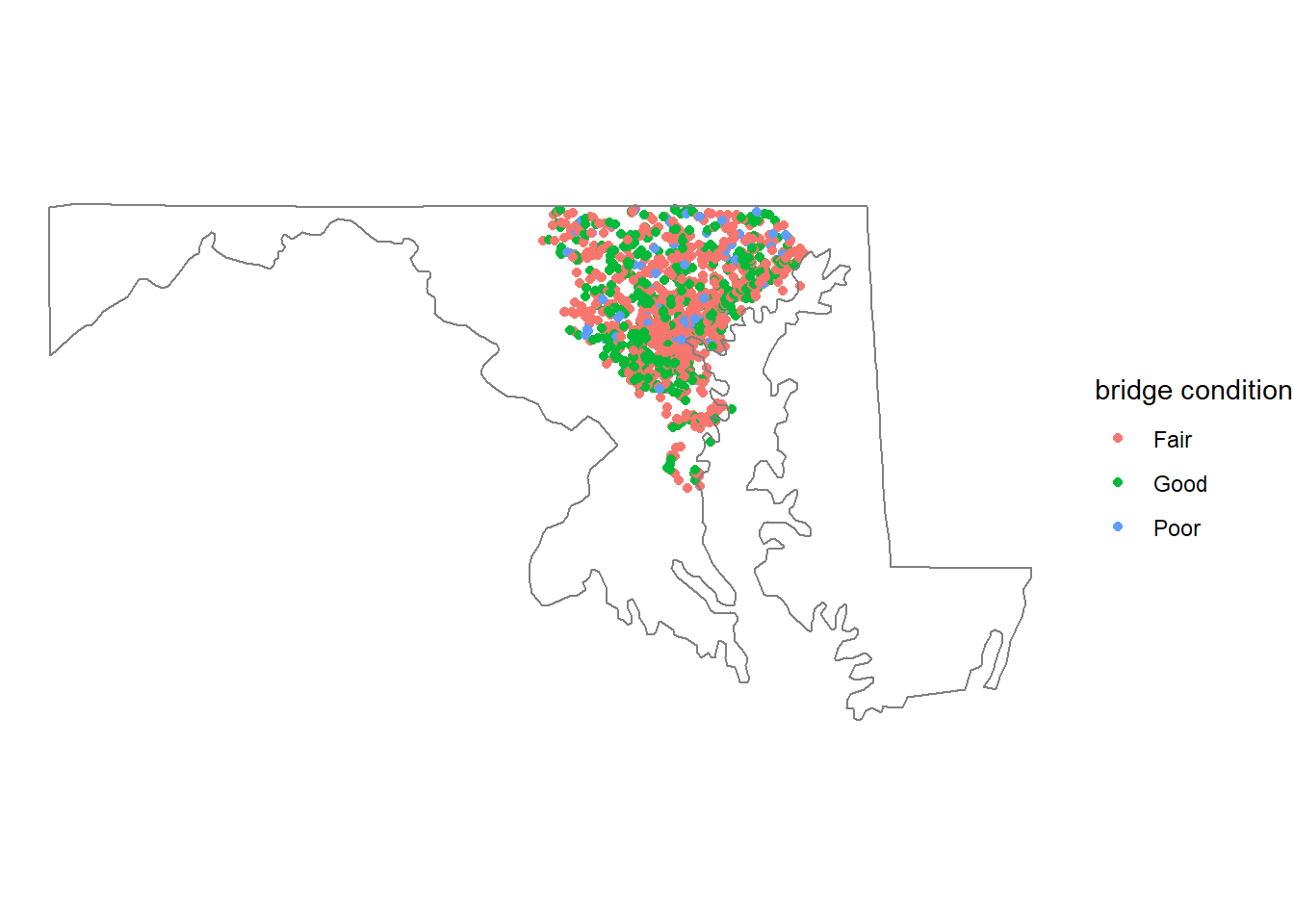
A map with counties included
mean_long_lat <- map_data("county", "maryland") %>%
  group_by(subregion) %>%
  summarize(avg_long = mean(long),
            avg_lat = mean(lat)) %>%
  ungroup()

bb %>%
  right_join(map_data("county", "maryland") %>% rename(lat_m = lat, long_m = long), by = c("county" = "subregion")) %>%
  distinct() %>%
  ggplot() +
  geom_point(aes(long, lat, color = bridge_condition), size = 1) +
  geom_polygon(aes(long_m, lat_m, group = group), fill = NA, color = "blue") +
  geom_text(data = mean_long_lat, aes(x = avg_long, y = avg_lat, label = subregion), size = 3) +
  labs(size = "average daily traffic", color = "bridge condition") +
  theme_void() +
  coord_map()
The following map more focused on counties with bridge conditions
bb %>%
  right_join(map_data("county", "maryland") %>% rename(lat_m = lat, long_m = long), by = c("county" = "subregion")) %>%
  distinct() %>%
  ggplot() +
  geom_point(aes(long, lat, color = bridge_condition), size = 1) +
  geom_polygon(aes(long_m, lat_m, group = group), fill = NA, color = "blue") +
  geom_text(data = mean_long_lat, aes(x = avg_long, y = avg_lat, label = subregion), size = 3) +
  xlim(-77.5, -76) +
  ylim(38.5, NA) +
  labs(size = "average daily traffic", color = "bridge condition") +
  theme_void() +
  coord_map()
bb %>%
  filter(yr_built >= 1900) %>%
  count(yr_built, bridge_condition, county, sort = T) %>%
  ggplot(aes(yr_built, n, color = bridge_condition, group = 1)) +
  geom_line(size = 1, show.legend = F) +
  facet_grid(county~bridge_condition) +
  labs(x = "built year", y = "# of bridges", title = "# of Bridges across Different Counties Faceted by Bridge Condition")
Most of Poor bridges were built by 1975 across 5 different counties.
bb %>%
  ggplot(aes(total_improve_cost_thousands)) +
  geom_histogram()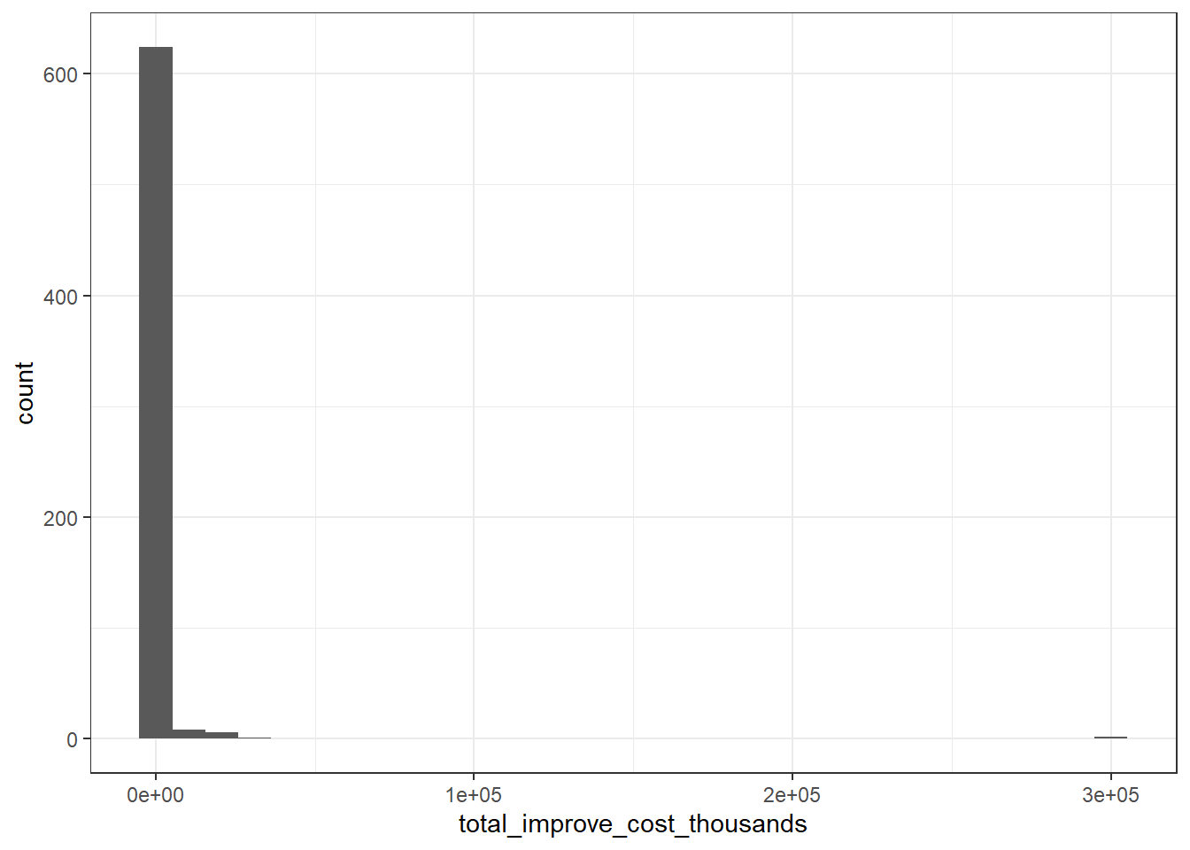
bb %>%
  filter(yr_built > 1900) %>%
  ggplot(aes(yr_built, total_improve_cost_thousands, color = county)) +
  geom_point() +
  scale_y_log10(labels = dollar) +
  geom_smooth(aes(group = 1), method = "lm") +
  labs(x = "built year", y = "total improve cost (thousands)", title = "The Relationship between Built Year and Improve Cost")
It is a bit counter-intuitive that the total improve cost is not relevant to the year in which the bridge was built.
bb %>%
  filter(yr_built > 1900) %>%
  ggplot(aes(avg_daily_traffic, total_improve_cost_thousands, color = county)) +
  geom_point() +
  scale_y_log10(labels = dollar) +
  scale_x_log10(labels = comma) +
  geom_smooth(aes(group = 1), method = "lm") +
  labs(x = "average daily traffic", y = "total improve cost (thousands)", title = "The Relationship between Daily Traffic and Improve Cost")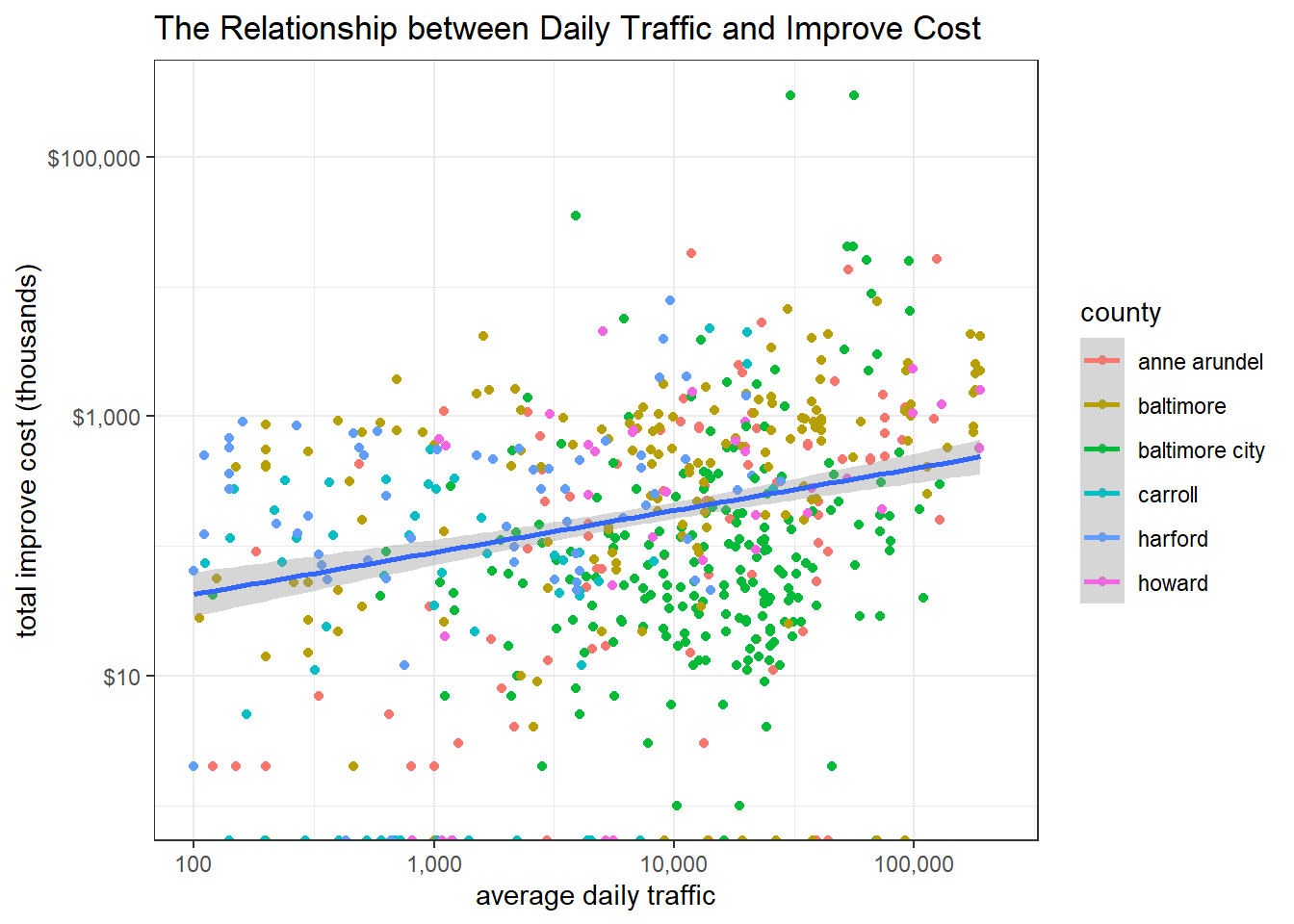
More traffic a bridge attracts daily, more total improve cost is required. This makes sense, as more vehicle travels by, more wears the bridge should have.
sum(bb$owner != bb$responsibility, na.rm = TRUE)## [1] 5Since there are only 5 records in the dataset where owner and responsibility differ, it is generally safe to drop one of the two.
bb %>%
  mutate(
    county = fct_reorder(county, total_improve_cost_thousands, median, na.rm = TRUE)
  ) %>%
  ggplot(aes(county, total_improve_cost_thousands, fill = county)) +
  geom_boxplot(show.legend = F) +
  geom_jitter(width = 0.1, show.legend = F) +
  scale_y_log10(labels = dollar) +
  labs(y = "total improve cost (thousands)")
New things learned: GAM & spline package
This section is largely referenced and inspired by David Robinson’s code for learning purposes only.
In his code, he used a logistic regression and a Generalized Additive Model (GAM) to predict bridges with Good conditions based on yr_built and various other features. I learned GAM from my Statistical Learning class and this is my first time seeing the model being used in the wild (with augment() function), which at the same time provides me an excellent opportunity to understand it more especially on how to use it.
library(broom)
library(splines)
bridges <- bb %>%
filter(yr_built >= 1900)
skimr::skim(bridges)| Name | bridges |
| Number of rows | 2068 |
| Number of columns | 13 |
| _______________________ | |
| Column type frequency: | |
| character | 7 |
| numeric | 6 |
| ________________________ | |
| Group variables | None |
Variable type: character
| skim_variable | n_missing | complete_rate | min | max | empty | n_unique | whitespace |
|---|---|---|---|---|---|---|---|
| county | 0 | 1 | 6 | 14 | 0 | 6 | 0 |
| carries | 0 | 1 | 4 | 18 | 0 | 1199 | 0 |
| bridge_condition | 0 | 1 | 4 | 4 | 0 | 3 | 0 |
| inspection_mo | 0 | 1 | 2 | 2 | 0 | 12 | 0 |
| owner | 2 | 1 | 4 | 32 | 0 | 11 | 0 |
| responsibility | 2 | 1 | 4 | 32 | 0 | 10 | 0 |
| vehicles | 0 | 1 | 12 | 15 | 0 | 1284 | 0 |
Variable type: numeric
| skim_variable | n_missing | complete_rate | mean | sd | p0 | p25 | p50 | p75 | p100 | hist |
|---|---|---|---|---|---|---|---|---|---|---|
| lat | 0 | 1.00 | 39.35 | 0.17 | 38.74 | 39.23 | 39.32 | 39.46 | 39.72 | ▁▂▇▆▃ |
| long | 0 | 1.00 | -76.65 | 0.20 | -77.26 | -76.77 | -76.65 | -76.54 | -76.08 | ▁▃▇▃▁ |
| yr_built | 0 | 1.00 | 1970.27 | 23.74 | 1900.00 | 1958.00 | 1973.00 | 1988.00 | 2017.00 | ▁▂▇▇▃ |
| avg_daily_traffic | 0 | 1.00 | 27310.42 | 40252.63 | 100.00 | 2471.75 | 10306.50 | 33935.50 | 222500.00 | ▇▁▁▁▁ |
| total_improve_cost_thousands | 1435 | 0.31 | 1693.12 | 16984.82 | 0.00 | 37.00 | 141.00 | 573.00 | 300000.00 | ▇▁▁▁▁ |
| inspection_yr | 0 | 1.00 | 15.53 | 0.59 | 9.00 | 15.00 | 15.00 | 16.00 | 17.00 | ▁▁▁▇▇ |
simple_model <- bridges %>%
  mutate(good = bridge_condition == "Good") %>%
  glm(good ~ ns(yr_built, 4), data = ., family = "binomial")


augment(simple_model, bridges, type.predict = "response") %>%
  ggplot(aes(yr_built, .fitted)) +
  geom_line() +
  expand_limits(y = 0) +
  scale_y_continuous(labels = percent) +
  labs(y = "Predicted probability a bridge is rated 'Good'")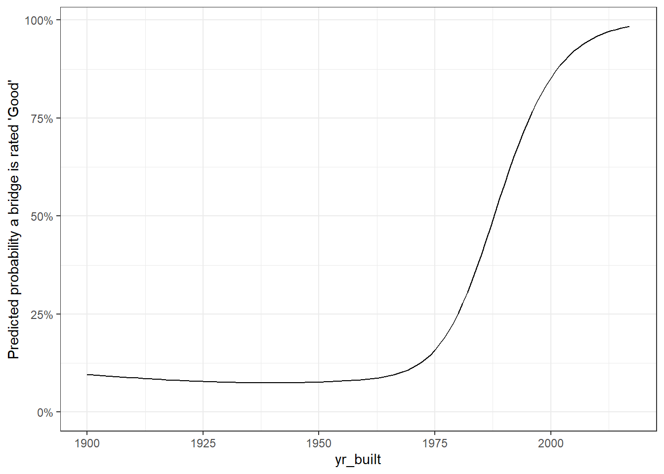
The original code from Robinson does not work, as bridges data frame has 2 NA values in the responsibility column. I am not sure why the code worked when he was coding it.
model <- bridges %>%
  filter(!is.na(responsibility)) %>%
  mutate(good = bridge_condition == "Good") %>%
  glm(good ~ ns(yr_built, 4) + responsibility + county, data = ., family = "binomial")

augment(model, bridges %>% filter(!is.na(responsibility)), type.predict = "response") %>%
  ggplot(aes(yr_built, .fitted, color = responsibility)) +
  geom_line() +
  expand_limits(y = 0) +
  facet_wrap(~ county) +
  scale_y_continuous(labels = percent) +
  labs(y = "Predicted probability a bridge is rated 'Good'")
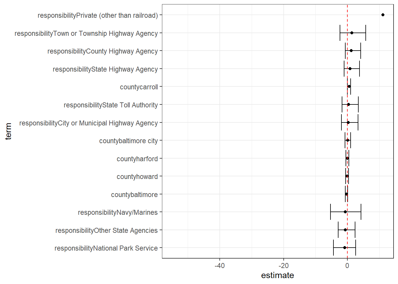
model %>%
  tidy(conf.int = TRUE) %>%
  filter(str_detect(term, "responsibility|county")) %>%
  mutate(term = reorder(term, estimate)) %>%
  ggplot(aes(estimate, term)) +
  geom_point() +
  geom_errorbarh(aes(xmin = conf.low, xmax = conf.high)) +
  geom_vline(xintercept = 0, color = "red", lty = 2)